Consortiq offers training, consultancy, filming and more in an effort to disrupt the drone and unmanned aircraft system industry. With an entrepreneurial business strategy in place, Consortiq hired us to design a credible and distinctive identity.
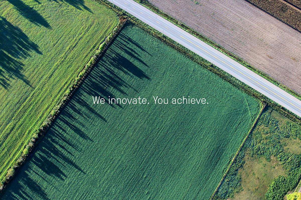
Through a strategic workshop, we began by defining the brand values as entrepreneurship, drive, passion, and smart, distilling the creative articulation down to “We innovate. You achieve.” informing the visual transformation.
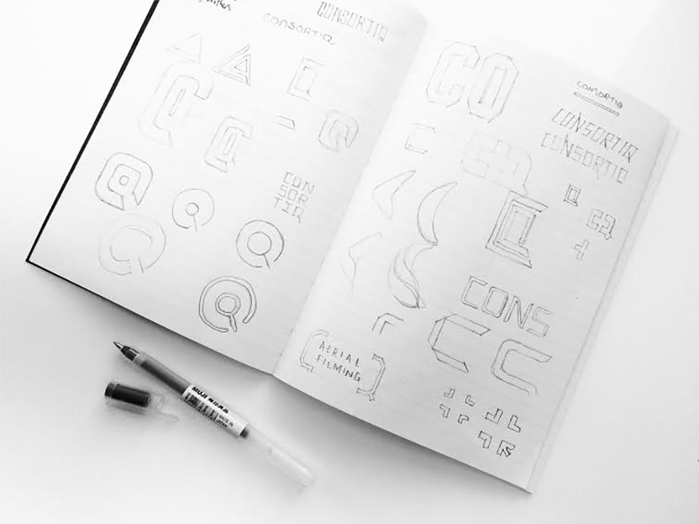
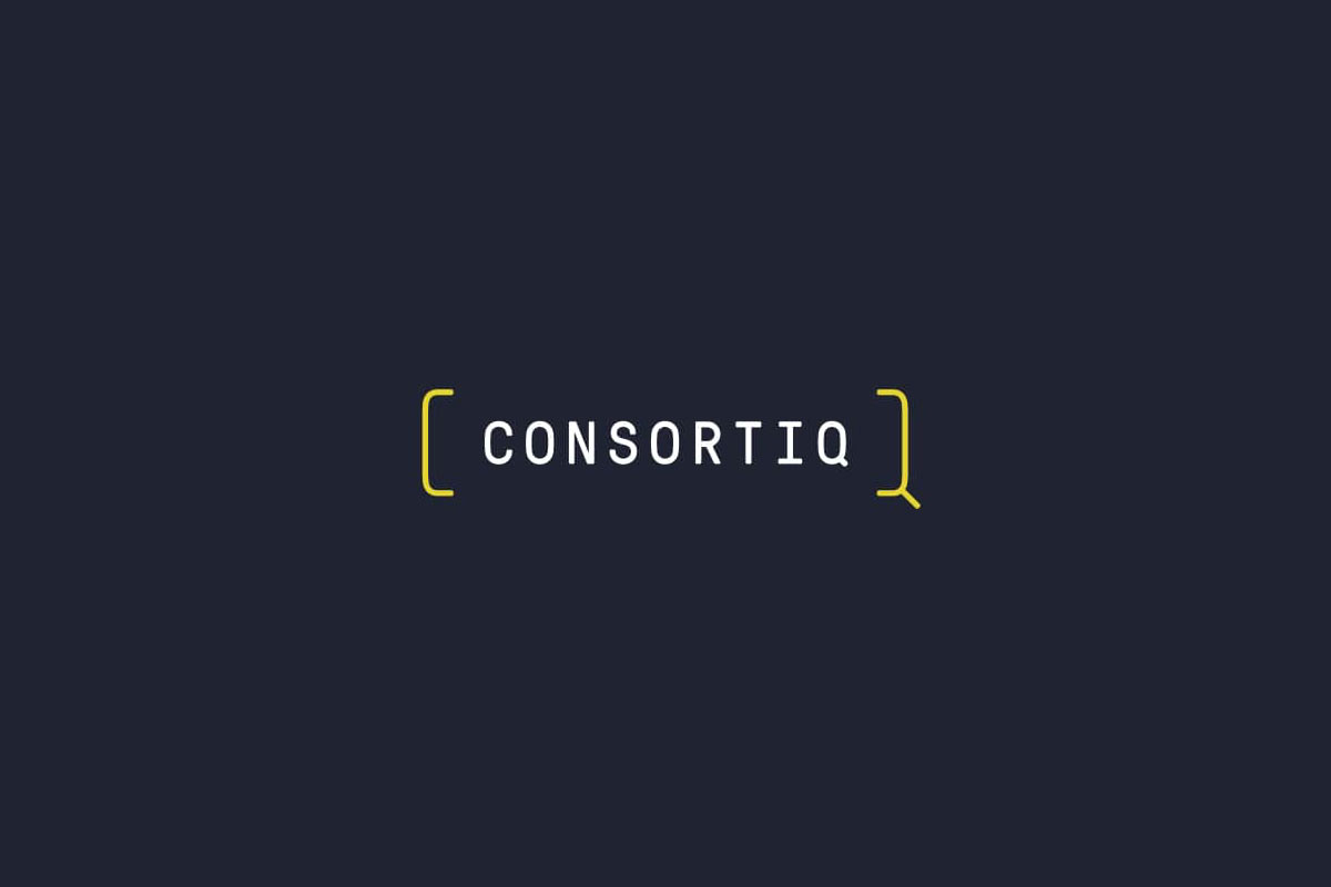
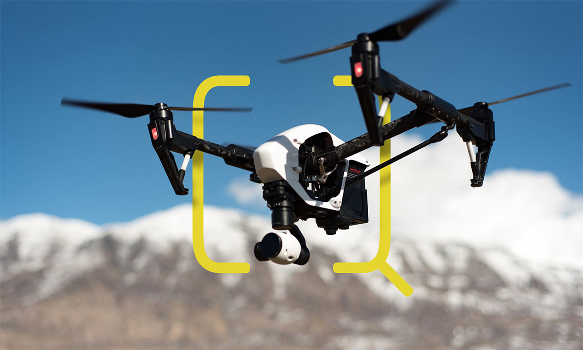
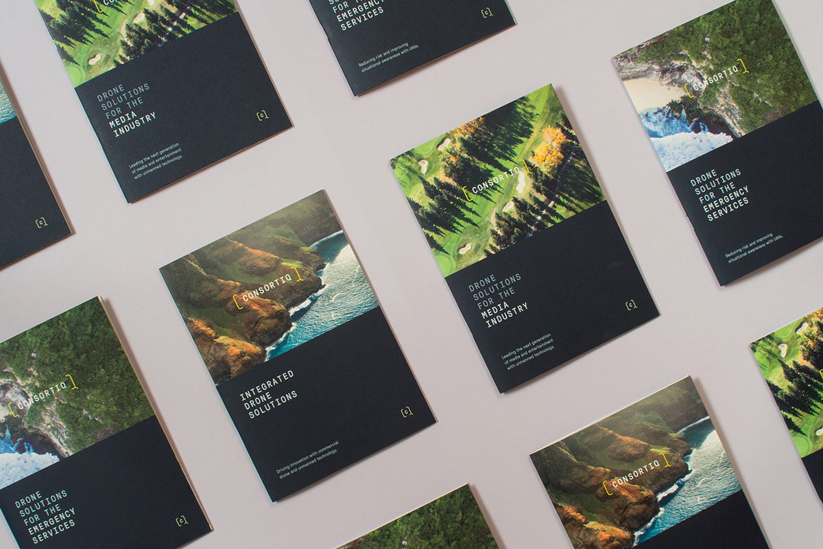
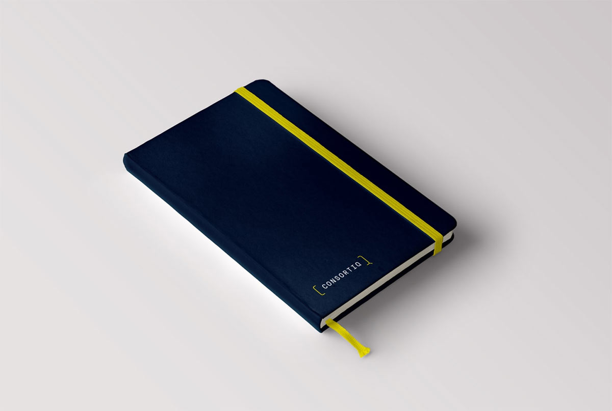
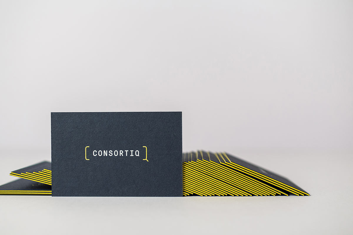
Structural flexibility was introduced through the typography and marque combining to create a logo system. Cropped versions of the C and Q letterforms are used to create a bracket device to frame the logotype. The shape of which was inspired by a view finder (associated with filming and photography).
The logo retains some reference back to the previous design with the capital Q but it makes more sense in this context as it has the ability to work across all of the hierarchical name requirements.
By positioning secondary text outside of the brackets, we could incorporate as much or as little text as we like. Brackets could be applied to any of the sub-brands, effectively creating new logos that are immediately recognisable as part of the Consortiq group.

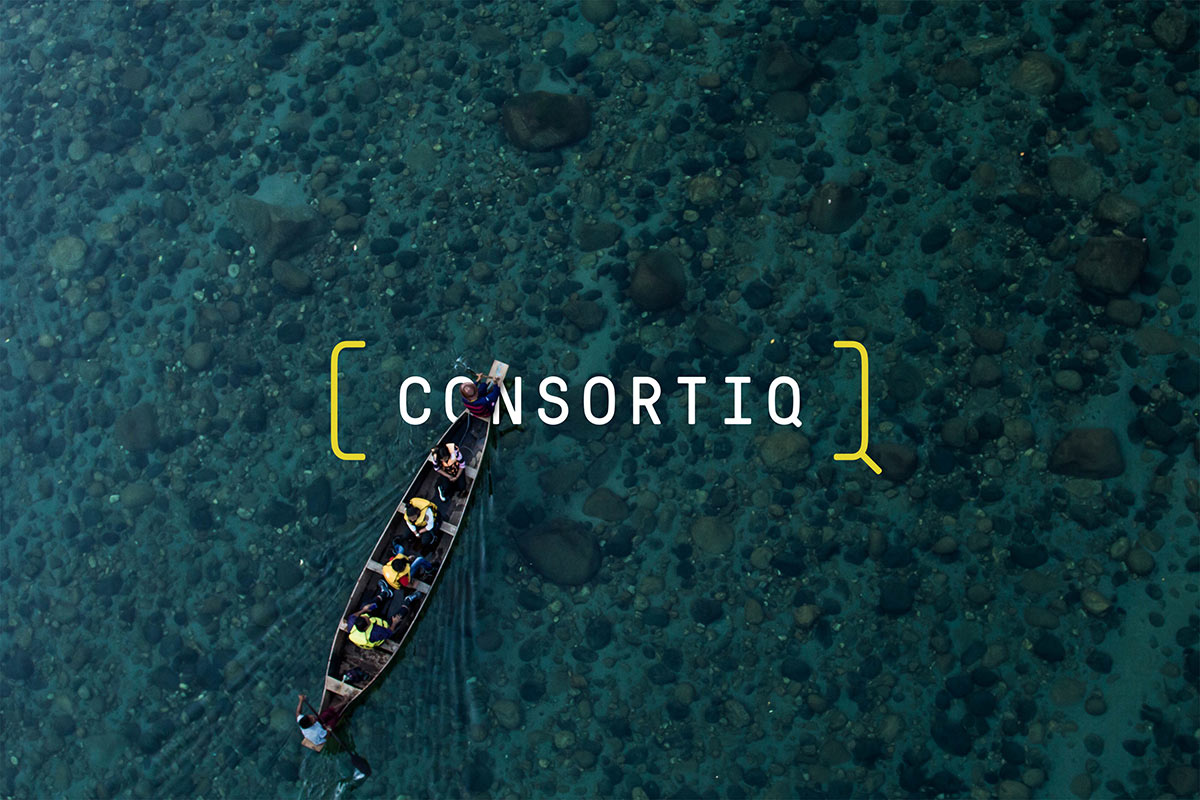
We used a deep blue grey as a foundation for the colour palette to provide a subtle corporate feel which compliments and contrasts with a vibrant yellow to create a lot of impact. The yellow was chosen because it has a lot of personality and it stood out from the sea of blue competitor brands.
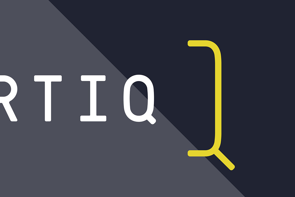
The lead typography is Pressura Mono to establish a technical feel. In order to line-up the angles of the brackets in the logo device we created a bespoke ‘Q’ for the logo typography that also gives a well-balanced and refined overall feel.
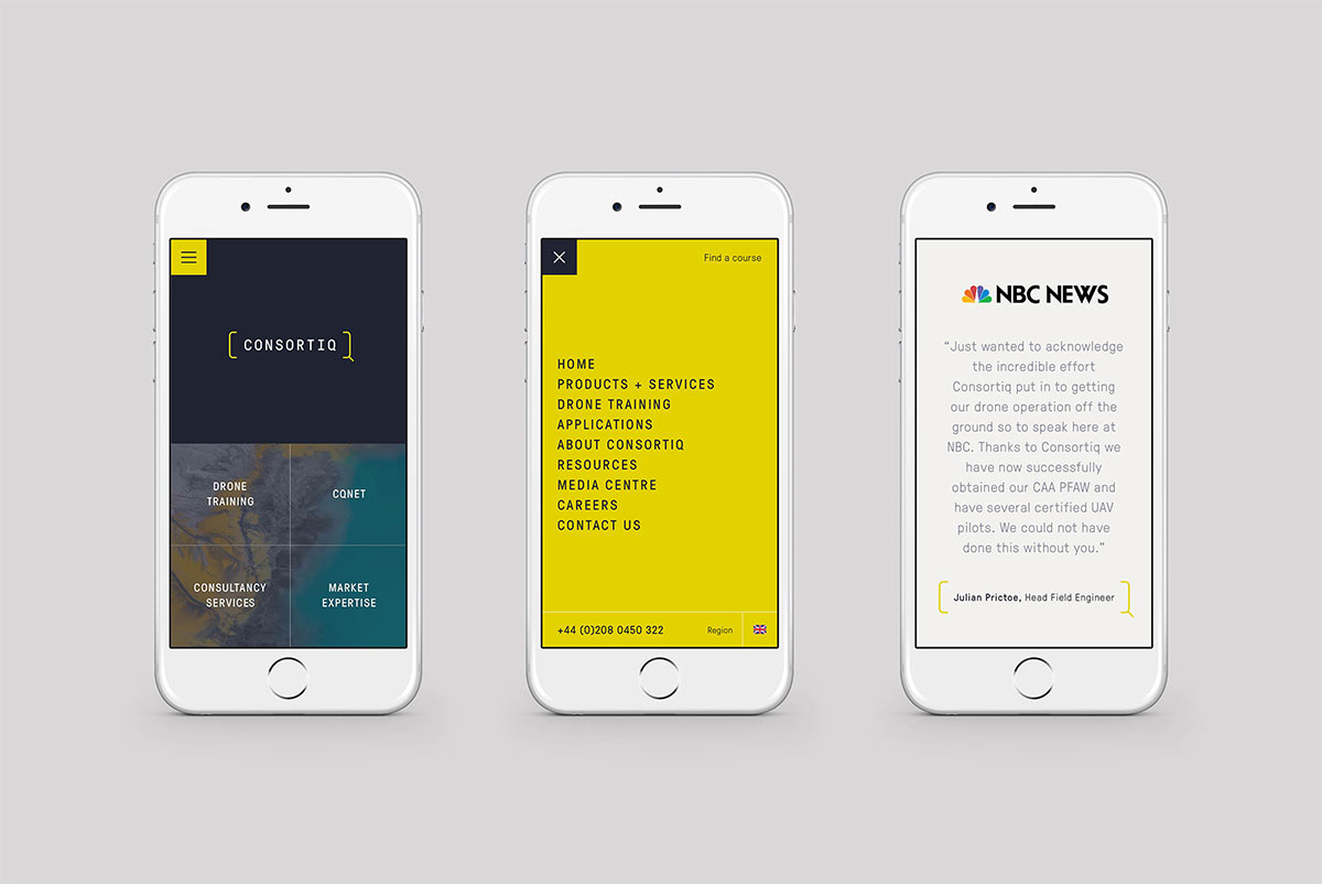
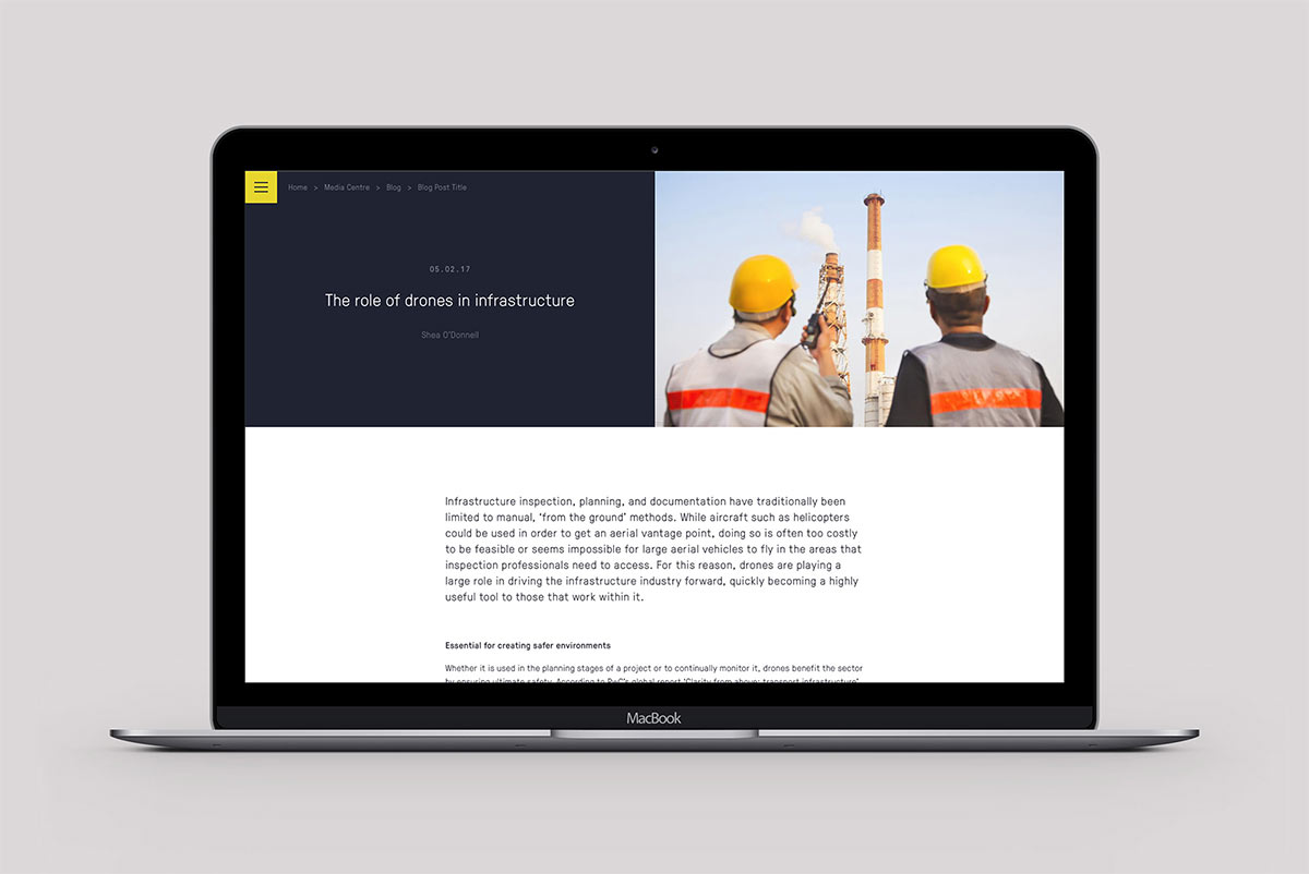
The website was designed with an unconventional menu and navigation. As a rapidly growing business, the site map was likely to grow so we took the decision to use a burger menu to focus visitors on the key areas of the site. The use of the bold yellow prevents the menu from getting lost. As a result, the design and layout are more dynamic and unique to the Consortiq brand.
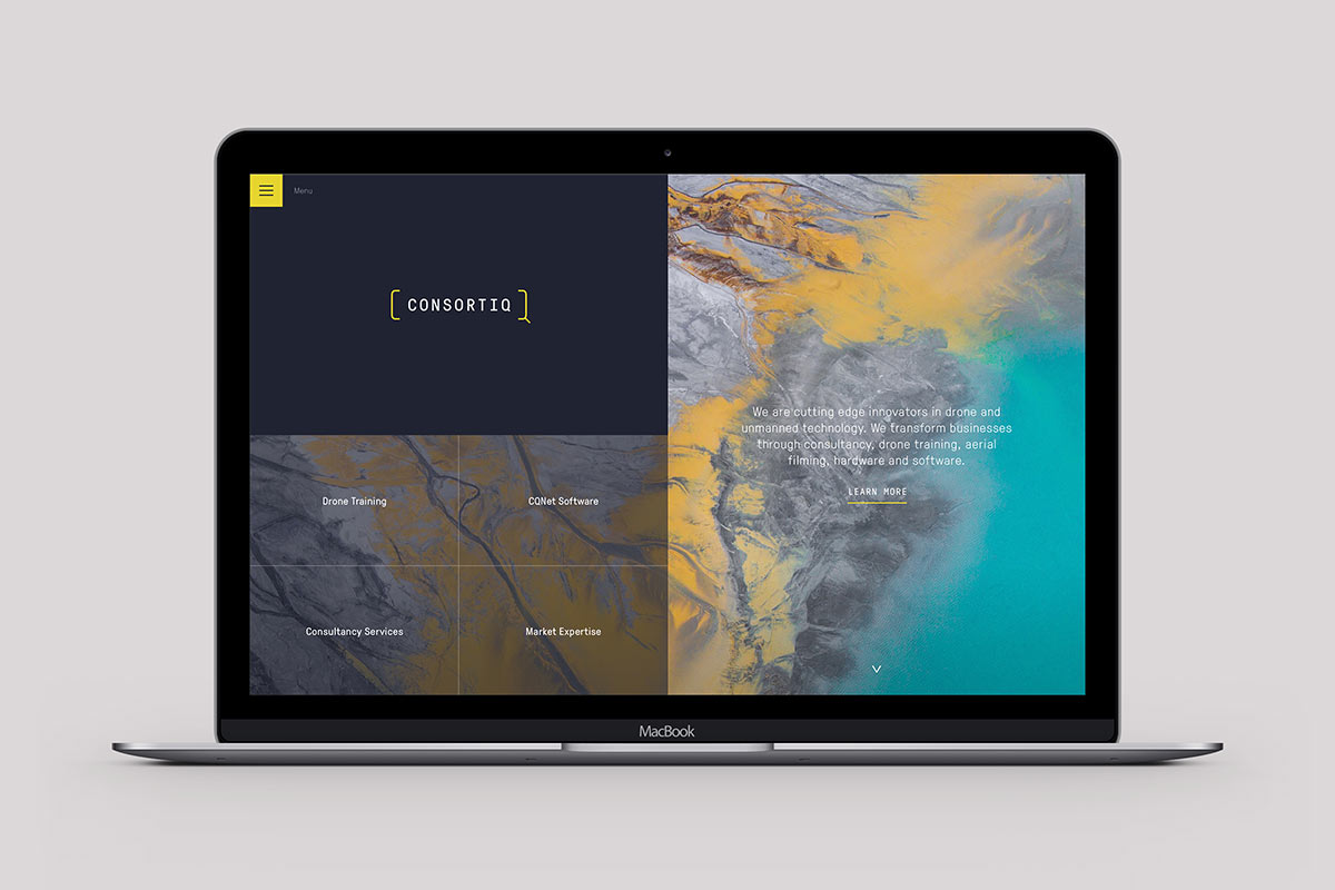
As with all of our design work, the desktop layout has been designed that optimizes well at mobile screen sizes and retains the distinctive look and feel. The result of the chosen route is an ultra-contemporary styling that aligns with the entrepreneurial, tech start-up and consultancy sectors to ensure standout.
Salad elsewhere on Identity Designed: Silver & Green.
More from Salad.


Comments
Wow, love it. Loving the use of colour.
Nice and simple, though the very modern and synthetic corporate-sounding name gives no clue as to the quite specific nature of the business. I guess the clipped CQ device goes some way to conveying the ‘viewfinder’ aspect. Some odd letterspacing on the CQNET version.