
Doctor Entertainment is an independent game development studio founded in 2009 by Jesper Rudberg and Anders Pistol, both senior game developers with experience from several multimillion selling AAA games. Their first game, Puzzle Dimension, scored some great reviews and proved that Doctor Entertainment was a developer to count on. In time for the announcement of their second release, they got in touch with us to do a complete rehaul of their company brand, including a new identity, business cards and website.

When we first sat down with Doctor Entertainment we were all pretty keen on trying out a concept that revolved around using a white cross from a directional-pad (from a classic game controller) against a green background, as a symbol for the company. The directional-pad would identify the game studio, and the white/green cross would tie in with the word ‘doctor’, looking like the sign for a pharmacy. The idea was that the d-pad would be the only real indicator of game development, in an otherwise very strict and clinical appearance, which would make the company stick out in an indie-game market where most other companies seem to go for either a dark and sci-fi inspired look, or a very playful, child-like appearance.
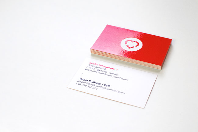
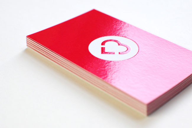
However, after having tried this approach something didn’t feel quite right. The Doctors thought it looked too much like a pharmacy, while we weren’t all that excited with the obviousness of the d-pad cross. It just felt too simple. Returning to the drawing board we tried to alter the concept of combining the words ‘doctor’ and ‘entertainment’ into one, and came up with something that instantly felt much better. The white heart on bright-red background connected perfectly with the loving and playful attitude of the company, at the same time as it could easily be seen as the sign hanging outside a young and fresh pharmacy. To add a third layer of meaning, we also made the heart look like it was written with the ascii characters < and 3, connecting it further to the digital nature of game development.


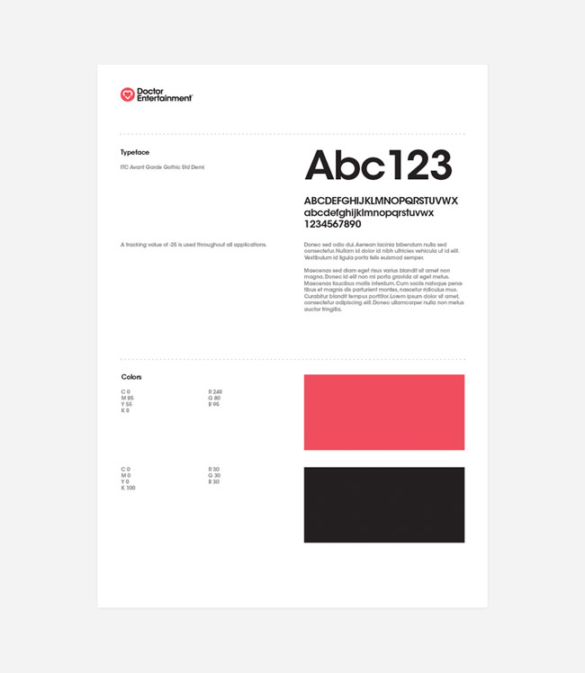
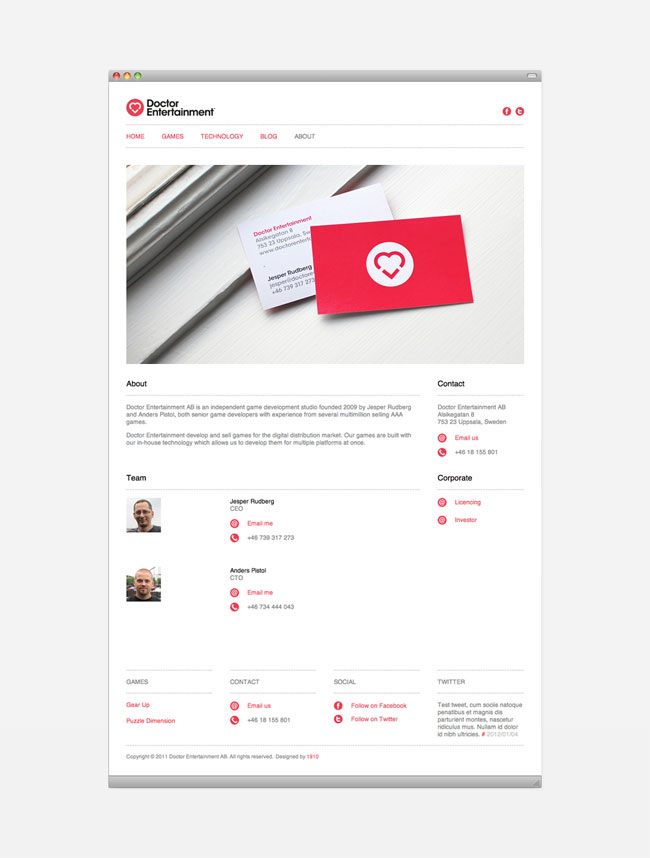
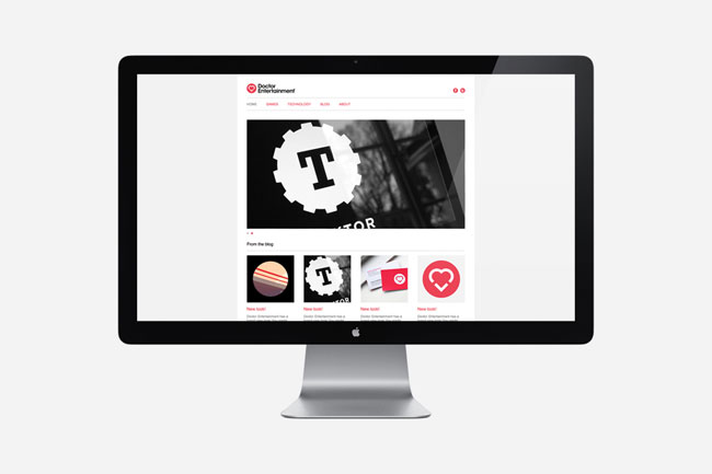
After having everyone agree upon the concept, we went on finalizing the logo and developing the rest of the identity. Avant Garde was picked as the primary typeface, because of its roundness working well together with the circular symbol, and the final color was chosen to look warm and inviting, edgy and youthful. The business cards got a uv-varnished backside, and the website was purposely designed with large images and typography to work well on the iPad as well as on desktop computers.


More than any other project we’ve worked on, this one really proved the importance of sometimes starting over if you’re not entirely satisfied, rather than trying to force your way forward.
More from 1910.


Comments
Damn, I can’t help but feel the D-Pad ‘+’ white/green cross mark would have been so much more effective!
It would have tied in better to gaming and the doctor aspect than just a heart made from <3
Shame.
Great project, I do however think that a green roundel and d-pad cross would have been fantastic. I agree it may have been a little simple but could have been bolstered with a broader identity system (icons, photography, written content etc) that would have neatly tied it more to gaming and balance out the clinical sensibilities.
The ‘e’ heart and red colour, while a neat combination, for me, has a heavier medical sensibility and although the line weight and geometric execution has the qualities you might expect from gaming I think it’s a touch confusing on first impact (an observation that is probably negated by the environments the identity will inhabit).
Please don’t get me wrong, I do like this and think it’s been really well executed.
I did a similar thing about 3 years ago. See: http://www.logospire.com/logos/1968
That was only just for fun so it is not a problem at all but it’s interesting to see a similar solution.
Great project by the way.
Cheers,
Oz
Please feel free to erase my comment if you thing is off, but I just don’t get this identity for a game development studio.
It lacks sophistication and it’s just plain with this 2dimensional feel.
I like the execution a lot but I have to admit that I was quite surprised that this is an identity for a gaming company. My first thoughts were a swiss or british non-profit organization, museum or architecture firm. The identity radiates part Bauhaus and part Neville Brody (especially the icons).
I agree with Alex and Richard on this one… The D-pad/medical cross possessed a fantastic simplicity that really embodied the brand. Just because the logo “feels too simple” doesn’t mean it won’t be effective.
“Wait, this just makes too much sense… it communicates exactly what we’re trying to say in a simple, relevant mark… Change it!”
Nice job on the application… Clean and crisp execution.
The d pad would have been too simple. It is also a limiting symbol as gaming progresses more into touch screen and motion control. It would have been like using a floppy disk icon to represent a modern tech company, even though it immediately communicates computer it is not the right choice.
I also appreciate the Swiss sensibility; it will stand out in a market full of clichés.
I think C jones makes an interesting point but would respectfully disagree. Indeed gaming is a quickly evolving industry but the d pad has been around for over 20 years, it is iconic and understandable by a wide demographic. Wii, while a ‘game-changer’ still utilise a D pad, as does their new Wii U Controller (and mobile devices such as DS, PS Vita while integrating a lot of touch technology also have a D-pad) so there is still a lot of equity in such a symbol and clearly an effective secondary interface. Don’t forget the emotional impact certain forms can have which trigger memories of past experiences and can continue to generate these after a technology has moved on.
We can see the same solution in a brazilian tv show called “Mais você” (More You, in english). Here it is:
http://1.bp.blogspot.com/-gYR_-HGc5ag/Tge-i-TmADI/AAAAAAAAA7c/Vp6JSNSXq-8/s1600/programa-mais-voce.jpg
ok, I stubbled on this, have had a good read and look and this is what I think. (I’m not reading others comments on this until I get this out so sorry if I repeat any points others have said).
Just to qualify, I’m not a mentalist. I’m a 37 year old designer, I’ve been an avid gamer since Atari 600XL. I love design, I love games.
The logo sucks. It lacks any sense of heritage with regards to gaming as a market / cultural phenomenon / pass time / industry. You can dress up the use of the 3 and the > symbol in finery of many feathers but in the cold, hard light of day, the meanings ascribes are pointless and trite. They have no authority. They are merely words, used to back up a bad idea. I don’t look at the identity and think this is a mark that makes me think of FUN, INDIE, or GAMES. It doesn’t make me think of entertainment. It makes me think of drugs, healthcare, old people with week bladders, young professional doctors doing private work, smiling nurses, being charged £20 for an aspirin and privatised healthcare, sunny LA and twilight care homes.
The D-pad was the obvious and correct choice if you wanted to go down the cliched route (not a bad thing). The D-pad is a cross, the cross is medical, the cross is inherant in nearly all gaming systems – even PC gaming have the equiv D-pad on the keyboard. The D-pad made sense, perhaps you didn’t push it far enough, perhaps sticking it in a circle wasn’t sexing it up enough.
I know it’s hard to create great identities, they are mini worlds, works of fiction. There’s only so many original ideas out there, but this one doesn’t even get half way. I think the real problem is you could change the wording and the mark would be completely meaningless. Change the words to Animal Hospital and it like like a mouse or an animal with big ears. Change it to Dating for Geeks and it’s a heart made up from a ‘less than’ symbol and two nerds kissing. You see the point I’m making? Anyhoo, hope this isn’t seen as some sort of rant, it’s very professional, well laid out and clean but as my old teacher used to say, ‘there’s no point in polishing a turd’ and this is one of those I’m afraid.
‘k, gonna read the comments now and see how my tunnel vision of design fitted in with the other posters.
:)
gareth
I have to agree with Alex – the D-pad and cross was such a promising combination, an opportunity lost. The heart concept is nice and minimal, but has no personality compared to the aforementioned.
I’m not here to pass judgement on the identity as I’m in the verbal design business. The execution is beautiful and very professional.
Gareth I just wanted to say that your comment made me really stop and think. It will be really helpful for other emerging designers to read and use to critique and question what they do.
1. Does what I’m creating reflect the heritage of the industry or business?
2. Does this design convey the feelings associated with the industry or brand —a sense of fun, entertainment, escapism etc?
3. How will it make the audience base feel — will it take them where they want to go?
4. Is the mark meaningful when it stands alone?
5. What’s the story I’m telling?
6. Does my rationale mean something or am I just using it to back up my idea?
Not the only questions to ask yourself about you work, but yours were some good ones.
I agree with Alex P, the d-pad idea would’ve been amazing, and I’m sure they could’ve pulled it off. Sure it might look a little like a pharmacy, but that’s when getting your name and motives around, so that the public can recognize that Doctor Entertainment isn’t a pharmacy or a video store specifically for doctors, its a quirky title for a creative bunch of game developers.
I feel that as clean as this is, and as wonderful as it is, it doesn’t get the idea across as well as it should.
I’m just not seeing ‘we’re a game development company’ when looking at the whole of the design. I actually thought this might have had something to do with doctors (as original as the name is, it’s confusing to the average person).
And I agree with Christian, this looked very Swiss at first, and I was surprised to see it as a game development company’s logo.
In fact, I thought it might have something to do with Victorinox, not to mention, I didn’t even see the <3 to begin with.
I think they've lost the point, it would've been so much more understandable and relevant if they stuck with the d-pad in the green roundel. This design is so far from what they really should be conveying.
And Gareth, once again, you couldn't have spoken more truer words! I agree 100%, the whole <3 thing just isn't as relevant and true to the idea of gaming, its leaning more to emoticons and the days of Windows Live Messenger.
And yes, there's no point polishing a turd. If the idea/premise sucks from the beginning, there's no point trying to make it something greater than it is.
Even the name isn't as great as it could be, but at least the d-pad idea would've evened things out.
And Bernadette, great questions! I think that they weren't thought about too long for this specific design, but I guess that's just how things turned out.
Overall, not so much impressed of the logo, but the design of everything else is appealing. Nothing too special, but still appealing.
I think the logo would look much more appealing if turned to a different angle. Rotate the logo 90 degrees anti-clockwise and you get the idea of “E” entertainment along with the “>” sign representing moving forward, and if turned 90 degrees clockwise you get the idea of the loving and friendly nature of the company with the heart shape.
If I am wrong, please comment below and correct me.