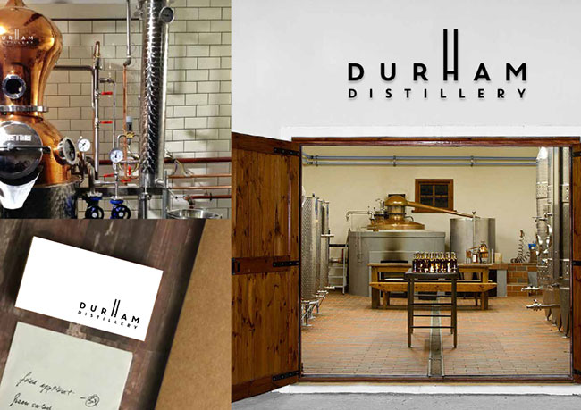
The story of our involvement with Durham Distillery goes way back to October 2012 and our work with Channel4 and Secret Millions. On set we met Jon Chadwick, project director and former NHS chief executive. We worked closely with Jon during the two week programming schedule.
Fast forward six months to July 2013 and we were once again approached by Jon. Following several months of researching and planning, he had decided to set up a distillery in his hometown of Durham, and he wanted our help to realise his vision.
Whilst ‘craft’ distilleries have seen something of a boom in recent years across the UK, this was to be England’s northernmost distillery and a first for the North East region. Jon was anxious and eager to make it a success.
We began with a period of strategic consultation, helping Jon understand the importance and role of brand as a business asset, writing a brand definition, creating a brand promise (Good Honest Spirits), and identifying a target audience. With these corner stones set and the name for the distillery already agreed, we began the process of visual identity design.
As a physical product, we understood that the most important application of the visual identity was to be on the product packaging and so we focused our attentions on developing solutions that had clear transitions into label designs.
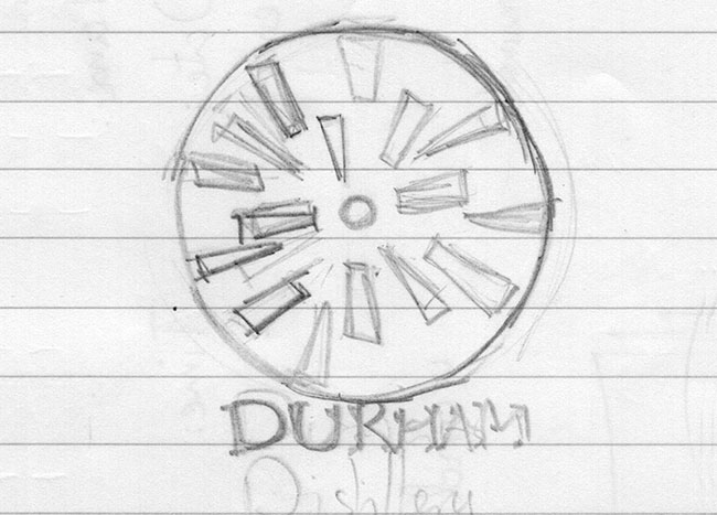
With a clear brief to focus on the regional heritage of the product, we started by looking into the long history of Durham City initially presenting two concepts based on; 1) the profile of the city’s famous Cathedral, and 2) the Cathedral’s Rose Window.
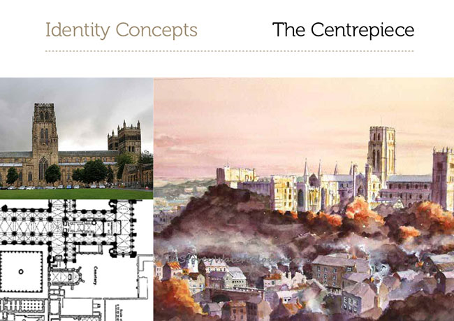
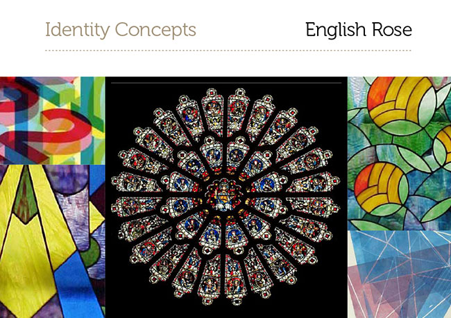
Jon quickly bought into our vision, and we began developing our ‘English Rose’ concept into the Durham Distillery Roundel.

It was at this stage that the actual nature of the products being sold by the brand became more and more important. Jon had long known the distilleries flagship product would be Gin, but hadn’t settled on a tasting style so we joined him on several Gin tasting sessions, helping shape this first product. This experience also formed a crucial part of our research, giving us true first hand experience of the marketplace the brand and its products would be competing in.
As the product developed so did the brands visual identity; shapes become more refined as flavours did, colours were tweaked to reflect ingredients, and typefaces altered as strengths varied.
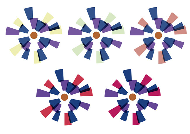
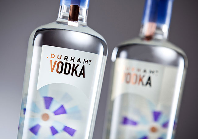
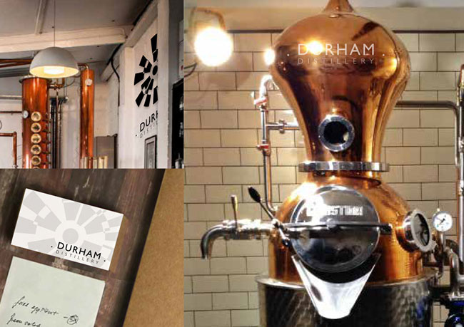
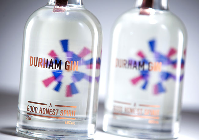
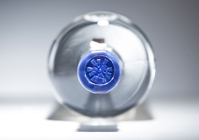
The bold graphic roundel is inspired by Durham Cathedral’s iconic Rose Window, modernised and distorted to reflect the layers of flavour and modern techniques used in product distillation. The Durham Distillery master brand remains single colour (copper because of the handmade copper still at the heart of all the brand products), whilst product brands use four colours (copper; the still, palatinate purple; the colour of Durham, and two others to reflect key flavours/ingredients). For the distillery’s first product, Durham Gin, these colours were a dark blue (the colour of Juniper) and a hot pink (pink peppercorns).
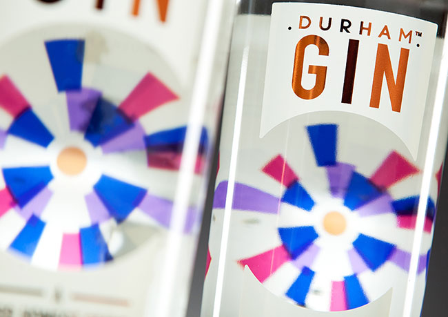
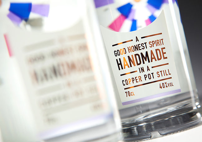
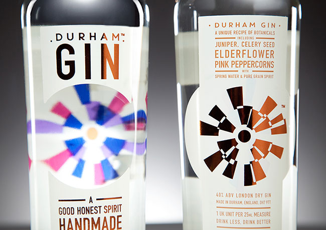
To reinforce the rose window inspiration, when it came to packaging we chose a look through style; reverse printing the back label and creating a two-part front label (challenging as we had to allow for refraction of the logo by the gin) to create a window from the front to the back of the bottle. Typography was stacked, a subtle reference to another craft in renaissance recently, traditional letterpress printing.
With the label design preliminarily approved, we worked closely with Durham Distillery’s suppliers and printers to ensure the finished labels stayed true to the approved design whilst coming in on time and on budget, whilst remaining practically feasible for them to apply themselves in short-runs by hand.
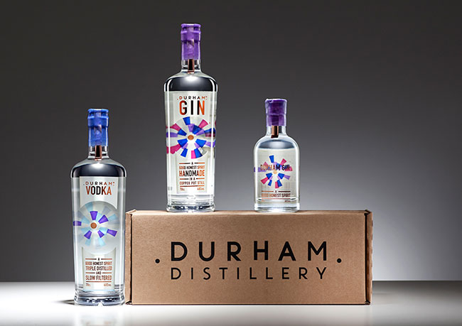
We also worked with the brand on the design of all other required touchpoints including; delivery packaging, digital presence (website and social media), and printed promotional materials (posters and product leaflets). We continue to have an integral role in the growth of the brand, and have helped them to successfully launch their other products; a limited edition Durham Summer Fruit Cup, a mini 25cl Durham Gin, and Durham Vodka, with more to follow in 2015.
Durham Gin and Durham Vodka are available from www.durhamdistillery.co.uk.
“I was really aware when I set up the company that we needed a distinctive brand that would stand out. Essentially, we are selling a clear liquid in a bottle, so I knew I needed something colourful and attractive in order to compete with international brands.
“Wonder Stuff Studio took us through the whole process, from first concepts, brand identity, website design, into bottle label and packaging. We’ve had a fantastic response to our brand, particularly the label design and the overall brand look, and after only a few months of trading we are already in Fenwick and Majestic Wines. Wonder Stuff Studio did a fantastic job for us, and we would definitely recommend them.”
— Jon Chadwick
Wonder Stuff elsewhere on Identity Designed: Lane7.
More work on the Wonder Stuff website.


Comments
For one horrifying moment I thought they’d gone with the rugby goalpost design. It felt a bit too gimmicky for my liking.
The final design is really good and should stand the test of time. In addition, I love it’s colour versatility and practical shape. I do love creative flair, but when it comes to company branding, I’m all about practicality too.
A job very well done.
Thanks for the comments.
We hadn’t noticed the rugby goalposts actually ;) although we did have a few comments to say it looked like Dunhill identity.