
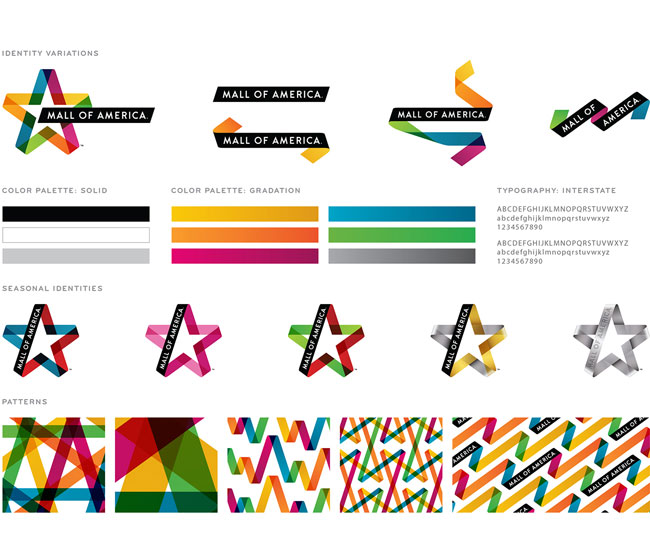
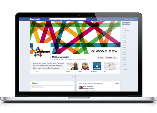
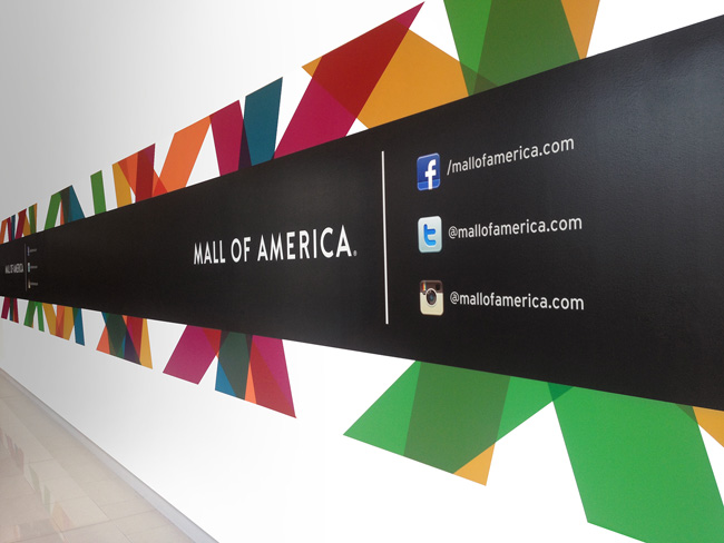
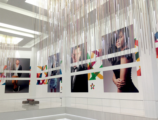
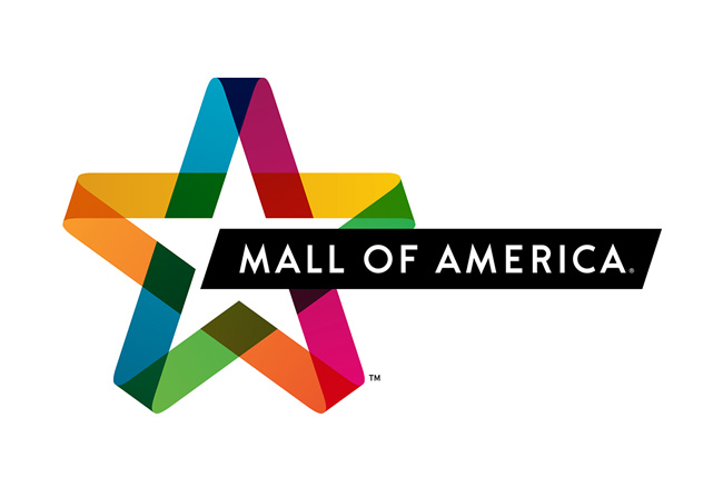
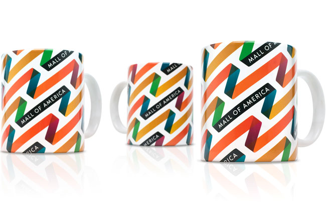
Upon its 20th anniversary, Mall of America was in search of a new identity, something that would better reflect its position as a curator of popular culture. Our challenge was to create an identity that reflected the Mall of America’s iconic, bold and unmistakable American image. New design elements include colorful interior branding, brand language, logo, environment, promotional merchandise, website and social media pages.
Our design redefines the true American star, threading together a place where fashion, entertainment, cuisine, thrills and community intersect. The result is a robust brand language that is fresh and full of energy and optimism. The design is accompanied by a tagline crafted by us, “Always New.”


More from Duffy & Partners.


Comments
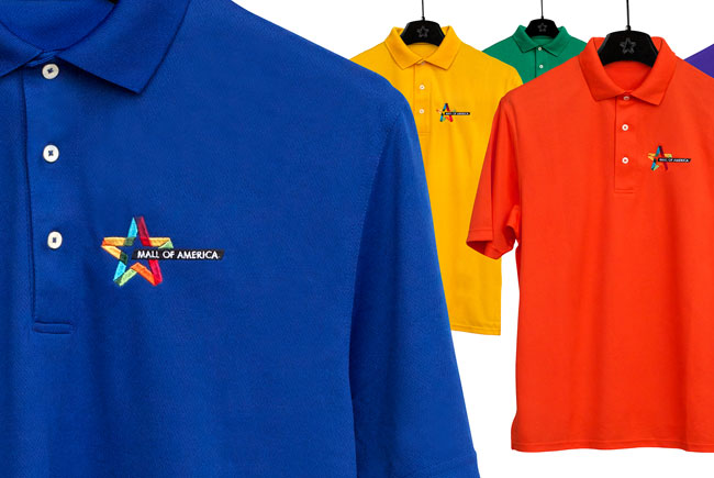
Really like this. I think the application of it has been done well and the star and ribbon hinting back to the old logo gives a nice sense of continuity. The brand seems carried so well but those polo shirts seem a bit uninspiring compared to the other identity components.
Love this. Beautifully executed identity. The application is fluid and fun, but I’m with Alex B on the polo tops, t-shirts would have been much better.
This has to be identity of the year. Every part of this has all of the hallmarks of excellent conceptual thinking and craftsmanship.
I agree with the comments about the polo shirts. The brand has a very colorful, youthful feel to it, the polo shirts themselves don’t fit that mold. Also, the logo has been used on a solid white background everywhere else, but on the polo shirts they have a solid colored background, which totally changes the feel of the logo. White polo shirts might have been more successful.
All in all, I think it looks great and brings the identity back into relevance. It has a somewhat trendy look that will have a strong appeal to the mall-shopping crowd. I think the use of color and overlapping says something about a diversity of products and brands under a single roof.
This is just so perfect in every sense. Quite inspiring to the rest of us. And well done to David for opening our eyes to Great designs and creations week in week out. I visit your sites at least once a week ever since I discovered this ‘Goldmine’. Keep it up!!
What a beautiful versatile identity system! I love the transparency of the ribbons, and the many variations you get by changing the colors in the logo, and by reforming them into other configurations. And they animate really well too. Great work!
You’re very welcome, Jared. I’m thankful to every commentator who stops in to share a few thoughts.