
McCormack Joinery is a London-based furniture workshop. They have worked primarily on bespoke commissions, producing custom furniture and cabinetry for corporate and private clients. Soon to expand to sell their own products, they wanted a bold and extremely minimal identity comprised of a simple, powerful marque.
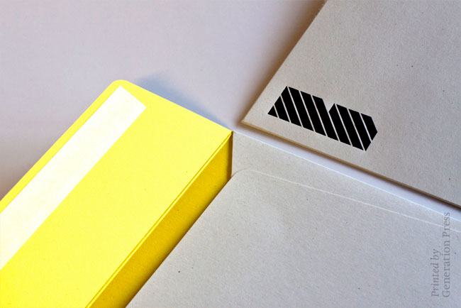
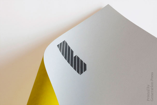
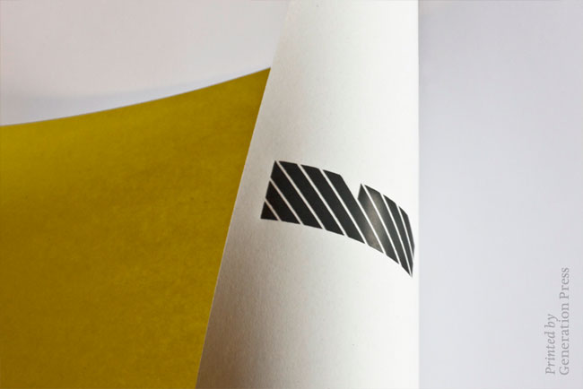
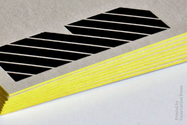
The logo is an abstracted M, the inspiration for which comes from a desk they designed with distinctive angled corners.


The stationery uses a matt grey foil on Cyclus offset stock. The edges of the business cards are edged with the company’s signature yellow. Print work by Generation Press.


View more identity work on the Wallzo website, and follow Wallzo on Twitter.


Comments
Very simple but enjoyable, love the mark and the inspiration behind it.
This is exciting stuff, strong, iconic and very inspirational.
Love the thickness of the business card. Cool identity for what seems to be a very cool and interesting client!
Looks strong, precise, modern and a little bit fun – which seem to really back up what they do. Looks like a great job.
Yes… great colors, and when reduced = good!
This is wonderful. Original, recognizable, clear, and simple. Matches the company pretty perfectly.
Great work. Hats off to Wallzo.