
Miller & Green is an independent hair salon that opened its doors in Sydney in November 2007. As a start-up in what is traditionally a generic industry, it was critical that they enter the market with a clearly differentiated brand. Initially asked only to design a logo and basic stationery, based on limited understanding of branding, we encouraged Miller & Green to stretch their imagination about what a hair salon could be. As a new venture we pushed the company to launch a strong identity from the outset that would drive their business and create impact in the market.
“By creating and maintaining a professional, friendly and creative work environment which respects ideas and hard work, and through training to get the best out of our staff, we will provide the client with the most pleasurable salon experience – fantastic hair backed by 5 star service. This will be the mission statement from the outset. We will gain our reputation by exceeding our clients’ expectations and making every visit special.”
— Derek Grant, founder, Miller & Green


Miller & Green asked us to create a simple identity for the salon that mirrored their promise to be elegant, unique and experience-driven. With the salon situated in a pedestrian thoroughfare, it was essential that Miller & Green encourage initial “walk in” business and break existing salon loyalties. We encouraged Miller & Green to challenge tradition and create a playful brand identity that would set their brand above their competitors. It was paramount that the salon began with an impeccable brand identity, and the followed through with a personality that fit with its high level service and sassy personality. The identity would then need to be rolled out across applications including signage, price lists, appointment, promotional, and business cards.


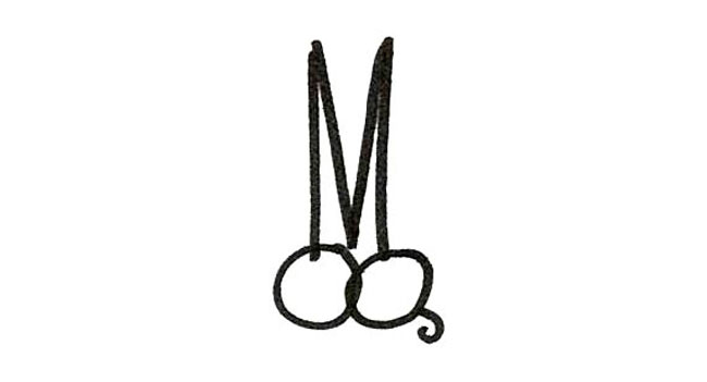
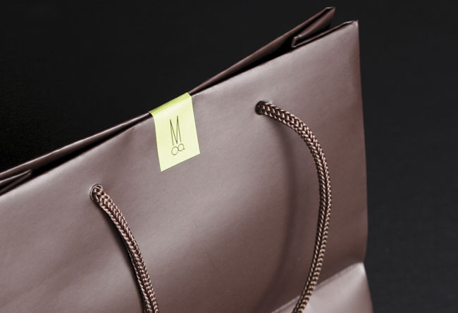
We created an identity based on a powerful idea that played on the Miller & Green initials and the essential hairdresser’s tool – a pair of scissors. Touching all aspects of the brand, we developed the visual identity, tone of voice, in-store branding, communications, and merchandise for Miller & Green. The vibrant color combination of lime green and dark brown reflects the salons elegant yet vivacious character and the tone of voice used through all communications is irreverent and fun. The result is a striking brand that intrigues and engages.

How is this the best solution to position the new brand competitively?
Within a year of opening it’s doors, Miller & Green proved it’s consistent high standards by scoring a trifecta at the Mosman Local Business Awards 2008: The Readers Choice Award, Apprentice of the Year Award & New Business of the Year Award. In 2009 it continued it’s winning streak at the Mosman Local Business Awards, this time winning the Hair Salon of the Year.
Creative director: Jason Little.
Designers: Pan Yamboonruang, Angela McCarthy.
More from Landor.


Comments
I like the concept but I’m not sure it works very well in that the M dominates the design quite heavily and it literally looks like Miller is standing on top of Green. I wonder if Green was as enthusiastic about this design as Miller?
I really, REALLY love that brand, stunning simple and beautiful and excellenly executed.
Pretty clever the way you got the initials in there, AND their tool of trade, the scissors. The way it’s been implemented turns it from a simple fun idea into a classy brand. Great stuff.
I love this! If this were Mortal Kombat, we’d hear “Flawless Victory” right about now.
I really really like the concept, my problem is I don’t like the form the scissors take, they appear (to me) unsophisticated, the blades look more like cloth scissors than a delicate hairstyling pair. I think playing with the shape of the M, giving it more character and thus altering the overall scissor form would have been a neater resolution.
Well, I think it’s absolutely fabulous.
I think it’s a fairly weak idea to be honest…
@Ivan
Is weak the correct word for how you feel about it, do you mean you think it’s simple and therefore not strong enough?
Personally I like it a lot, as with Tim I do feel miller has a stronger presence, however with the way the letters fit together I think the idea and mark have been executed very well indeed.
I especially love the appointment cards and other accompanying stationary, very friendly use of wording and the colour complement each other well. Two thumbs up for Landor.
Like all art, craft and design, observations about various details can be subjective. however, BRANDING, which is what this is about, is the bigger picture. I see a strategic idea carried through to help establish and build a business. Bravo!
I love the branding that carried out among all areas. I really enjoy the tone and copy of the print pieces and the style. High Five!
Love it!
…and David, love the new direction!
Amazing work and execution of the brand. The exploration is reminiscent of the preliminary work i did for Mark Garrison salon in New York, NY. http://www.vigorbranding.com/branding-case-studies/mark-garrison-branding.php
Salons are as fun as restaurants with the leeway they give you.
Kudos.
To be honest I didn’t realize the logo was neither a pair of scissors nor an M + G (yeah I saw the M but not the G) until I saw the sketches. Apart from that, really like the rest of the design, clever and funny.
Its funny, but I see the ‘g’ as eyes and the ‘m’ as cool looking pointy hair, bringing subtle humour to an already simplistic and well conceived design.
Wonderful color scheme. However, didn’t know that the ‘g’ was even a ‘g.’ Thought perhaps they were eyes, or an infinity sign. But after seeing the sketches, everything came together.
I really liked it! The color usage, the applications, everything. It really caught my eye. They used the combination of ‘M’ and ‘g’ in a very clever form, making a really conceptual, original and interesting brand identity.
At first I tought it could be better resolved, because ‘M’ looked like more important than ‘g’, to me. It has greater proportions and seems to represent more in the logo, forming the blade of the scissors. But I think the concept it’s very full of meanings, more than an ‘M’ and a ‘g’ could represent. The project isn’t just the logo, but the way it works on the applications and in everything. This is a very nice project!
Congratulations for the blog, David! I”ll send my picture with the LogoDesignLove book too!
It’s simply an “oh yeah I get it” kind of logo. The best logos – I think. ‘Nough said. : )