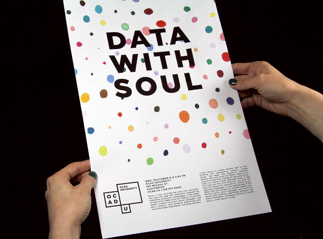
OCAD University, Canada’s pre-eminent art and design university, had achieved degree-granting status and with that, a new name reflecting that status. They needed a new visual identity that would reflect the path of a 135-year-old institution moving quickly into the future.
The BMD team worked collaboratively with OCAD University staff in an intensive research and engagement phase. We involved students, alumni, faculty and staff by facilitating interviews, designing multiple workshops, disseminating questionnaires, leading classroom discussions, connecting through social media — with the goal of excavating the stories and spirit of OCAD U. The synthesis of this material led us to a robust set of design principles that would guide the design work. The visual identity needed to be a true reflection of what we heard and saw — an inclusive, vibrant and vital institution built on creativity, risk and innovation.


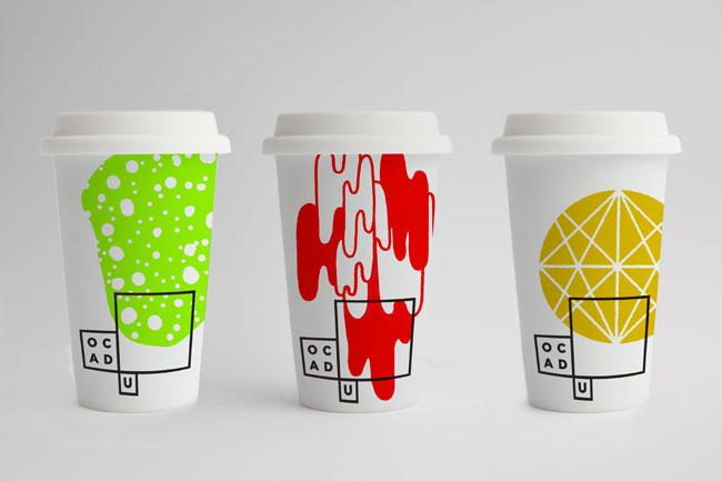
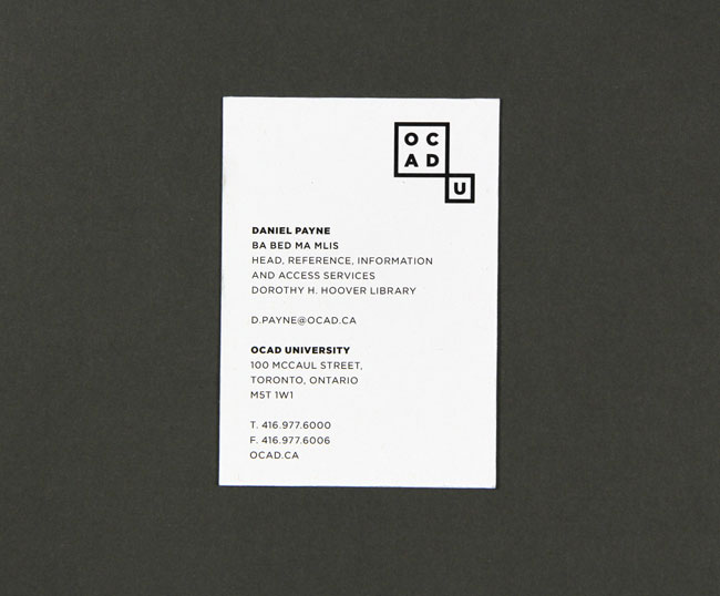
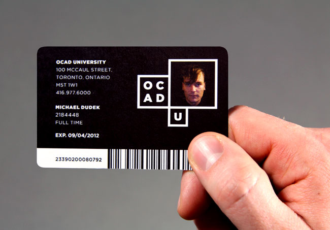
With this in mind, we asked ourselves, ‘can the visual identity reveal the extraordinary creative energy that lives at OCAD U?’ Inspired by the iconic and transformational Alsop-designed building, BMD created a base of black and white pixel ‘windows’ — modular frames to hold actual student art and design work. It is through these ‘windows’ that we see the core of OCAD U that is often hidden from view — conceptually strong, diverse, and compelling. This is a dynamic and modular identity where every year, graduating student medal winners will be invited to contribute to the logo within the basic window framework, providing a set of logos for that year. As OCAD U grows and matures, a living library of identities will necessarily emerge, recording the ideas and aesthetics that have shaped our culture over time.
In order to introduce the identity, BMD collaborated with OCAD U staff on a 2-minute video for launch of the identity. The BMD team wrote, directed, conducted interviews, commissioned music and edited a short piece as an inspiring encapsulation of the reason and rationale for the identity.
![]()
![]()
![]()
![]()
![]()
![]()
![]()
![]()


More from Bruce Mau Design.

Comments
I love it, it’s so versatile, but in a structured way. Great work.
Follows the trend of adjustable identities but feels solid enough to carry it and the student participation is a top idea. Inspiring stuff.
Great stuff, we really like this.
Really versatile and fluid while at the same time it looks very rigid. Love the very clever use on the envelope and student cards.
Lovely. Remember seeing this on Brand New an admiring it then,and it’s just as nice on a second visit. On a slightly (and I apologise for this) crude note, the still frame of the video above looks like someone is drawing a vagina in the box. Or is that just me?
Overall a nice crisp, modern and flexible brand. I’m a total sucker for black and white brands too. Fingers crossed this Aol.-inspired avenue of flexi-brands doesn’t date soon.
Really not feeling this one, personally it doesn’t stick out as being bold and daring and artistic. The strokes are very bold and thick, and it seems awkward with the big square sticking to it.
I’m not very impressed with this either. I think it was a huge mistake to even go with OCAD-U when OUAD makes more sense even if it isn’t as much fun to say. Aside from that the only application of this I enjoy is the student card w/ photo. It feels bland.
I liked Hambly and Woolley’s logo much better, and it would have been just as effective with a U instead of a C. Not to cast a shadow on this undoubtedly very expensive initiative, but i wish that i were more surprised to see that it was pulled directly off of the exterior of the building..
Well, it appears OCAD has hopped on the “identity system” train. Aesthetically the identity feels very 90’s, but that’s another train that has picked up speed lately. To me, the system is awkward, naive, and will ultimately need to change again once people realize how limited it is. Sorry OCAD, this one doesn’t work.