Skip to the content
Identity Designed
Toggle menu
About
Book
Resources
About
Book
Resources
Subscribe
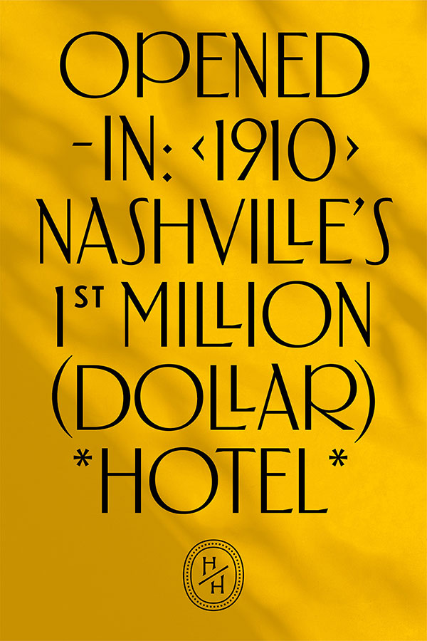
The Hermitage Hotel
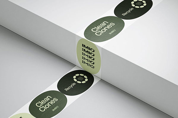
Imio
Earthfoam
Juicy Sonic Magic
September Café & Cake
The Other House
Ryuko
Atypical
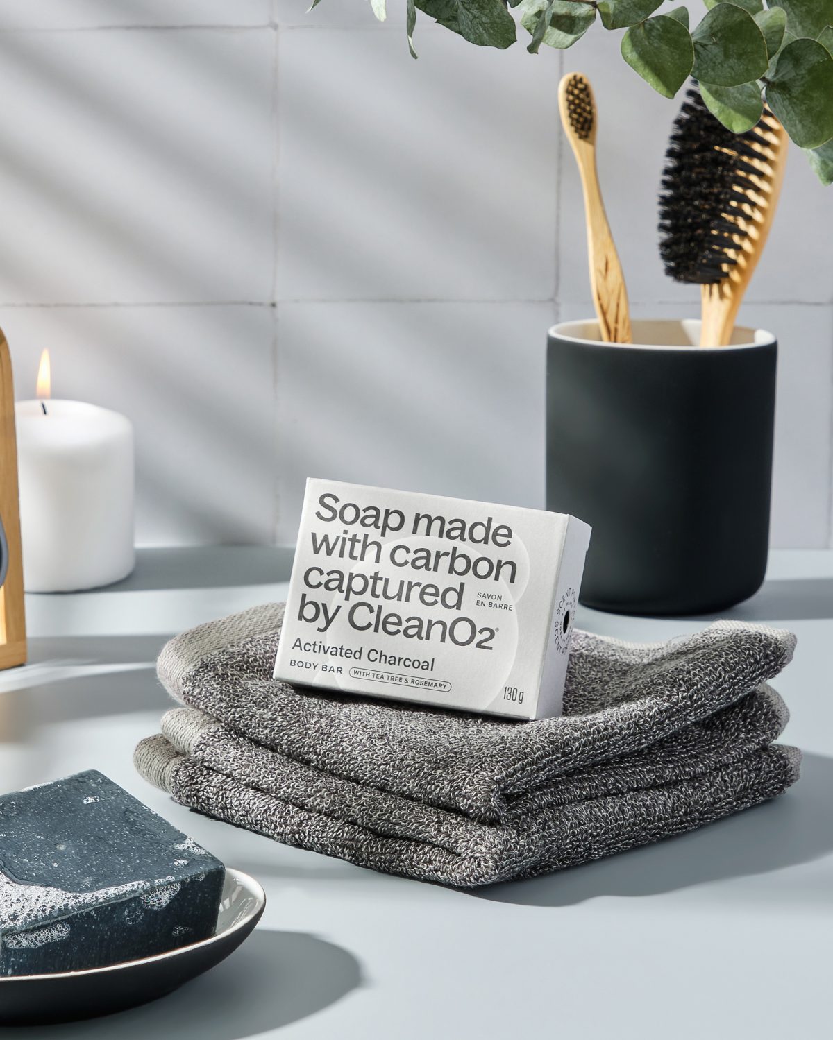
CleanO2
Contemporary Art Now
Big C Charters
Freetree
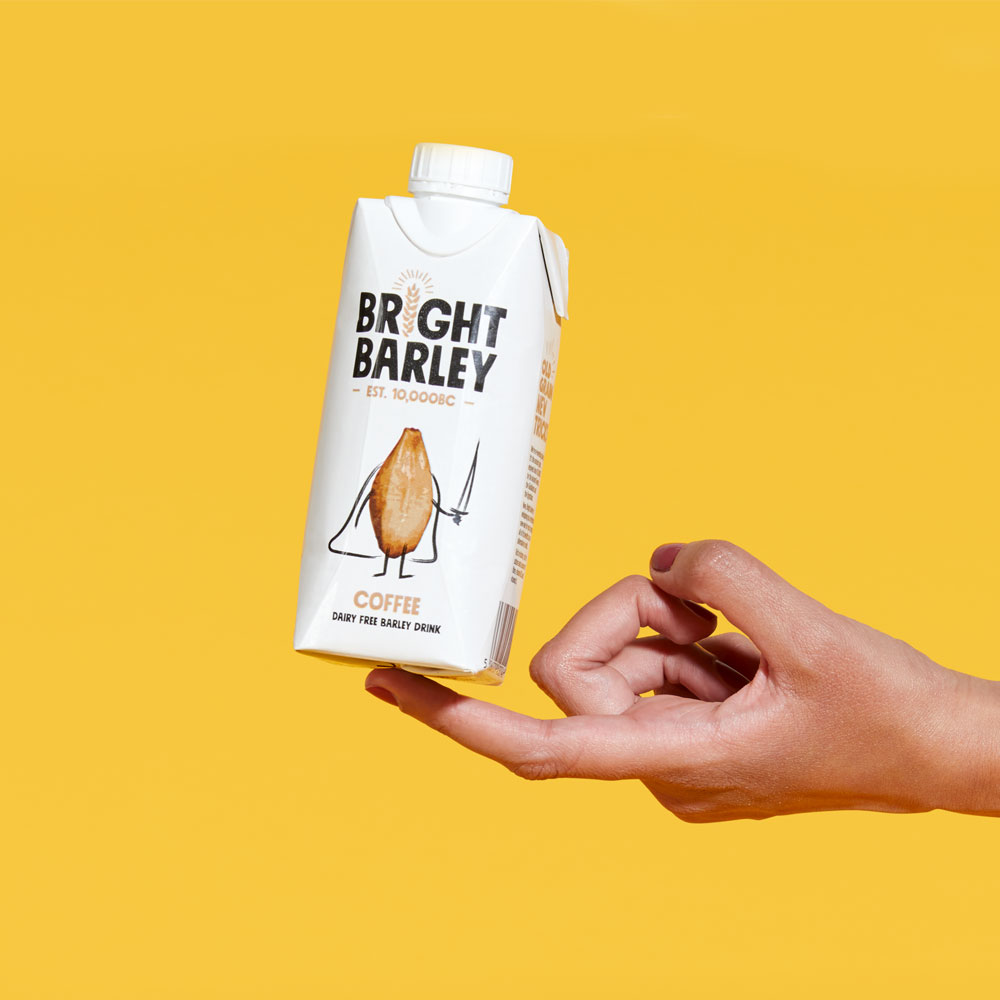
Bright Barley
BERA
OOP
Newer
Older