The Juice Agency is a Toronto-based digital marketing firm which sits at the intersection of strategy, user experience, and technology innovation.
Juice evolved from Communicate New Media, a design and development shop with a seven year history of creating award-winning work for some of Canada’s leading advertising and marketing agencies. As marketing budgets shifted more towards digital initiatives, we often found that the briefs we received were lacking in sound strategy, weren’t grounded in best practices around digital or social executions, and often weren’t asking the right questions or solving real business problems.
In 2011, we made the bold move to rebrand and become a direct-to-client agency, with the belief that we could plan and execute digital marketing better, cheaper and more transparently. Being our own agency would also allow us propose the innovative solutions we often generated; ones that traditional agencies often shied away from.
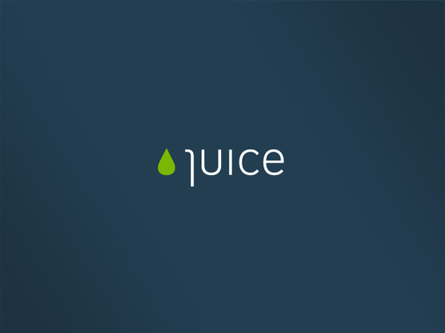
While several potential agency names were added to a whiteboard over the course of a few weeks, over time, “Juice” proved to be the one that resonated the most with the founding partners. It references an energy-giving, healthy liquid from a natural source, and colloquially, “juice” can also refer to energy, or electricity.
When the founding partners identified the core values and vision for the agency, much of the language that evolved from those sessions — concepts around honesty, transparency, natural processes, a lack of artificiality, dynamic flow — found their way into our initial brand story. The visual identity we designed would need to communicate this vision and language.
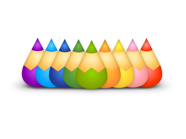
As a digital agency, we believe in constant evolution and change. We didn’t want a static identity but a dynamic, changing one; a core shape that could serve as container for different layers of meaning. We began by sketching numerous different ideas with the goal of finding a pattern or system that we could apply in various ways. We explored several promising options (a sort of “orthographic juice box” was popular for a time), but we kept returning to the simple, organic droplet shape time and again. It spoke to our brand story better than anything else, and held the potential for a larger identity system.

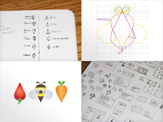
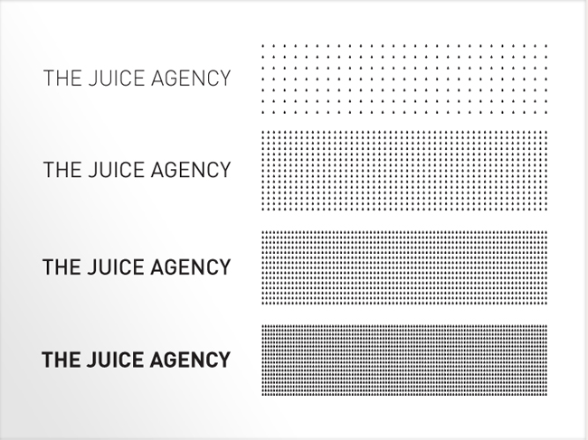
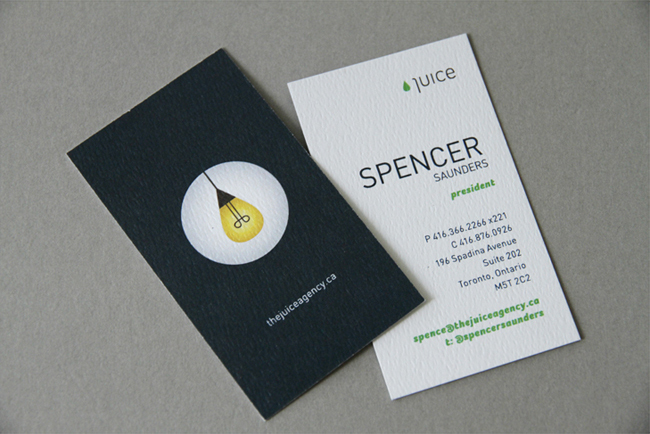
As soon as we had developed a few successful iterations of our identity (the bulb, the pencil), and saw that it would provide a rich and fertile system, we moved toward selecting the typeface. Recognizing that we needed something clean and rigid to lend stability and maturity to the ever-changing, colourful variations of the droplet, DIN became a logical choice with its clean, technical appearance.
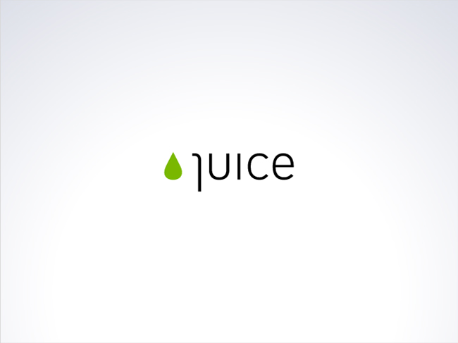
However, we eventually altered DIN’s “J ” in order to improve its relationship with the curve of the droplet. This unusual “J” is also a nod to the innovative solutions we strive to bring to business problems.
While we use DIN in most of our communications, we also use Foco Black Italic — a “wanna-be” script font — as a complimentary typeface. In cases where our playful illustrations do not appear, Foco keeps the flavour of our brand intact in ways that DIN alone never would.
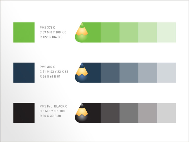
The colourful icon system we developed was never intended to serve as the logo itself. Rather, we developed a clean, simple logo based on a green droplet and wordmark. While we were tempted to use a bright, friendly orange, we recognized that the stereotypical colour of ‘orange juice’ would come to mind far too easily. Since our brand story uses words like “evolution,” “natural” and “seeds” (our process is “Sow, Grow, Flow”), the lively green spoke to our personality quite well. After experimenting to find a complementary colour, the dark blue emerged as something that showed-off the identity well, while providing contrast and legibility.
Today, different iterations of the “droplet” appear throughout our blog, alongside copy in sales decks, in our print ads and more, allowing us to tailor our visual message while remaining true to our brand.
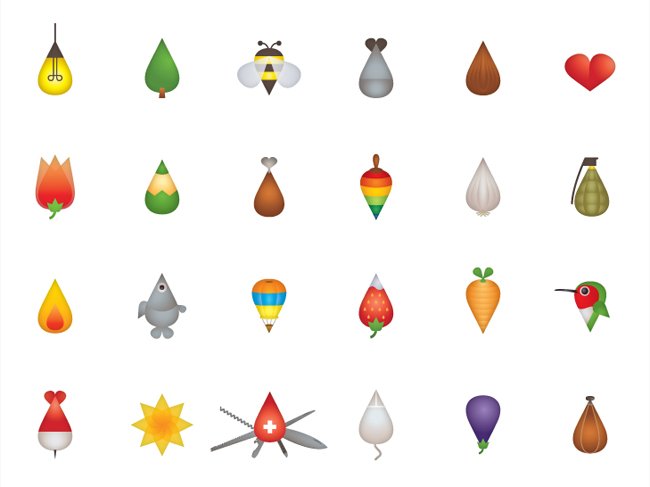
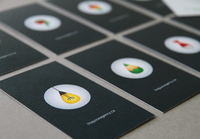
Our business cards provide a good example of our flexible, dynamic identity. We have developed a large number of icons so far (some of which can be seen in our animation at the foot of the post), but we chose eight iterations for the cards that best communicated our personality. For example, the “strategic” dart, the “social” bee and the “energetic” hummingbird.
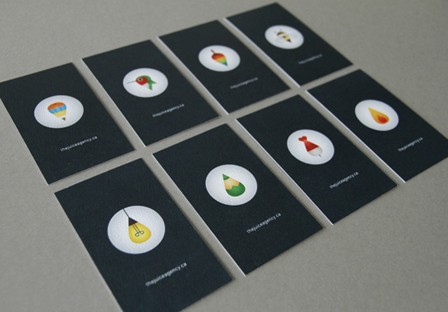
We sometimes present our cards with the icon showing and allow people to choose the one they like best. This experience — that some people interpret as a playful little “personality test” — tends to break the ice. In the process, our card becomes less of a formal necessity and more of a personal keepsake.
More from The Juice Agency.


Comments
I think I have a little problem, sometimes it can read “Luice.”
Sorry for my english.
Interesting idea, but I feel that the overall execution is very child like.
Are they talking to clients, or educating children?
Amazing. The animation really shows how the whole package pulls together.
The word mark is a bit awkward with the J in “Juice” being a little difficult to figure out, but once you see it u see it, and so it probably does not matter.
If you can attract clients who will let you do work like this I expect to see you in the annuals.
… those 24 words … speechless, need some juice!
The “24 words” video shows a lot of creativity. I just think that these 24 words capture too many adjectives to be memorable and distinctive. The overall style reminds me of the “eye bee em” (IBM) poster by Paul Rand from 1981. (http://www.die-neue-sammlung.de/z/muenchen/sam/gdesign_/plakate/b0001_1_de.htm)
I totally dig it. It’s fun and energetic. Not cold and boring like big corporates.
I say kudos for trying something so unique with the letter J. With such a recognizable word like juice, it’s readability doesn’t suffer much at all. The “Implementations” are a little juvenile in a sense, but the concept is strong and they look much better printed on the biz-cards.
Consistent, well-thought, and fresh.
I want to have a glass of juice, please!
This is beautifully done, I love the colours, the typeface, the whole lot! However I’m disappointed with the shape of the logo, it could be any old teardrop-shaped logo, and I don’t think the message is really clear about the logo’s shape being used in the imagery.
It’s a clever idea nevertheless, but perhaps it could be made clearer, e.g putting the logo and type underneath the illustration (where the website address is), so the person viewing it can see that the teardrop element of the logo is used in the illustrations.
Really well executed, such a high standard of work.
Yet, I still don’t feel the changing/dynamic logo is convincing for me.
I love this!
I love it. I enjoy creative companies that show a sense of humor. I do think their website could have been better though.
I think this was the most creative and effective ID design I’ve seen in a long time.
The animation explained it thoroughly and creatively. At the same time, was
very entertaining. Bravo!
What is their focus-point? I really LOVE the graphic solution(s), but what they do exactly is difficult to understand. Because now they do everyting?
http://juicedesign.com
The agency that already exists in SF might cause some confusion.