
Worldpay is an astonishing organisation. Without them, that payment you are considering doing today, probably wouldn’t work. Or certainly wouldn’t work as well.
Worldpay help businesses sell more. Whatever their size, whatever the business.
Starting as the brand ‘Streamline’ which you’ll still see on thousands of chip & pin devices, Worldpay now operate in over 40 countries and is a major global leader in payment processing.
They pioneered online payments for small and medium sized businesses and process millions of online payments every day. In fact Worldpay first provided Internet payment services in 1994, making it one of the first ever providers of such services.
From face-to-face transactions, to online and phone transactions, they provide an effective, secure payment service. Yet few people really know of the brand. It’s one of the financial world’s best kept secrets. But that is changing.
Why rebrand?
Worldpay was owned by Royal Bank of Scotland. Bain Capital and Advent International bought a majority stake.
In late 2013 they took full ownership, valuing the company at over £2 billion.
This new ownership has lit a fire under the organisation who has now stepped up it’s operation, with a new focus and a newly energised management team.
Research showed that most people think they know of Worldpay. But when questioned — many simply think they know the brand. We needed to help create a way to raise the public profile of the organisation and it’s many services.
Working with the senior management team we undertook the huge task of connecting all corners of the business. Worldpay not only operates in over 40 countries — it offers hundreds of services, products and bespoke solutions to some of the worlds biggest brands. Each of these services and products had it’s own name, often it’s own approach and many have their own branding.
It was a large group of sub-brands, endorsed brands and products that had evolved, rather than been designed. Time had come to unite the many.
It was time to create a symbol of change for the organisation, not just a change of symbol.
The solution
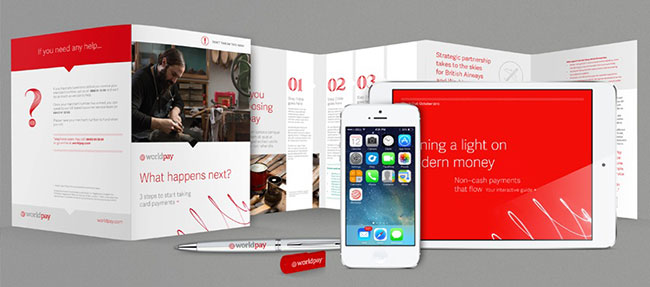
This is a big brand, with big ideas and big ambitions. So we created a big Brand World for them to work right away, and keep working for them across all platforms, applications, products, services and future challenges.
We’ve created hundreds of proactive and practical applications.
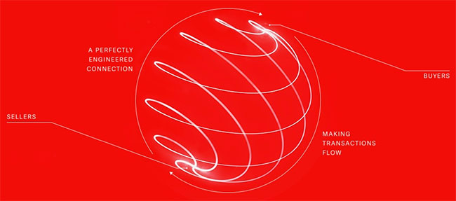
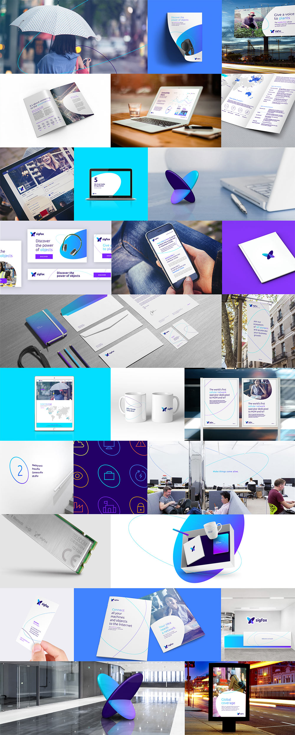
Because Worldpay operate on such a large scale it was important from the beginning to develop a core idea which would tell their whole story through their branding. Yes they process transactions and provide payment solutions, but what they really do is connect people. They enable buyers and sellers to interact with one another from anywhere in the world, seamlessly and with ease.
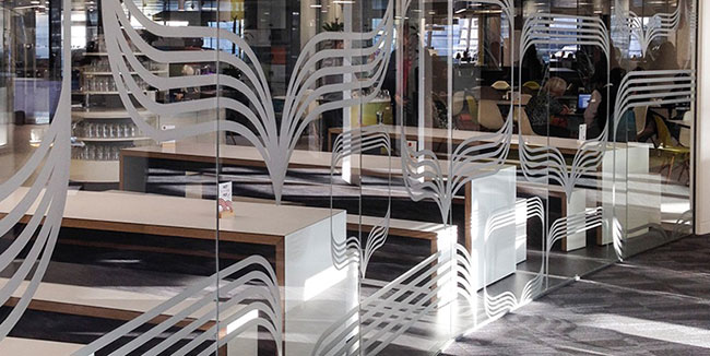
We have developed a world based on the idea of fluid connections which takes different forms depending on where you come into contact with Worldpay. From a bold light based brand property which echoes the trails of digital payments, right down to creating an entire suite of iconography that carries the same depth as the rest of the brand. Everything has been designed to be recognisable as Worldpay even when you can’t see a logo.
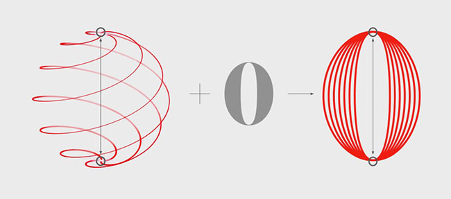
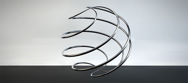
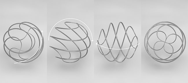
There are many ideas behind the new work. Modern money not only helps pay people globally and at speed, it carries data with it about times, locations, sectors and frequency. This data is very useful to help build pictures that can help businesses better shape their operations. This idea of modern money inspired the creation of not only the loxodrome but a bespoke typeface, inspired by these paths that money create.


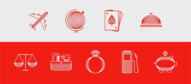
An exhaustive set of iconography enables the brand to transcend language across the 40+ countries they operate in.


Of course, there’s a new logo, inspired by the data trails made by money as they travel around the planet seamlessly.


Brand work for the new London HQ, including new systems for navigating almost 100,000 square feet of offices in the Foster + Partners designed Wallbrook Building in the City of London.
The move to Wallbrook brings together five offices to one central state of the art London hub. We worked with the TSK group on the interior design to bring the brand world into the space without it becoming repetitive badging.
We’ve created a full strategic approach to all of Worldpay brand communications.
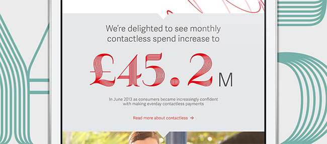
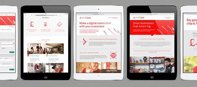
Colour systems enable the brand to connect over many platforms — we’ve worked with Digitas LBi to launch an entirely new approach to the digital experience. The new website is a radical but logical departure for the entire sector.
This is what the old Worldpay website looked like.

New reporting documentation such as annual reports have been created using the new brand work and developed by Carnegie Orr.
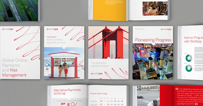


A full photographic toolkit has been created with photographer Simon Warren, launched with an exhaustive photoshoot that took the team from London to Miami to a variety of UK destinations.
“Creating a photographic library for Worldpay was a mammoth project in itself. Photographic subjects covered everything from whole Airlines to individual market traders in London, to horse racing in Miami. Within each photo we set ourselves the task of always having something red — be that a bikini, a hot air ballon or sushi to tie in with the brands new colour. The scope was huge — we needed to cover everything you might purchase from a round the world Holiday to a takeaway.”
— LAURA HUSSEY, SOMEONE
Every part of how the business represents itself has been reconsidered.
“Our new brand reflects values that differentiate us in the market. It is progressive, straightforward and authoritative, just as we are in the way we do business.”
— TONY CATALFANO, CEO, WORLDPAY US
We worked for over a year to create a strategic approach to the newly invigorated brand analysing and redesigning hundreds of touch points. Everything from how the brand speaks to people, the imagery it uses, iconography it employs, to installations in the new and existing offices have been created by SomeOne.
“With so much of the financial world languishing in a sea of blue and grey, we’ve employed a careful balance of reassurance and innovation to form the foundations for the reinvention of this sector — led by Worldpay.”
— SIMON MANCHIPP, SOMEONE

SomeOne elsewhere on Identity Designed: Wright Brothers, Big Eyes, Resonate.
More work on the SomeOne website.

Comments
Love the sculptural version of the logo. The 2d version less so. Would like to see an animated version. (Not a fan of the toilet door symbols though.)
Overall very nice. I agree with Naill that the 2d logo is a tad bit awkward. I would bet at a smaller scale and in print it is looks quite elegant, but this large scale isn’t doing it any favors.
I think the tone and esthetic quality of the type and symbols is very appropriate. It reminds me of the animated videos—which were keyed to Gershwin’s Rhapsody in Blue—that they would play preflight in United Airlines airplanes. I think that same grand, busy, and connected world tone is resonating here.
Oh boy, that is a truly beautiful branding
While the loxodrome and wordmark are a big improvement on the previous design, I think there’s a disconnect between the logo and the custom alphabet and icons.
I find the logo to be a bit forgettable although the loxodrome is really well done, but the alphabet and icons are truly lovely. The write-up edges close to hyperbole in places, and I don’t find the website to be particularly radical, but it is a finance company after all.
Having said that, the whole thing – website, packaging, stationery, etc – is lovely (mainly thanks to that gorgeous bespoke type).