10 Hammersmith Grove will bring a new state-of-the-art building to the area which boasts a raft of impressive features, from rooftop gardens to a roaring open fire in reception.
The first of two new Grade A office buildings offering 275,000 sq ft of space in total, 10 Hammersmith Grove will deliver 109,556sq ft of modern, high quality offices together with two restaurant units and a significant new public realm.

Attention to detail lies at the heart of our brand work and the design of the building to create a working environment that works for its occupiers: a generous public realm; three roof terraces; an open fire; a cohesive visual BrandWorld connecting a bright and breezy new office environment.
SomeOne worked with the team at Development Securities to create an intelligent and adaptive BrandWorld to be applied both to extensive marketing materials, a digital online presence, hoardings and internal signage.
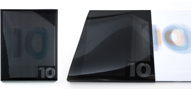
The innovative brochure created by Shaun Turnbull at SomeOne features a ‘scanimation’ cover where the number 10 not only animates, but cycles through a spectrum of colours as the brochure is removed from a clear plastic sleeve to reflect the adaptive qualities of the architecture.


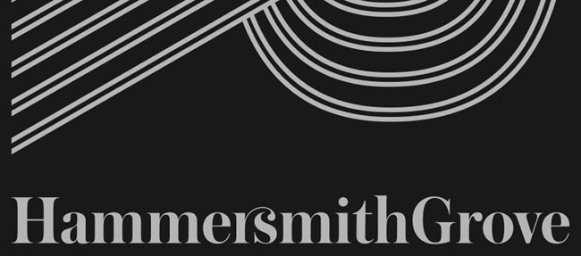
The BrandWorld system also contains a bespoke headline typeface. Designed by SomeOne designer Karl Randall, the typeface mirrors the lines found in the buildings exterior. This visual theme has been extended to a series of pattern applications that will be used throughout the building.

A little more about the area and the architecture:
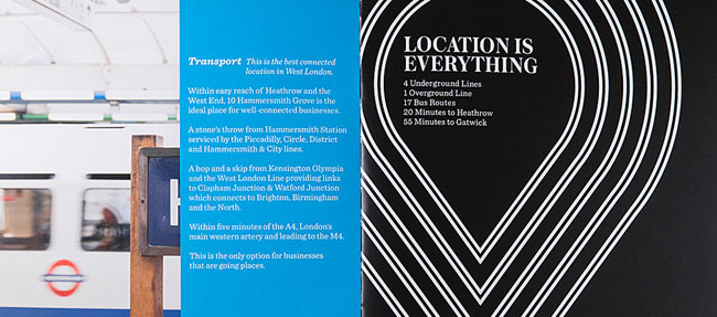
Hammersmith is undergoing significant transformation — its convenient location mixed with a rich network of blue chip organisations from Coca Cola to Pernod Ricard mean it has become a highly desirable place for people to live and work. Within easy reach of Heathrow and the West End, 10 Hammersmith Grove is the ideal place for well-connected businesses.
The office reception is designed with the highest quality finishes, complete with “Artwall” and fireplace.

Three roof terraces feature greenery but also paved areas providing space to relax or entertain. A new public realm facing Lyric Square is designed to reflect the building’s striking angles. Seating, planting and way-finding elements respond to the form of the building.
The public space comprises three distinct areas.
1/ “The Garden” is a linking space between Hammersmith station, Lyric Square and the main reception, with seating along both Beadon Road and Hammersmith Grove acting as a natural buffer to the road and providing a sense of enclosure.
2/ “The Grove” reinstates the historic alignment of Hammersmith Grove, featuring a row of seating, planting and trees.
3/ “The Copse” is a space to relax in, sheltered between 10 HG and its neighbour to the north.
Base build specification:
- ‘BREEAM’ Excellent
- 1.5m planning grid
- 100mm clear raised access floor
- 2.75m clear floor to ceiling height
- Floor loading of 3.5kn/m2 plus 1kn/m2
- 3×17 & 1×21 passenger lifts
- 2 pipe fan coil system
- 222 photovoltaic panels on roof
- Triple glazed facade
- 4 car parking spaces, with 2 electric car charge points
- 106 cycle spaces
- Locker, shower and changing room facilities CAT – A (as part of tenants fit-out)
- Metal suspended ceiling
- CIBSE/SLL LG7 lighting with intelligent lighting control
Sustainability:
- Solar photovoltaic panels provide up to a 10% reduction on current good practice building electrical consumption.
- Use of LED office lighting incorporating automatic daylight dimming controls providing up to 40% reduction on current good practice building lighting consumption.


SomeOne elsewhere on Identity Designed: Eurostar, Wright Brothers.
More from SomeOne.


Comments
What’s not to like! Love the typeface, the wonderful ligature, the huge 10 in the lobby area, the shiny literature covers, the slightly retro mod look. The overall identity works really well.
I must agree with Martin. That typeface and ligature are genius!
The typeface and building make you wonder what was designed first? Great work. Can’t stop looking at it.
Lovely ligature, identity works well but those buildings are boring, dull, generic, ugly things with no sense of proportion, fun, or place. To have made sense of that, Simon is to be commended.
It’s a shame that an identity is selling dull architecture.
I’ve been following SomeOne’s work for some time (on this site and others) — it’s consistently good.
This is no exception — beautiful, bold and appropriate to the subject.
Great stuff.
That R/S ligature is fantastic!
I do like how the bespoke typeface mirrors the design of the architecture – I fully encourage this sort of continuity. Albeit, agreed on the poor building, but there are so often missed design opportunities like this pairing. This is a relatively small project and I wish much larger identities with longevity had initiative to create solid, holistic design approaches such as this typeface. The rest is slick and SomeOne’s good business and usual.
I love the typeface and that ligature is incredible, like Victor I can’t stop looking at it.
Holy hot smokin ligature! Love it.
That is a jaw-droppingly good brochure system.
The r/s is a touch of pure typographic class.
I would have loved to have been present at the very moment that combo was discovered.
It is a smoking hot ligature (hopefully it is an actual ligature in the font file, rather than bespoke) however it is not unlike something that Si Scott, Herb Lubalin or the like have probably created before. (don’t make me go for a hunt to find the specific sample though!)
The rs ligature is wonderful!!
Fell in love with the gorgeous ‘rs’ ligature straight away, it’s just a shame it’s had to be dropped into the middle of the name. Strikes me as an idea that was too good to dismiss, but has no meaning in the context of this brand. If only they were called “10 Rochester Street” or something. Lovely overall brand work across all executions. Nice one.
I really liked the ligature and numbers, but the effect is a bit lost on a white wall.