Aena is the world’s number one airport operator in terms of passenger traffic. Over 577 million passengers passed through Spanish airports in the last three years. The company manages 46 airports and 2 heliports in Spain and participates directly and indirectly in the management of a further 15 airports in Europe and America, including London Luton Airport, with a 51% stake.


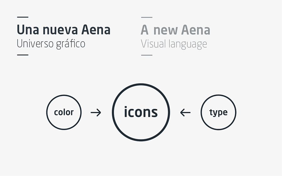
Taking the logo designed by Estudio Mariscal as a starting point, we created and structured a new visual language: a graphic system to meet the multiple needs of the company.
We set out with the premise of establishing a system that would be flexible, capable of adapting to Aena’s many needs; unique, making the brand recognisable across all applications; and clear, serving as a visual guide for airport users.
The challenge was not to create applications for each case, but rather to provide the client with a set of tools and simple guidelines with which Aena and its brand department could resolve all communication needs.

The brand is the signature
The first decision revolved around the logo: the logo is the identifier and should appear as a signature, not as a visual element. The use of the logo as a visual element would cause a counterproductive repetitive effect. While still a main identifying element, we established a measured use, to be employed with other elements of Aena’s visual language.
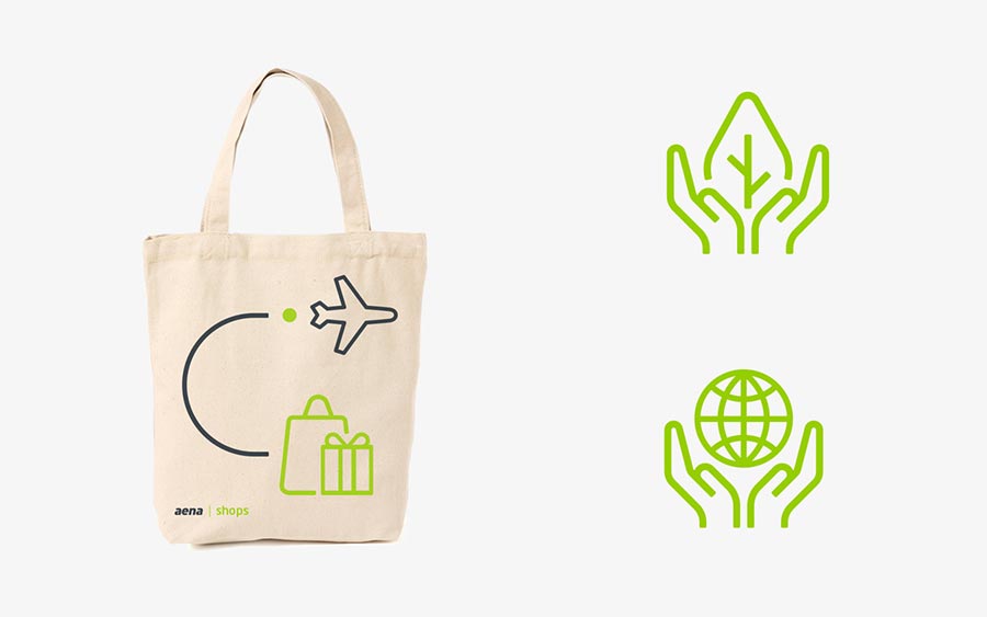
Green is the strategy
Green is the brand’s identifying colour, its sign, the reference in the midst of an airport’s visual noise. Green is the accent, indicating everything of interest to the passenger. Green stands out and highlights the essential, even in areas with high concentrations of white or dark grey.
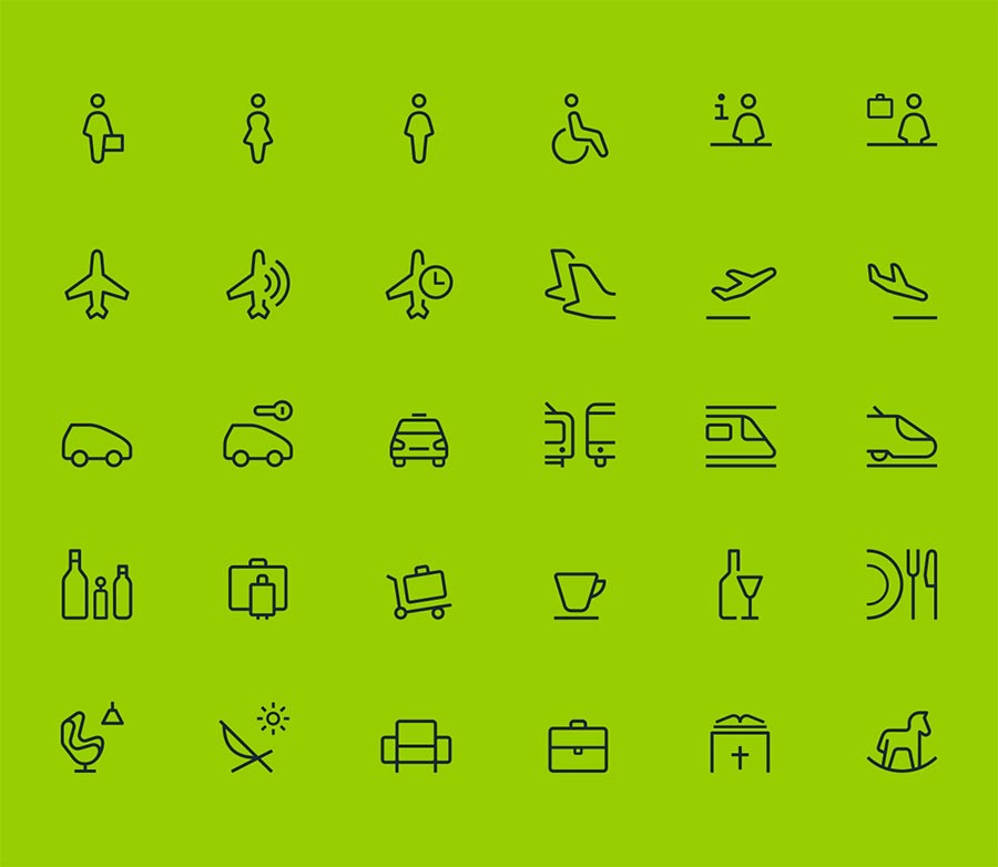
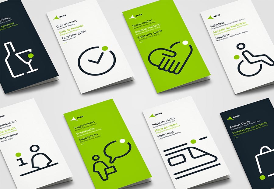
Icons as a universal language
Icons are a universal language, particularly suitable as a way to communicate information in an international environment. We based their morphology on the corporate typography, so that they work seamlessly together. They are a main brand element, serving to illustrate the various services and functions, as well as a graphic resource in brochures, commercial messages, merchandising, etc.


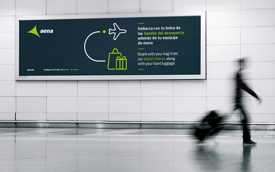


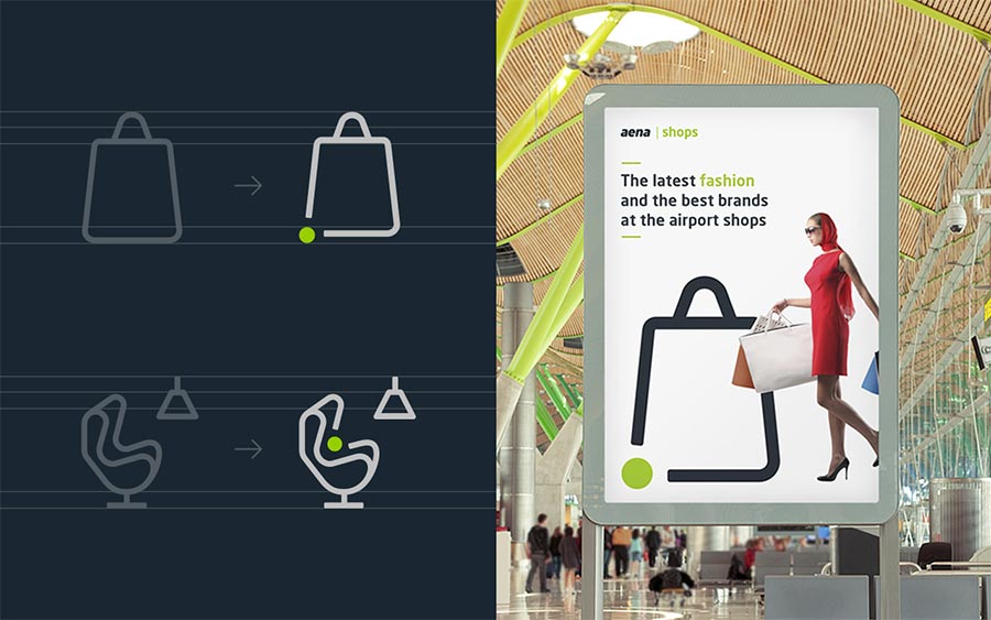
The airport routes
The flow of people in airports represents routes towards a journey. Helping travellers along these routes is what Aena does. To illustrate the routes we used icons, lines and points to create small stories we call “narratives.” Narratives explain services and illustrate messages.
Typography as image
Typography is a constant element in all applications, identifying Aena in a clear and hierarchical manner. It stands as a visual differentiator. We structured the typographic hierarchy with significant intention, limiting the use of weights to identify languages and the colour green to highlight the key words in the message.
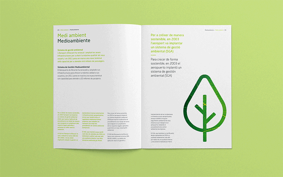

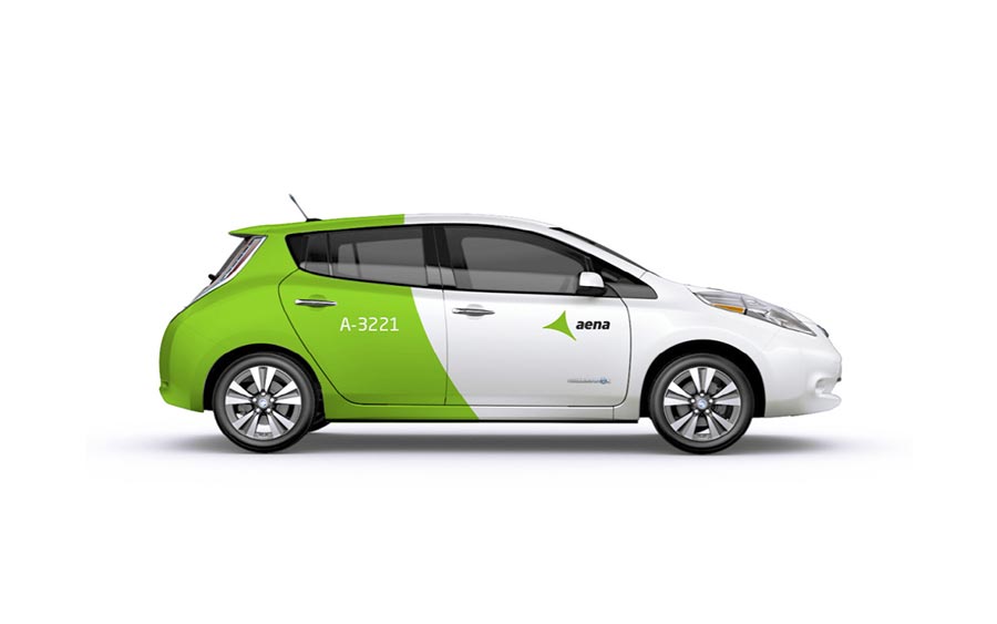
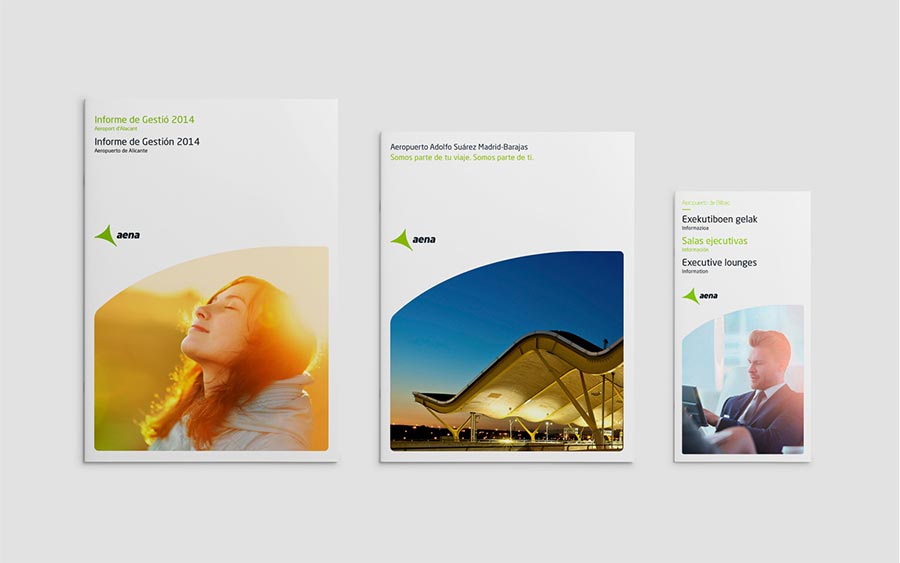
To extend the brand, we developed an individual tone and style for specific applications, such as press inserts, publications, vehicles, charity spaces, crèches, and more.
The typeface used is Neo Sans. It was initially chosen by Estudio Mariscal when they designed the logo. We decided to stick with it because we liked the smooth curved angles. In addition, its clean and contemporary feel gives Aena a relevant tone of voice.


More from Biográfica.


Comments
These icons are outstanding! I’m marvelling at the clever icons for village, viaduct or e-car. I thinks this is a great identity altogether: light, modern, consistent – I would hope that it ages well. I would be interested in more aspects of signage as this is something that airports must solve well. I’m not a big fan of the “aena” logo whose concave shape doesn’t fit into the rest of the system, and neither the car.
Excellent pictograms!
Nice work, but really it’s only an update of Ana Aeroportos from Portugal, if not a complete rip off. Sorry.