
We share our studio space with Alex Telfer, an award-winning photographer and director acclaimed within the fields of advertising, design and editorial image making.
Having worked with us for a while now, Alex originally approached Precept to produce a new portfolio. However, after undertaking the brief, Nick our creative director, felt that Alex would benefit greatly from taking part in our brand development workshop. It was during this process we realised that Alex needed a complete brand refresh.
Our team worked closely Alex to develop an understated identity that would roll out across a range of print collateral and Alex’s online platforms. Our aim was to create a brand which allowed the quality of Alex Telfer’s work to remain the key focus. Applying our expert knowledge of branding, we collaborated with talented British writers, fashion designers and printers to create Alex’s new brand identity, produce his new portfolio, website and a limited edition monograph of Alex’s collection of images of St Mary’s Asylum.
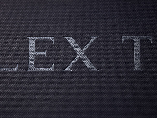
During the development process for the logotype, we sought consultation from Kris Sowersby, the renowned typographer behind the logotypes of high-end brands such Conde Nast. Taking inspiration from our discussions, I looked at how we could apply a modern twist to classic typography by accentuating the stems, strokes and serifs of each character. To capture the essence of the brand, I created a bespoke logotype, inspired by traditional serif fonts. The final logotype was simple but beautiful, setting the tone without overpowering Alex’s work.
![]()
The accompanying typeface selected was Cassia, a slab serif with a classical appearance designed Dieter Hofrichter at Hoftype. The typeface complements the bespoke logotype, with its elegant and flowing aesthetic continuing the understated theme.
In order to let Alex’s photography take centre stage, we developed an image-led website. To ensure Alex’s work is the main focus, text is kept to an absolute minimum and users are required to click to reveal the information. The overall concept behind the web design is to simply frame Alex’s images for optimised viewing. We approached the site as we would a blog to further enhance the understated theme, creating an easy to use and somewhat informal interface that is relaxed and user-friendly.

To heighten the user experience, we used subtle fades and transitions throughout the site emphasising the impact of Alex’s work.
We ensured a consistent user experience no matter what size device is being used, by building a cross-platform site. The mobile and tablet versions of the site also incorporate functionality usually found on these devices, such as bespoke front end design for mobile and swipe function on the image galleries.
You can view the website at www.alextelfer.com.
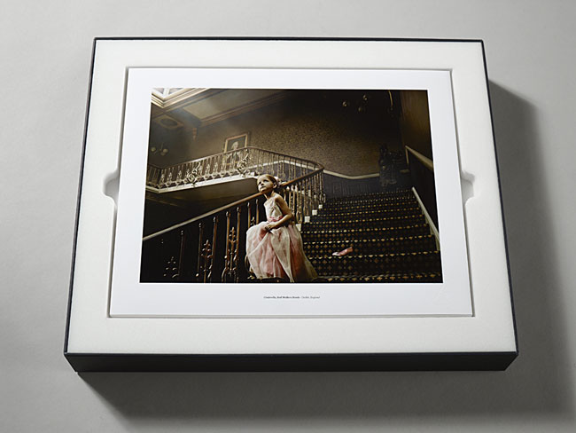
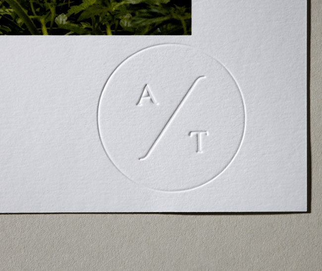
Consisting of a handmade box containing 30 photographic prints, each on 325gsm art stock and debossed with the newly created brand mark, the new beautifully simple portfolio reflects the understated quality of Alex’s work. Its design is minimalistic and similar to the website, is focussed on framing Alex’s work.

The box itself is constructed from 3000 micron grey board, wrapped with 135gsm Naturalis Absolute White Matt with a Buckram Emboss which has been printed with one spot colour on all linings, with the logotype subtly applied to the lid in a clear foil.
Within the box, we designed a custom foam inner that has been created in three tiers using white Custompac. Each of the tiers have been die-cut to house the elements within Alex’s portfolio: the 30 prints, businesses cards and a space for either an iPad or a copy of Alex’s latest monograph.

Our concept behind the new portfolio was to offer a high-end photographic presentation which would still allow the viewer to feel connected to the work. To give the viewer the full impact of Alex’s work, the three tier interior of the box is designed to gradually reveal the different elements of Alex’s portfolio. This design also allows Alex to tailor his portfolio for each client meeting.


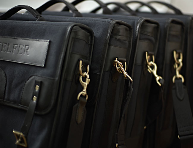
The portfolio itself is housed in a bespoke bag designed by Nigel Cabourn, who we worked alongside to ensure the final product was consistent with Alex’s brand identity. In keeping with the minimalism of Alex’s brand, his logotype has been blind embossed onto the bag’s front leather panel. Constructed by English handmade leather and canvas bag specialists, Taylor Kent & Co, the bag was created using high quality materials including Ventile, Harris Tweed, the finest army canvas and leather.


The Alex Telfer Collection: St Mary’s Asylum monograph
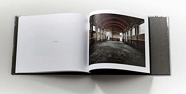
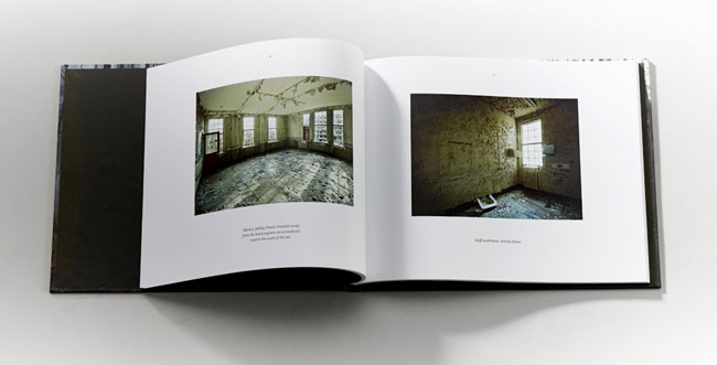
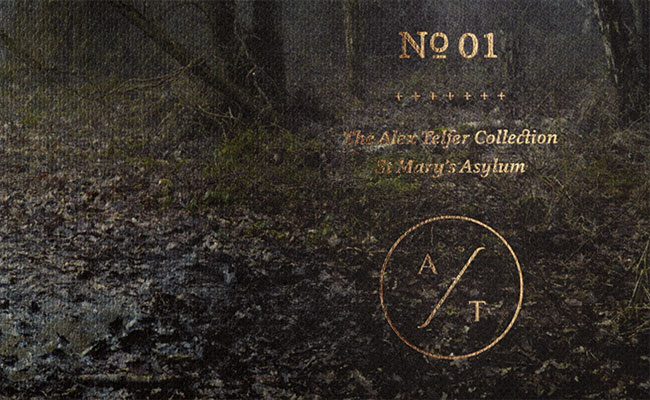
As an ongoing direct mail piece, we created the Alex Telfer Collection, a series of limited edition personal projects. For the first monograph, Alex Telfer shot a selection of photos demonstrating the demise of the derelict St Mary’s Asylum in Stannington. These were used by Precept to produce a limited edition monograph of the haunting series of images, as part of Alex’s rebrand.
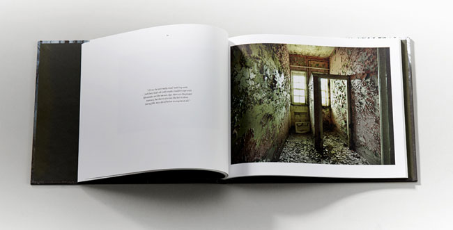
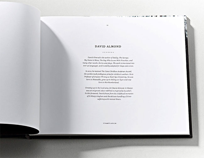
We worked closely with Alex to find the most relevant writer to create a foreword introducing these images, eventually commissioning award-winning children’s author, David Almond. Having grown up in the area, St Mary’s Asylum formed part of the folklore of David’s childhood, his foreword adds an element of storytelling to the images.
Along with the production of the portfolio and stationery, Trust Print Consultants produced the monograph. The monograph itself comprises 90 pages printed on Mohawk Everyday 120gsm, with 8 page end papers printed on 135gsm Naturalis Absolute White Matt. Wrapped with 135gsm Naturalis Absolute White Matt with Buckram Emboss, the cover of the monograph was deliberately designed to remain consistent with the texture of the portfolio itself.
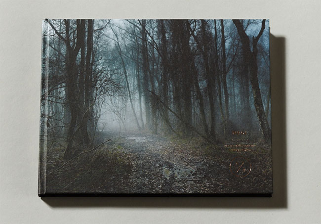
The cover features a landscape shot outside of the asylum. Alex’s brand mark and the name of the collection was applied to the cover subtly, using a classic bronze foil, which was selected to compliment the tones of the photograph.
More from Precept.


Comments
I think the logo itself is boring. If what it was printed on didn’t have such “quality” to it, it would fail.
Wow this really elevates his work to an almost high-fashion status. Really nice use of material texture, (and presumably weight) and while the logo-type feels a little fussy in its custom detailing, and is perhaps a little oversized for something that is meant to be understated, it certainly has a distinctive and proprietary quality.
An excellent identity for a brilliant photographer!
Steve Deer
Senior Art Director
McCann Manchester
This is stunning. I love the logo-type and the emblem, beautiful. I think its stylings are just minimal enough to not be distracting but create a really strong impression at the same time. Top drawer work. And being a man of several man-bags, that one is gorgeous, envious… =)
Nice clean design work, the emblem is much more memorable than the logotype but yet it’s only used secondary. The clients photography shines through and is the hero which answers the brief well.
What really got me starring for a minute or two was the book, It is something really beautiful!
What made me somewhat sad was the loading time for the website, jesus christ that made me almost give up (spoiled?) after clicking the second link. I don’t know though if that is the hosting company’s fault, design flaw or just being to far away (living in the Netherlands so I don’t know where they are hosting). No matter fading or how nice the site is actually looking, that should get a look on it to fix it ASAP!