Blés is a new line of organic wines by Aranleón, one of the most renowned wineries in the Valencian community.
In a context in which the winegrowing sector is one of the most important and deeply rooted in Spain and, at the same time, one of the most quickly changing, international expansion is one of the keys to the future that will guarantee the survival of many of the wineries in Spain. This is the case for Aranleón Blés, which in its Crianza variety is already the best-selling organic wine in the Quebec province (Canada).
CuldeSac performed an analysis and a restructuring of the Aranleón product line to help foster the company’s growth, paving the road for its release into international markets.

Timeline
– March 2013: product and brand structure analysis / product strategy
– March / April 2013: brand redesign / brand implementation / packaging design
– May / June 2013: proposals presentation
– July 2013: labels production
– September / October 2013: applications production
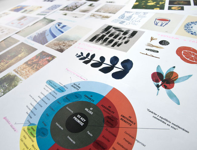
“One of the challenges has been achieving a coherent relationship between the brand, the product and the company’s business strategy.”
— XAVI SEMPERE, CREATIVE DIRECTOR, CULDESAC
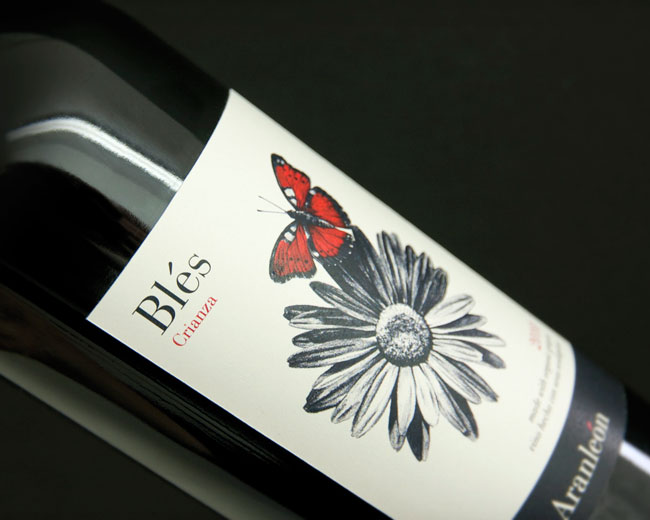
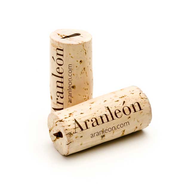
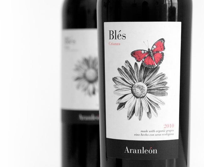
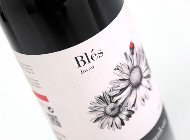
CuldeSac defined a new identity through packaging for the new line of Blés products – Blés Reserva, Blés Crianza, Blés Roble and Blés Joven – including the design of the labels, boxes and corks for the new bottles. The visual identity is one that communicates and emphasises the main attributes of the brand: organic, Mediterranean, warm and empathetic.
The creative motivation behind the rebranding comes from the “blés” — a yellow flower native to a 120-hectare vineyard in Aranleón.
“Aranleón is the fruit of a young and committed initiative with a philosophy strongly rooted in creating organic wines. Ever since the beginning, we here in the creative team have been supported in the differentiating value of the brand, in its organic wines, to generate a set of illustrations for its Blés line that is capable of faithfully transmitting the link between the winery and the organic management of its vineyards.”
— Dailos Perez, Culdesac

Typeface rationale
The Bauer Bodoni font family has a classical nature, however, it shows one of the most modern designs of the serif category due to its clear and rational appearance. Its clean transitions, straight and high contrast shots, give it great firmness, without losing its link with the tradition of the literary world that’s so important to Aranleón. This is a typeface with a proven track record in the publishing field and rises the product positioning providing elegance and distinction, compensating the close and organic nature of the handmade illustrations.
An important element of the brand within the Bauer Bodoni font family is the “accent.” This provides personality to the brand and is therefore used as a fifth element.
Regarding the support texts and other information, it was decided to choose a bright and friendly typeface. The Alright Sans fits perfectly with the Bauer Bodoni font family. A classic typeface against another one, more modern and innovative. It is the perfect tandem to represent a brand that respects and shows off his legacy but walks steadily forward.
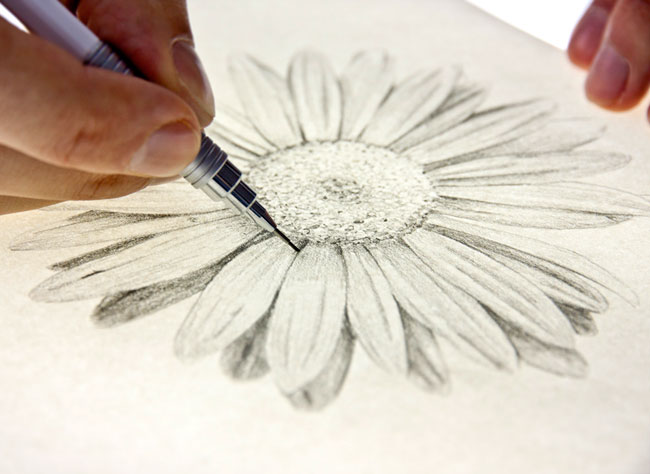
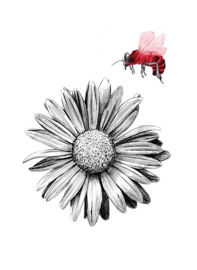
A series of labels was created that establishes a hierarchy for the varieties of wine, each demonstrating a different type of animal —ladybug, honey bee, butterfly and bird — and its relation to the blés flower. Each of these small organic elements is taken from the firm’s corporate red, alluding to the accent colour of the word Aranleón in its logotype.
The illustrations are drawn by hand in order to highlight the unique and natural character of the product, the importance of the course of nature at organically cultivated vineyards, and the irreplaceable link with Aranleón.


More from CuldeSac.


Comments
Beautiful. I always appreciate something I couldn’t do myself. Lovely, understated illustrations… I’ll drink to that.
The brand maintains great balance between graphical clarity and an organic touch free from cliches.
That’s lovely, although the other Aranleón packaging is nice, too (I’m not sure if CuldeSac is behind that).
Is this just for this new line, or the brand as a whole? It seems more cohesive than the other packaging, so it would be nice to see it applied across the board, and to the website (which could do with a facelift).
Oh how lovely to see the illustrations being hand drawn like that. I wonder how they coloured in the red areas?
For a long time I’ve wanted to play with adding small splashes of colour to pencil drawings but not sure what medium to use for the ‘colouring in’ bit.
I imagine they’ve done it post-production, ie as a separate layer of artwork so they can be consistent in the application of the red when printing the labels, using a pantone red over printing the b/w illustrations.
Hi David,
Would love to know the strategy and planning work that went behind this identity. If you would be able to share that it would be great!
Thanks in advance.