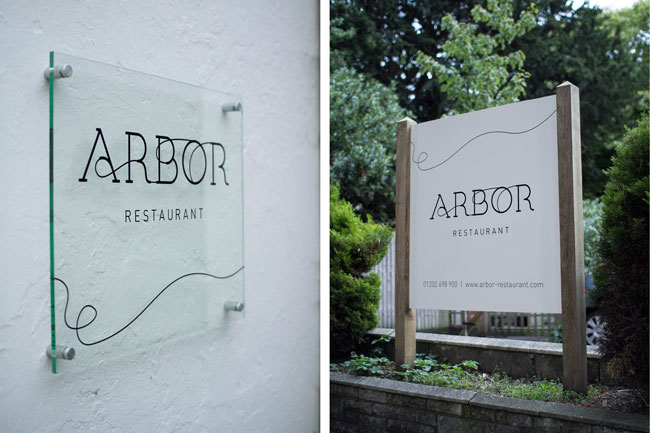
It’s always nice when you get to work with local businesses that you know and like. Our recent project for the Arbor Restaurant is one of those.
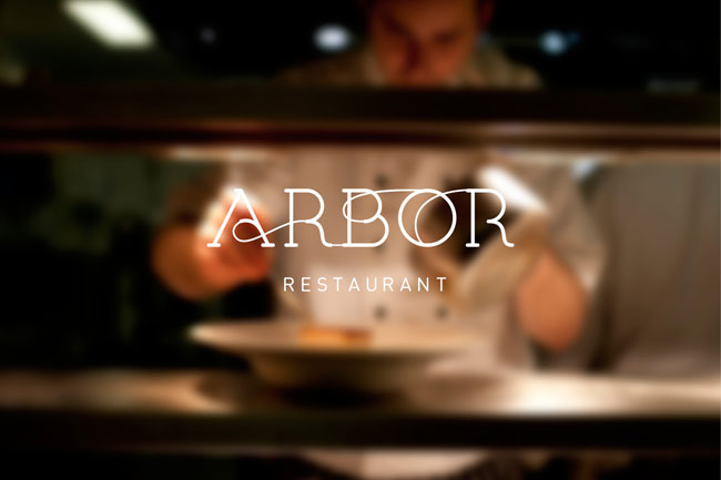
Arbor is the new restaurant at the Green House Hotel in Bournemouth, the most eco friendly hotel in the UK. An award winning business with conservation and sustainability at its heart, the team at The Green House wanted a restaurant to match. It was our job to create a new identity that is both sympathetic to the existing hotel brand and has the presence to stand alone as an independent entity.
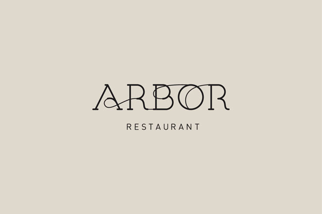
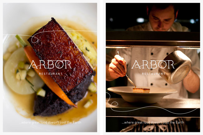
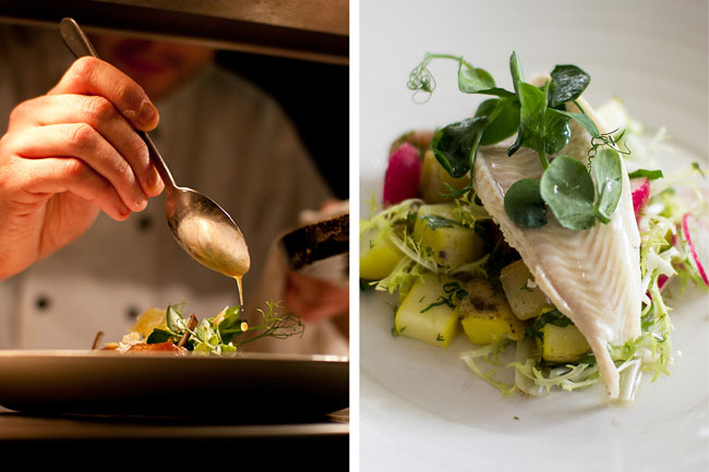
Our initial task was to develop the name and logo that would be rolled out across the website and restaurant point of sale. The chosen name Arbor derives from the Latin word for tree, which ties in nicely with the existing woodland-themed rooms already in place at the hotel. It also seemed like the obvious choice for a restaurant with an 8-foot wooden tree sculpture in its centre!

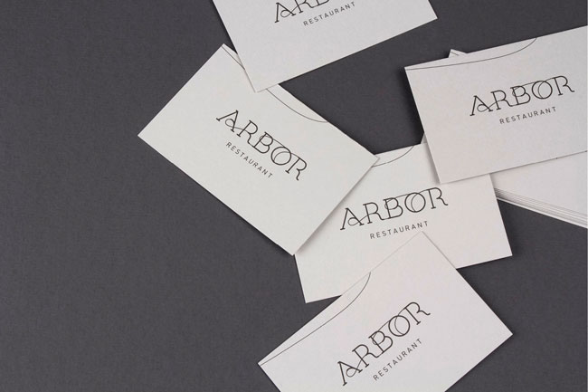
Using the existing Green House logo and typography as a starting point, we developed a new typeface that was both softer and less formal than the original ITC Lubalin. Unique and bespoke to The Green House the addition of the organic flourishes is indicative of the new restaurant name without being contrived or obvious. The movement throughout the logo subtly suggests growth / roots / branches / natural / environmental etc.

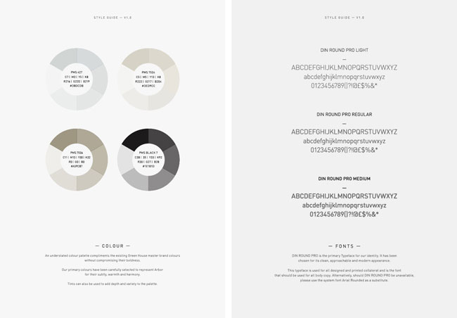


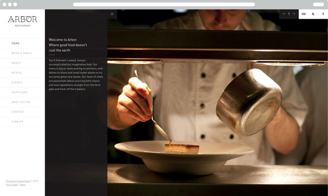
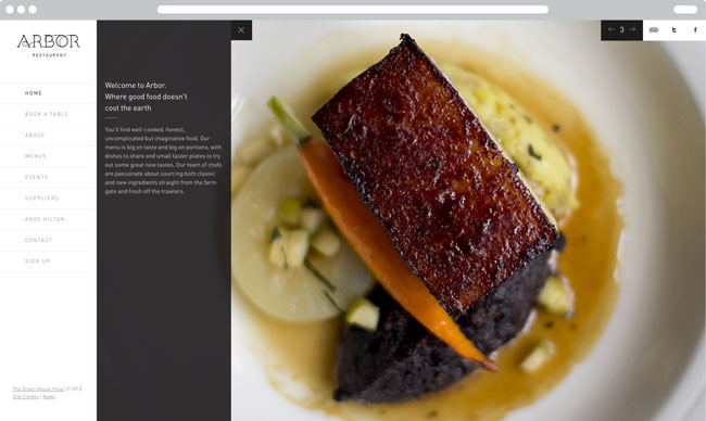
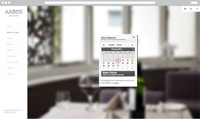
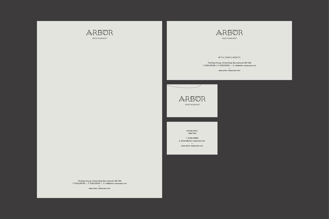
As part of the project we also designed a fully responsive website that integrated with the hotel’s existing booking system and a suite of stationery that utilised natural stock and vegetable inks. Both interior and exterior wayfinding was also implemented throughout the hotel to complete the full experience.


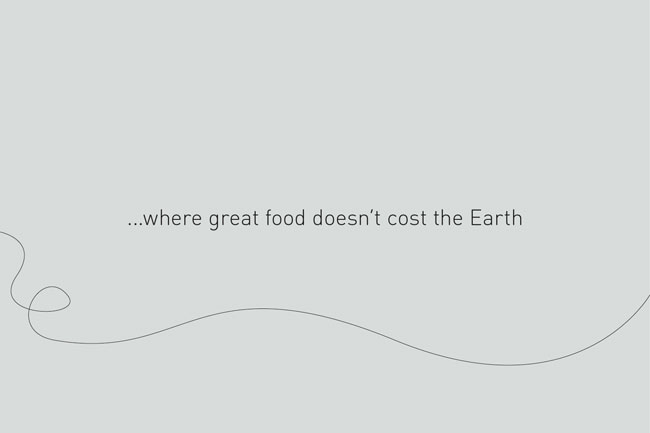
Should you ever find yourself looking for a restaurant that serves great food that doesn’t cost the earth, be sure to check out Arbor.
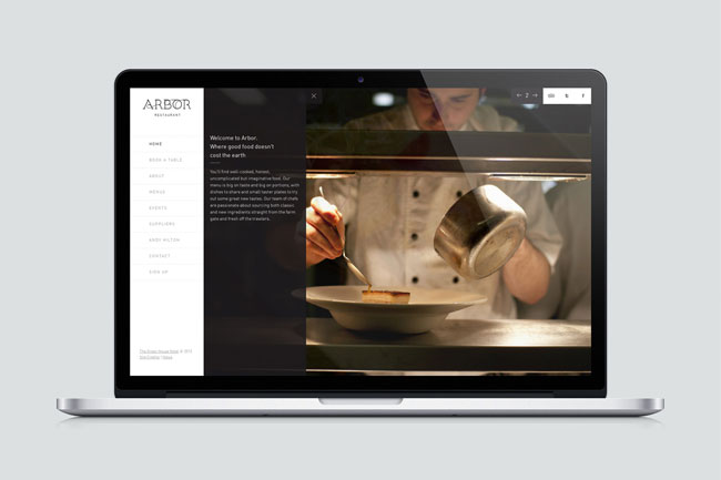
Food and restaurant photography by Salad.
Salad elsewhere on Identity Designed: Beaujais.
More from Salad.

Comments
The original typeface is very nice. It looks a bit art-deco. I’m still trying to get used to the thin connecting lines, though. They make it look a bit like it’s halfway trying to be a script. All in all, though, it gives a good impression, with the muted colours and all.
I think it’s lovely. I really like the connecting lines on the font, as it gives the whole thing an arboreal feel without hammering it home by sprouting leaves.
The copy is great, too – very clever. Great work.
I really like the connecting of the letters in the beautiful custom typeface. Another thing I like is how they use the line throughout a majority of the pieces they designed.
Loved the logo and the rest of the identity. The thin strand looks good on the logo but does it give the impression of a strand of hair in a few pieces?
Really nice identity. Simple and fluid. The colour palette works well also. Good work.
I like the thin connections between letters, but I find the connection between the B and O a little awkward. I would be curious to see what kind of connection ideas between those two letters were ruled out before going with what they have now. Otherwise, all good. That is my only critique on an otherwise beautiful brand.
There’s a hair in my food waiter!
Makes me think of this project:
http://www.behance.net/gallery/La-balta-cu-peste-Restaurant/2893821