
Private schools are a relative novelty in Romania, with most of them being less than two decades old. Public schools have a mixed reputation, with underfunding and lack of curricular reform affecting all but a few of them in terms of student performance and development, and parent satisfaction. At the same time, the wider public regards private schools more like service providers who are more eager to please than to really teach and educate the children in their care. Of course, the reality is in many cases starkly different from this perception.
Challenge
Ten years ago, Little London started out as a kindergarden. Since then, it has expanded into primary and secondary school, it has grown into two campuses, and it has made significant investments into brand new, custom-designed buildings. But, most importantly, it has grown a much larger, highly professional faculty that provided an educational experience that is cutting-edge, holistic, and highly satisfying to the entire academic community: children, parents and teachers.
The community received outside recognition and took pride in its achievements, but realised that its former brand identity had grown utterly obsolete. Students in more advanced years as well as their parents and the teachers felt the “little” qualifier in the brand name was not suitable for them and for a prestigious college that was also preparing to inaugurate a high-school in 2015. That is why the management decided to make a radical change in this respect, one that would prove inspirational to the very diverse brand stakeholders, from inside and outside the school.
Strategy
Creating a new brand identity that would gain acceptance throughout the school community required a brand audit that involved stakeholders of all ages and roles, without overlooking the competitive context. This audit provided the basis the joint client-agency team needed to develop a representative brand definition. In turn, the definition allowed for the effective development of basic identity elements (name, slogan and logo) that were subsequently rolled out in corporate communication and signage materials.

The original, pencil-drawn Avenor star is above — it wasn’t a star at that stage, but a hollow square.
 Digital explorations (above)
![]() Logo proposal one (above)
Logo proposal one (above)
![]() Logo proposal two (above)
Logo proposal two (above)
![]()
Result
Through its roots, the newly minted brand name Avenor speaks of the road (avenue) to the future (French: avenir). This idea is explicitly reinforced by the new brand slogan, Creators of Future. The new logo in the shape of a star made up of simple, colorful stripes, depicts the school community with its different constituents and interests that converge towards a shared purpose. The whole of the new brand identity was entusiastically received by students, parents and teachers alike, who instantly identified with it and took it up with much pride.


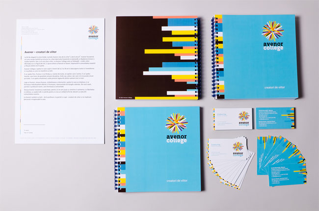


Avenor College was proud of its ”talking walls” (walls full of the students’ and the school’s projects and ideas) as a teaching/learning instrument, so we decided to prepare a brand identity guide in the shape of a poster. It will adorn the Communication Officer’s office walls as a constant reminder of the school’s identity usage rules and liberties.

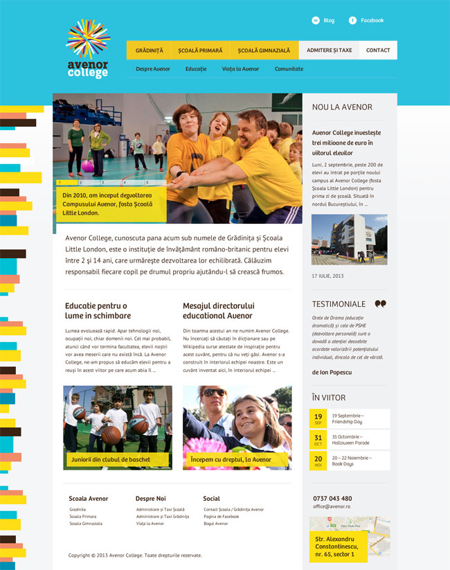
We designed the Avenor College website in such a way that the school could turn it into a responsive website when they decided to.
The logotype is set in Zine Slab Bold, the website uses Bree for titles and PT Sans for body text, while the corporate document templates go for Calibri, based on a firm client requirement for us to choose a widely-available system font.
“Our goal has been reached: we have a new name with great potential, one that is full of meaning, British-sounding yet meaningful in other major languages, easy to remember with a positive vibe, and able to take you to a place where you really want to learn and live. We really found ourselves in this new name.”
— Diana Segarceanu, executive director, Avenor College

More from Storience.


Comments
Absolutely love it! Very fresh, fun and playful. I wasn’t sure how scalable logo proposal 2 would’ve been, but I’m happy they chose the other option anyway.
Not my cup of tea I’m afraid, not saying it’s bad or wrong, just a bit brash for my tastes, best bit is the cup cakes. Im sure the target audience / and client love it.
Absolutely love this. Original and well thought out. Love the utilization in large and small formats. There are so many ways to integrate the visuals.
Why is everyone making branded cupcakes these days? It rarely feels appropriate. Seems more like a tactic to beef up a slide deck. Perhaps think about other objects related to the industry and audience, in this case a tassel would have been nice to explore.
I am not familiar with education system in Romania and it would help if the submitter could elaborate on the age and education the student receive at this institution. I suspect that this is not a college like I would find it in Britain or the US despite talking about an “academic community” being served.
As for the identity itself: it is quite playful, closer to the way Google presents itself than colleges in the US or UK. I’m not so fond of the colored stripes in the margin of pages especially when they create steps from having different length. Rather than being playful I feel they add clutter, unlike the more dynamic and curved stripes in the logo exploration (most of which I like) and on the bus. I also feel the color combination could have been lighter to add to the sense of playfulness. Maybe there are reasons for the particular colors but otherwise I would expect the particular combination to not age well. I believe the identity could be made stronger by reducing colors and shapes while keeping a sense of playfulness that is a bit more grown up than the current one.
If you want to compare notes: the identity is also discussed over at Brand New. Commenters there like it for being bold but would have preferred more attention to typography.
Very fun and an enjoyable branding to look at. Love the playfulness of this with the colors and also with the use of the color stripes.
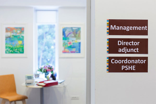
I really like the colours used in this identity. I also like the loose collection of overlapping lines. The only place where I don’t think it worked as well as it could is the building signage. If the lettering wasn’t as deep the legibility wouldn’t have been effected by the shadow of the sun. It’s a small detail that in no way takes away from the excellent work here.