![]()
At the beginning of 2012 the owners of Bacoa and Kiosko, two very successful Burger bars in Barcelona, commissioned us to develop their new visual identity. After learning about their product and sector we came to the conclusion that everything that makes their product special should be as well a key value of their visual identity.
We boiled them down to two key values:
1. Handmade. They try to prepare as much as they can themselves and the recipes for burgers and sauces are their own inventions.
2. Local (Spanish). Most of their recipes are inspired by Spanish dishes or use traditional Spanish ingredients.
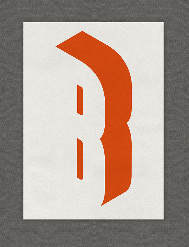
One of the biggest influences was the typical Spanish bars from Barcelona. Usually they were built in the seventies, often using condensed sans-serif typefaces cut from acrylic glass.
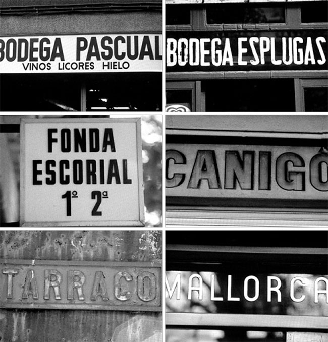 Typical signs from Barcelona
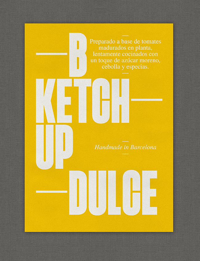
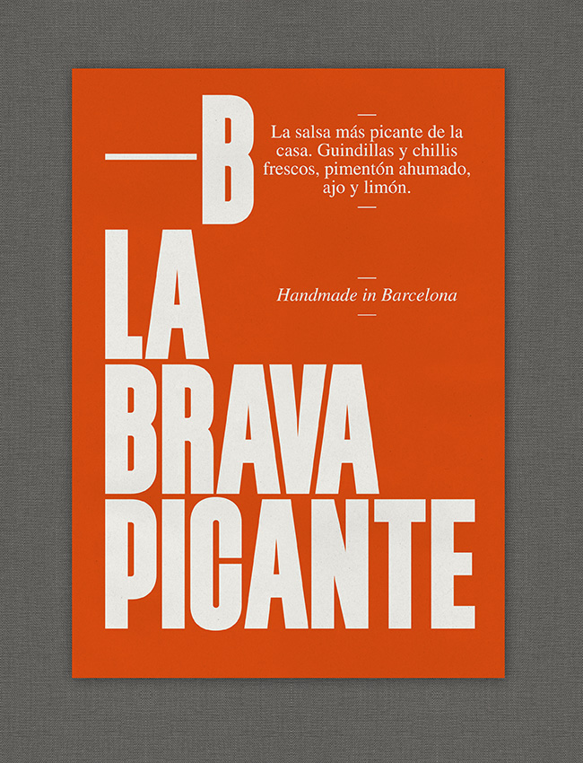
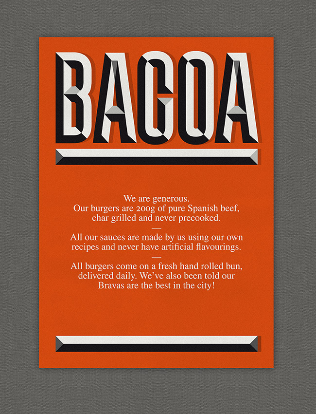
Inspired by the vernacular type found at bars in Barcelona, we drew a new typeface, the TpBarPaco. Jacques Le Baily programmed the open type features and generated a web font. We used Times Lt Std for smaller sized or bigger amounts of text.

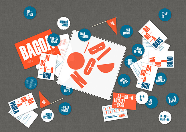
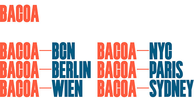
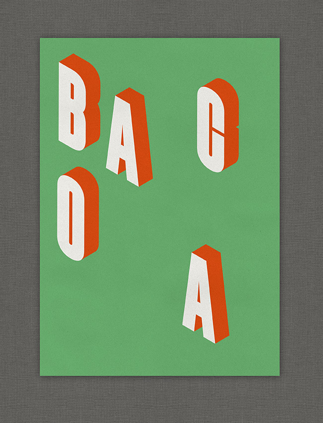
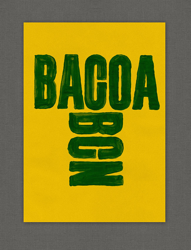
The wordmark Bacoa can be written in different ways.

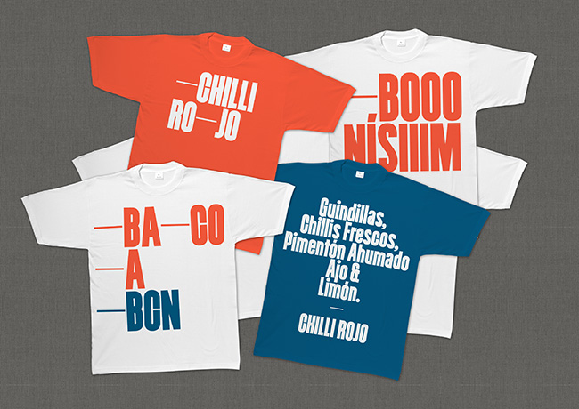
Em dashes are used to add spaces in between letters. The flexible use of the wordmark allowed us to maintain simple typographic solutions without becoming repetitive.

The colour scheme of typical Spanish bars is very limited. Usually the boards, napkins and doilies are only printed in two colours, red and blue. We gave the colours a warmer twist, making them look more “summerish.” It was important to use a lot of white on all the applications, and we also tried to embrace the sometimes amateurish design that gives such Spanish bars their charm.

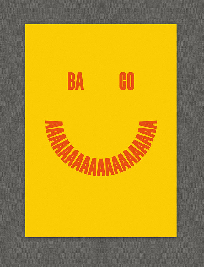
We played with the visual expression of the pronounciation of words, like for example “SO GOOOOOD.” We used this way of spelling on t-shirts and napkins.
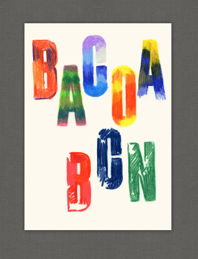
Bacoa became a franchise in 2013, so one of the needs of the identity was to be able to create sub-brands for different cities.
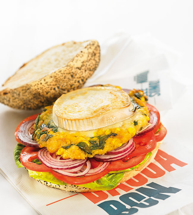
Every three months Bacoa offers three new special burgers, using ingredients of the season. TwoPoints.Net developed a concept for a campaign that focuses on the ingredients and avoids the typical burger photography. A food stylist and a food photographer made sure that the ingredients would look fresh and appetising.
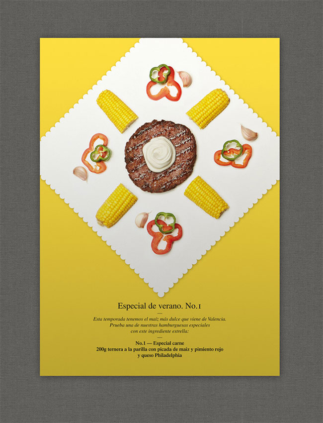 Summer special, beef
 Summer special, chicken
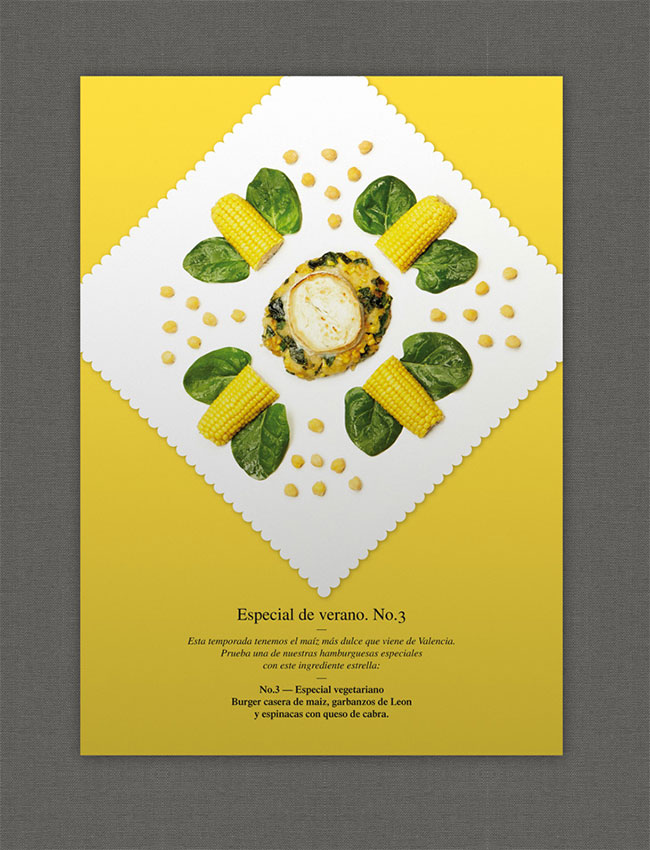 Summer special, vegetarian
Depending on the characteristics of each ingredient we chose to show them raw or cooked. The ingredients are not composed in Photoshop. It would have been easier, faster, and cheaper to shoot every ingredient only once and then repeat them in Photoshop, but we were interested in the little irregularities in the details. They make the ingredients look more natural, unique, and reinforce the value “handmade” of the brand.
In each season the photography and the background colour of the image would change. The image was used as a poster and postcard at the burger bars and as a banner on the Bacoa website and Facebook page.
 Fall special, beef
 Fall special, chicken
 Fall special, vegetarian
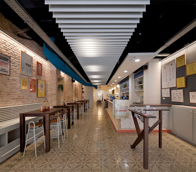
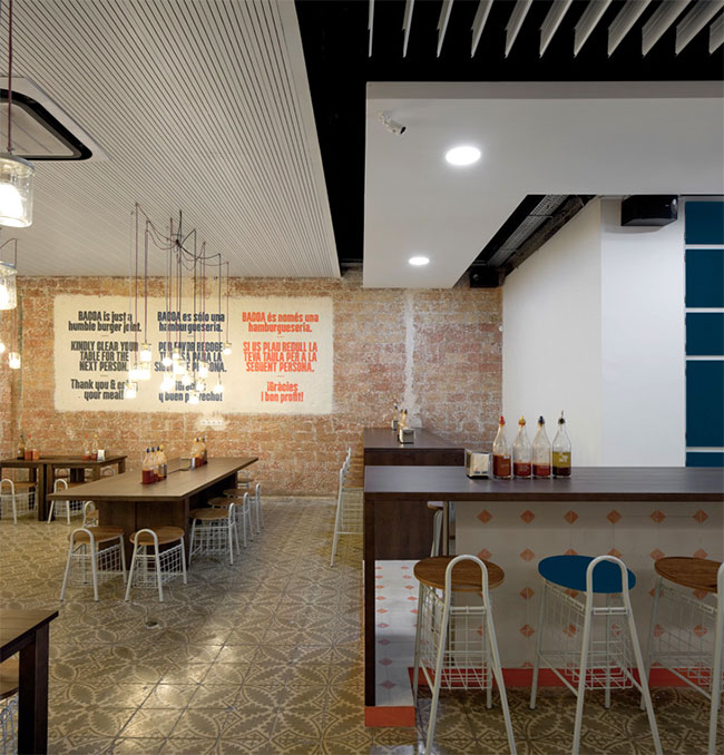
We were also commissioned to work on the interior design for Bacoa’s new flagship restaurant, directing a team of architects and furniture designers and completing the graphic design ourselves.
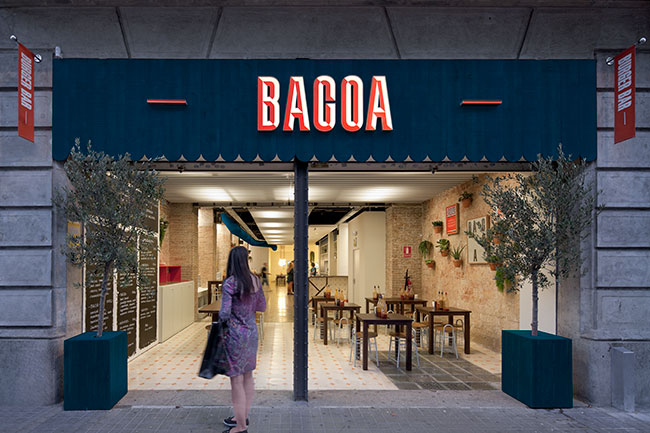
The location of the burger bar is very central. It’s just in between Plaça Catalunya and Plaça Universitat, but still belongs to the Eixample, a district which was built at the end of the 19th century, beginning of the 20th. All the flats, stores, and restaurants in that district have a similar shape — not very wide, but very deep. This was a challenge. We had to think of a way to make the pedestrians stop and look inside. We tried to achieve this by using a lot of light sources at the end of the restaurant.
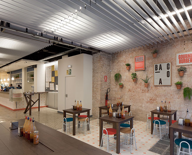
The area in the entrance is always open, even in winter. It’s visually separated from the rest of the space through the custom made tiles on the floor. We were very careful in the use of the corporate colours. According to the visual identity “overbranding” would have been counterproductive. Now and then we let the colours appear, but tried to lay a stronger focus on untreated materials, such as wood or stone.
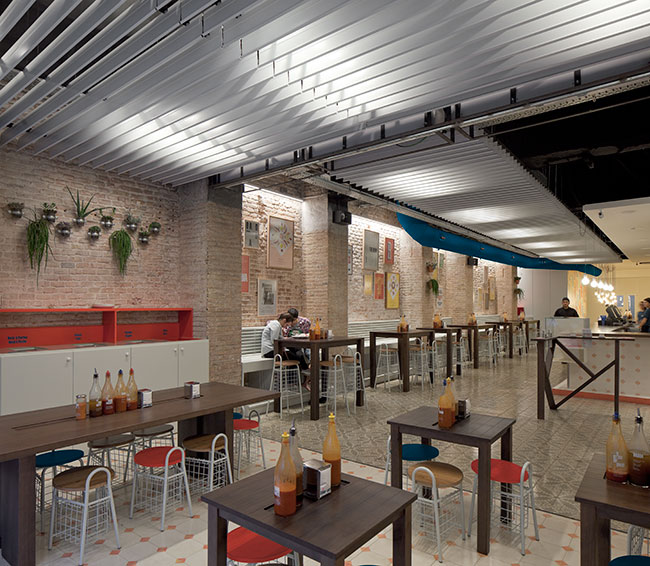
The appearance of the corporate colours on certain elements of the interior design, such as furniture, boards, frames, tiles, walls, and on printed elements such as the burger holders, napkins, doilies, pencils and order forms, creates a formal consistency that makes the brand recognisable even if the logo isn’t visible.

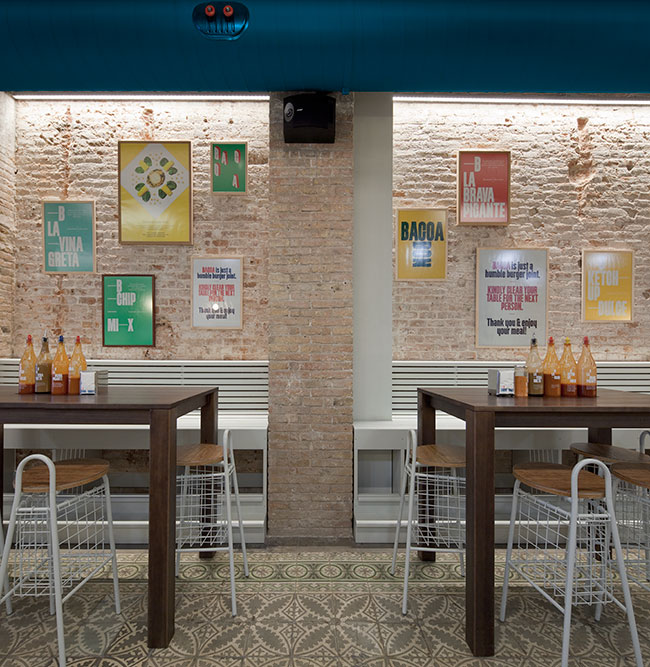
For the wall on the right (above), we separated each product group to increase legibility, like hamburgers, drinks, and fries. Additionally we coloured the frames so that Spanish and Catalan could be easily distinguished. The specials are shown in the middle. Their background changes with the season of the year, like we did with the posters and postcards.
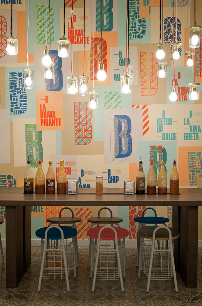
For the wall on the left (below), we designed more than 30 different posters. Some explain how the sauces are made, some announce the special burgers of the month, and some just have the function to reinforce the values of the brand.


Passing by the bar on the right opens up another room (below). We placed most of the restaurant’s light sources in this space to make it more visible from the entrance. We used the corporate typeface to stencil-spray the wall with a friendly reminder asking customers to throw away their trash before leaving.

It was important to us that Bacoa doesn’t look like just another franchise. So we had to get our hands dirty and do something which looks handmade. We rented a small silkscreen atelier in the old town of Barcelona and silkscreened more than 200 posters, each one a little different, each one unique.
Even hanging the posters on the wall was a challenge. The painters that were hired to glue the posters to the wall had a hard time hanging something slightly out of angle.
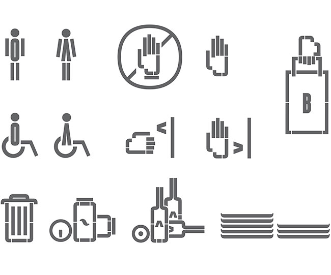 Bacoa pictograms
The new website tries to be more user-friendly than the old one, taking into account that user-behaviour has changed in the last couple of years. Mobile devices make users want to browse more and click less. Clicking, especially if the clickable object is very small, became very inconvenient and unnatural.
The directions to the next restaurant can be calculated using GPS. To remain independent of Google or Apple maps, we used an alternative interactive map software that had another important advantage, it’s customisable and can be adapted to the visual identity of Bacoa.
Client: Bacoa
Year: 2012-2013
Chair design: Bahbak Hashemi-Nezhad, London
Architecture: [dLZ] Studio, Barcelona
Photography: Pedro Pegenaute, Barcelona
Food photography: Becky Lawton
More from TwoPoints.
Comments
I love the store front. The chiseled type style is definitely making a comeback, and not just as a Photoshop effect. I also love how Euro the the brand and store are.
It’s beautiful work, but I don’t think that the icons respect the style of the brand.
The main concept is great and beautiful until I see the pictogram. I don’t think it matches with the whole identity. Other than that, I love it.
I recently visited Barcelona and absolutely loved the food, the burgers were the best I have ever tasted, I was hoping that they had a chain in the UK but sadly found out they don’t. I was wondering if there are any plans for the UK and if so would love to be part of the franchise. Truly fantastic food, well done.