
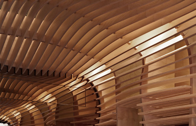
Baker D. Chirico celebrated the launch of their new identity with the opening of their second store, in the inner city suburb of Carlton. The project was a unique collaboration between FOD (Fabio Ongarato Design), architects March Studio, artist and fashion designers PAM, and Daniel Chirico – Australia’s most recognised artisan bread maker. Focused on the juxtaposition between age-old tradition and craft, and contemporary design thinking with a surreal twist, the new store creates a truly unique and unexpected experience.


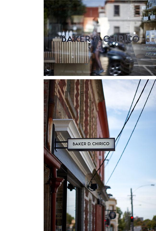

Photography by Peter Bennetts.

Fabio Ongarato elsewhere on Identity Designed: ACCA, Social Traders, K.P.D.O.
View more identity projects on the Fabio Ongarato website.


Comments
I really appreciate this. Does the logotype use a custom font?
The shop alone is amazing. Makes me feel that I am in a working model of a loaf of bread rising in a stone clad oven.
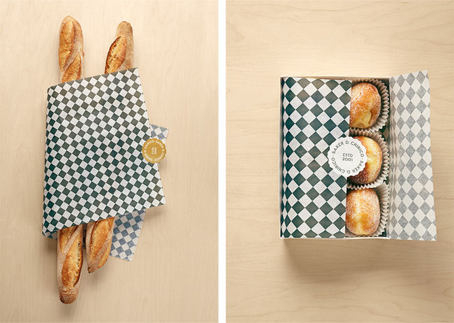
The stationery is quirky utilising a strong graphic device and illustration style… think I was only expecting a black and white photograph of some Dali-esque baker twirling his moustache on the reverse of the business card.
Beautiful stuff.
Used font? Neutra. It seems a little modified (A, B…).
The shop itself is amazing. You’d go in there just to look at the place. I love the connection between the floor and the packaging, that is a nice touch. Great job.
A little aside: The text next to the hand reads “Hörner aufsetzen”. This is a well-known German slang term for having an affair with somebody else’s wife and the gesture actually fits this meaning. Not sure what I should make of this.
I think the “B” is wonderful.
Love the shop. It’s remarkable.
That is the identity.
They didn’t need hands and pictures of bread on the bags. They are pointless. They let the identity down.
I wonder at what stage of the shop fit FOD finished the identity, and whether or not they experimented with an idea showing the shape of shelves. I particularly like how the floor tiles are carried through to the packaging. Perhaps the addition of hands ties-in with Daniel’s personality.
Just goes to show, your logo can be simple and does not need to do all the work. Let the identity shine! That wood work alone would make me want to have a step inside.
I love the shop and the packaging. As far as the branding, I agree that the hands ‘kills’ it, but it is still ‘saved’ by the beautiful font and logo applications.
I would say this brand definitely makes me want some fresh bread and other bakery items, so I would say kudos to the designers and everyone who was involved.
I love the wood shelves on the wall and ceiling but set beside the other wall the bakery looks a bit unfinished. I like the checker pattern for the paper and the simplicity of the identity. The hand is creepy.
When I see photos of shops like this, I immediately question certain practicalities. Some major, some minor. Like, how accessible are the light fixtures to change a light? How easy are these shelves to clean? Where is the pricing? Because if it is not easily readable, someone will come along and tack up a hand written price sheet. To me the bread disappears into the monochrome of the shelves. It might have been more dynamic if the wood had a dye finish to provide contrast. And looking at the photos, the undulating walls do not provide a sense of comfort. It would be interesting to see this in the real world, in real use. Maybe next time I go to Australia.
I like it. Not in love but I like it. I particularly appreciate the idea of using “The Dictionary of Italian gestures” created by Bruno Munari, even if the final result is a little bit creepy, but still a good idea.
Fantastic work, love the balance of simple geometric patterns with the vintage typeface and characterful images that are almost Monty Python in feel.
The shop design itself is genius and worth the visit alone, form and function at it’s best, beautiful work.
A really nice, slightly off kilter but memorable and coherent design here!
Not much to say about the identity, but the interior design is esthetically amazing. I love the fact that although it’s a small space, I want to just hang out in there. Lovely execution.
So funny, I buy bread at this shop everytime they open, I have managed to get my colleagues onto their beautiful bread. Alas they only open from Wednesdays :(
It is an awesome shop and the bread is fantastic.
I, too have been curious about the font for their logo, it sort of reminds me a bit of MONA (Museum of Old and New Art – now that is another brand identity worth showcasing if you haven’t already) It is the most quirkiest private museum which is a huge tourist destination for Tasmania.
Everything comes together well. A thing of beauty.