The brief was to create a new strategic position and distinct identity for BERA — an equity assessment platform whose unique tools create the guiding light for Fortune 5000 brands.
The challenge was to create a confident, straight-talking identity for a tech company who use data to foresee potential future outcomes. BERA work with algorithms to revitalise brands who have lost their way—but they didn’t want to come across as a “data” company.
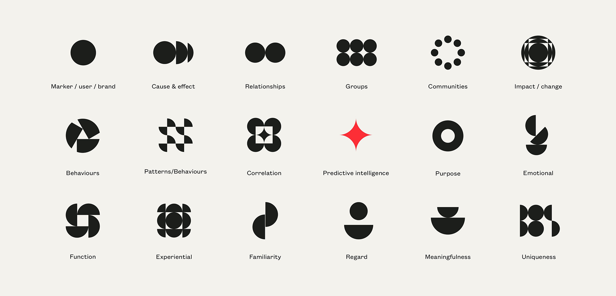
Our solution was to transform the “magic” of their platform into a solid reality. We used chaos theory to explain how seemingly random information (data) can have simple, systematic patterns underpinning it.

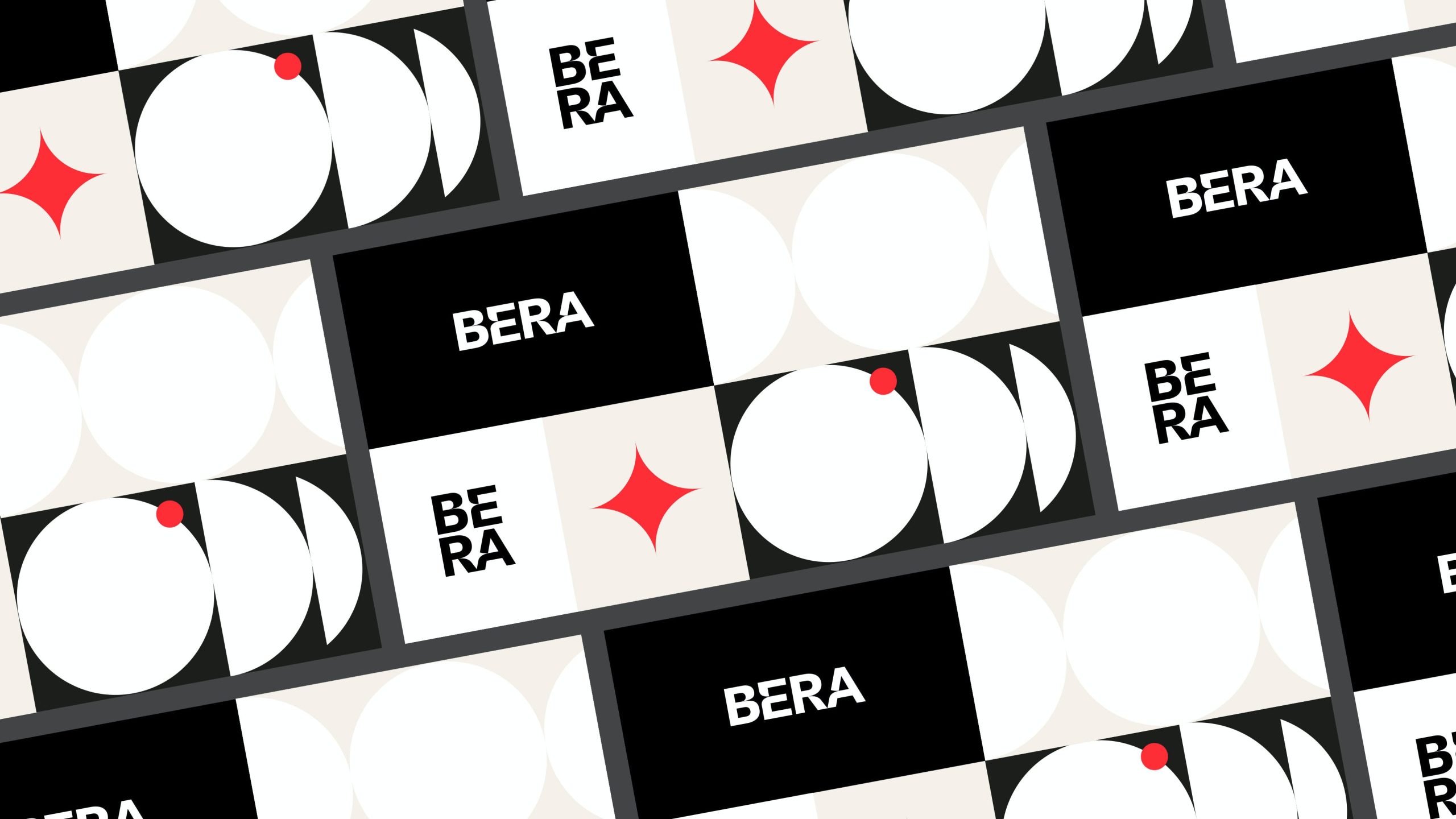
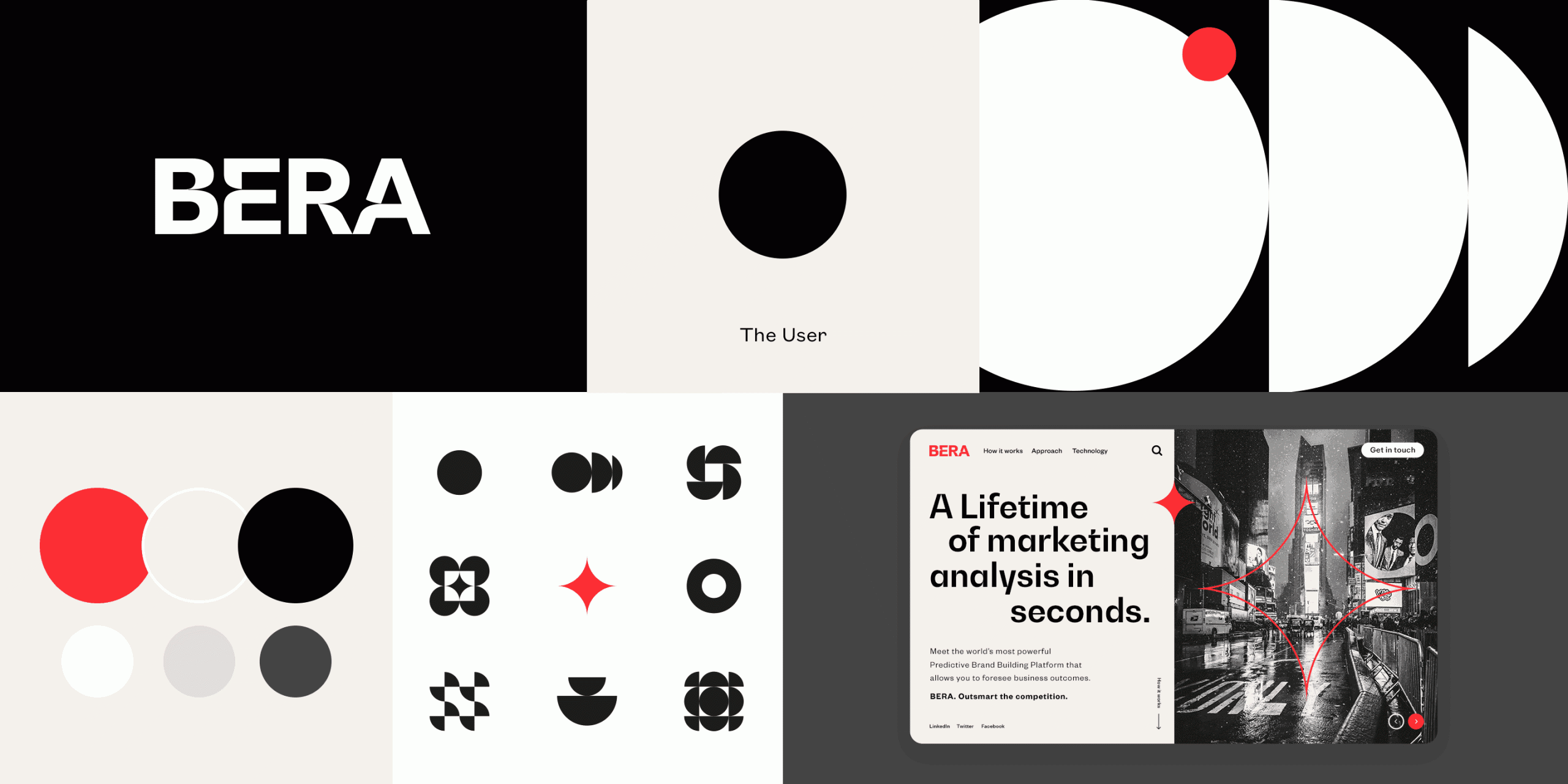
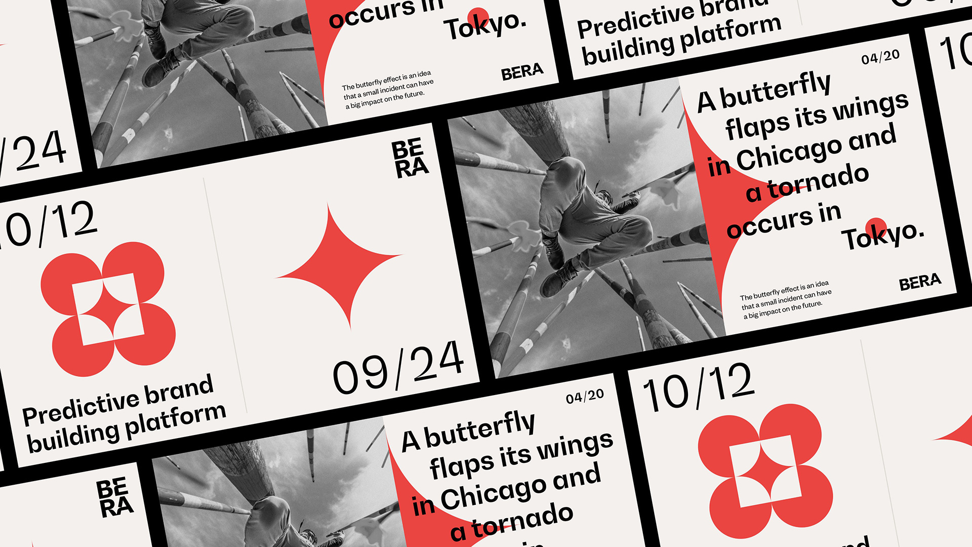
We developed an icon set based on circles, which could have complexity added or abstracted away. From these icons we developed the “North Star” — the brand marque which was etched into the logotype and used across company collateral as a visualisation of their process, as well as philosophy.
We used BW Gradual to create a customised wordmark, choosing the font for its pure shapes and fast curves which lent themselves to a “Star” like effect.
More from How&How.











Comments
Love the use of negative space and red accents. Very effective.
Love the colour selection :)
Absolutely stunning design!
Love the star’s integration into the BERA word mark! The brand’s iconography is also well-executed.