
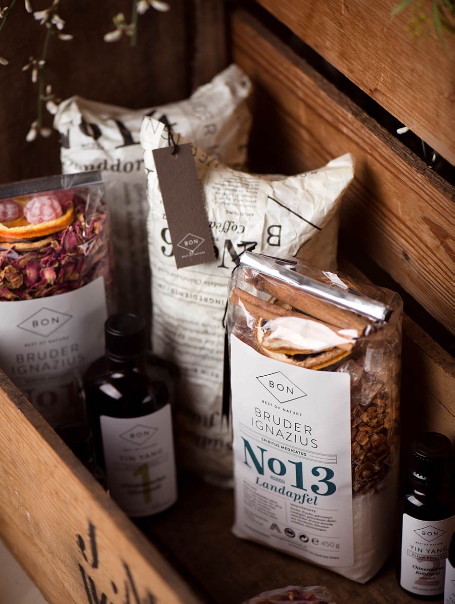
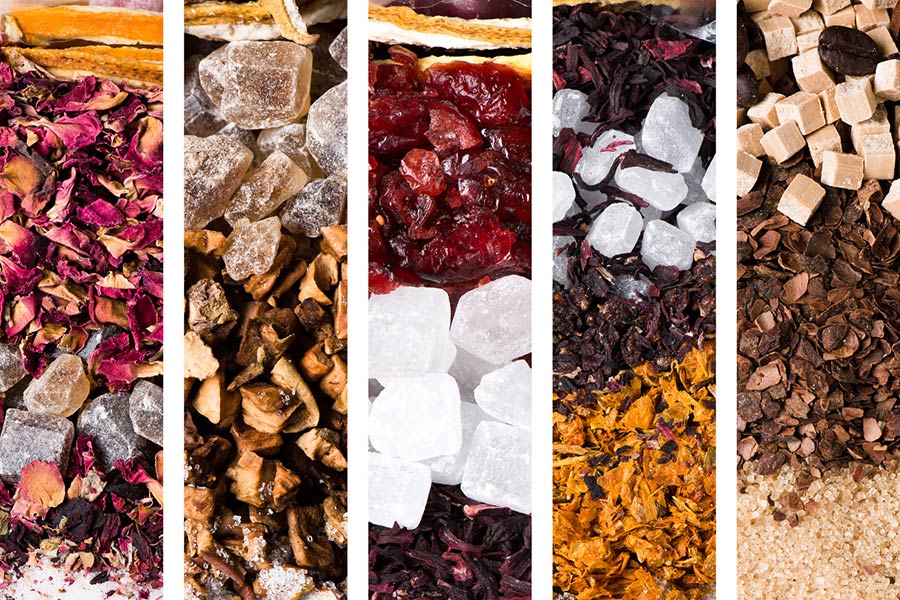
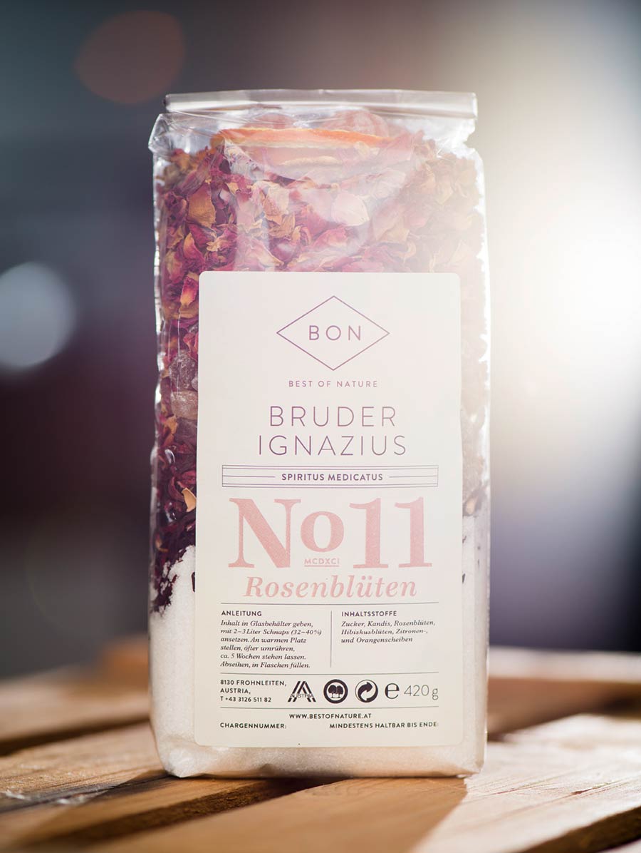
Best of Nature, or BON for short, only uses the most natural ingredients in traditional recipes for its finest oils, herbal mixtures and essences. The high-class distillates and mixed spices now appear in a new packaging that gives every product its space without failing to provide consistency. What stands out most: the classic, but elegant packaging design that focuses on the products themselves.
During the last few years, new markets have opened up due to the development of the web and the possibilities that go with it. This meant that a strategy needed to be developed in line with the web’s continuous adaptions.

Previous BON packaging (above), not by Moodley
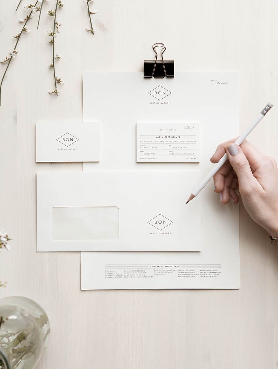
As well as the strategy, we had to develop a new graphic concept: the logo and the packaging range were redesigned to create a more unified brand, distinctive in the market. Our branding and packaging combines all the above aspects as well as attracting attention with its simplicity.

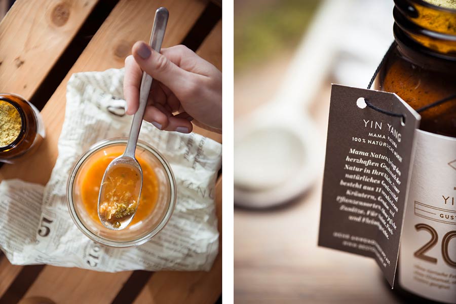
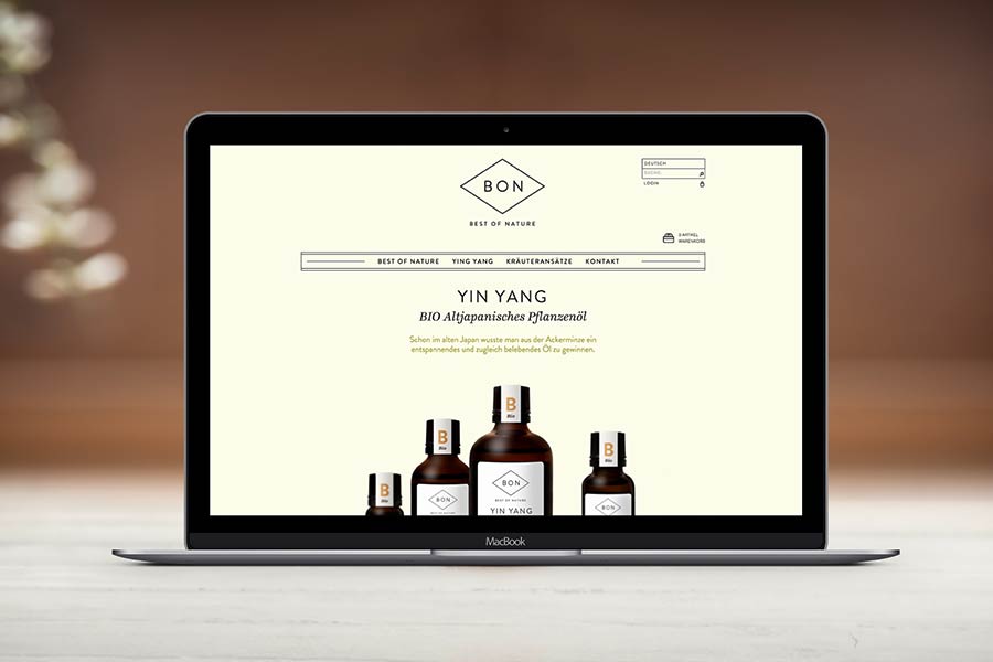
In the course of the project, all of the brand’s tangible elements were refined for the new design: labels, bottle hangers, wrapping and letter paper, business cards, etc. We also developed a multilingual online store to further the selling of products.
The fonts used in the identity were Brandon Light, Medium, and Bold, Helvetica Neue Roman, Ingeborg Italic and Bold Italic, and Plantin Std Semibold Italic.








Visit the Best of Nature website.



Moodley elsewhere on Identity Designed: Am Fleischmarkt 1
More from Moodley.



Comments
Hi there, lovely work. Would you be able to share the details of the photographer? Thanks.
Very impactful, and so relaxing to look at. Great design!
I don’t know. The branding and all looks fine but the logo doesn’t stand out for me. Either a filled shape might make logo stand out a little more?
The materials look classic though! great job!
What always intrigues me is why people associate something looking retro with being good quality.
I think the chocolate bars look great, the branding is extremely clear, simple and elegant. Yet the packaging typography for the other items is overly cluttered and fussy by comparison.
The jar labels have a very clinical and medical feel to them, you might think you’re taking something your doctor prescribed.
Overall I think the chocolate bars worked the best at hitting the right spot visually. Everything else is a huge improvement on what they had before.
I agree with Brian Terry, I also think the logo looks so simple, I personally thought it’s not “minimalist”. I also like the previous packaging design, I think it looks a little unique.
But the whole new design is fresh and soft. :)