
We’ve been working for the past few months on creating an adaptive visual identity for a new visually-led advertising agency, based in Victoria, London.
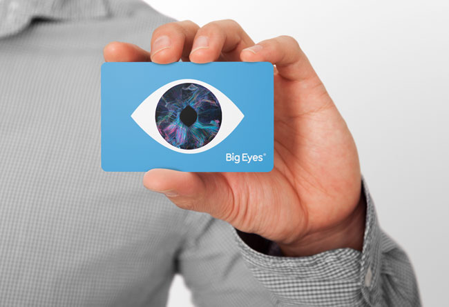
The new agency is the brainchild of Martin Galton and Oliver Lewis-Barclayis, and it’s called BigEyes because of its visually-led approach to advertising.
“We want to make visually exciting work, but also honest representations of the brands we are helping communicate. We want to make work you can ‘look in the eye’ — work that is the right mix of truthful and interesting.”
— Martin Galton, creative director, BigEyes
The ever-changing branding enables the new agency to more easily explain their approach. It’s a brand that’s in permanent beta. Always learning, always helping.
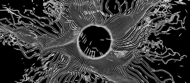
The identity is fuelled by a series of digital sculptures created by artists FIELD. When viewed from the front, the sculptures are designed to resemble the complex series of fine muscles that expand and contract to make up the iris of a biological eye. The data randomises, giving an infinite number of iris designs.
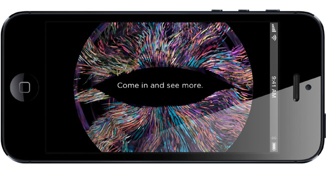
These artworks are being used across a broad variety of applications — all with the idea of keeping things visually interesting.

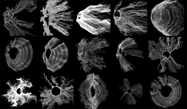

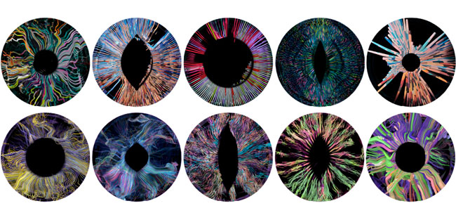

The brand will be soft launching over the next three months, and we’re working on a wide variety of applications, from digital to print to interiors to vinyl (yes, a record!). We’re looking to produce an album of visually-led music — soundtracks from some of the greatest visually memorable films of our time. Lawrence of Arabia, StarWars, PulpFiction, Easy Rider…



SomeOne elsewhere on Identity Designed: National Maritime Museum.


Comments
Wow those renderings look fantastic, to me they have an interesting digital/organic duality, and a slightly eerie human/animal/alien quality in the changing shape of the pupil.
Although I do appreciate the impact derived from juxtaposing the fine detail of the iris and the abstract frame of the eye across the wallpaper and business card, these elements don’t feel completely resolved compared to the edge to edge application of the renderings on the cup, record and memory card.
I have to say that this blew me away. It’s amazing to look at — also, I agree that some of the elements look better than others, but I guess that’s the point, a brand that is in ‘permanent beta’ is always in flux — so I guess they can adapt it easily enough… so if they get feedback like yours Richard — they can change it.
Smart approach — way better than the usual fixed logo.
It’s creepy. And I don’t even have a hangup when it comes to eyes. But I do know people who really have an issue. Any “eye” specific logo or advertising bothers them. But then, I presume those are not the clients they are going after. In all kinds of edgy design, you take the risk of automatically repelling a certain percentage of the viewing population. And that is not bad. Trying to be universally loved usually just makes you universally forgettable. This is certainly not forgettable. ;)