Birmingham’s history is one of creating; of craft and of industry, a history in which design sits at the very heart. Why the city has never had a design festival — whilst other UK cities have well and truly flown their design flags with great pride — is a mystery. A group of Midlands makers, maestros and misfits felt the time was right to remedy this. June 2018 saw the launch of the Birmingham Design Festival — a celebration of the dynamic design industry in the second city and surrounding areas.
Setting up a design festival is no small task — the sponsorship, the venues, the speakers, the logistics — all enough to make the mind melt, but one of the toughest asks is getting the message out there and inspiring people to come along and get involved. Here lies the job of the brand. Luckily the Birmingham Design Festival team consisted of a number of designers that ply their trade in this particular area — Luke Tonge, Ash O’Brien from Two of Us and Paul Felton from Common Curiosity.
From the outset we were keen that the branding had real substance and longevity. We wanted to develop a visual identity that trod a delicate balance of representing the city of Birmingham and its design industry, whilst swerving any overused clichés.
Birmingham has been known as the “City of a Thousand Trades” and “the workshop of the world.” They’re sayings ingrained in our city, and a reputation us Brummies are all proud of. This reputation for craft and the handmade felt like something we should absolutely look to bring to the fore and harness in the brand identity.
Through our research we uncovered a rich graphic language in existence for centuries — found in hallmarks. A hallmark is a series of marks containing letters, numerals and symbols, struck on metal items to denote the content of the piece, the maker behind the design and any distinguishing characteristics. Hallmarks date back to the 4th century AD — silver bars marked as belonging to Emperor Augustinian around AD 350 represents the oldest known form of consumer protection. This graphic system has continued to modern day and is prevalent in the jewellery industry — one of Birmingham’s most famous exports. The link between this system, making jewellery, and Birmingham felt like a perfect fit. Birmingham also has its own Assay Office, one of only four in the UK. We thought we could look to harness this graphic lexicon that is intrinsically linked to Birmingham’s historical and contemporary craft, but re-appropriate it for a contemporary forward-looking festival.
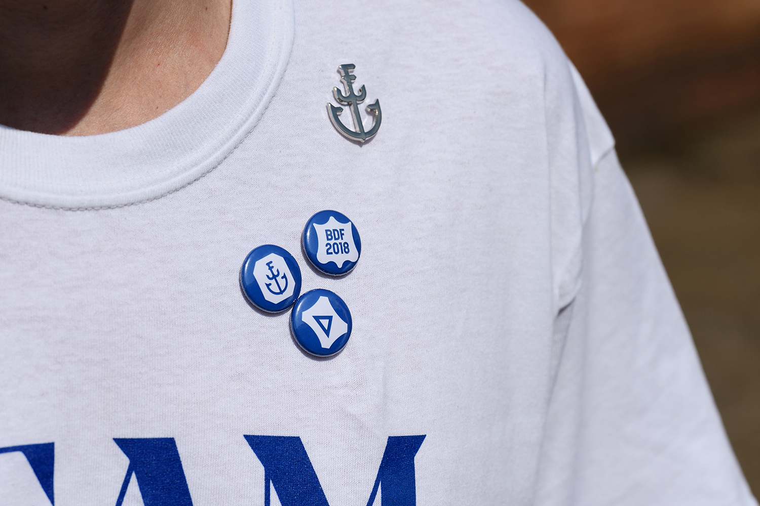
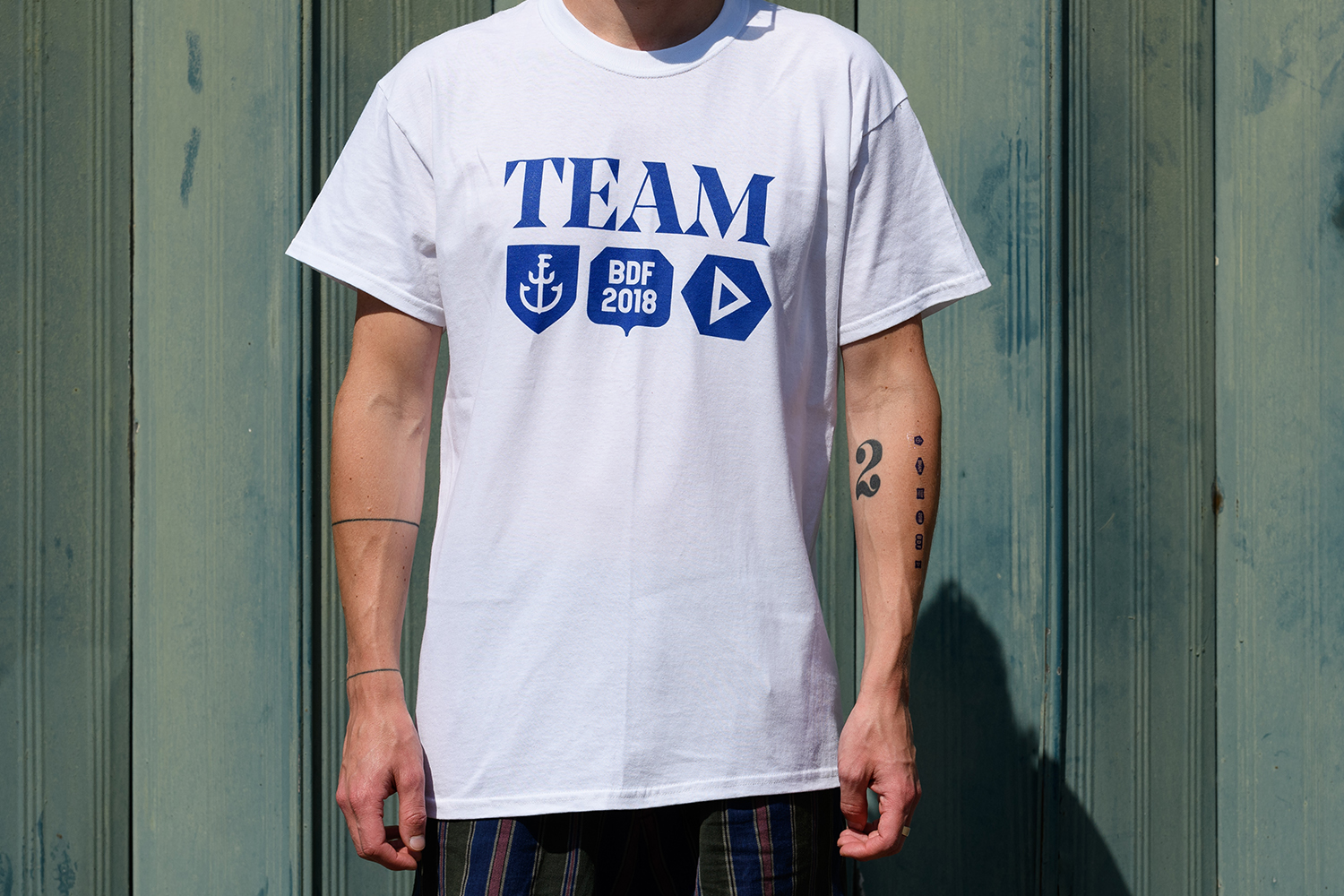
We began to create a series of graphic shapes inspired by existing hallmarks and experimented with including letters, numerals and symbols relevant to the Birmingham Design Festival. We liked how we could be flexible with this system of “carriers” and elements within, so created not a single logo, but a system whereby multiple and ever-changing logos could be developed. The elements are all rooted in the same aesthetic so consistency is maintained by the parameters of colour, typeface, and the system itself. This allows us to be flexible with the construction and arrangement.

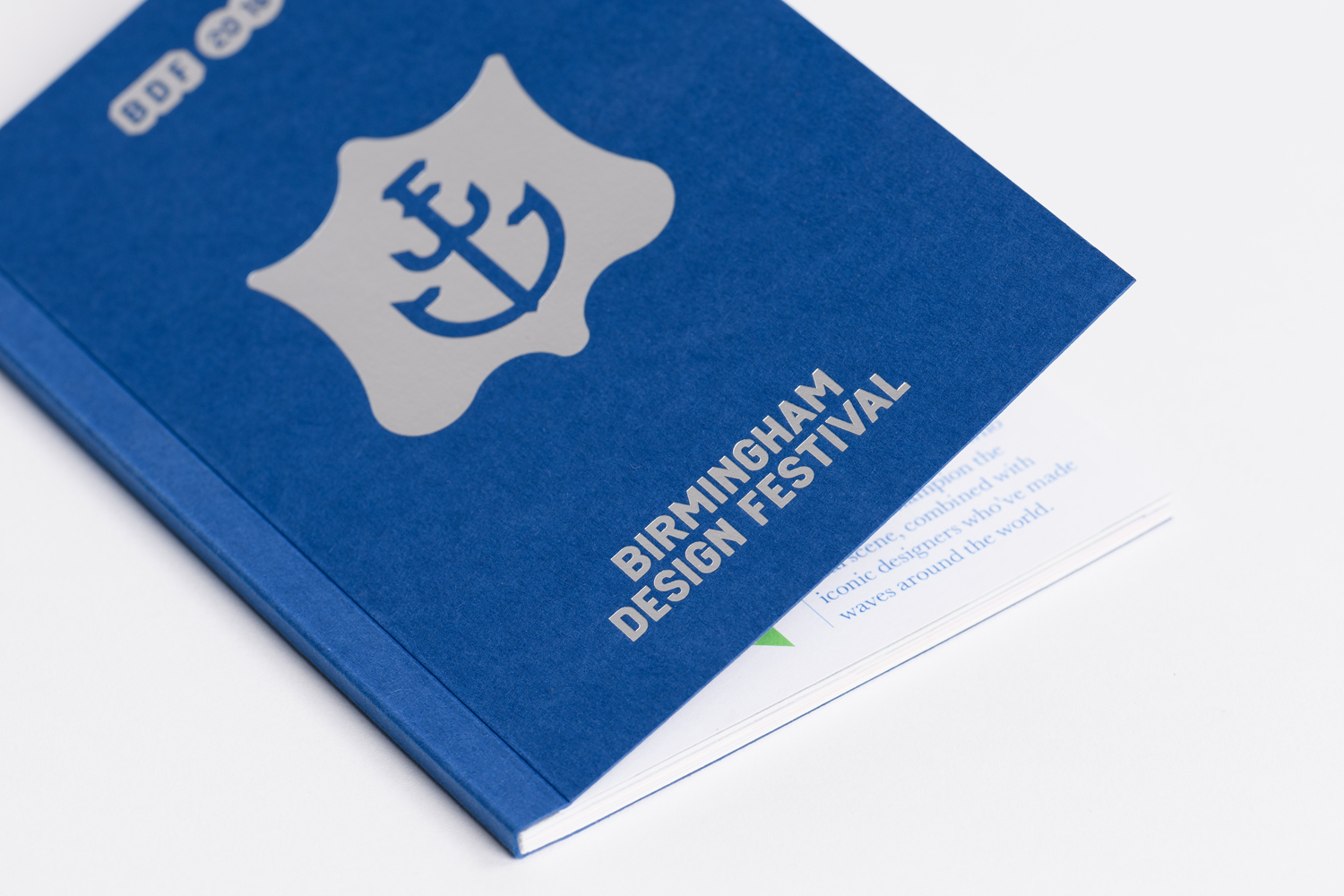
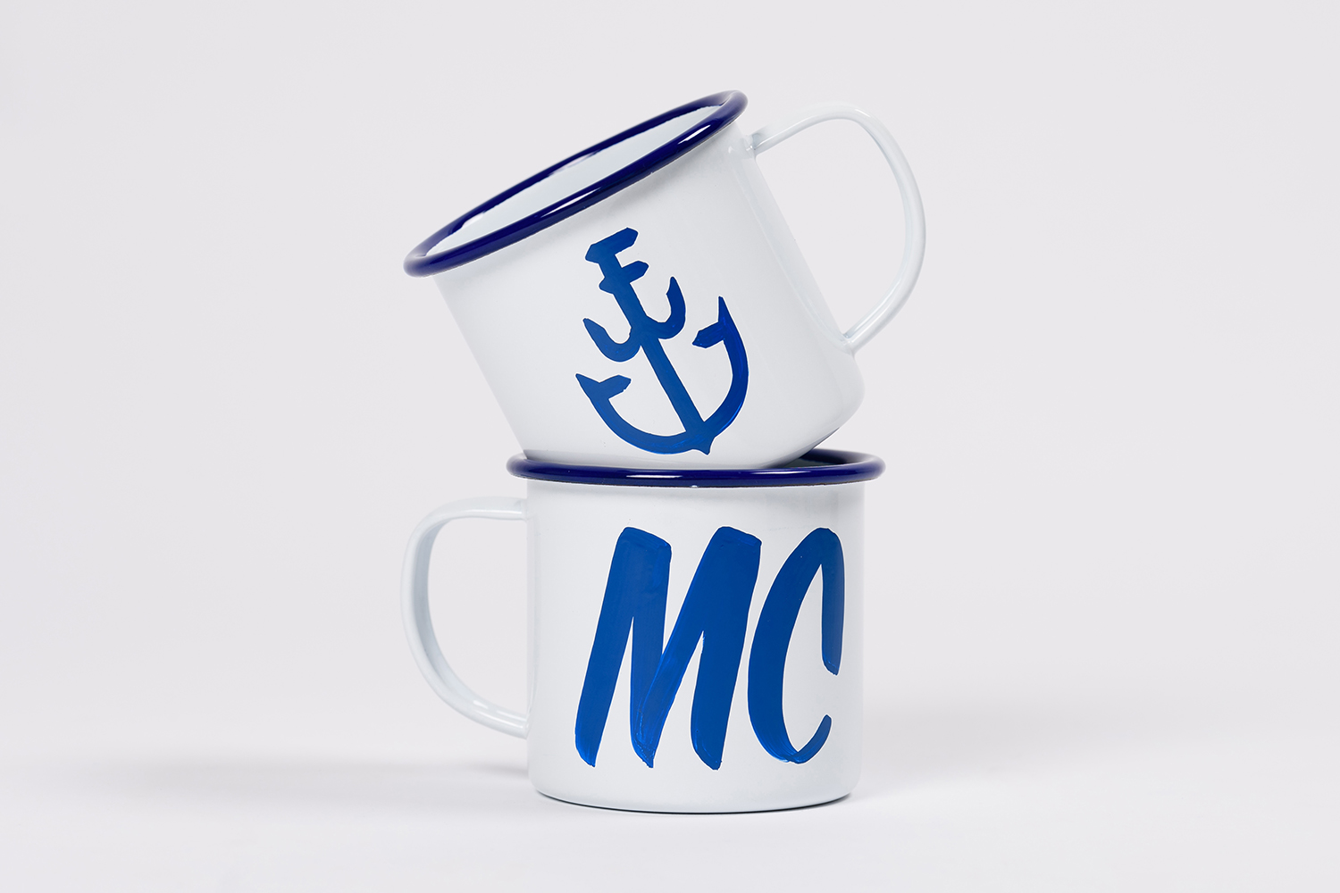
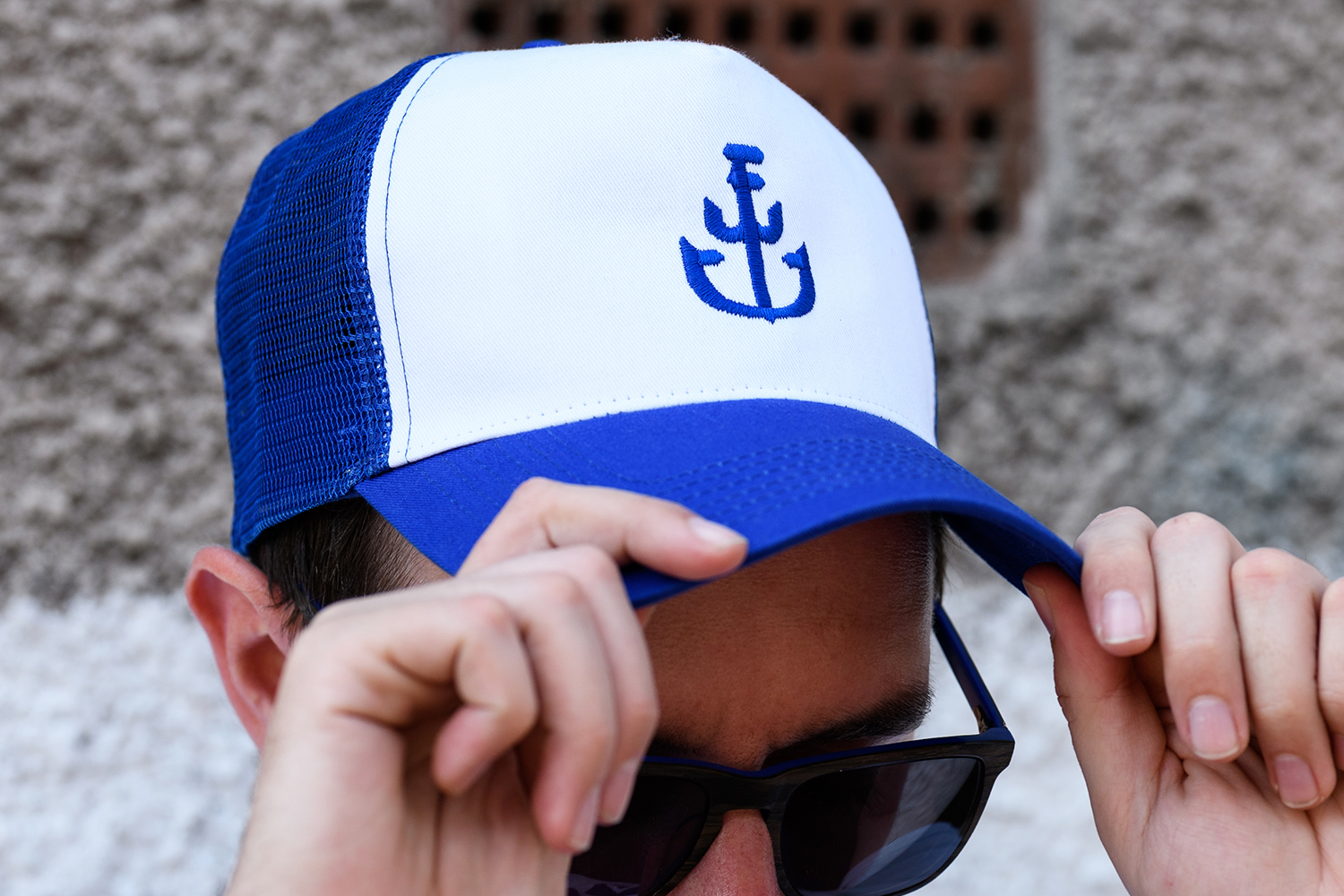
The carriers will hold the name/acronym and the year of the festival, and we have also developed a BDF monogram in the shape of an anchor — a nod to Birmingham’s assay mark. Each year, the festival will have a theme that becomes the driving force behind the programme of events.

The single word “Forward” has sat proudly under the city’s coat of arms since 1838 as it grew from a town to a city, and it felt like the perfect theme for the inaugural festival. The triangle (or arrow) that’s used also references a hallmark symbol relating to an old Birmingham assay mark.

The ongoing colour palette is blue and grey, inspired by the Birmingham coat of arms, with accompanying colours defined by the yearly theme. This year, complementary red, green, and yellow hues were selected — all energetic and progressive colours.
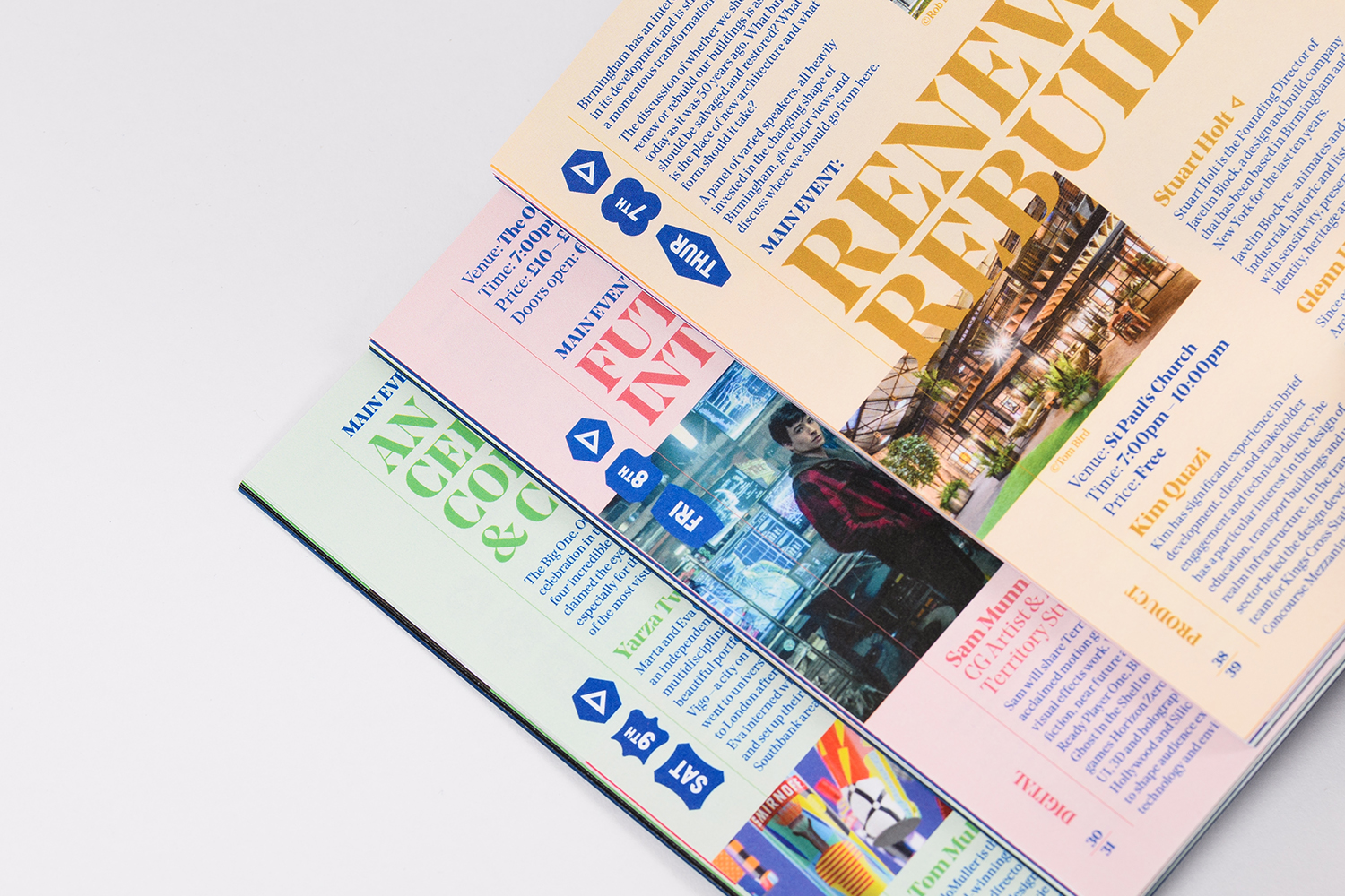
Typography also plays a key role in the identity, and we have a suite of three typefaces. Cornelia is used in the wordmark and was selected for its similarities to the old factory and warehouse signage still visible on many of Birmingham’s institutions of craft and manufacturing. Noe Display is our primary typeface, selected for its chiselled serifs that again reference Birmingham’s industrial heritage and share visual similarities to the hallmarks. And finally we wanted to pay homage to Birmingham’s most famous type designer John Baskerville, so our body copy is set in Baskerville.




More from Luke Tonge, Ash O’Brien, and Paul Felton.


Comments
I like how the heritage of the city informed all the design decisions. The identity was perfect for the festival, as if it was waiting to be discovered.