
Blank Digital are a New York-based boutique retouching and digital capture company. The quality of their stunning photographic and motion work speaks for itself, ensuring steady work with the best photographers in the business. However, with an offer broadening to include new motion capabilities, and an ambition to cement direct relationships with the world’s most successful luxury, fashion and media businesses, they needed a more proactive strategy.
Story
Brilliant visual storytellers for their clients, Blank were missing opportunities to communicate the breadth and benefits of their own business.
Moving Brands worked with the Blank founders to define their offer, to create an identity worthy of their expertise, and provide creative direction to deploy this new brand across their digital and physical touchpoints.


System
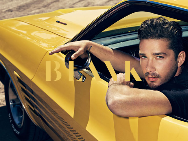
We defined their brand narrative as ‘realizing image potential’ – an ambitious stance that focuses on the real business benefit they offer. The monochromatic identity system has an attitude and an edginess to appeal to their high-fashion audience. The mark references Blank’s own editing process; it appears to be at the point of mid-creation, but still elegant.
The soft colour palette and typeface nod to the family-focused values and love of tailored, crafted elements, characteristics of the business that were often referenced in workshops with the Blank founders. Most importantly, the system provides a sophisticated, flexible foundation from which their own work can shine.


Experience
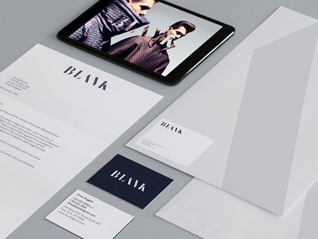
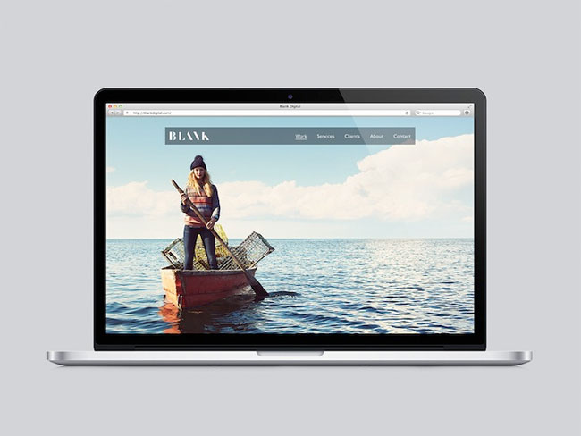
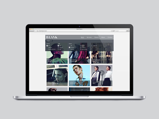
The final visual identity system contained best practice templates for their desktop website, print collateral and the mnemonic mark that can be seen on all digital platforms. We are currently working with Blank on further storytelling components, including the creation of a sales presentation and showreel.
“As a company that prides itself on the highest quality of still and moving imagery, we found Moving Brands to be ideal creative partners as we navigated the process of redefining our brand. Pushing us to dig deeper and to think holistically, they guided us to a level of exploration we hadn’t expected. With an earnest passion for what they do, we found their approach to be thoughtful, comprehensive, well considered, and simply inspiring. Their professionalism and integrity have not only impacted our brand, but also the way we do business. As a company who delivers on their promises and gets it right the first time, we cannot thank you enough, Moving Brands.”
— Scott Michael Fenn, co-founder, Blank Digital
More from Moving Brands.


Comments
I’m not sure and would be more convinced if the company’s competence for photography and retouching were matched by masterful typography. In my mind the logotype is stylized to the degree that it doesn’t reduce the brand to its core but it goes beyond.
I think it’s difficult to read. Especially on the ‘N’. It needs about 5 or 6 seconds to understand that it’s Blank. I thought a logo should be easy to read so it’s easy to memorize and recall, but I don’t think Blank successfully does that. It could be read black or something, as the ‘N’ resembles the symbol of ‘\’ (you can’t spell it with only an alphabet). The typography is great but it lacks readability.
The concept of mid-creation is a nice idea but this doesn’t really come across well as a static logotype nor does it appear to be expanded upon in motion, in print or on-line. As a predominately logo-centric solution to me it feels a little linear and a touch unresolved (but not in the way intended), a tough thing to really write considering the appreciation I have for Moving Brands’ work in general.
I see BLINK and BLACK, methinks there were some better type resolutions in the process work…
I like the identity, but I’m struggling to understand how “realising image potential” could be considered an “ambitious stance” for a retouching business’s brand narrative, since it describes what they actually do.
They were crazy to change the old logo, the concept of blank, a blank space defined by a simple thin line… shame to change it!
The logo design came together very well. But I do agree with what others have said about how you have to take a minute to see that it says blank.
Super clean typography, my only qualm would be that that it is hard to really discern if the “N” is a “V” or not. Still very nice logotype!
I think the logo refers more to a fashion brand than a company working with retouching images. AND is not that readable either…
Conclusion: why fix it if it ain’t broken?
Strong idea, but the execution isn’t great. There is too much attention drawn to the B and L, leaving the whole logo unbalanced. Imagery looks great, however.
@sonia – imo the logo needed a redo. While I have nothing against the original concept, I still think that the typeface used was very basic, almost lacking and definitely did not stand out.
@Ardi – I agree with it. I think I see why Moving Brands did not want to make the N more distinctive, as the overall idea has been done before (http://www.behance.net/gallery/Abstrakt-branding-2011/2289586). Who knows, maybe the way the N is designed will actually become it’s distinctive point.
This is beautiful work. It visually elevates the look.
And it does not look like “Black”. If you cannot read it or if you don’t get it, you probably aren’t a visual creative and you wouldn’t hire them anyway.
The trouble with asking people what they think is that they will tell you. This is great work. The logo is unique. No one really struggles to read it, they just want to complain about something and that’s all there is.
Agencies like Blank are all about their body of work, they are not about colour palette or tone of voice or to be honest their logo, it’s their expertise.