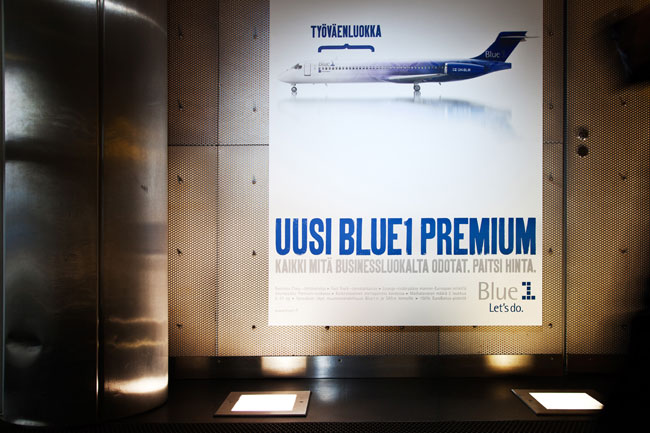
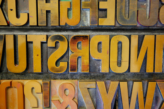
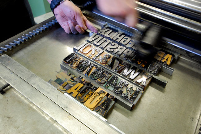
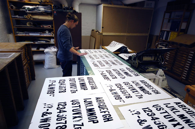
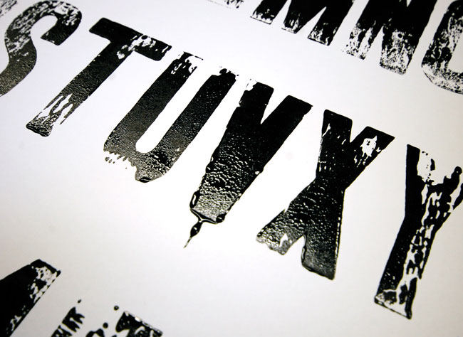
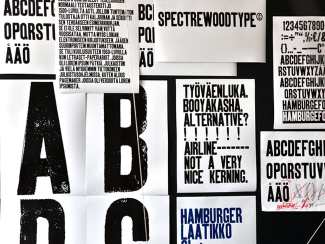
A robust custom typeface designed for airline Blue1’s Premium class is the core visual element of a launch campaign created in cooperation with an advertising agency Lovely Amsterdam. The typeface was created with an old letterpress machine and a set of wooden block letters. After printing, the individual letters were digitised, cleaned, vectorised and modified to make it a full working font family.




More from BOND.


Comments
I get the feeling the work that’s gone into this will be lost on most of the commuters. But it’s a welcome change to the cleanliness of everything you see in most airports.
Looks like they cleaned up the lettering a bit too much and lost a lot of that roughness that they generated from the original letterpress.
Like! One technical question: capturing the roughness creates pretty big outlines for each character. Could this become a problem?
Stunning, I love the upfront look of this, and the fact that it was created the traditional way, then digitized.
However, I’m really not sold on the grungy printed effect, the appearance of the type in the first image is much better, looks cleaner and more like what an airline would use, but with the grunge/texture it loses the whole ‘premium’ element, and looks more like a degrading lower class.
Inspirational nevertheless.
In the last poster, I wish they didn’t neglect to convert into dollar signs (at least) 6 more remaining letters ‘S.’ Isn’t good design all about consistency?
I likey.
Something quite unctuous about letterpress type. The only thing that slightly pisses in my soup is that when you digitise it, it becomes a strange animal. On the surface is looks hand-made and random with all that lovely distress and texture but when you see a letter repeated all those beautiful random elements suddenly are brought into sharp focus. You see it’s a lie. This is not something that can easily be got around and it’s no big deal in the grand scale of things but I always find myself looking for repeated patterns and when I find them, the magic just seems a little less magical.
Like the execution though, the blue on a backlit box looks corking.
Interesting comment Gareth and agree. I wonder whether it would be possible to create an algorithmic typeface that generates new random distress across each letter, that would certainly help retain some of the magic across repeating characters.
Hey Richard, I’m sure that it’s possible. We can get broken, unreliable scientific equipment all the way from Leicester to the surface of Mars, doing something a little clever with type has to be within out abilities.
I like the new typography, and as a Finn, I’m also able to read it! This creative approach puts a heavy weight on copy text though…
Not used to flying in business class, but I have always thought that robustness is not what the customers are looking for. But maybe that’s a good differentiator?
I’d like to know why they did it that way, there’s not much information about the project.
Gareth & Richard
There are already a handful of typefaces that do exactly that. The one that stands out in my mind the most is a typewriter-ish offering that is available (if I recall correctly) through FontShop and possibly a few other retailers. The name of it escapes me at the moment.
And it’s not difficult at all to generate a number of alternates for each glyph—the trick is making sure that whoever handles the designing of collateral knows how to use Open Type features, and then actually does.
As for the point-heavy outlines, with professional software, it’s much less of an issue than it used to be. Still can be tricky, but definitely manageable.
this is a good font – multivariant letters (6 of each!) guaranteed to keep things looking random.
http://www.myfonts.com/fonts/yellow-design/veneer/
Love it – simple as that, life’s too short to be a critic – if you ain’t got anything encouraging to say, get on with some of your own work. Great to see some genuine effort rather than the soft most easily and immediately maximum cash profitable solution.