
We developed a new brand strategy and identity for Broadgate, central London’s largest pedestrianised neighbourhood that connects Spitalfields, Shoreditch, and the City of London. In line with the ambitious £1.5 billion masterplan by joint owners British Land and GIC, the new brand celebrates Broadgate as a place for forward-thinking businesses and an open, public arena for people to explore new experiences in food, retail, and culture.
You think you know your city, but then there are places that surprise you. Broadgate is definitely one of those, a neighbourhood in its own right, with a diverse community and a unique urban environment with huge potential for cultural interventions. We wanted to change the perception of Broadgate to reflect the reality of what it is today, and importantly, how it will shift over the next ten years.
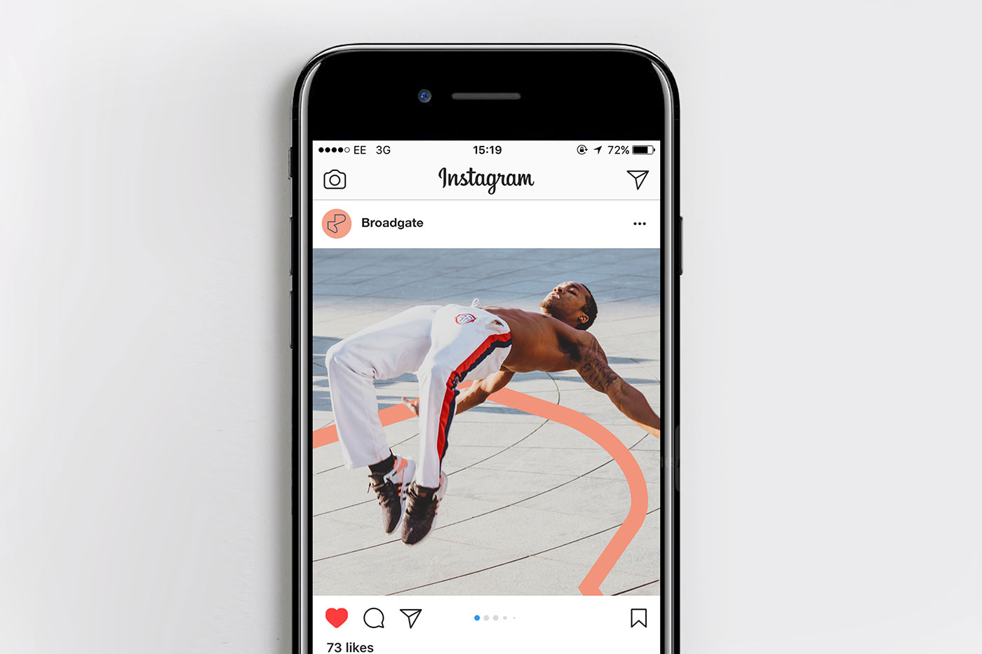
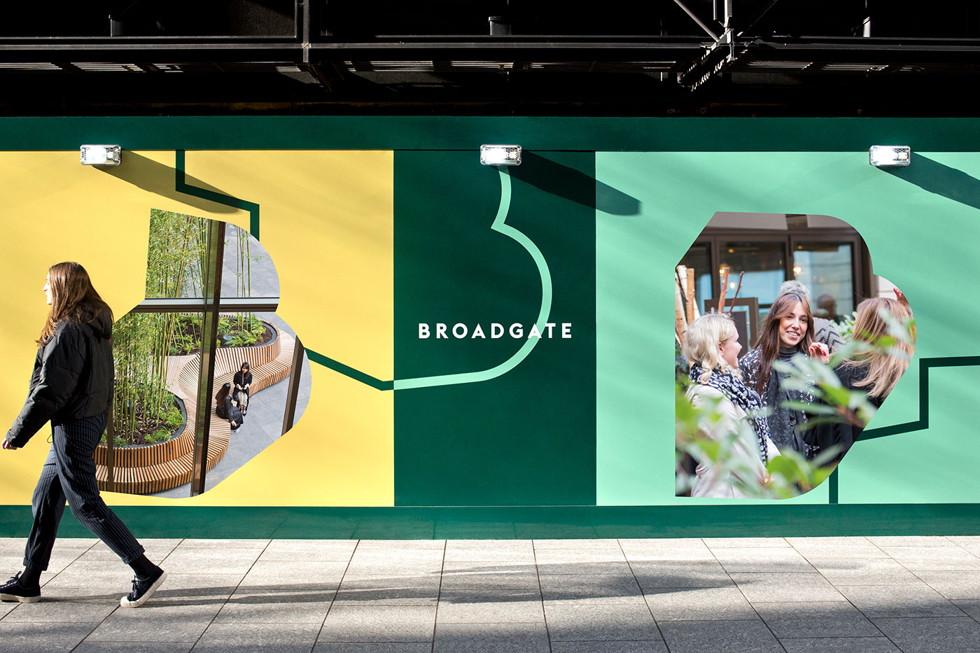
The bold identity captures the energy of one of London’s fastest changing destinations, and breaks away from traditional B2B communications to engage a wider consumer audience across London and beyond.
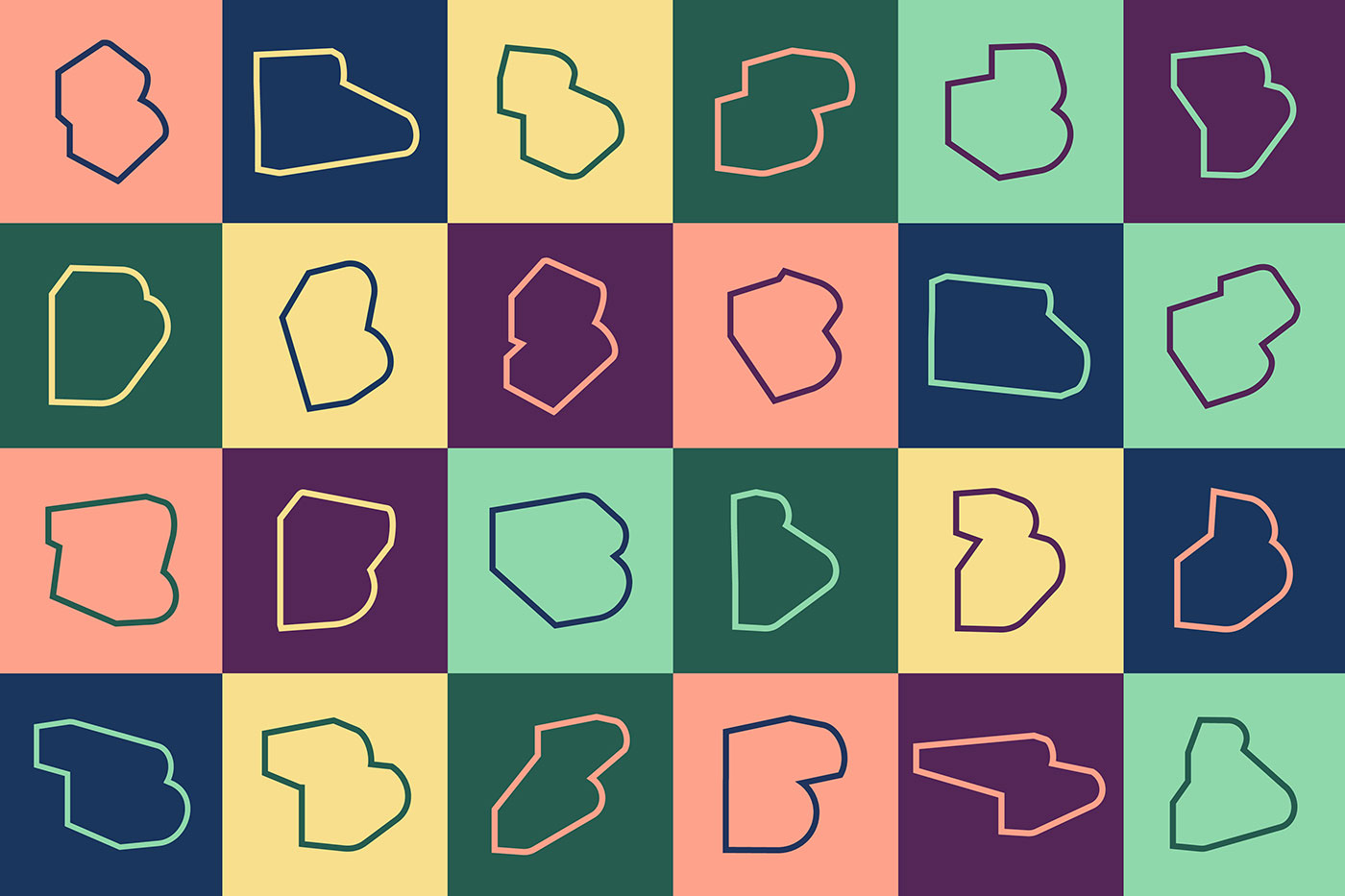
The brand strategy visually translates into a digital-first identity that’s always in motion through a generative “kinetic B”. Underpinned by a bold, clear, and strong wordmark, the identity changes shape, colour, and scale to enable different expressions.
To manage the brand’s three dimensional nature we produced a bespoke interactive tool. With it we can generate endless variations for static and animated applications and manipulate the forms by pushing them around in space and rendering them out at different scales. It allows the identity to adapt and evolve over time, while staying coherent.
In use, the “kinetic B” can be both whole or cropped, filled or outlined, graphic or textural — it becomes an edge to cross, a line to follow, and a window into the moving world of Broadgate. Supported by a robust, bespoke wordmark adapted from the Euclid Flex typeface, the identity’s interchangeable colour pairings break from traditional business conventions into a more consumer-oriented contemporary space. The primary and secondary typefaces are Gotham and Lyon.
The new Broadgate brand launches this month. The identity will be rolled out in coming months across print, digital, events, installations, on-site activations, social media, and merchandise.
David Lockyer, Head of Broadgate, British Land said, “The new brand is an excellent reflection of the progress we have made to create a truly vibrant, engaging neighbourhood for those who work and visit the campus. We are delighted with what dn&co have achieved, working alongside us to deliver this fantastic new way of representing Broadgate.”


More from dn&co.


Comments
What’s that program in the video footage?
An excellent zag with the identity in making the brand more accessible to more people. The “B’’ outline worked well across mediums; brilliant choice.