
Competing in a saturated snack bar market, we developed a strategy for Byte Bars that subverts stereotypical “crunchy granola” aesthetics. The outcome is a brand that appeals to a younger generation with a bold identity and light-hearted irreverence.

Visual identity
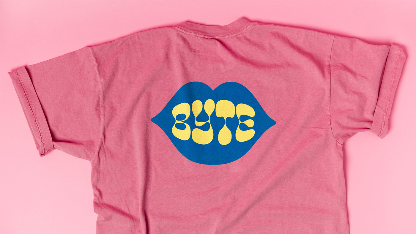
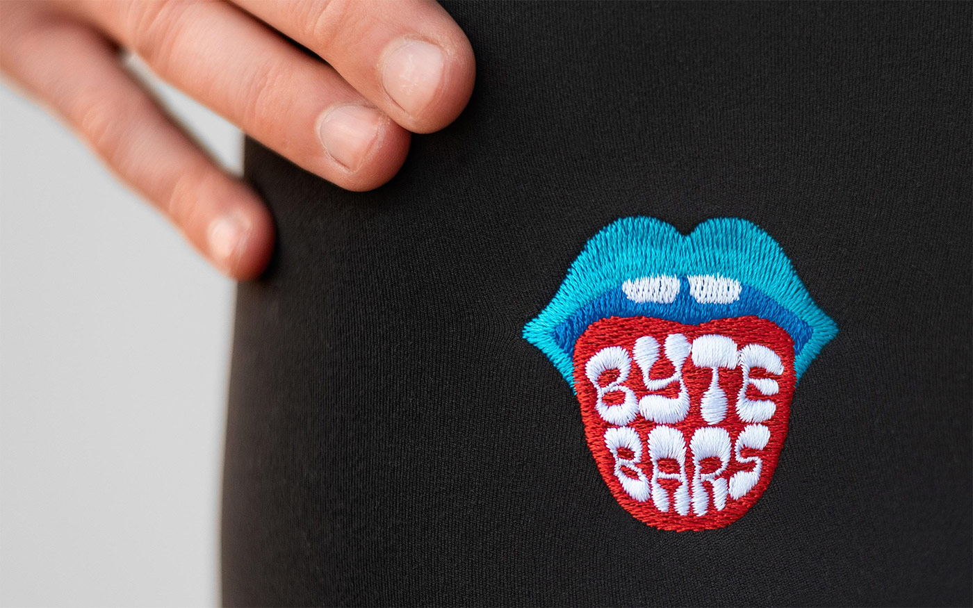
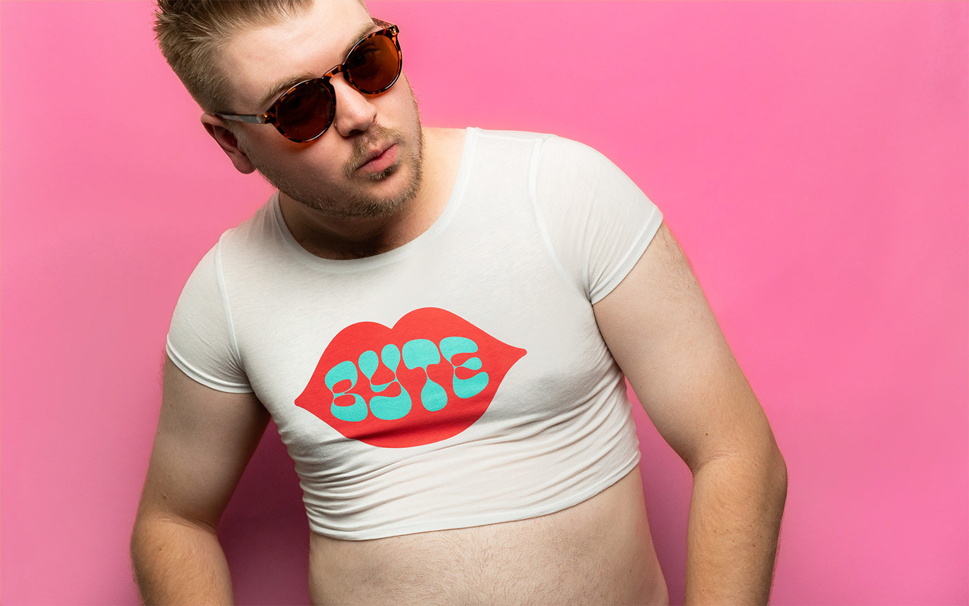
Representing a cross-generational, free-spirited vibe, the shapes of the type and icons are influenced by the groovy 1960s and the vivid color palette is drawn from the electric poppiness of the 80s and early 90s.
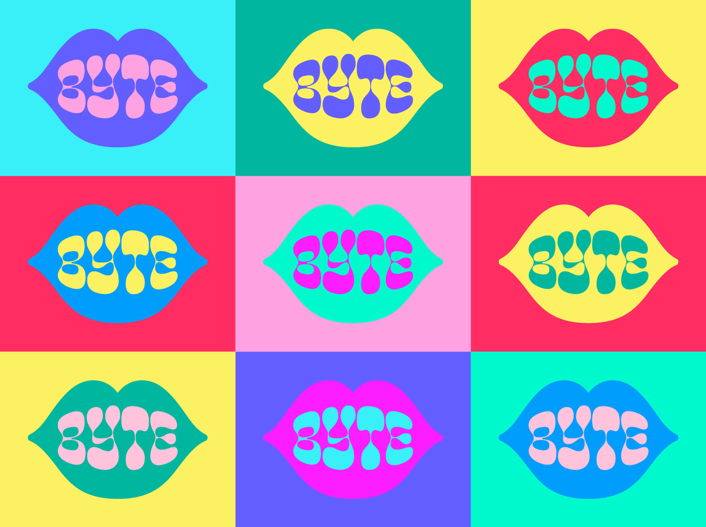
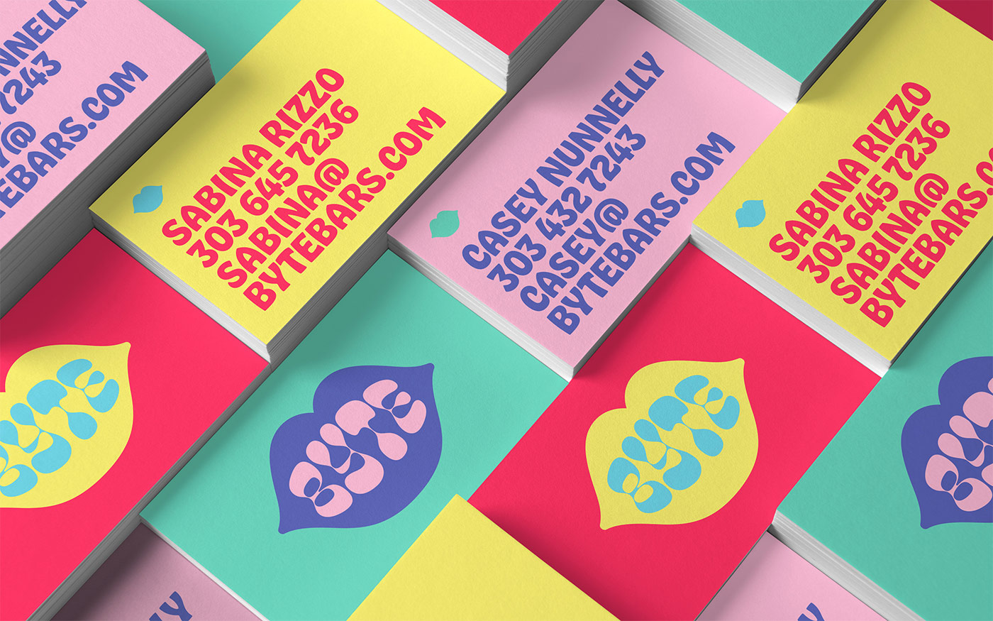
Playing off of the brand name, we developed a series of mouth icons of varying detail. Combined with an extensive color palette, the dozens of potential icons allow Byte to give each bar their own look and keep the brand fresh.
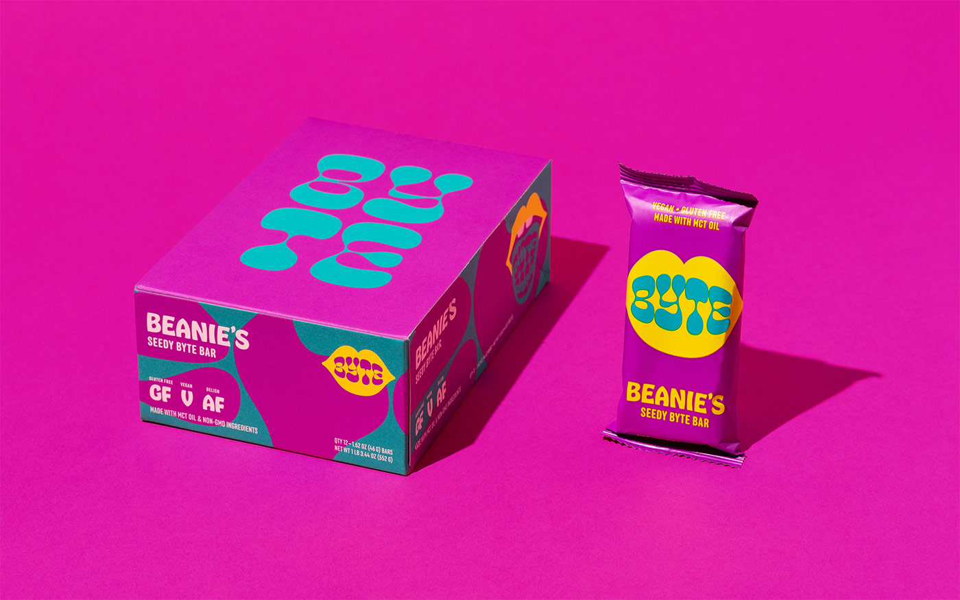
Packaging
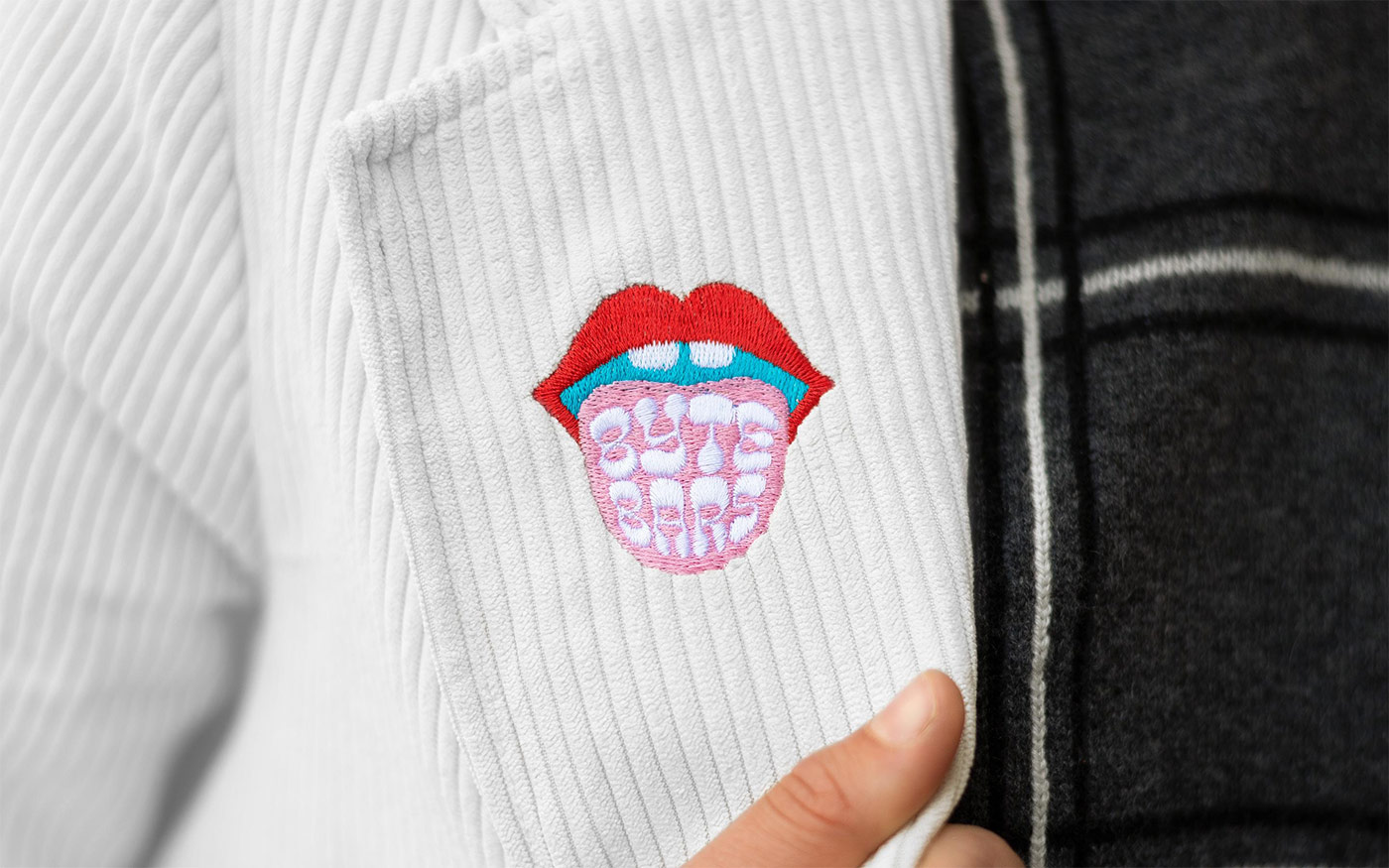
For Byte’s retail boxes, we used Neenah Paper’s Folding Board 100 PC White, a 100% PCW recycled stock. For Byte’s t-shirts, we spec’d water-based ink which is a superior choice over conventional plastisol ink both for the environment and for the quality of the print.


The plight of plastic is especially grim when it comes to flexible film substrates (the method by which snack bars, among many other foods, are packaged). Conventional plastic films are comprised of multiple materials which are laminated together. This process creates lightweight, inexpensive, highly functional substrates, however, these films cannot be recycled in conventional curbside recycling streams due to their multi-material makeup. At the time of publishing this case study, there are no compostable flexible films that offer the same stability and barrier protection of a conventional film structure. If you know of one, let us know.
Cast Iron Design elsewhere on Identity Designed: Roger the Barber.

Comments
An identity with a delightful irreverence, I laughed a few times. Saturated colors matching the humor, excellent.