
Chocolate Molinillo is a group of event and interior designers focused on creating magical experiences for as many children as possible. They came to us with a name inspired by a Mexican folk song — “Chocolate Molinillo, estirar estirar que la reina va a pasar” — a nonsensical rhyme that layed down the central concept of every child becoming the protagonist in their personal fairytale.
Children don’t see the world as it is. Everything is something else, shinier, bigger, more fantastic. Chocolate Molinillo wants to create anything a child can imagine. Amazing spaces, unforgettable events, unique products, all to fill their lives with enchanting memories. We set out to remind parents what it’s like when everything is a surprise. The result is a brand identity that includes special pop-up invitations, quirky illustrations, and a heavy dose of magic.
Every childhood is it’s own fairytale, and Chocolate Molinillo wants to tell them all.


We approach each project with a five-step methodology:
- Context immersion
- Business immersion
- Identity design
- Brand tools
- Communications
Every project begins by looking towards our client’s client. In this case we conducted interviews with parents about how they feel when organising events to celebrate a special moment in their child’s life. Some parents expressed that there was a sense of competition in their community, while others said that they really wanted to create a unique memory they could share forever. These conversations shaped the way we thought about Chocolate Molinillo’s offering.
While children are at the centre of Chocolate Molinillo’s purpose and the ultimate client, it’s the parents who do the hiring. Achieving a connection with them is just as important. Our client decided to position themselves as high-end provider with a “magical memory” as their differentiator.
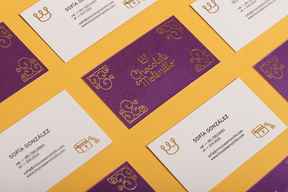
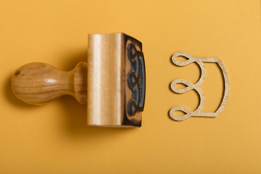
All this shaped our graphic style and tone, incorporating gold foil and royal markings, pieced together with the ingenuity and playful technique of a child.
The logotype is inspired by a child’s take on cursive royal markings, immediately connecting you to the brand’s own fairytale.

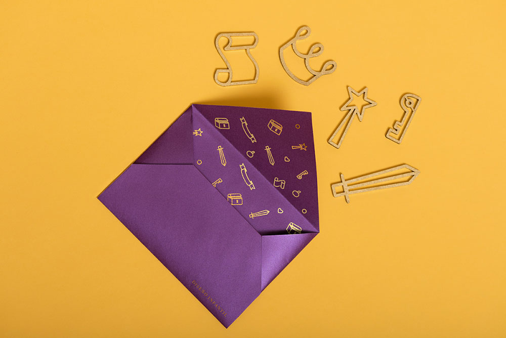
Chocolate Molinillo looks to sponsor events in their community and showcase the type of work they can do. For a special event we created a pop up invitation that’s a direct reflection of the storytelling experience you’ll get to live.

The invitation’s cover is written with a cursive hand lettering to add a little class, while maintaining playfulness and charm with it’s geometric shapes.

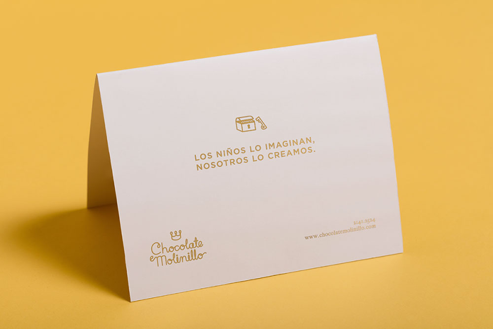
Our ethos for the entire project was reminding parents what it’s like when everything is a surprise. Our envelopes have playful patterns waiting inside, our contract has quirky iconography and might make you feel like it’s prop in a play, all this to really put parents in the right type of mood.
We created a modern take on all the figures that make up the world of Chocolate Molinillo. The website animation reflects how everything in a child’s room can be completely transformed with some imagination.


The project was so much fun, and we hope you enjoyed having a look.

More from Analog.


Share a thought