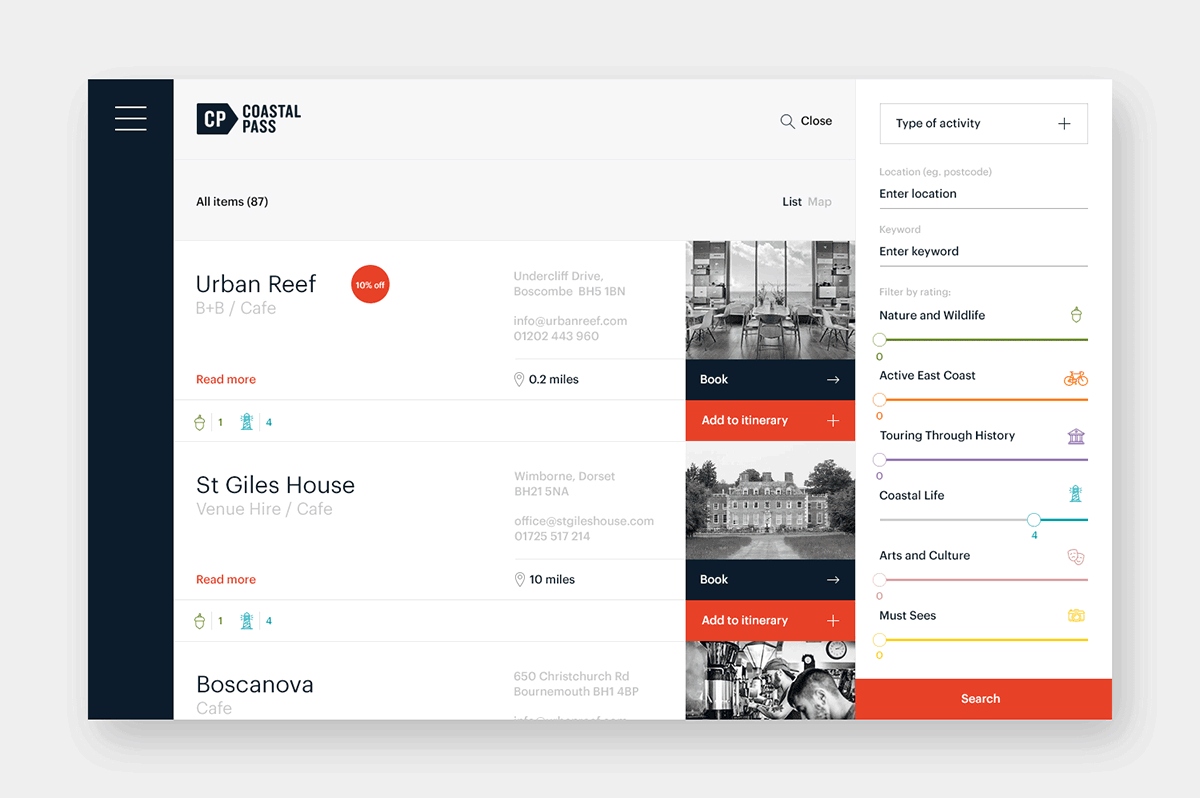
Coastal Pass is a new initiative for visitors to explore the east coast of England. Created by the National Coastal Tourism Academy (NCTA), Coastal Pass is a video booking tool that enables visitors to plan and build their own itineraries, creating bespoke short breaks and holidays.
NCTA wanted people to visit the east coast of England, so we created an identity that literally pointed them in the right direction. Rotated 90º and you have a subverted ‘location’ pin commonly used in applications such as Google maps, etc.
Originally, the identity was only to be used alongside partnership brands such as The Suffolk Coast or Visit Essex for a series of interactive videos that would prompt viewers to build their holiday itinerary. Therefore, the identity had to be recognisable at small sizes and unobtrusive, yet bold enough to work on its own.
![]()
![]()
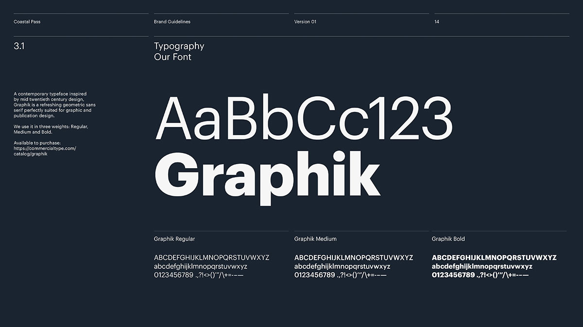
Graphik was chosen as the main headline font for its clean lines and varied weights. In addition, we wanted an identity that had a contemporary aesthetic that felt culturally relevant. The introduction of the ‘Explore, Embrace, Enjoy, England’ strap-line allowed us to define England as a destination brand, that actively encouraged customers to start their journey.


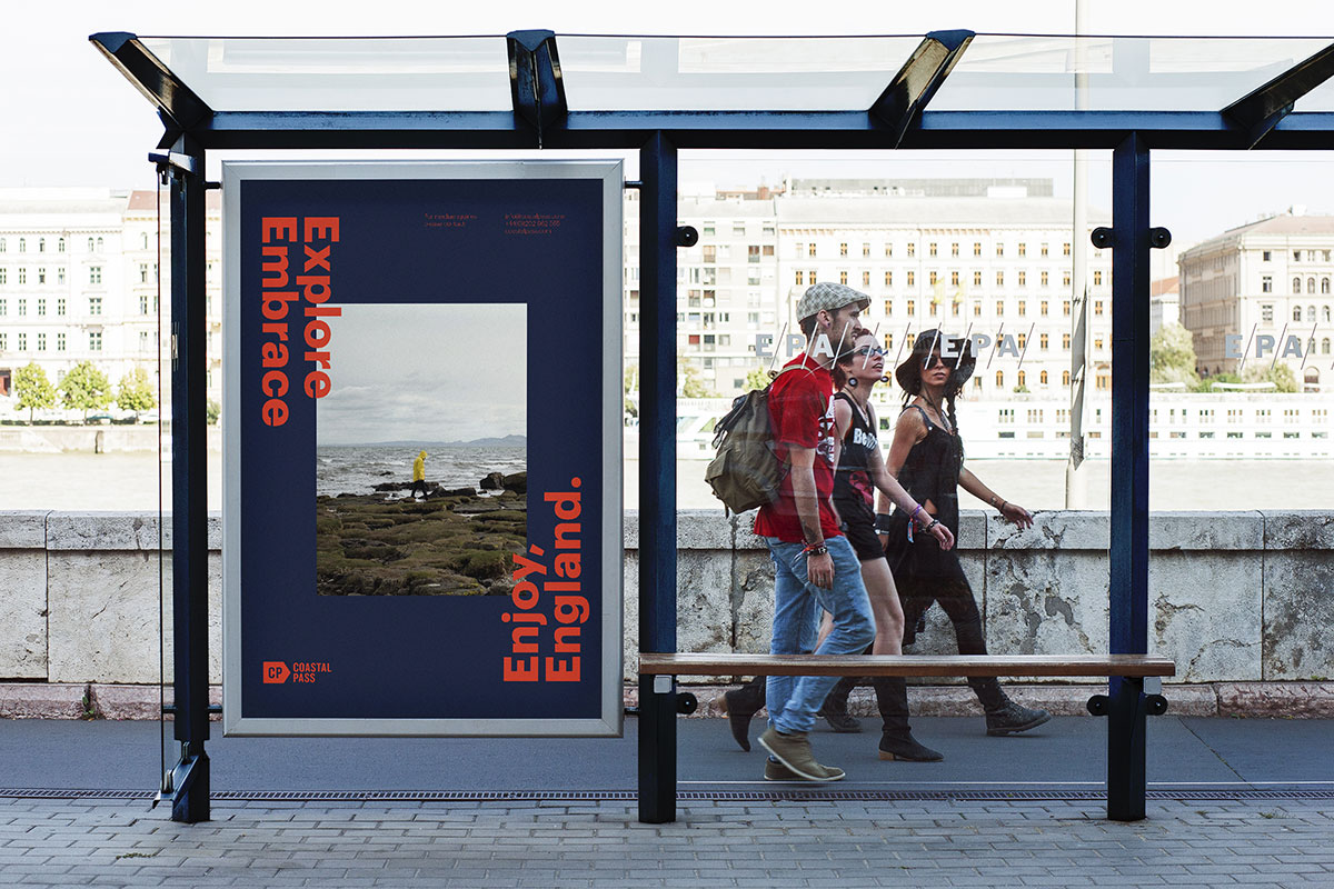


The colour palette is typically British inspired, with a nod to the inherent nautical context of the brand. Subtle adjustments to the hue of the red and the blue were also applied to achieve a European sensibility that would resonate with visitors from the Netherlands.

Mega elsewhere on Identity Designed: St Giles House.
See more from Mega.

Comments
I’m tempted to call this strong and stable but will use fresh and solid instead. I like everything except the posters and banners which I feel lack the freshness of the rest. The posters in particular with an image set in I’ve seen many times for concerts and exhibitions. The cursor for the vertical scrolling list as a metaphor for choice is fantastic.
Pretty much what I came to say. Looks like someone went to Dribble or Pinterest or something and said, “Yeah, that will work.” I’m no web guru, but I can’t help but think that the website is a bit templatey. The animations, the logo itself – they say the right things. The standardized impression the type gives is also the right message. But then the posters and environmentals go from basic to just inappropriate. The photography is too trendy. The unnecessary thick color borders… You could make the case for the two-toned (top and bottom) text only poster as a part of something, but it needs a white or something to offset the red and blue. Really disappointing overall, the more I think about it.
Awesome idea and lovely design! Also, I love this blog <3
Fantastic work!
I really like the posters and banners.
Simple and clear.