Since it was founded in 1987, Conservation International has been one of the most influential environmental groups in the world, successfully convincing governments, corporations, and the public at large to help save “hot spots” of threatened biodiversity around the globe, in the process protecting half a billion acres of wilderness. However, with the planet’s extinction rate estimated at 30% to 50% in this century, the group realized that basing their appeal to the world on protecting the environment, as an end in itself, has proven to be not enough.
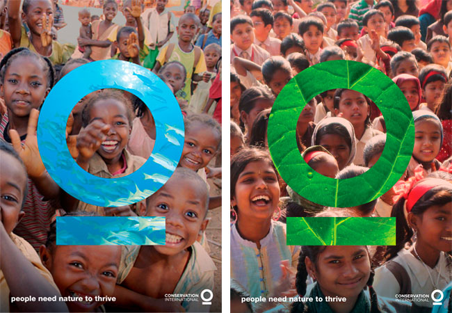
To confront this reality, Conservation International is fundamentally redefining itself as an organization that protects nature for the well-being of humanity, basing their appeal to save the environment on the idea that humanity needs nature to survive.
With a monumental shift in strategy at hand that augurs for a seismic change in the environmental movement as a whole, Conservation International’s old mark — an illustration of pristine wildlife (see below) — no longer communicated its identity, or its mission. So the group came to us to create a symbol that matches its new message.
 Old mark (above left) and new (right)
Principal partner Sagi Haviv’s solution — a blue circle underlined in green — symbolizes our blue planet, emphasized, supported, and sustained. The mark can also be seen as a unique human form. As a result, the new mark works both as a powerful brand signal for Conservation International, and a critical new mission message.
The new symbol for Conservation International is an instance in logo design where the power is truly embedded in the simplicity. Yet it is expressive enough to help the organization redefine itself, and therefore has the potential to become a true international icon. It was a perfect fit.
Conservation International will begin implementing its new identity in Fall of 2010.


More from Chermayeff & Geismar & Haviv.



Comments
Clean and simple !
Obviously speaking the ‘Conservation’ story- message conveyed very nicely :)
Beautiful,
Expressing the core message while stripping away any surplus. Conservation in name and form.
The mark is right with my ideals, but man am I tired of seeing Gotham…
Also, reminds me of OmmWriter http://www.ommwriter.com/ (two times in one day; the first was Information Architect’s new Writer for iPad app) but with that photo-fill trend from 2009 going on.
Beautiful and well thought out. The logo has a very strong meaning and gets the message across. The posters are simple but yet powerful in many ways! Great job!
What a transformation from the older logo.
@ David Boni – thats definitely a case of “when logos look alike”
Immediately reminded me of the closer-to-home Great Lake Taupo identity: http://www.greatlaketaupo.com/
I think as an idea it’s nice—striking, simple and bold, but it’s been done before.
Typographic Design. Love it!
Love it. Very nice ads/posters. Simple, but flexible.
I think any logo this simple in design is going to end up looking like something else. I just wish designers would stop putting photos inside their logos.
I’m not a fan of this, it’s very corporate and what are the posters about (I doubt they are real posters, just examples of how the logo may be used as part of the presentation to sell it to the client).
Why can’t designers use simple language to describe a logo or symbol instead of waffle like “…an instance in logo design where the power is truly embedded in the simplicity. Yet it is expressive enough to help the organization redefine itself, and therefore has the potential to become a true international icon. It was a perfect fit.”
I’d be more interested to hear the brief or the problem before seeing the solution.
Brilliant. How for the love of God did these guys manage to sell such a simple, iconic solution to the client?? Please teach me!
Apparently it took them 6 months. https://youtu.be/Fz-XGd8EX3U
I think this is high concept and oversimplified execution.
Perhaps it’s just me, but the meaning of the logo didn’t come through on first glance; which I believe is vital. This comes through subtle identifiers that help people see that this circle is indeed the planet. Yet in this design, the green line (while lofty in meaning) throws off the perception that the circle could be a planet. What do these two shapes, put together, represent in the real world?
**warning: this is a diatribe. a spewing of my stream of thought(s) on logos, iconography and the epidemic of well executed concepts lacking meaning and endurability. yep, self serving and self-indulgent. Hey, it’s the interwebs. flame me!**
I think Conservation International (bad name to begin with) cannot afford to just jump into the over-simplified, vague logo treatment, especially when the execution has very little, if any relation to the essence of the company.
For my 2¢, too vague and a missed target in lofty conceptual design.
Geez, we all have opinions – that’s why “crowdsourcing” is completely inappropriate and ineffective for the design process.
It isn’t often that a logo translates successfully to an icon only execution. i can only think of a handful, and those took decades of building equity through constant awareness promotion efforts. iconic (no pun intended) brands don’t have the freedom to do this simply because of their decades of existence, there must be some element of cultural affinity within their “fanbase.” to me, their [sic] brand must also support, conceptually, the idea of an archetypal visual message. Nike did it, but Nike could do it (and just do it, too) because their swoosh was arguably ubiquitous- and archetypal (iconic, transcending symbolism and secularism) in terms of recognition, and their audience would likely identify with, and almost certainly expect nothing less from Nike; a forward thinking brand, whose essence evokes innovation. i guess i am saying this move by Nike played directly into what the brand stood for ” simplicity, assertiveness, individualism and forward thinking,” i am speculating here. in the world of logos, ubiquity will only serve well with an archetypal icon. not a symbol
Apple’s essence evokes simplicity, subtle and sexy, with a tip of the hat to rebellion – the bite taken out fo the apple, the original sin, the gain of knowledge. but oddly, I tend to not see the apple any longer, or its missing bite. a transformation has occurred, at least in my mind. A transformation that money cannot buy. A transformation to archetype. I think it is safe to say there exists a bit of psychology to be reckoned with here.
If you back off from the mark enough, and try to see it for what it is, and separate yourself from the actual brand and its meaning. Its a damned apple with a bite out of it. Yep, you can assert quite a bit of symbolism etc, to me, it is this exact micro-context that exemplifies the value of a brand’s logo and how important all of the things that are NOT the logo, and the extremely critical role they play that completely overshadow the logo in terms of essence.
I like to think there must almost always be some degree of rebellion as a component of a brand’s essence to successfully pull off a symbol only logo. In doing so, in and of itself, a rebellious move. I suppose another instance that doing this can work, is an overt essence of austerity. and even then requires lengthy brand equity building that could take decades. Still and then, it is a risky move.
A symbol doesn’t fare well as a logo, as it is almost always overly-conventional and arguably marginal and mediocre. There has to be a twist. An ironic or clever subtext that underscores the story. This is where the rubber hits the road in my opinion, semeiotics. Icon vs symbol.
In the end, I believe a logo, icon or mark should at the very least have some sort of archetypical meaning. Even in the event decades of awareness building has taken place, this would be a valuable facet to take into consideration during the process of evaluating the pros and cons of icon-only logo.
In the case of Conservation International, there really is no symbolic meaning, beyond a circle with a horizontal line below, in this logo design, thus resulting in ambiguity. You might enjoy a slight degree of success, for a short time, by stylizing the treatment and context to create a hip and culturally aligned vibe. Eventually that will wear thin, the logo being abandoned by cultural transformation. A deadly fate for any brand.
Of course, there are the times when a really pretty, cool logo design works too. :)
Hell, I don’t know what I am talking about. I am just a wanna-be Landor staff member.
Do you work at Landor?
I really don’t know what to say about this apart from it seems like a rip off from the design agency Purpose based in London.
The branding was for a pub called ‘The Armoury’, it’s a great piece of work and is completely appropriate. Is this? looking at the nature of the subject?
It can be found here.
http://www.purpose.co.uk
The Armoury identity
Oups. Same things ?
http://www.logodesignlove.com/the-armoury
@TheNoone and mr.lecerf
I Believe this was done before The Amoury, so your comments about pretty much void i’m afraid, someone has to stick up for the work, good or bad
Hmm. @Chris: upon further research, it appears as though these logos were devoloped almost concurrently. I find this a bit curious. The Armoury logo, developed by Purpose UK and first announced on their site 08-06-2010, shows a type treatment combined with the same geometric elements -circle and horiz bar – in their logo. The Conservation International mark, the subject of this blog post, appears to feature the same exact circle and bar elements found in the logo developed by Purpose UK for The Armoury.
Is it possible that this happened entirely as unaware coincidence? At what seems to be the same point in time? If this were a wager opportunity, I might bet against this as pure coincidence. But wait, Purpose UK was simply using this as an integrated element for a stylized type treatment. Perhaps more about execution of a broader concept. Not a particulary novel treatment actually. In my mind there lies support of a disconnect as opposed to the suggested connection. (I did a logo in 1991 that featured this exact treatment for the O character).
Sagi Haviv of Chermayeff & Geismar designed the Conservation International logo in 2010 according to an interview on LogoDesignLove.com (which links to this page). On their blog, the new identity was announced September 2010.
In defense of what _could_ be argued to be coincidence, the weight of the lines for both versions are different, however, the “Armoury” version required a weight that matched the weight of the font used the type treatment, lest the result lack proper execution entirely.
So, I am back to scratching my head wondering what Sagi was smoking when he decided to pitch his concept. And moreover, what in the hell was the decision-maker at CI thinking when they approved this lackluster concept? And how much did they get paid? Uggghhhh!
Maybe Sagi would take a moment and share his insight?
The old logo was pretty bad, but the new logo is so generic it doesn’t convey anything at all. All the artspeak in the world can’t save it from its essential blandness.
International symbol for toilet. “Saving the planet one flush at a time?”