DeviantArt, the world’s largest online social network for art, approached Moving Brands to undertake a massive rebranding, as well as the design of a revolutionary new app.
An internet institution, DeviantArt had grown from a niche platform for sharing original Winamp skins to a digital art juggernaut with 32 million registered members, making it one of the largest social media sites in the world. Moving Brands was engaged to support the drive for new partnerships and aggressive goals for growth, working with senior leaders on branding, experience design and communications.
“We’ve always had a strong community and sense of purpose. Moving Brands collaborated with us to create an amazing new mobile experience that elevates our art, and a brand that articulates the story that I’ve been trying to tell the world for years.”
— Angelo Sotira, CEO
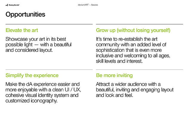
DeviantArt’s strength comes from it’s phenomenally large and loyal user base. They consider themselves a community, not a business, united in love and support of art and artists. In partnering with DeviantArt to redefine their core beliefs to enable growth, we were ever-mindful of their relationship to their community and the impact of changes to the brand and experience.
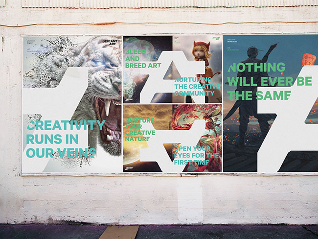
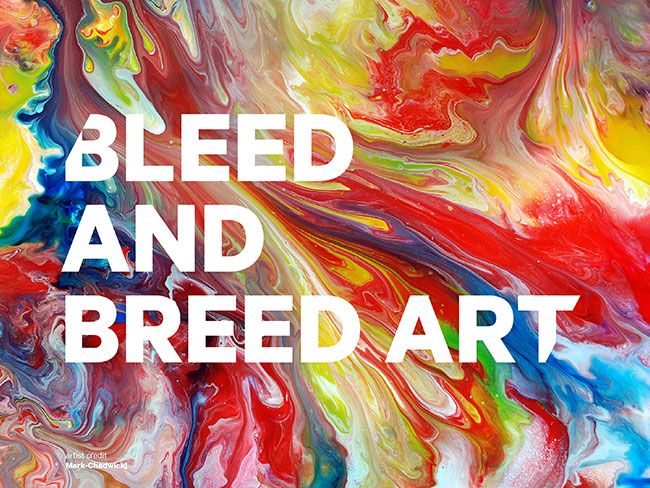
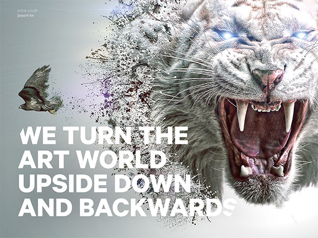
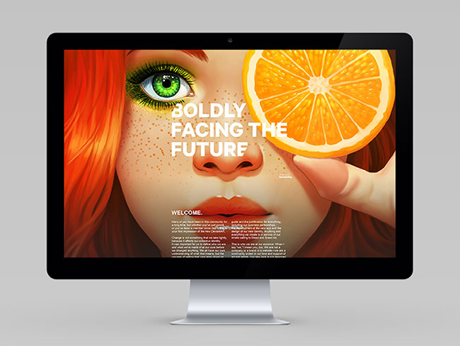
To guide these changes we defined and articulated their core story — “Bleed and Breed Art.” This is a bold promise and challenge from the world’s largest collective of digital art and artists to nurture creativity and spread art throughout the world.
That single declarative statement drives every brand initiative. From vetting potential business and sponsorship opportunities to launching a new app and a refreshed web experience, the criteria for judgment is always “will it bleed and breed art?”
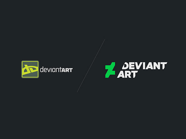
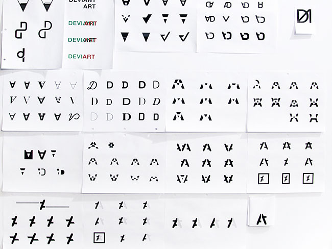
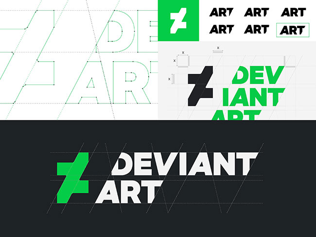
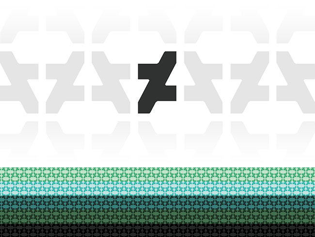
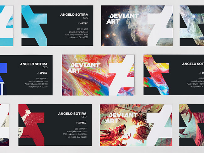
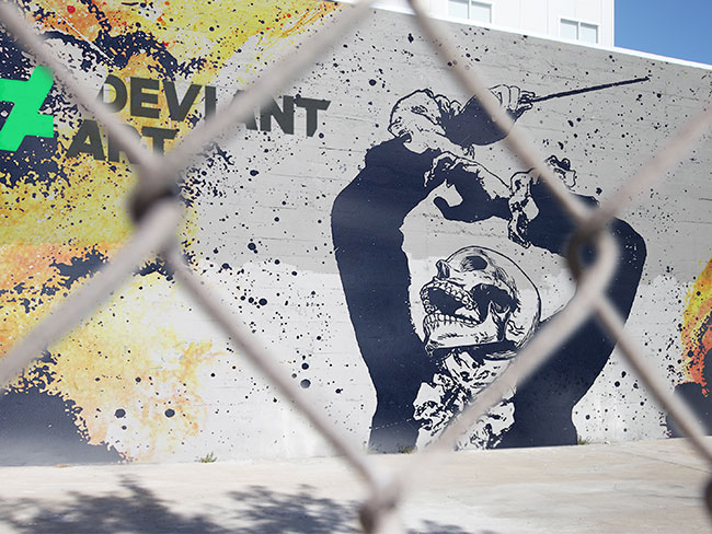
The logo is a careful evolution of their existing mark and a literal representation of their desire to turn the art world upside down. This is further articulated with a unique brand pattern made from the symbol that reveals both the right side up and upside down “A.”
The identity system allows the characteristics of the DeviantArt community to shine — a kindred sense of family and belonging, and the magnetism of a truly addictive art experience.
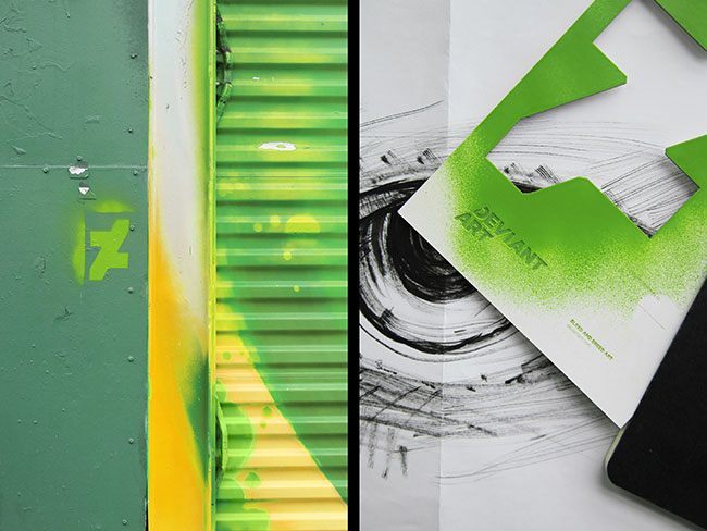
Angles within the system are derived from the 62° angle of the symbol, including brand typography and a fully customized iconography set for the website and the mobile app. Symbol crops were used to create containers for content and communications.
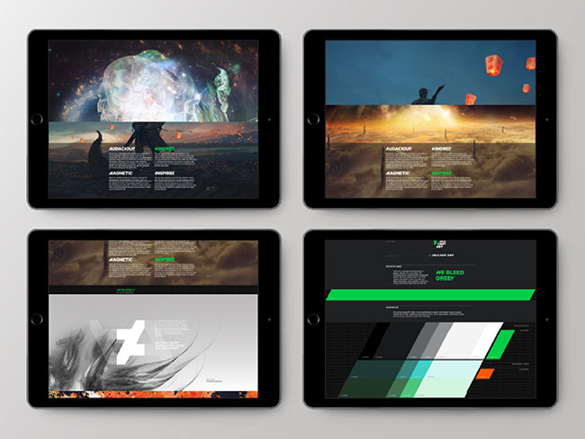
The brand’s color palette was evolved to present art in its best light. The hero DeviantArt Green was made more vibrant but used sparingly for effect and highlighting, while carefully selected dark neutral grays are used pervasively to showcase art. Color choices were made in tandem with the app development to be optimized for the mobile UI.
The individual elements of the identity system are further detailed, and available to download, on a launch microsite co-created with Moving Brands.


DeviantArt launched their new brand on December 4th with a microsite and films created by Moving Brands. However, the best is yet to come, with the new DeviantArt app (available on both iOS and Android) launching 10th December.
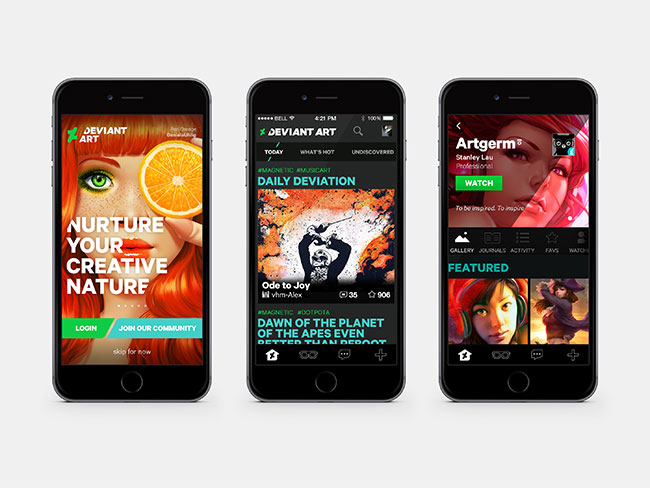
DeviantArt is yet to enter into the app world; with more of its users accessing the site from mobile devices and eager for a suitable platform, the stage is set and the audience primed for a revolutionary new mobile experience.
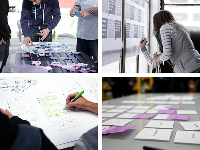
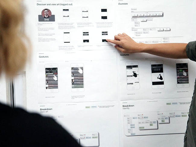
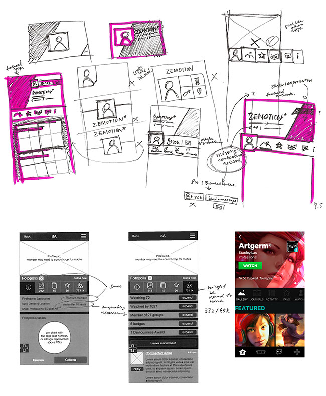
Design of the app started with a comprehensive mapping of personas and the creation of its architecture, which ultimately guided the app’s features and functionality. Purposefully designed in tandem with the rebrand, we set the foundation of the user experience and UI with wireframes and motion studies that applied the look and feel of the brand system into the behaviors of the mobile experience.
Throughout the engagement, we’ve elevated the art in every possible application — from the app, to the identity system, to brand communications — so designing for artists always comes from artists. It is the perfect articulation of Bleed and Breed Art, right down to ensuring that all artwork used in brand communications is credited back to the artist.
With the app launch still to come this month, stay tuned as we capture the response.

The DeviantArt microsite.
Moving Brands elsewhere on Identity Designed: Cambridge Design Partnership, Watermark.
More work on the Moving Brands website. Follow the team on Twitter.
Comments
This must have been a difficult job for Moving Brands. Having read the description here I imagined DA to be something like Dribble or Behance but it feels quite different. Users of DA voice strong negative feedback. Before commenting here I would suggest to take a look at the site.
Interesting logotype approach and application, but the symbol just doesn’t work for me.
I really like the approach and the mocked up application the logo works. However, I’ve just been over to the DeviantArt site and in reality, it doesn’t look as great as these sleek mockups. I would imagine a new DeviantArt site won’t be too far away. It looks very odd with the new logo in place and it doesn’t compliment their new brand identity at all.
Immediately thought of AGDA
http://www.agda.com.au
These type of identities get fabricated faster than dubstep tracks. The reasoning behind cutting the corners feels too superficial and in my opinion it becomes a tiresome text effect.
The idea behind the “A” is strongly inspired by the typeface Replica from Lineto and they could easily have used that as a logotype. I also don’t get why the a in “ART” is not cut in the lower left corner when the “A” in the logo is. And why suddenly cut the lower left corner of the A in the logo when the identity is build around cutting upper left and lower right corner?
The logotype looks really interesting, but the application in their website looks very out of place. To be honest, I used to visit DeviantArt some 10 years ago, and it doesn’t seem much different now.
So when is their website going to look like it’s not stuck in the 90s and going to give my computer a virus? Why spend so much time on rebranding if your website is not going to change?
I like the logo, and think it’s the best choice from the ones shown above, although I also like the triangles as I’m a sucker for geometric design. I think they could have gone even more abstract for a client like this but, as I said, I like the logo.
The text is a different matter. By itself, the typeface is fine and matches the new bold approach, but I’m with Frederik on the slashed off corners – I just don’t see the point. When Deviant Art is broken up (as in the Mickey Mouse thing picture) it looks okay, but in all the other applications I don’t think it adds anything. (Great website and work, by the way, Frederik.)
Having said all that, it’s a vast improvement over the previous logo.
Have to agree with what most people have said here. It’s a strong concept and I think the new logo works well (although I’m not too sure about the sliced corners, think they could have pushed that a bit further).
But, and it’s a big but, it’s going to take a huge leap to get the site itself from where it is now to where the new identity wants it to be. Can they pull it off? I really hope so!
I agree with everyone here in that the mark is decent, but the sliced letters aren’t working. For some letters like the “D” the slice cuts off right at the counter, turning a nice looking letterform into an awkward mess.
Some people are criticizing the rebranding of DeviantArt, but I think it is a smart move. The logo is good, complying the latest trends. The new type is stylish, which I think will go well with the overall theme of deviantArt. The main problem is the website though. They rebranded everything, except their website which is pretty much still the same. They should have brought something new to UI, make some changes that would enhance the experience of users.
I have been a deviant art loyal deviant for last ten years. But I cannot relate to the new identity. The approach may be interesting but it is an art community with deviant forms of art. For me this graphic is too pointy, completely ignoring the roundness, curves of art forms.
I am not really that good in art, but ignoring the norms of art is what they mean with “deviant” art. So, I think ignoring the usual roundness and curves of art forms makes sense here.
The logo style looks interesting, and it’s very suitable as tattoo graphics, but I personally don’t like this logo.
I’m really inspired by the amount of work Moving Brands put in this, and the concept is also very artistic & audacious, but it just doesn’t feel right in the overall execution. DeviantArt may have a rebranding soon.