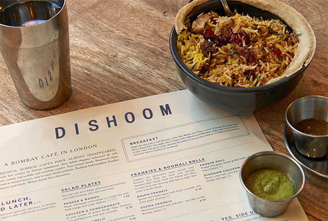
Dishoom take inspiration from Bombay’s beautiful old Irani cafés. We’ve been working with them over the last two years to evolve their visual identity and help with anything print based.
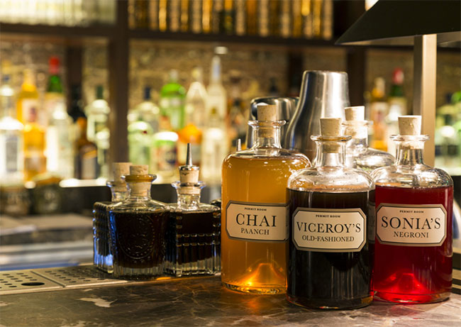
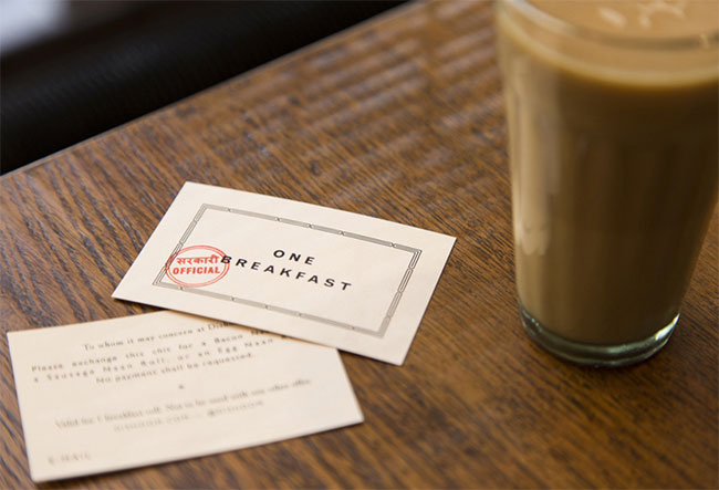
Our most recent project is working with them to launch a new restaurant in King’s Cross — the Dishoom KX Godown. We worked on their new logo, all their menus, exterior signage, cocktail packaging and a number of other printed pieces.
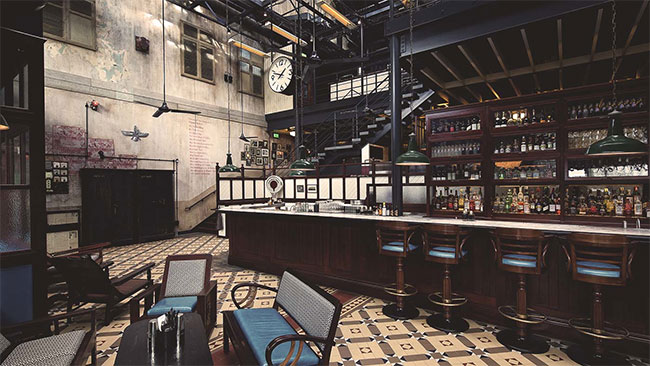
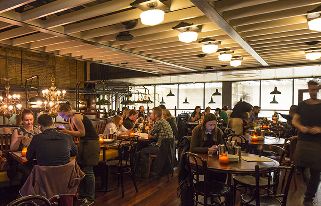
Each Dishoom has its own back story, and this one is inspired by its location — an old railway transit shed. Dishoom imagined a young Irani in 1928, who sees the opportunity to start selling chai to railway workers, and slowly builds a ramshackle Irani restaurant. Dishoom King’s Cross is this restaurant decades later, now established, even something of an institution, and still serving the local people, railwaymen and office workers of the local area. The name itself — ‘Godown’ — is an old Indian word for warehouse.

Inspiration for the look and feel came from old Indian train paraphernalia mixed in with the vintage Bombay style that runs right through all their restaurants. We worked with Kalapi Gajjar-Bordawekar, an expert in Indian typefaces, to make sure our style felt authentic.
When we started working with Dishoom we made a decision to move away from their existing logo, instead preferring to take each piece of collateral individually, and write ‘Dishoom’ however felt best for each design. This loose approach felt much more in keeping with Dishoom’s ethos than a formal brand system.

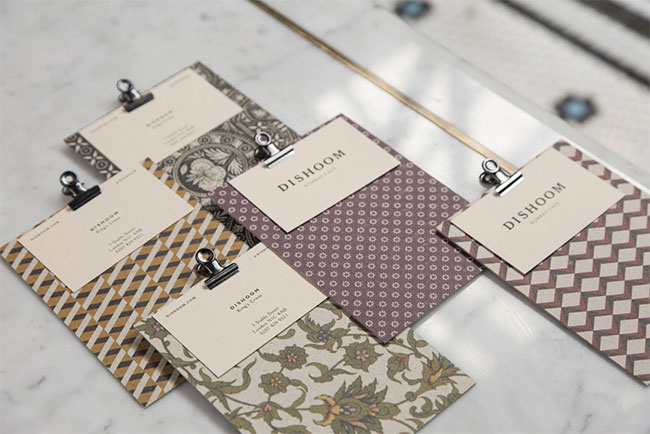
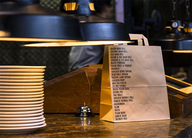
There are a couple of typefaces we regularly use — Gill Sans, and Cheltenham — which people have probably started to associate with the brand, but even when using these we have the freedom to track them differently, use different cuts, add shadows, etc. And sometimes we change it because it feels right for the piece, for example all the new takeaway collateral which uses various cuts of Berthold Akzidenz-Grotesk.
When we started working on this newest restaurant we had a rethink about how collateral should work across each Dishoom establishment. Some pieces — such as the bar menus — were already different for Shoreditch and Covent Garden, but the main menu was the same. With their third restaurant opening, we decided that the distinct feel of each site should be subtlety reflected on their main menu, by changing the typeface of the masthead. We are now using Gill Sans, Clearface, and Sim Hei for Covent Garden, Shoreditch and King’s Cross respectively.
Conversely to all this, we decided to create a logo for the KX Godown, but one to be used very sparingly. The main use for this was the sign in the entrance, but it also appears on a couple of Godown specific items, such as the Permit Room menu. The idea was to reinforce the institutional feel of the Godown with a strong mark, but again not creating that something that has to be used strictly across the board.

Filling in the gaps:
- & Smith designed a new logo, exterior signage, posters for the interiors, new bar and juice menus, revised main menu, invites and bottled cocktail labels.
- The restaurant is the newest addition to King’s Cross development.
- It’s the third permanent Dishoom restaurant, alongside Covent Garden & Shoreditch.
- It’s the largest yet at 9000 sq ft, with 250 seated in the restaurant and 92 in the bar.
- Exclusive to Dishoom King’s Cross — underground bar the Permit Room; award-winning bottle or cask-aged cocktails; beer on tap from the London Fields Brewery, an all day juice bar, new lamb special Nalli Nihari (with or without lambs brains) and a chef’s table.
- Opened on 20th November 2014.


& Smith elsewhere on Identity Designed: Shrewsbury.


Comments
Oh my, this is so, so good!
I honestly don’t know where to start with which part of it I like the most – I love everything about it. It looks so simple, yet it’s so well thought out and detailed. On top of that, the food looks amazing.
Brilliant work by & Smith.
One of those jobs that makes me jealous!
We have loved every aspect of this design. What is more intriguing is to imagine that such an inspiring design has been worked out in a location outside India while we being in India have still not come up with something so stellar. Can your design services be availed in India? We are in the restaurant business and a leading brand in Indian food, and are now introducing a fun Indian brand much like Dishoom but for the Indian market. I’ll be happy to know if such an association is likely possible. Please do let us know. Thank you. Alok.