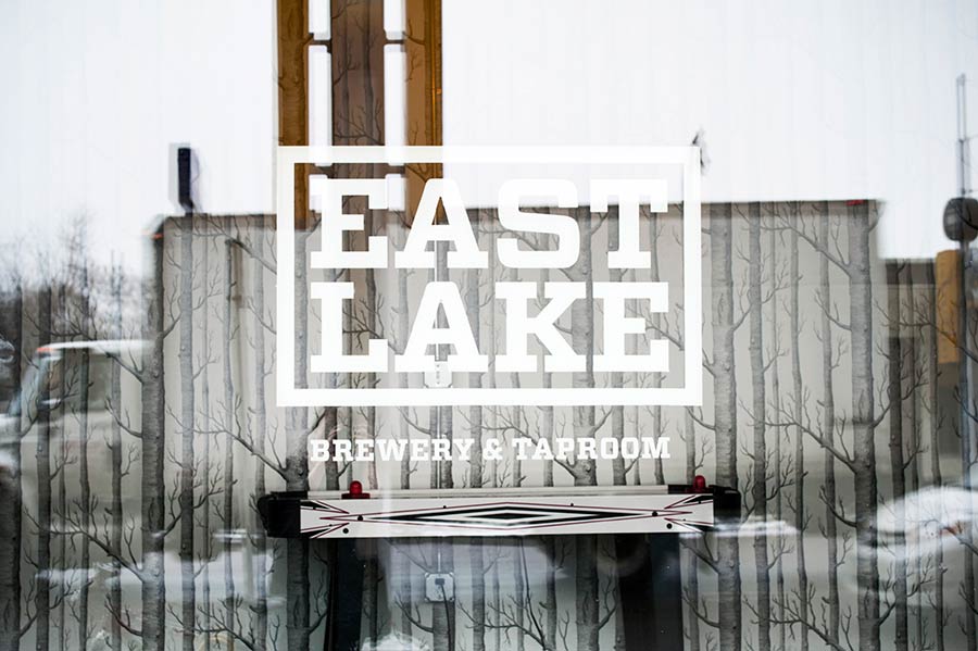
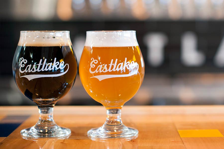
Ryan Pitman, a Minneapolis-based bus driver, had been brewing craft beer on his own for years. A dream came true when he came across the perfect space to create a brewery in the heart of Minneapolis, on East Lake Street. Ryan shared with us his intention to produce a wide and ever-evolving range of eclectic brews with unusual ingredients. Our intention became to supply the brand with an open identity that put an emphasis on uniqueness.

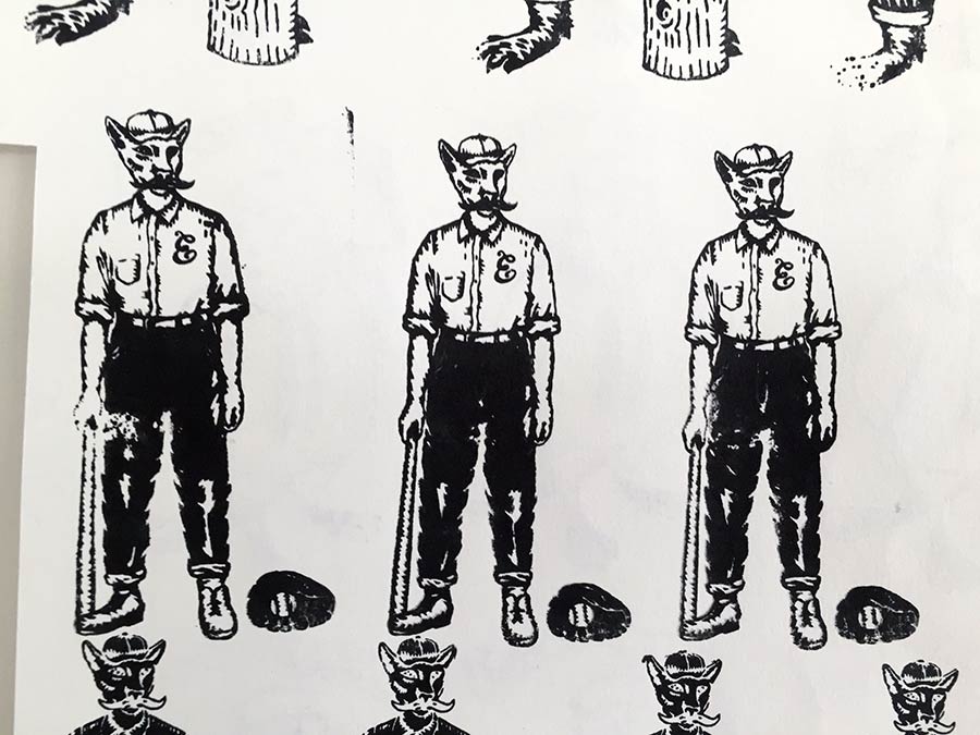
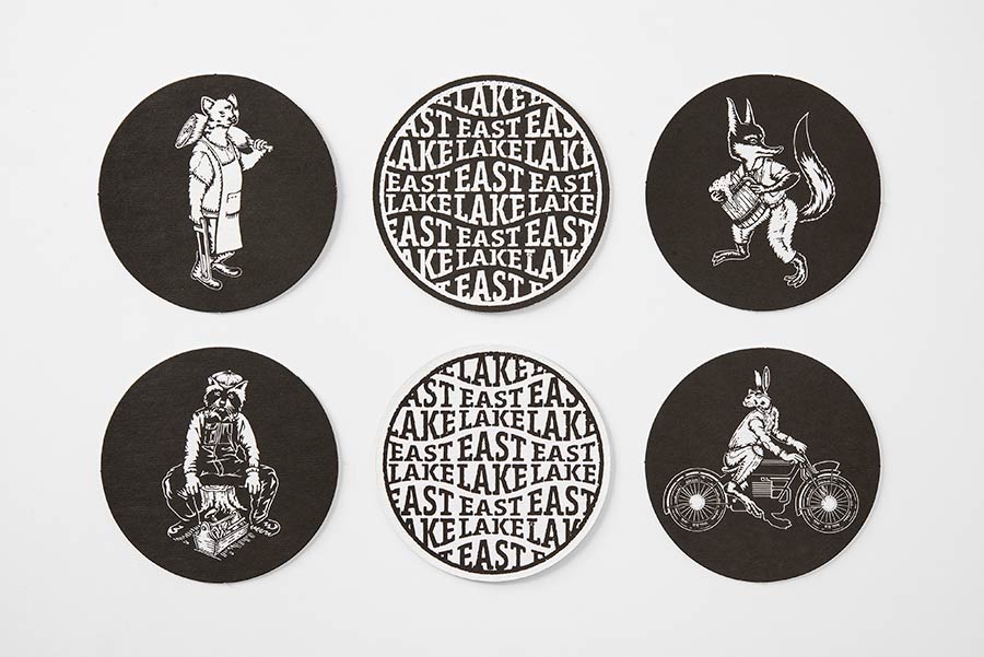
We soon took note of the rich cultural heritage of the Eastlake Brewery neighborhood. Ryan let us know that he believed his establishment would be frequented by a rotating cast of local characters, and because Eastlake is a small and local business, with success hinging on the quality of the customer experience over anything else, we decided it wasn’t so important to have overly strict and uniform communications, but better to come up with something memorable and fun. This inspired us to create a set of unique characters to represent the community as well as the eclectic brews.

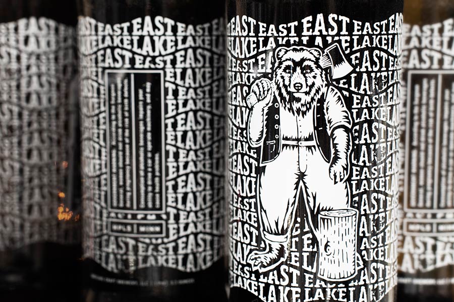
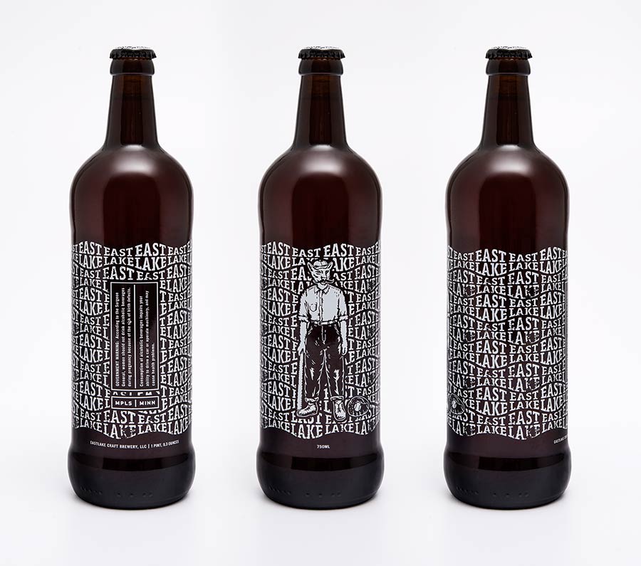
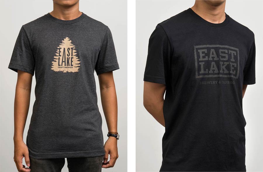
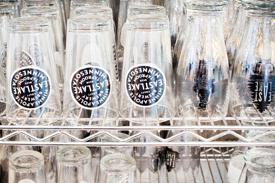
Along with these characters, we developed a range of logos that harken back to the olden days of both Minneapolis and Eastlake Avenue, as well as a set of graphic elements that tip a hat to the city of lakes.

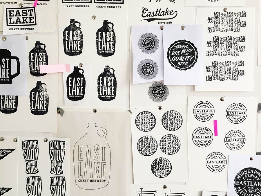
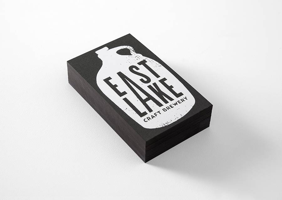
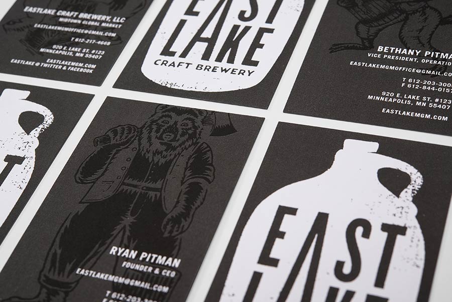
We wanted each logo to be unique and stand on its own. Some of them are completely custom, like the script, the wave pattern, and the Eastlake “E”. For others we used a typeface and modified it, like the block logo with the slab serif and the jug logo. With others, like the round logos, the typeface wasn’t modified at all.

But most importantly, the use of the stamps brings all of the logos together texturally, adding imperfections, distressing the line and distorting the shape of the letterforms.
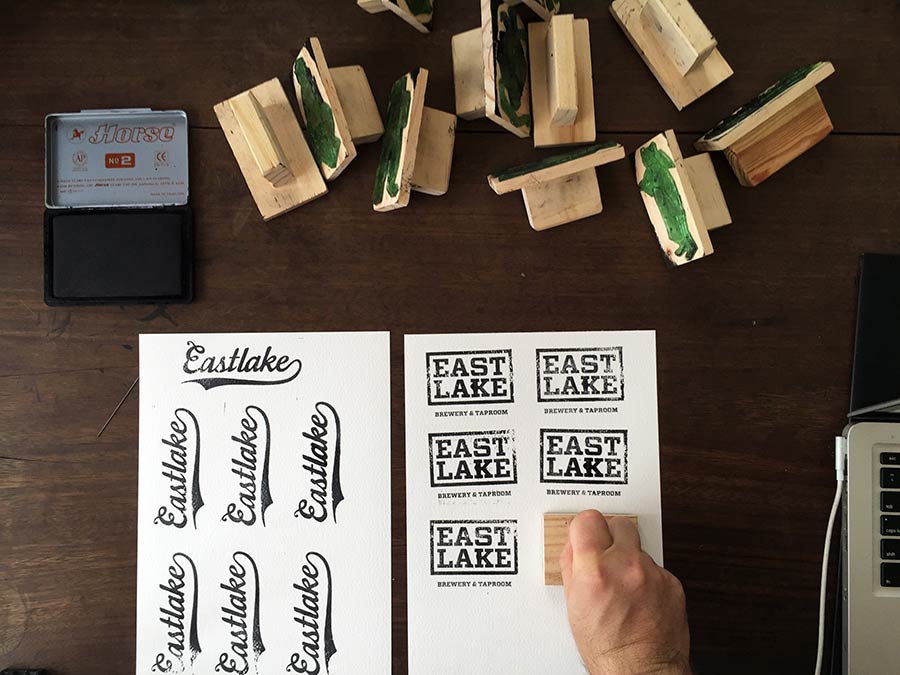
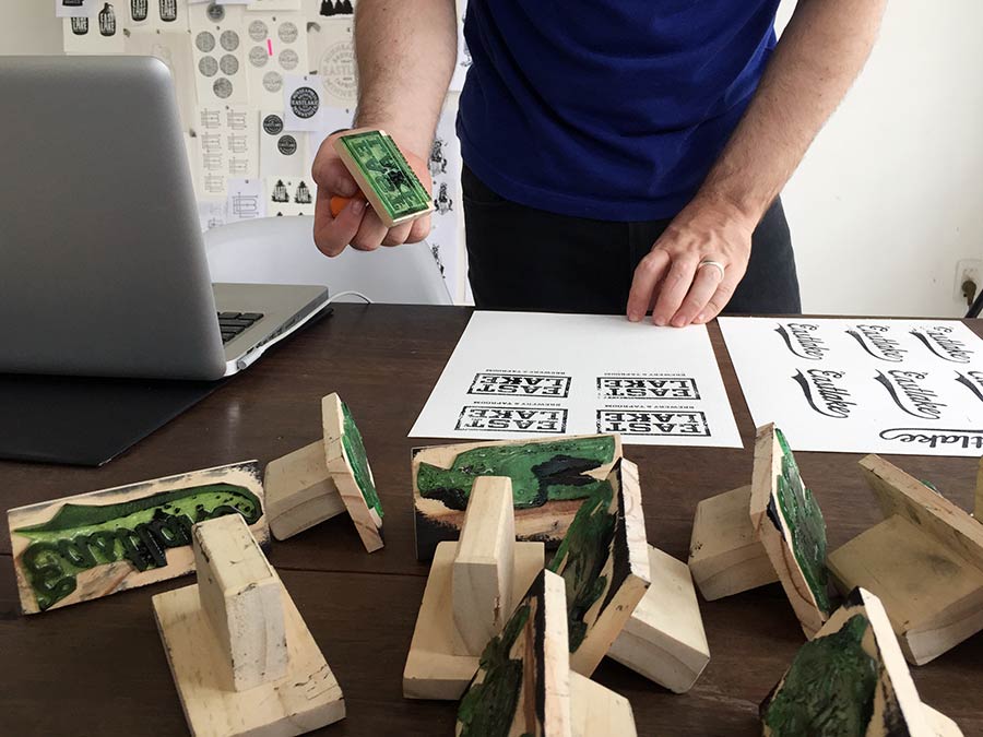
We had the stamps made on Stamp Street here in Saigon. In Vietnam every company from the largest to the smallest has a corporate stamp that they use for official documents.
Catering to this need you can find small stamp making shops, many of which operate on the same small street. Production methods are limited in Saigon when compared to more developed markets like the USA. But at the same time we can engage with local craftspeople to add a unique flavour to our projects.
We created over 50 stamps for the Eastlake project while testing and producing the logos and characters.


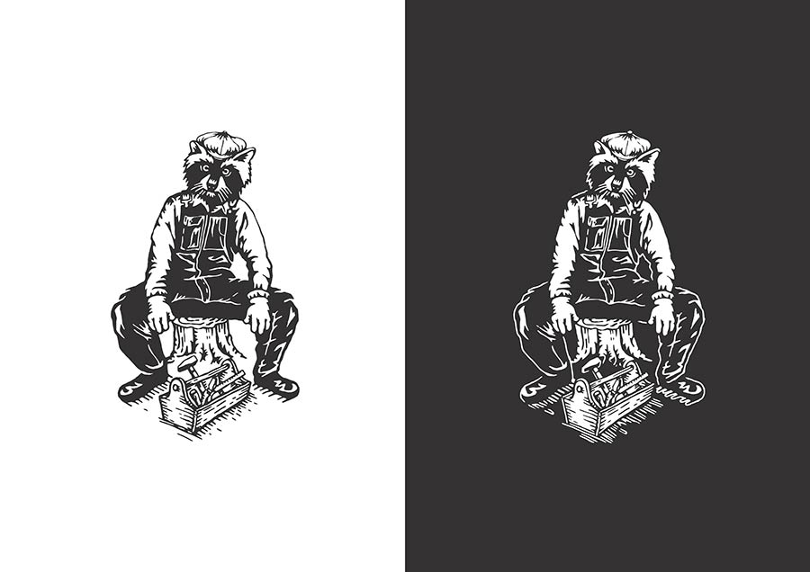
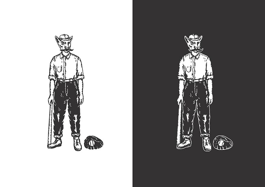
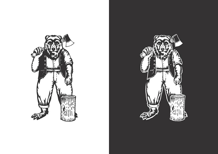

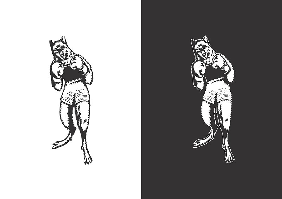

Our cast of working class characters, Minneapolis inspired logos, and unique graphic elements, personify and identify what is at the heart of the brand: finely crafted beers with great character, and the community who share them.


Studio photography: Wing Chan

Rice Creative elsewhere on Identity Designed: UNICEF ZEROawards.
View more identity work from Rice Creative on Behance.

Comments
Oh, man… this is solid. Love it!
I really like the ideas, rustic and earthy. You get a sense of the beer and it’s personality.
However… having multiple logos shouts, “We don’t know which idea we like so we’ll use them all.”
While all of the individual elements of this identity are great I agree that there are too many. It will become difficult to identify with the company if nothing is consistent. And while the characters are great the use of them on the bottle over the background pattern is extremely busy visually and it all just gets lost in each other. It seems like someone needed to step in and say ‘scale back’.
@Mark Thank you for the feedback. I understand your point. We made a choice to develop multiple logos instead of a single logo from the start as part of our brand strategy. We had a few reasons for choosing this direction, but most importantly we decided that the benefits of a single logo mark were fewer than the benefits of creating a memorable brand story with personality. Eastlake’s unique selling point is its diversity. Eastlake creates a diverse range of beers made with unusual ingredients and is housed in the Mid-town Global Market (a hub for diverse food options in Minneapolis) which is located in a multi-cultural neighborhood. The multiplicity of logos and characters are a direct response to this unique aspect of the brand.
I completely disagree about the ‘too many elements’ comments. I think that’s what makes it great. It’s a brewery, not a blue chip corporation. They can be playful and everything falls within the same visual look which makes it cohesive.
I agree with Joshua.
What I love about the brand identity most is how it makes you feel. The rough quality, vintage typography, and whimsical animals take you back to a different time when THINGS were make by hand. The THINGS weren’t perfect but they had spirit which made them perfect. ;)
This looks like it would have been Mark Twain’s favorite beer. The branding feels very honest.
This is amazing work. The way it was rolled out is stunning. Was it really necessary to spend time, money and resources on getting stamps made though? The texture is beautiful but can be recreated digitally.
Smokin Beaver! Make that reversed on to a black tee and I’d buy it! Very nice work.
I always admire designers that recognize and value the diversity of their communities. The use of the animal/human blends was brilliant. It is profoundly humanistic without isolating certain cultural groups from the beer community. Then to further this with the imperfections of the stamping process. There is nothing better than the quality that comes with analog processes. Wow. Love.