Escape the City are at the forefront of the movement towards a new world of work. 250,000 professionals have joined their community and they’re on a mission to help 1,000,000 others escape unfulfilling jobs and do work that matters. Inspired by these disruptive principles we created a unique ‘uncorporate’ identity – handmade and purposefully inconsistent but still modern, digital and ready to take on the world.
Background
Escape the City began in 2009 as an email list of interesting job opportunities for people looking for more fulfilling work. Six years on it’s grown into a 250,000-strong community and they’ve become a global authority on the future of work. As well as collating the “most exciting job opportunities in the world” they now run a range of community programmes and have huge ambitions to grow into a global brand.
Challenge
Escape is a purpose-driven brand with a proven track record and a huge community of committed advocates, but their branding was holding them back. To establish their position as a global authority and achieve their bold ambitions they needed to inject some fresh creativity into the brand and reassert their philosophy through all their communications.
Approach
Having spent time with the team in workshops and at their Tribes and Mondays events, it soon became clear that a standard corporate identity system wouldn’t do.
Our solution needed to reflect their firm anti-corporate principles, community vision, and DIY ethos. And because their brand is about action not perfection, it had to be practical, gettable and deliverable — the polar opposite of the precious, pretentious, and parody-worth rebrand projects we’ve all seen so many of.


Escape the City is a people-powered movement, not a profit-driven corporation. So we ripped up the corporate identity rulebook; choosing inconsistency, flexibility and freedom rather than enslaving ourselves to strict rules about grids, logo sizes or geometric consistency.


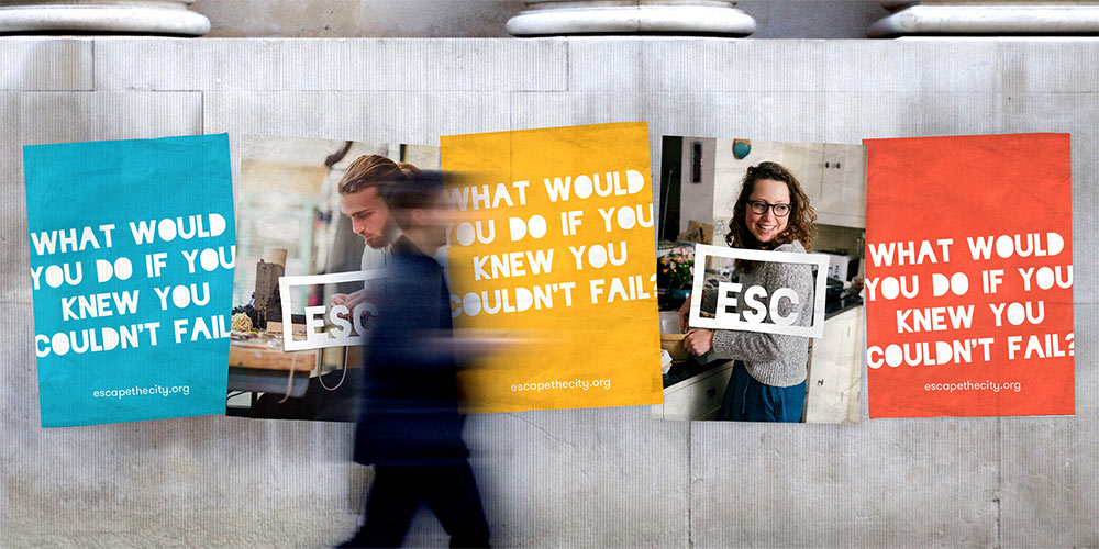
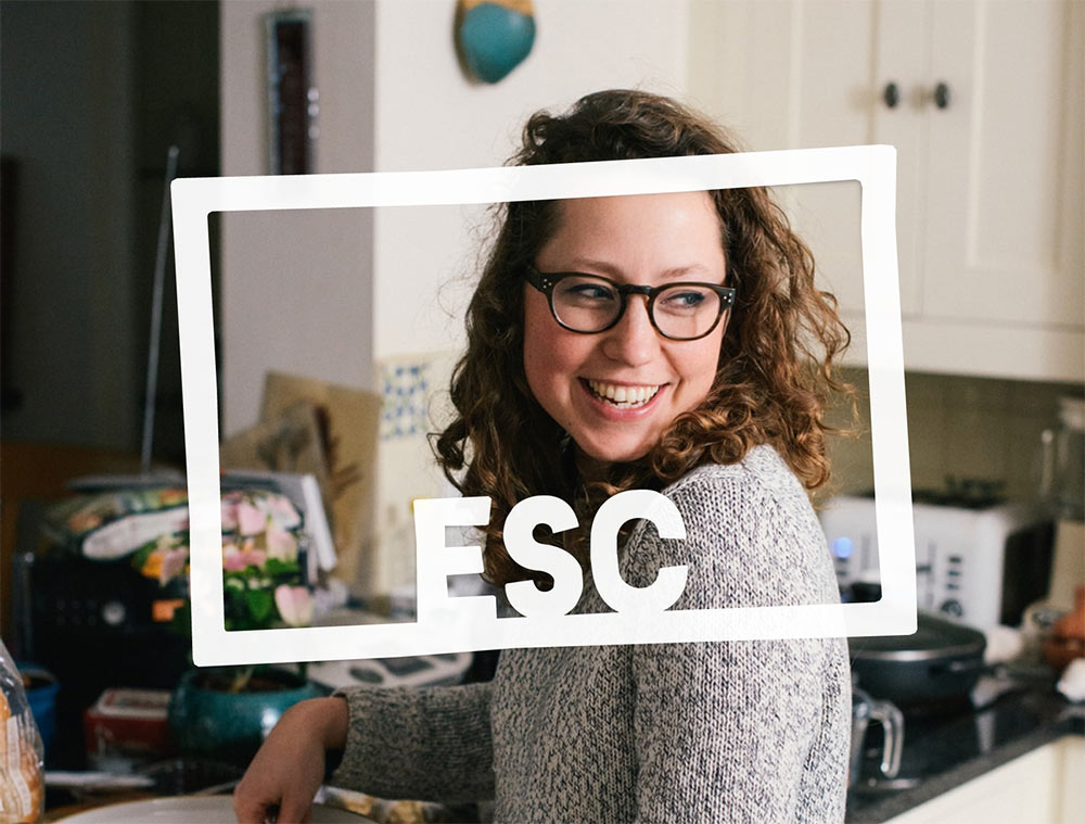
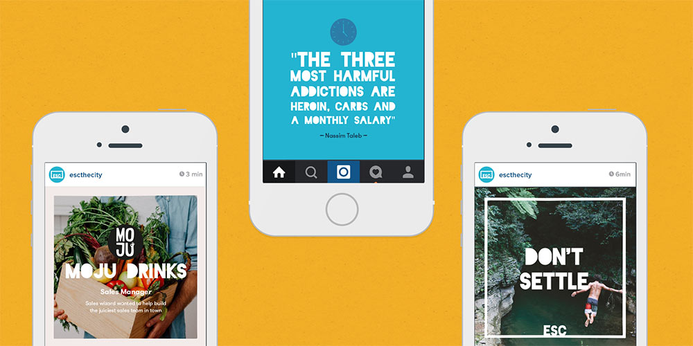
We kept their original ‘ESC key’ logo concept, but gave it a fresh look and an all-important twist. By outlining the key we’ve turned it into a frame — a flexible graphic device we can use to house the amazing stories in their community and focus on what people can escape to, not what they’re escaping from.

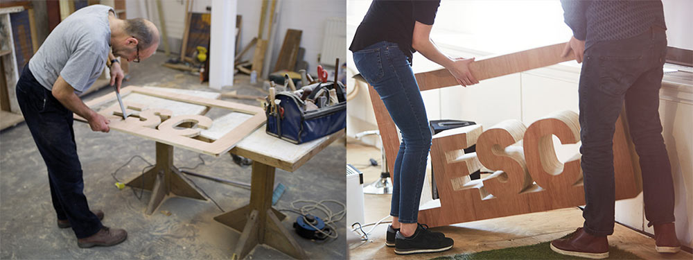
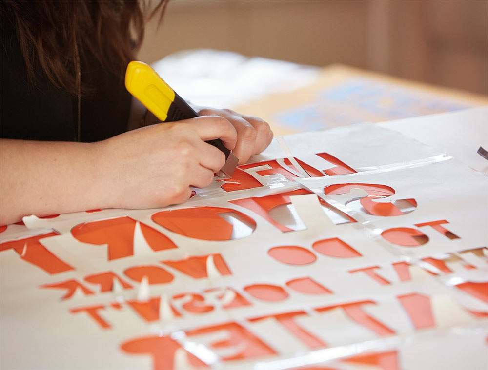
Inspired by the protest stencils of global grassroots movements, the whole visual identity is designed to be handmade. Keeping things unpolished, inconsistent and not too perfect reflects Escape’s experimental DIY ethos and empowers their global community to shape the direction of the brand.
Although DIY-inspired, our approach to the brand identity was always digital-first. We redesigned their core web experience, rolling out the new handmade graphic styling across the Escape the City site as well as simplifying complex job search functionality.
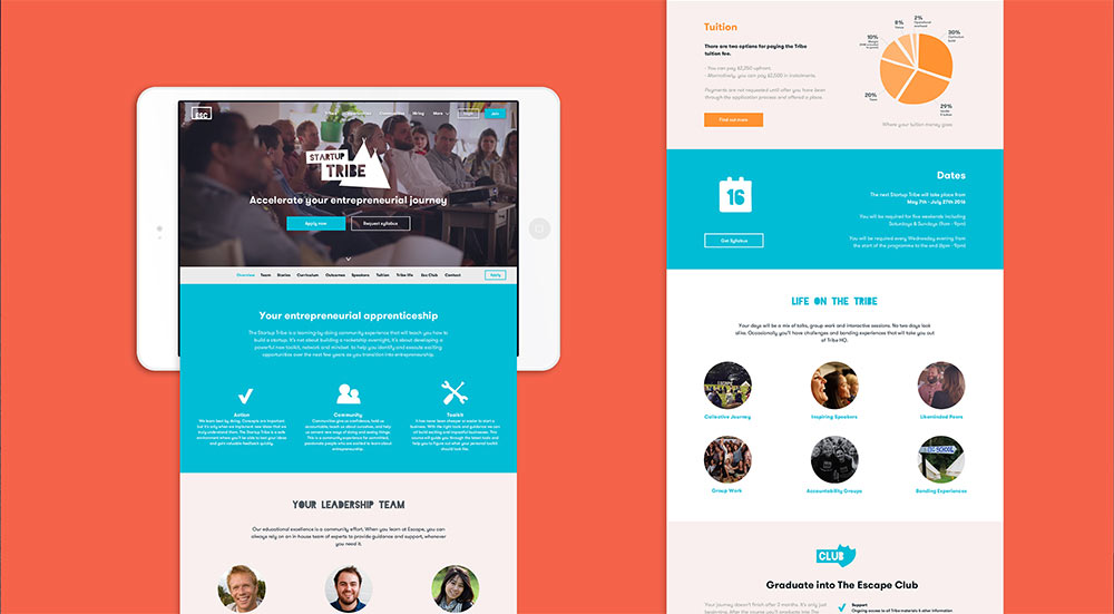

Escape the City started as a jobs board for ‘the most interesting jobs in the world’. But today they do so much more. Our new sub-branding system brings some much needed consistency to their product range, enabling them to promote their core Opportunities and Tribes products far more effectively.


View more identity work on the Article website. Follow the Article team on Twitter.


Comments
This was a great read! The case study is very interesting and I think that the logo and identity design is really good. However to me, “Escape the City” brings connotations of community work – maybe volunteering or working with charitable organisations and even travel-related opportunities. After visiting the website I realised that it was a recruitment site disguised by a great design and brand identity and really most jobs on there are in the city, like every typical recruitment website. I also visited the “About” page and found it hard to ascertain how and what “Escape the City” can really help me with in the few minutes that I had to read that page. What I got was a whole lot of graphical stats and copy that did not spell out how this organisation can really help me with my dream job or escape the city.
@Meena you’re right. I think “Escape the City” is meant to be metaphorical.
Like…
Escape the city and sit down for a minute. Sit under a tree. Rest your head. What’s the future going to bring when keep going on like this? Search your happiness and find it in a job you like, instead of whatever one brings in the money for a materialistic life. The money to compensate your oppressive daily life. So escape and move on.
But even then you’re probably right. Maybe instead of “Escape the City” they could have used “Pause the City” or “Escape the Routine”, because you don’t really want to get away from the city, and instead just make a change in your life.
A great job, but the ESC symbol is really strong, I can’t but help think they would have been better off calling it ESC or just ‘escape’.
Fantastic work! Just curious, whats the name of the font you are using?