
Nick Mercer, commercial director of Eurostar, says this rebrand sets to underpin significant change.
“After an amazing 16 years of providing the leading European international train service, we have committed to a £700m investment to radically improve and invent new services, products and their organisation as a whole. The organisation — once three companies spread over three countries — is now one London-based company and is more agile and speedily adaptive than ever before.
“With so much change — we needed a way to signal what’s new within the service — our new brand identity will signal these changes… so where you see the new look, you’ll experience our new thinking.”
Change is afoot at Eurostar and the new £700m investment is already taking effect.


Design is very much at the heart of the new thinking. Every customer experience is being deeply considered to ensure the traveller gets the very best out of their time on-board, on-line or on any part of the Eurostar experience.
Everything is designed to reflect Eurostar’s design-led ethos. One brand, many ideas — all beautifully designed to give people a better experience
A new fleet of state-of-the-art trains has been designed, with interiors created by Pininfarina to redefine what customers should expect from international train travel. A new faster website will speed up booking by at least 20% as well as allowing customers to more swiftly and easily create bespoke travel plans beyond the three core destinations of Paris, Brussels, and London. And the eco program “TreadLightly” will be improved and more deeply applied to the bedrock of all new design thinking ensuring Eurostar remains one of the most carbon efficient and ecologically sound ways of traveling.
Our approach to the re-brand was unusual in that it didn’t rely on one idea, but many ideas in many channels to create a more adaptive, flexible and useful brand identity. It was about creating symbols of change, not a change of symbol.
At SomeOne we’re quite well known for having said we don’t think logos do enough to help products, services and organisations differentiate, communicate and adapt in the modern world. So we created a multitude of ways Eurostar can create exiting experiences for their customers and staff, everything is adaptive, everything points towards Eurostar’s design-led point of view.
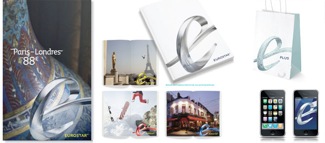
Some of the things included in this first burst of work:
- Brand values, strategy and tone of voice
- A three dimensional brand sculpture
- An extensive set of onboard online and off-line pictograms
- Signs and icons
- A signature bespoke typeface
- A new colour scheme
- New digital applications
- Animations
- Brochures, booklets, posters and packs
- On-board magazines, advertising
- Differentiation between new classes of service
- Newly-defined loyalty schemes
We’re working with Eurostar as the Brand Guardians managing the migration from old to new.
Clearer classes of service
Eurostar has three levels of service. Standard, Standard Premier, & Business Premier. The new names and branding for each of the services were created by SomeOne.
Each experience is very different, yet each service is very Eurostar. So it made sense for the new visual brand identity and Brand World to be applied across the three tiers, but so they remained easily differentiated for ease of use, each was given it’s own brand identity principles, colours, tone of voice, and imagery.
Eurostar had three different services when you booked a ticket.
You could travel “Business Premier” — which meant you could use the lounge, travel in the Business Premier class carriage (the best carriages) and get great food and drink onboard, at your seat, for one price. You could even check-in super quick which meant even less waiting time. The thing is, everyone just called it ‘First Class’.
You could get the regular service from what was called “Standard Class” — here you got great value travel and it’s the core of the Eurostar brand.
Then there was the ‘other one’ that was called ‘Leisure Select’. No one really understood what it was, how it differed from Standard, or “First” — but it was actually brilliant. You got to travel in the front section of the train, get good food on-board to your seat and receive a considerably better experience than traveling in “Standard Class.”
The problem was the offer wasn’t clear. The naming was confusing. There were three totally different visual brand identities that didn’t connect. Signage was confusing and often led to those with Leisure Select tickets trying to get through the fast-track check-in or booking desks when in fact the tickets were only valid to go through regular channels.
This confusion often led to disappointing customer experiences and made it hard for people to make the right choice when it came to buying tickets. It also made it very hard for the staff at Eurostar to describe the three offers and therefore tough to sell.
New Nonclamenture: We simplified things by just describing each class.
- Standard
- Standard Premier
- Business Premier
Then, using the adaptive sculpture, created three beautiful versions.
- One from brushed Steel
- One from bushed steel, placed next to gold
- One from gold


We then created specific photographic treatments for each tier.
This way each tier felt different, told it’s own unique story and was flexible enough to take on new ones. Most of all they felt united and firmly from Eurostar.
“You would be hard pressed to find someone who could really describe the three classes of service offered a year ago. Things had become confusing and we were not doing our offer justice with the branding. Now we have three clear points of view that elegantly connect to the Eurostar vision of travel. We’re delighted with the results.”
— Jean-Marc Barbaud, Eurostar
Elegant loyalty schemes
For frequent travelers, Eurostar has it’s own loyalty schemes, Carte Classique, Carte Blanche, and Eurostar Plus. Like air miles, for train travel — they reward repeat usage by either giving preferential treatment (like access to Business Premier lounges and fast-track channels) or by giving discounts on travel.
Carte Classique was the unsung entry-level loyalty scheme that sat under Carte Blanche which stood alone. They had a completely seperate look and feel and bore no relation to the Eurostar brand. The collateral was expensive to produce and communications were not clear about what members actually got in return for joining the scheme.
Eurostar Plus was widely misunderstood and needed to be reconsidered. It was so muti-faceted it was beginning to become fragmented before it had a chance to become established.
We looked at the issues, simplified the complexities and, using the adaptive sculpture, created three beautiful versions for three interlined visual brand identities.
We gave Carte Classique it’s own sculpture in a unique material. Blue Marble.
We gave Carte Blanche it’s own sculpture in a related material. White Marble.
We created a new tier — Noir… yet to be launched… but very special.
Each of these is united by a common material and differentiated by colour, imagery, and tone of voice.


This way each scheme felt different, told it’s own unique story, and was flexible enough to take on new ones. Most of all they felt united and firmly from Eurostar.
Eurostar Plus was a different offer. The idea we discovered behind Plus is that it can constantly surprises you with tasty little treats. It’s a holder for new ideas — like an egg — the scheme lets you hatch all sorts of clever little ideas to either treat your friends and family to a trip somewhere or just discover something new. So we chose to make a one-off. The adaptive sculpture was made from an egg shell — there’s even a little feather that softly indicates clever little savings.
“Loyalty schemes often use the same clichés — gold, silver & black — we were thrilled to see SomeOne creating something logical yet lateral with the materials and ideas they chose to apply to our Carte Classique, Carte Blanche & Eurostar Plus — it’s given each of the schemes it’s own opinion, it’s own look, and further differentiated us as an original voice in travel.”
— Elodie Delalleau, Eurostar
Signature typeface
We created a bespoke display typeface to help create a fully cohesive visual brand identity for Eurostar. This enables the brand to communicate to its audience without the need for traditional badging — simply by using the typeface, with its signature swash characters, communications can be branded by the application of the typeface.
The Eurostar brand sculpture contains a long flowing line that represents the idea of effortless travel. We used that curved line to create swash characters for a bespoke version of Fresco.


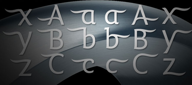
While the Eurostar branding uses all of the Fresco typographic family, Fresco Informal is the more playful part of the Fresco family that we employed for headline usage.
We created a bespoke headline cut for Regular, Bold & Italics that had swashes extending to the left. Then we did the same to allow swashes to flow out to the right. This way headlines can be branded simply by applying a swash character to the left & right of the sentence or word. There are swash characters for both upper and lowercase, as well as special characters and numerals.
“When we began the journey to create a new visual brand identity for Eurostar, I didn’t consider a bespoke typeface to be part of the end result. But now we have it, I can’t imagine not having one. It’s incredibly useful to have it as part of the brand toolkit, and it looks beautiful.”
— Emma Harris, Eurostar
Iconography that’s iconic
Eurostar is an international service with many nationalities of people using the service every day. Non-written communications are the only practical way of signposting the essentials on-board. From safety information to where to find your nearest glass of champagne.
The pictograms used on-board had evolved from basic standard icons and needed a total overhaul to ensure everything the customer experienced was easy to understand, efficient and lightly reminded people that they were on-board a Eurostar service.
We created an entire set of pictograms and symbols that both conformed to European safety standards, and were ground breaking in the way they connected the sculptural twisting forms of the brand’s sculpture to the wayfinding.

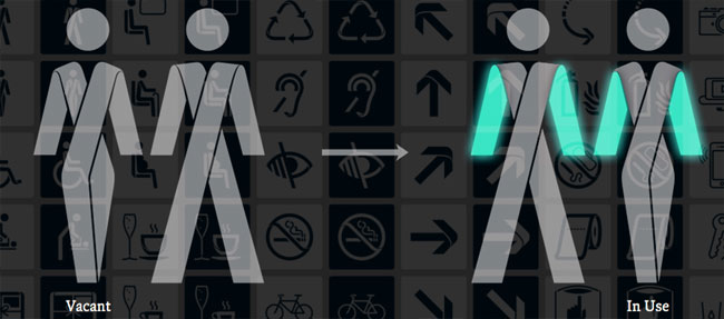
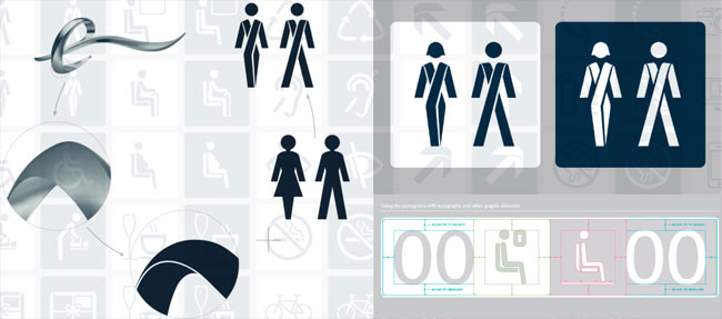
We wanted to create pictograms with enough detail that they were interesting at large sizes and held the sculptural form present in the sculpture, but that also worked well at a glance (and conformed to international safety standards). It was quite a tall order, but I think the ambition has paid off.
We also designed functionality into the pictograms that makes them more useful to the customer. For example, where possible, they can animate or simply change colour — colour-change systems will indicate if a facility is vacant or engaged.
While these pictograms and symbols are going to be used primarily on-board they are also going to be applied online where the brand needed to signal actions in a globally understood non-written format.
“We asked for a new set of symbols that conformed to international safely standards, but that felt ‘Eurostar‘ — we got so much more… it’s an entirely ownable visual language that extends from our core brand identity.”
— Ruben Arnold, Eurostar
Sculpted brand thinking
Eurostar is a physical product, a service, and an organisation, but it is also a deeply-loved promise of an easier, simpler, more effortless way to travel between the UK and Europe.
In research, and by just watching on Twitter, we saw a huge amount of excitement that comes with travelling on Eurostar.
Twitter is often alight with praise and the thrill of arriving in London from Paris in such an effortless way.
There’s no nasty 2hr check-in, no over-the-top security, just sensible, slick, well run systems that get you on your way swiftly and efficiently.
It was this feeling of effortless travel, of the fact that Eurostar opens the way to new experiences that we wanted to get across in the branding — it felt right to do something progressive, something beautiful, something sculptural.
Trains speed through the tunnel leaving a wash of air in their wake. We wanted to capture this speed as it darted through a loop that represents the tunnel… but the experience of Eurostar is multifaceted, so we wanted the sculpture to appear radically different depending on the material it was made of and the angle from which it was viewed.
We looked at the work of Zaha Hadid — the way she uses highly progressive systems to create effortless lines in her architecture… and the artistic movement of the Futurists who captured the idea of motion, speed, and dynamism so elegantly.
We made a physical sculpture that acted as a basis for the aesthetic of the brand as well as an ever-changing and adaptive logo.
We will also use it physically in Eurostar locations across Europe.


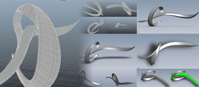


Core structures were crafted in CAD programme Maya to achieve the perfect form, then went to high-resolution texture mapping, and finally Photoshop to achieve the quality of image files we needed to be future-proof.
We didn’t stop at computer modelling. We wanted to do this in real-life so people could see this symbol of change for themselves.
We worked with rapid prototyping which enables computer graphic files to be ‘printed’ in three dimensions.
Large scale moulds were cut using robot arm milling machines that were then crafted by hand to create casts for the fibreglass shells that contain a steel skeleton that holds the sculpture together.
They get heavy. The 3-metre version takes four strong people to lift it!
When we presented it to the board of Eurostar it got a spontaneous round of applause! You wouldn’t get that from just a logo!
“SomeOne have not just re-branded our organisation, they have created a work of art that we are simply delighted to call our own.”
— Sarah Sempala-Ntege, Eurostar
SomeOne elsewhere on Identity Designed: Wright Brothers.


Comments
Great work – perhaps the squiggle sculpture can replace the ghastly kissing couple at St Pancras ……..
Money well spent in my opinion. It’s just lovely to behold and oozes creativity.
Great strategy. Can’t fault that in any way.
I’m just not a fan of the execution. It just feels like it will date quickly, the odd ungainly sculpture symbol just looks uncomfortable and there are a lot of swooshes and ribbons.
I get the impression that they started with mood boards with pictures of trains and Frank Gehry buildings and tried to convert that into an identity, but it hasn’t quite worked.
Making something chrome or gold just feels so unfriendly, mechanical, more akin to the graphics you see animated on a news channel than for a service that takes you in comfort between the heartland of Continental Europe and London.
I loved the GBH D&AD award winning, engaging, witty, fun and beautiful work created for Eurostar First Class a few years ago: http://www.dandad.org/awards/professional/2005/categories/2200/corporate-brand-identity/12821/eurostar-1st-class-catering-collateral It really brought a smile to my face when I saw it. It felt human, personal, special.
Eurostar really is excellent and the new developments really do sound exciting as the interiors of the trains look a little dated these days. Like I said, great strategy and I like the way Simon Manchip thinks, but i just don’t feel this delivers.
Un projet mené de main de maître et titanesque. Un signature élégante et fluide. Un typographie identitaire et une plateforme visuelle réfléchie. L’ensemble donne a Eurostar une personnalité forte et distinctive.
A great project led by professionals. An elegant and fluid identity. I really like the new typeface and brand territory. I think Eurostar can count now on a distinctive and strong personality. Explanations are relevant. I like it!
I like how SomeOne approached the whole re-branding : it’s not just about a logo. They took it as a whole, in a “holistic” way, if you allow me. They managed to answer to a mental need one can have to find his way just by looking at it, as it happens on-line, at the travel desk, in the station or in the train. It is clear here that the goal was not to bring a new killer symbol but a pleasure for the eye and recognizable style in any situation. Finally, the pure lines, the coherence, and the research, pushed further to an artistic side (with a subtle futuristic and modern kick to it), give a (French or British, whatever) elegance to the whole which, I think, brings the company’s brand to a higher level.
And for those still skeptical about it : please stop looking for a logo or a way to put it “flat” on letterheads (why should it be flat anyway?); don’t even look merely at the sculpture itself but look for an environment. Your experience in your house is not limited to how the name is written on your door but expands to the colors, the shape, the texture used, the couch, the TV, the table, the frames and every object placed into it. It’s your environment. It’s your experience. A brand should be an elemental experience not just a flat visual. Now let me come back.
All my respect to Simon Manchipp and his team. Thumbs up.
Loved the precision on Lee’s commentary. I felt the same, but wasn’t able to translate into words.
Those “rocky” renders and shapes will sadly date quickly.
A great strategic design solution but I got a bit concerned with the pictogram example. Maybe I’m missing something but shouldn’t the highlight colour for ‘In Use’ be red?
I think it is just brilliant!
See how many things you can still do without a logo..
Are logos that important nowadays?
love the pictograms as well
I think the way it adapts and translates works really well, I do agree though that there is a strong possibility of it dating quickly.
BUT it depends how often it changes and how it progresses as I get the feeling this will be an ever changing visual identity.
Although I do feel it’s weakest in the way it’s used on the terminal signage and metallic effect.
Overall it’s a very interesting solution and like the fact it stems from a 3D sculpture.
Maybe I’m being too blunt, but I just plain don’t like it. I don’t like the decorative typeface with its little swashes; I don’t like the logo, despite the excellent application finishes; I don’t like how massive it on everything.
There seems like there was no restraint paid, just plaster it on everything bigger, bigger, BIGGER. Oh, and make it in marble, and chrome, and gold and a bush too. Can we put that swash we’ve got on the ‘e’ onto every letter?
There’s adaptation and then there’s sluttiness.
I do like how the subtlety of swash was translated to the supporting graphics, and which everything else could have been done with that much finesse. The old brand needed an overhaul, but this is over kill.
Absolutely stunning. Well done!
Hi,
I’m not a professional designer, but I’ve been in prepress of publishers and leading ad agencies for years, and now I develop software for graphics industry. And I’m a huge railway fan.
Sorry, I don’t like this logo a bit.
It’s obviously created by exceptionally talented people.
But…
It’s too pompous, dated, complicated, unfriendly. Doesn’t convey the spirit of modern high-speed trains. Would be more suitable for the luxurious Maharaja Express that crosses India.
Having said this, the old logo wasn’t any better.
Just my opinion.
Sam you had me laughing out loud. Bigger, Bigger, Biggerrrr!
My favourite part of this are the toilet icons. I wish there was more none 3D stuff.
On a side note, I have to say the guys at SomeOne sure love to write! I have to come back to this one and read it properly…someday.