
We saw our move into our new London office as the perfect time to evolve our agency collateral, taking time to refresh design elements that still worked well – such as our logotype, set in Chevin, coupled with our minimal palette centred around yellow, that we deemed integral to our brand – with a new character set (originally inspired by our four lovely office dogs) and copy style that features quirky, irreverent brand statements and asides set in Apercu, a versatile typeface from Colophon. The project was pushed through quickly in line with our move to our new premises, starting in December 2012 and live in March 2013, but we’re adding new elements all the time, not least new brand characters.


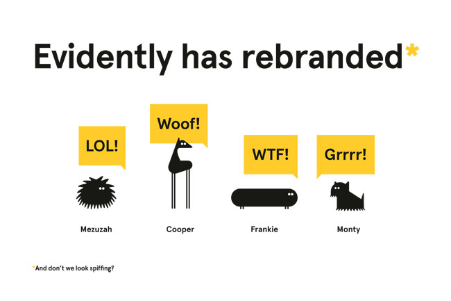
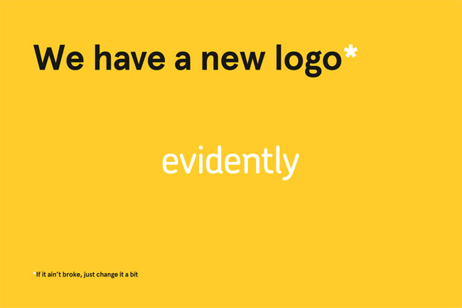
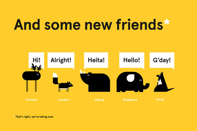


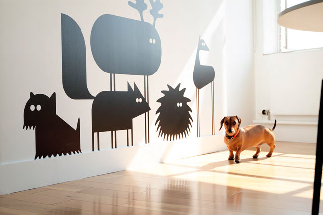
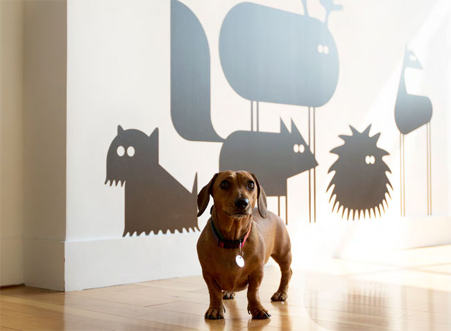
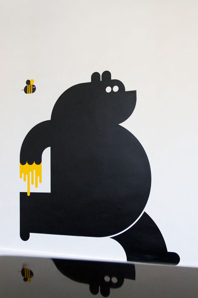


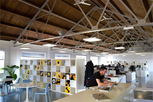


Our business cards were expertly printed by Generation Press — with a set of characters foil blocked onto thick stock (each employee can choose their own favourite character to personalise their card) — and our compliments slips and promotional book (‘The Little Story That Brands’) printed by TransFunction, who also did an excellent job.
We feel the rebrand displays a clean, modern style whilst retaining a quirky, offbeat nature, kind of like the work we do.
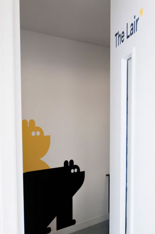
View the Evidently website. Follow Evidently on Twitter.


Comments
That running bear with the honey is the best thing I’ve seen today. I love the mascots.
Haha. From the sketches I was expecting not to like the design but as I was scrolling down it really grew on me. Now I’m liking it quite a bit. It is a good mixture of funny, quirky but also clean and organized. It has lot of personality, for sure. Thumbs up!
This is really wonderful. Those critters warm my heart! It’s fun, quirky, cute, modern, and sophisticated.
This brought a smile to my face. Love the characters and how they I’m guessing have some of them in and around the office?
Top notch stuff.
I’d like to work there!
I agree, I’d love to work there! Masterfully incorporated into everything. So many subtle nuances that will keep you chuckling. :D
This. Is. Awesome! The copy makes it from ‘really good’ to ‘top notch’ though… there’s a really skilled person behind that (or people)…
This is nice but I can’t help but be a little annoyed that the speech bubbles aren’t pointing at the character’s head and in some images aren’t pointing at the characters at all.
Love it. Personality in branding and indeed in business is more important than ever. Really nice work. Witty, minimal and totally engaging.
I want to work in that studio! The simplicity of the mascots and copy really is spot on.
Outstanding work, beautiful and warm.
Nicely done!
I will give a B-.
Technically it is OK. But overall the design is just not impressive. It is too common.
Looks like a great environment to work in. I’m sure that any new visitors to the premises will also get a sense of welcoming and friendliness. A Great approach to design agency branding!
https://www.petinsurance.com.au/
Looks like someone has ripped you off majorly, and won some awards.