
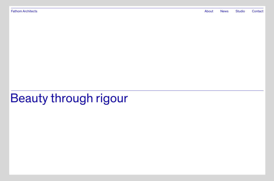
We created the name and brand identity for Fathom Architects, a new practice set up by Justin Nicholls, former partner at Make Architects and Foster + Partners. Fathom’s brief was to communicate curiosity, collaboration, contextual sensibility, and an approach that embraces technology to deliver beautiful, rigorously designed buildings.
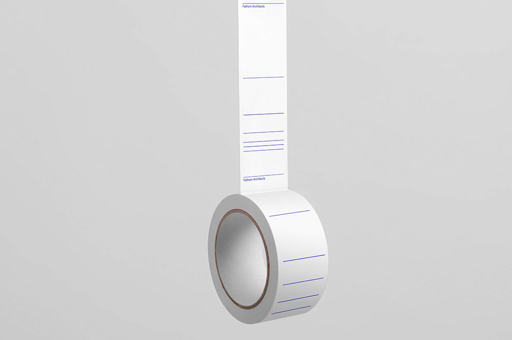
 Typeface used: Optimo Theinhardt


Built on Justin’s philosophy of pushing thinking beyond the expected architectural solutions, the brand name plays with two meanings of the word ‘Fathom’: as a human-scale unit used to measure depth, and the deeper understanding of a difficult problem after much thought.

Justin Nicholls, Founding partner of Fathom Architects said, “We sought an identity that communicated both our collaborative approach, and an inherent curiosity in finding creative solutions to complex problems. dn&co challenged the usual confines of architect naming and branding to create a minimalist identity playing on depth of thinking and clarity of approach. Their bold, reductive visual strategy provides a strong platform for our ideas and effectively communicates how we approach design.”


As a business we looked to capture Justin and his team’s unique interest in challenging projects that don’t have facile, fast answers. We wanted to demonstrate their core competency — depth of thinking. We also wanted to create a memorable name in an industry where most practices focus on the lead partner names. As a practice, Fathom aims to be collaborative and inherently about the collective team rather than the ‘starchitect.’

With a bold, reductive approach, typography, colour and dynamic lines come together to create Fathom’s flexible identity.
Project scope: We developed the name, brand positioning, identity, stationery, digital and social platforms.

More from dn&co.
Comments
Beautiful and simple.
Greg Sorensen by DIA. Done first and better. Could be a coincidence but unlikely given their similarity.
Nothing like it. They’ve both used rules – that’s where the similarity ends.