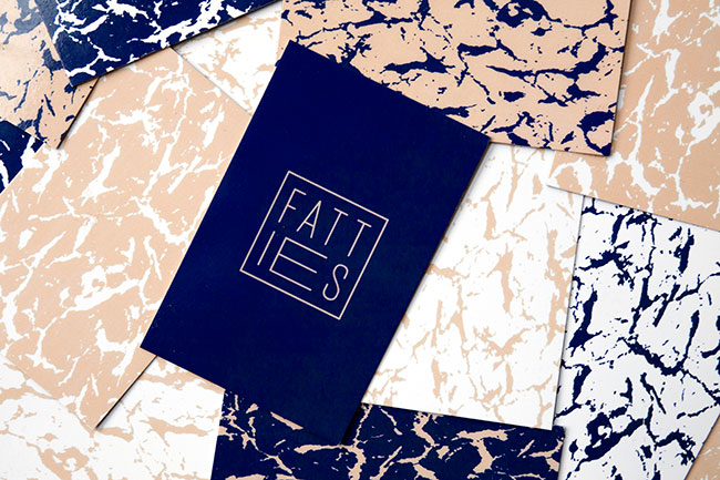
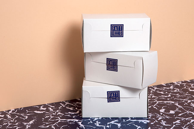
We worked with Chloe Timms, the founder of Fatties, to develop the name and identity for this new bakery/confectionery. Fatties produces its treats from a small bakery at the back of Broadway Market and will be stocked in La Bouche and Pinch Pantry. Fatties’ product range consists of things like cardamon and pistachio caramels, bags of passion fruit sherbet with pineapple lollipops, and coconut flour brownies.
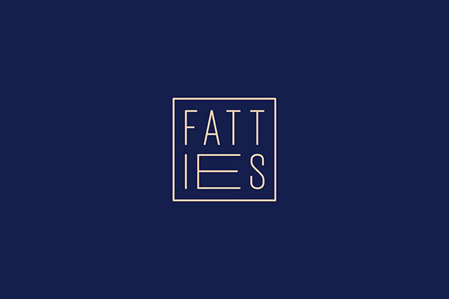
We created the name and design simultaneously with the idea of juxtaposing the connotations of the name with a clean, sophisticated design. This was done by playfully stretching the letters in the logos, combined with a modern colour scheme and a pattern/texture evoking the floured surfaces seen in bakeries. The overall objective was to produce an identity that was luxurious, playful and modern.

 Logo experiments
To further express the brand we art directed promotional images, completing the visual identity.


More from Dot Dash.


Comments
Love this…. really something to look up to. The only ‘but’ I can think of is that I’d have expected the word FAT to be fat, instead of the E of ies, but maybe that makes it more unique…
Great…love it. The concept of expansion when you have a lot of the sweet stuff is perfect. It doesn’t have to have fat type to express the idea. As Massimo used to say “the word dog doesn’t have to bark”
The expansion concept is great…something I’m fighting every day. I’ve expanded a little too much.
I agree with Jim, one should be careful with over explaining. I love the logo variations, and the presentation is fantastic!
I personally love the Fat “E”. Especially since when you say it out loud it’s actually pronounced “Fat Es”