
We first met Derek Fernholz and Blake Thompson a few months prior. They were friends in the early stages of opening a production brewery in Sioux Falls.
They’d been home-brewing and enjoying craft beer since they were totally of legal drinking age. And by chance, while individually scheming up a Sioux Falls brewery, they ended up meeting, hitting it off, and hatching a concept in one of the most under-served craft beer markets in the United States.
It’s interesting that no matter how far we travel from Indy, we continually run into the same thing — young people all over the country who decide to stick around their home town, plant a flag, and work their ass off to make their community more vibrant and attractive.
Derek and Blake had a solid business plan, funding in place, and a location pinned down. What they didn’t have was a name, brand identity, or package design. Adding drama to the story, they had already gone through an unsuccessful branding process with another firm, prior to reaching out to us at CODO. And they had nothing to show for it — no name, no positioning, no branding, nothing, except the hollow feeling of throwing a briefcase filled with money off of the most desolate mountain peak.
One of the questions we love to ask new clients is this: if your brewery was a person, who would it be, and why? Clients can struggle to answer. It’s not unusual to hear, “Oh, well, I don’t really know any celebrities.” So instead, we’ve started to ask: if your brewery was a person, what personality traits would that person have? The goal, for the sake of the creative process, is to give ourselves an idea of tone and approach. We would almost never actually consider putting this person into the final logo itself, because there lies danger — at best, the output will be corny and clichéd, at worst, you’ll have that most dreaded of advertising fallbacks on your hands, a mascot.
Mascots are stupid. Actually, a mascot is the most literal, condescending, heavy-handed application of branding we can think of. Paint a guy’s face with makeup and now kids want hamburgers. Loathsome. Even contemporary applications of mascots are offensive.
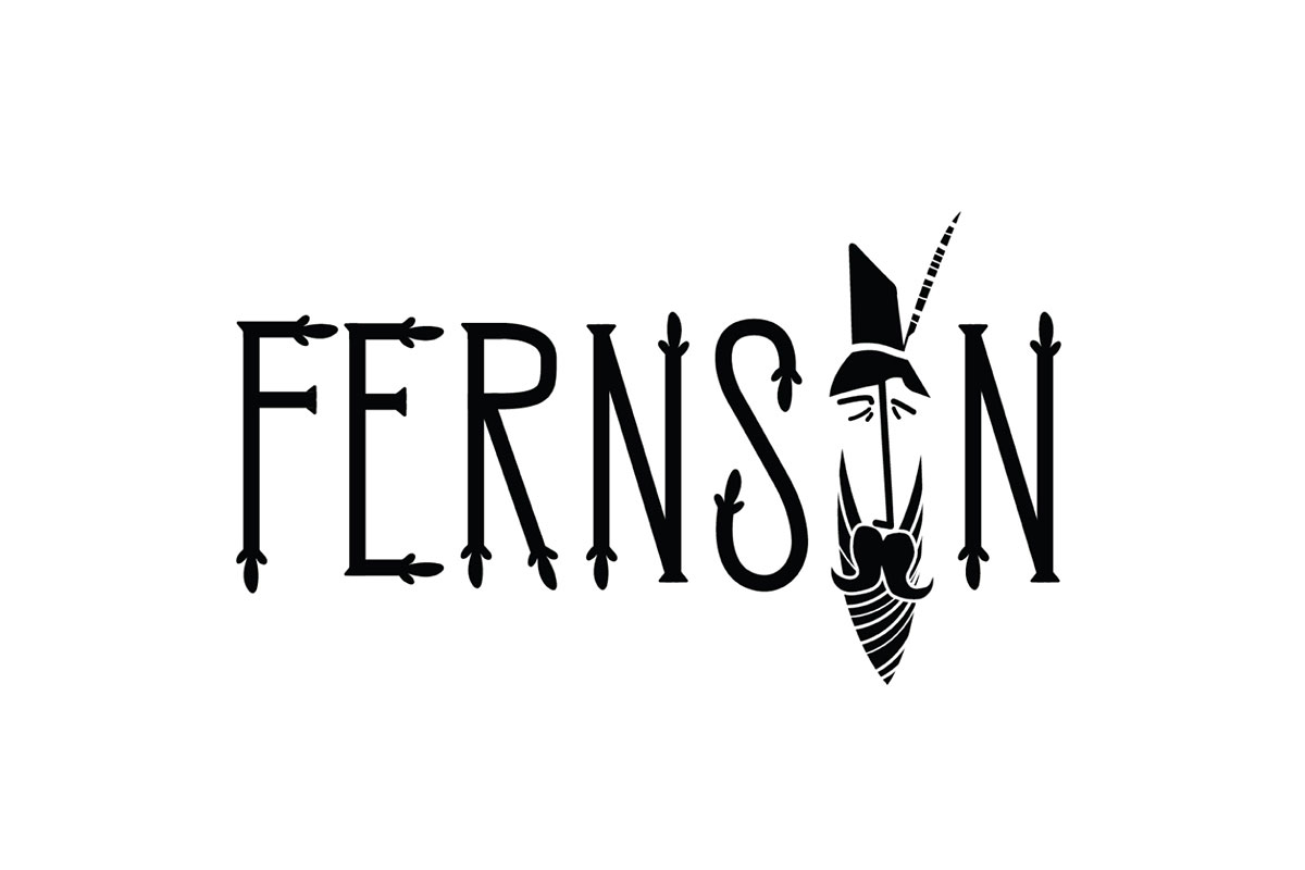
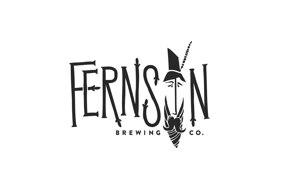
And here we are: self-avowed mascot haters, presenting a logo that literally centered around the face of a made-up, idealized person. But the damnedest thing is, it felt right at the time, and it feels more right now.
The only way to do this project justice would be to create something (someone?) entirely new, out of whole cloth. This will make sense to anyone who has been out there, in the middle of nowhere. Surely this will make sense to anyone who has felt that expansive vacuum all around them, tugging, urging us all to pursue better. To want more for ourselves and the communities we call home.
After working with these guys long enough to understand where they were coming from, it clicked into place. Somewhere, by the shoulder of the highway, past the industrial parks and weigh-in stations, you may come to meet a man. If you were to speak with him, it would not be clear if he were highly educated, homeless, or some combination of the two. Was he a rich man forsaking a gilded life of luxury? Or a brilliant genius who slipped through the cracks of society?
 Fernson identity evolution.

 An almost-there iteration.
Is he magical in nature? Has he forgotten more than most would care to ever know? Has he been around a lot longer than many would guess? Would he play a friendly prank on you, given the opportunity? Yes, yes, yes, and yes. We’re not quite sure what we’ve helped bring to life. Without realizing what we were doing, we split the atom that makes up more established American folk legends like Johnny Appleseed or John Henry. And hey, if that’s too pretentious for you, maybe you could imagine him palling around with those guys. Or at least knowing a guy who knows a guy.
Or maybe, in the minds of South Dakotans, somewhere in their collective consciousness, floating above peaceful, flat, bergs, as good citizens sleep soundly, there was a Fernson-shaped hole. All we, Derek, and Blake did was to draw an outline around it.


Here’s the thing about being a designer — you can come up with the most dazzling execution of a concept. You can sweat every detail and gnash your teeth polishing mockups for a presentation. You can wrack your brain into the wee hours of the night, bleed for your craft, and then drive halfway across the country to present. None of this is a guarantee that your work will land with the client. I guess we got lucky this time, because Fernson stuck the landing.
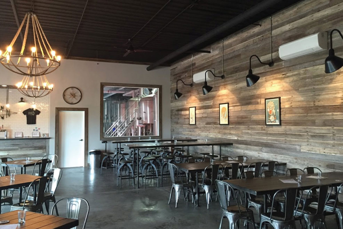
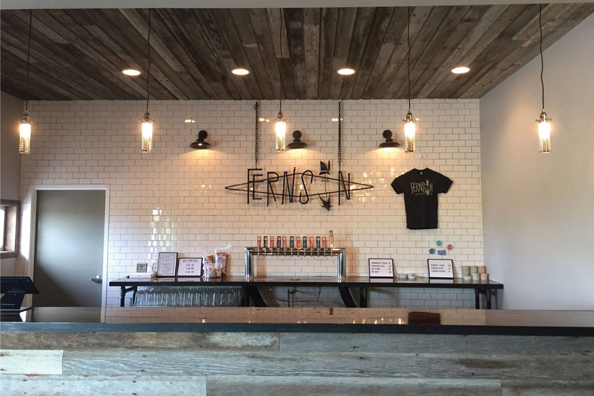
Since completing the branding and design work, Derek and Blake have been putting their 30BBL system through its paces and are already eyeing expanded distribution, cranking out well-reviewed beers at a good clip, and have opened a cozy taproom. It’s been fun watching them grow and breathe life into the brand. If you’re ever making your way through the plains, swing by for a pint — it’s worth the detour to #FindFernson.


CODO elsewhere on Identity Designed: Tomlinson Tap Room.
More from CODO.


Comments
This looks outstanding. I love the journey you went through to create the face of Fernson. It is always refreshing to see the path to victory! Cheers!
This is fantastic. It’s so great to see more sketchbook work behind designs, especially in this case since the final logo has a really nice hand-made feel to it… it’s almost simply a vectorised version of the sketch. The style adds so much character that I feel I need to experiement with this type of design for potential future projects.
I love when a hand crafted identity system comes together like this. The wall art is especially impressive. A thin wordmark can be tricky, but the rod iron works perfectly with the environment.