
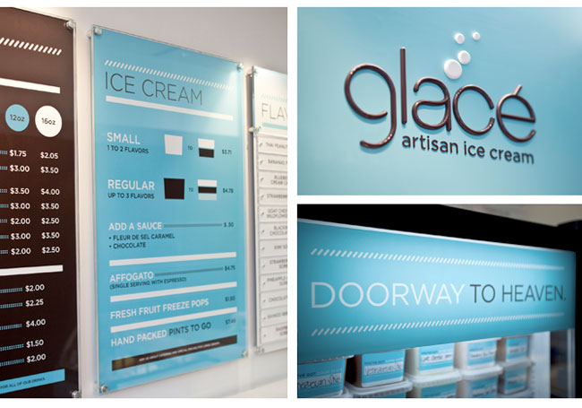
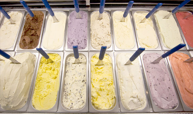
Kansas City-based Glacé Artisan Ice Cream (say it this way, “Gla-say”) is a more grown-up sweet treat expression, rich in texture and inventive flavors like Venezuelan dark chocolate, fleur de sel caramel, and pineapple-cilantro sorbet.

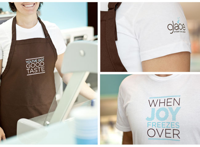
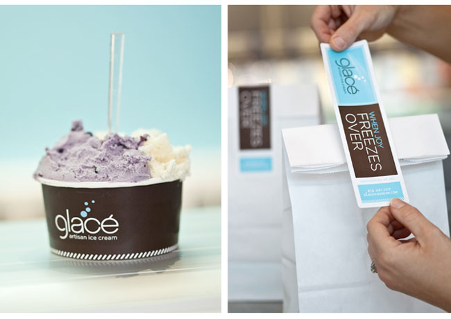
The corresponding brand expression is clean, sophisticated and a nod to the owner’s love of modern minimalism. At the same time, copy and color palette make it feel fun and approachable. The logo also incorporates a sly tie to ice cream with circles that look like melting “drips” hitting the floor, while tailored graphic elements make the identity feel fashionable and unexpected in the category.


Credits:
Designer: Nathaniel Cooper
Writer: Brent Anderson
Photographer: Gabe Hopkins
More from Bernstein-Rein.


Comments
Hi Nathaniel, nice work. I love how you’ve engaged the customer with the conversational packaging, t-shirts and loyalty cards.
I think it all works very well, the colour palette, how its carries across on to clothing, signage, the tubs etc.
BUT I find the actual logo abit weak compared to everything else.
Not really sure its that distinctive, what are the bubbles for? what do they communicate?
But that said its a great end result across the various media.
I’m loving the clean minimalism, really lovely elegant style.
This was really well designed. I love the colors and the simple feel to it. Perfect fit for the brand!
I love it: the font, the colours, the menu, the containers, the labels… Very classy! And now I feel like eating ice cream.
Great work! I love the palette, and it comes out feeling exciting, without being childish.
Though I’m with Gareth on the bubble-issue, the logo would’ve been strong enough without them.
That said, it’s still great work. The use of Gotham is good. A safe choice perhaps, but in this case it’s actually very well suited.
i’ve seen this branding featured on so many other design blogs and i love it every time i see it. love the overall feel. cool, crisp and minimal. very nice work.
Yeah its a really cool design (pun very much intended).
My only problem with this is the shop, it looks soooo very cold in there.
This is such a fresh identity. I really love that shade of blue – perfect for this.
The identity reminds me a lot of the spas and make up boutiques here in Charleston. If I saw the sign on the street that’s probably what I’d think it was. I am a fan of the simplicity and cleanliness. It is very nice overall.
~J
What a very refreshing identity system, really sophisticated!
The smooth flowing feel and look of the type is very appropriate. It’s simple and definitely pleasing to look at. The droplets are a nice touch. Relevant and effective use of type can make such an impact. I want some ice cream right now.
It’s all utterly stunning.
Very posh. I’d walk out of there with my bag feeling dead posh. It would make me happy to pay more (and hence cover the cost of all that gorgeous branding, ha ha)
There’s that use of brown again!
The creation of the identity and how its put in use has blown me away.
Thank you nathan for the great job well done… I am so inspired..
cheers
Nathaniel and I had a blast concepting and executing this brand (how can you not, it’s ice cream!). Helped to have a client who gave us free reign to run with it. Many thanks to you all for your comments, constructive criticism and votes of approval. Cheers.
The smooth, flowing feel and look of the type is very appropriate. It’s simple and definitely pleasing to look at. The droplets are a nice touch. Relevant and effective use of type can make such an impact. I want some ice cream right now.
I think someone stole this design:
http://www.glacehelados.com.ar/
I agree!