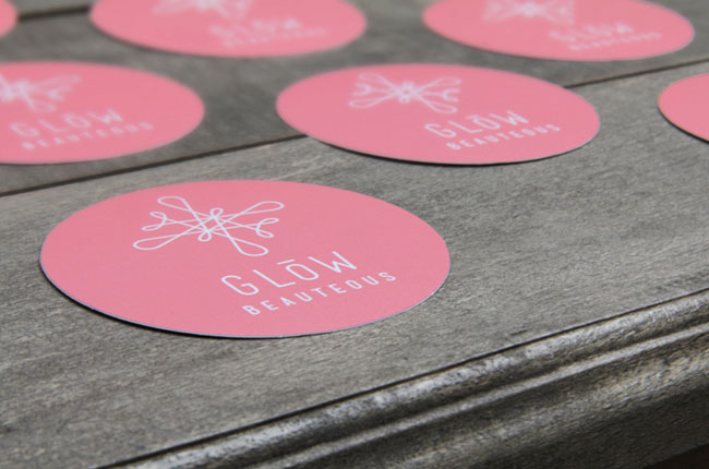
After three successful years, Melbourne’s Glöw Beauteous founder and owner Gabriela Sebastianko decided it was time to give her business a design facelift. She put this project in the capable hands of me, Sarah Bürvenich.
First and foremost the new identity had to embody Gabriela’s modern and professional approach to beauty. It not only had to convey the science that lies behind Glöw Beauteous’ techniques, but also the playful element that comes with making people feel pampered and looking gorgeous.
The clientele are primarily female, aged in their mid 20’s to late 50’s. Glöw Beauteous is focused on sustainable skin care and scientifically sound methodology, with special attention to protection from the sun and environmental hazards (Australian sun can be very nasty). If you’re expecting nail polish, color cosmetics or Botox injections you best look elsewhere.
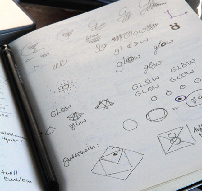
Luckily, the fact that I was living on a sailing vessel in the middle of the Pacific ocean didn’t put Gabriela off. I can appreciate that not everybody is willing to work remotely with a designer, especially if the client isn’t experienced with the design process. Building the client/designer relationship when communication is limited was quite a challenge.
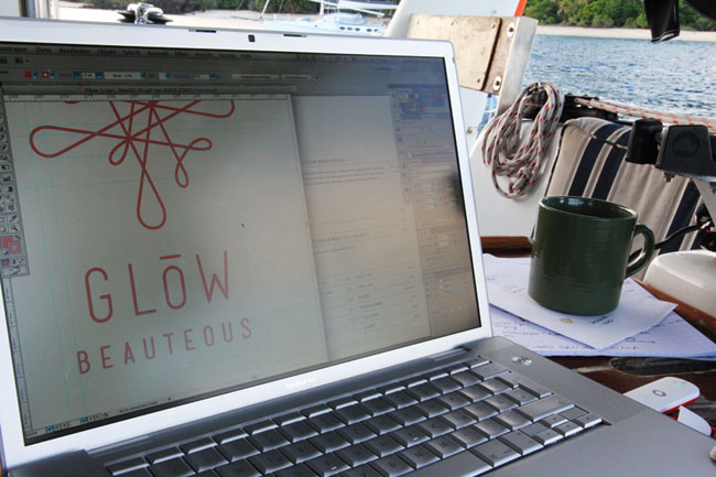
Fortunately Gabriela was undeterred; she liked my style and decided to work with me. She has an amazing personality and was able to confidently make decisions which allowed the design process to move smoothly and quickly.
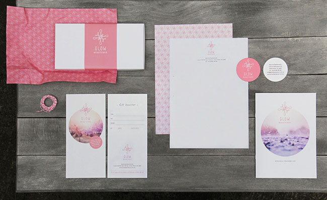
In designing the company’s logo, stationery, and website, I developed an elementary, contemporary, identity with a distinctly feminine feel.

When the clinic was founded in 2009 Gabriela wanted a nod to her European heritage by changing the letter “o” in “Glow” into an umlaut. We kept this little feature when we changed the business name from Glöw Beauty to the more gentle and elegant Glöw Beauteous.
Elemental but not simple; the logo represents an infinite cycle. The balanced circular flow portrays the self-renewing ability of our skin. Characterised by an organic and cohesive shape, the logo features the idea of consistent treatment and highlights the scientific approach, as it can be interpreted as the fractal like cell structure of the subject’s skin.
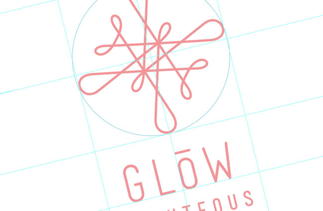
The design operates on two levels — the first being a visually delicious logo, the second reveals the intrinsic elements of the business, through the use of a warm colour palette, organic lines and a cyclical shape.
The imagery is aquatic, clear and flooded with light. Utilising a color palette of soft pastels such as coral, vanilla, light lavender purple and a warmish beige-grey reinforces the femininity and tenderness the business embodies. The stock photo for the gift voucher is the only exception, featuring a whimsical urban scene in the same color range.

Living on a boat, surrounded by water, and having an underwater camera came in handy. I couldn‘t resist using the look and feel of water (imagery) for the fresh appearance of the identity and I‘m quite happy with the result.



More from Sarah Bürvenich. Follow Sarah on Twitter.


Comments
I think designers should be wary of using the term ‘face-lift’, it suggests superficiality rather than something of substance, which this clearly is. Nice mark, imagery and typography, although I dislike logos as patterns – it could have been easy to create something a little different to add breadth – its a small detail and overall there’s a great sense of cohesiveness in the use of colour and line weight.
What are the typefaces being used for headlines and body text?
I found some of the execution clumsy, but good effort nonetheless.
Richard, thanks you for your feedback. Don‘t you think ‘face-lift’ is quite appropriate for a rebrand of a skin clinic? I couldn‘t resist – well, maybe a result of my odd german humor …
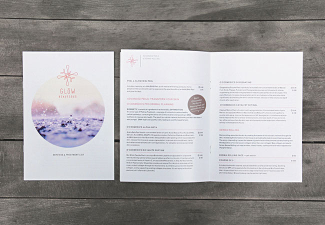
I like logo-pattern. Obviously. I made a few different attempts though and tested them as pattern as well as I developed little details (have a glance at the lines and the ‘special-offer-buttons’ in the brochure or the fold marks on the letterhead) which follow the principle of the logo-loop.
At the end of the day I liked the logo-pattern the most since it will also help customers to identify the brand when they get a wrapped present.
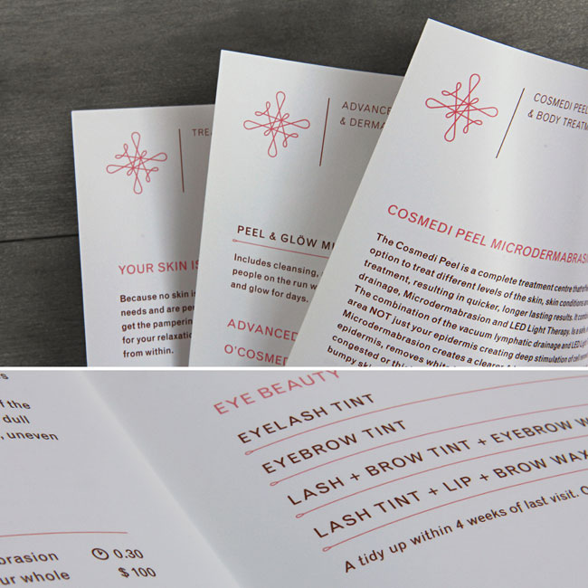
Christian, the used typefaces are ‘Mensch’ from Morgan Knutson for the Logo and ‘GrotesqueMT’ for headlines and body text. The copy isn‘t black though. I used a warmish dark brown to make it softer and more friendly. Black seemed to be a bit harsh for this layout.
Sarah my apologies I’m an idiot, I take things way too seriously so these things frequently slip me by.
Good to read you explored some other patterns before coming back to the logo, I still believe it’s identity overload rather than broader subtleties but do appreciate that you felt it was right for your client.
This is gorgeous and super inspiring. I’d love to know what Ivanisawesome means when he says some of the “execution is clumsy”.
Although I find the finished product rather nice to look at – nice colours, especially – I found the write-up and approach (as it was explained here) a tad self-indulgent. I know now quite a lot about the designer, but very little about the client.
I also would have liked to have known a lot more about why certain decisions were taken, particularly the name change. Is Glöw Beauteous really “more gentle and elegant” than Glöw Beauty? Was there research? As a bloke touching forty I realise I’m about as far from the target clientele as one could possibly get, hence I’m asking rather than making a judgement.
I understand the role of the designer, but this reads a little too much like a one-way process, with the designer keen to stamp her style all over the finished product. I may be wrong, and I realise it’s my interpretation, but I would have loved to have heard more about what the client wanted and the image she was keen to portray.
One final thing, do people still make websites using only Flash? Won’t be looking at it on my iPad, then.
This is not working for me, it says ‘squiggle’ more then ‘glow’.
Well, I am the client.
To maybe explain a little better:
Name change: I have outgrown Glow Beauty – simply. I now do mainly skin treatments that are very specialized and I don’t offer the kind of beauty treatments you expect from a beauty salon.
On the other hand I don’t feel like a skin clinic which is clean, sterile and a bit cold. I have a very personalized approach with my clients and also prefer a warm environment. So the name change was appropriate as I wanted to keep the Glow part, which was my business name for around 3.5 years and also part of my European heritage and therefore identity. I was bored of “beauty” and wanted a warm, feminine and different name without being mainstream (clinic, salon etc). So the poetic “beauteous” was what I felt was appropriate after trying a few combinations.
I feel Sarah did capture my ideas in her design perfectly. It wasn’t a one way approach at all. She captured warmth, femininity and my scientific way of looking on to the skin with the logo, colour palette and the whole design perfectly.
I am not a designer so might not be able to explain the process as perfectly as designers do. All it matters is a happy client who identifies with the work and I do so.
So Mark – if you don’t have anything nice to say maybe don’t say anything at all. Design is so subjective and I understand the constructive exchange of ideas and critique but really think there is no need to degrade someone’s work with a harsh comment.
Gabriela, thanks for commenting. Great to hear that Sarah captured what you wanted so well – it speaks of an excellent working relationship.
I wish continued success to you both.
I just want to commend Gabriela for commenting on the behalf of her designer. So often we see criticism from commentators who don’t know the whole story, in this case, a satisfied client, which really is what matters. I wish all commenters had to display their own work to hold themselves up to equal judgement. To echo Richard, continued success to you both.
Wow. Super inspiring. I’m a definite “GO” for circular and pastel theme sites. Nice work!
Personally I didn’t think Mark’s comment was that harsh. I think you’re being rather unfair, Gabriela. But as it’s your new identity I can understand you being precious and protective of it. As designers we can only gain from hearing what other designers think of our work. Mark felt the design didn’t work. On an open forum, where the designer is actively seeking feedback from fellow designers, this is a totally acceptable opinion to post. It’s what the forum is for! We all gain from it. We shouldn’t put work up if we can’t cope with critical comments. I’m sure Sarah understands that and hasn’t taken offence and vowed never to design again! Personally I love the whole identity and would be very proud if I’d created it.
The re-brand is gorgeous, especially the colour but does anyone else find the company name a dreadful tongue-twister?
I can imagine website visitors typing in the company domain name wrong every time as well due to spelling ‘beauteous’ incorrectly. I think the new name is more harmful than a good change.
I also like the way some really good photography has been incorporated. It works really well and looks almost retro.
With the photography it reminds me a tad of the feel of the Anais Anais branding.
Love the colours, photography, font and application. Undecided about the icon, it’s unique but not sure if its something or nothing (like how would it look in very small and black and white standing alone?). I agree with the name being a bad choice as well as a flash website. Lovely client to come and stand up for the designer. Definitely a great project by a great designer.