We’re a newborn branding, marketing, and social media agency based in Italy. Marketing consultancy is a very serious business, but we want to stick in people’s minds. That’s why everything we do has a twist to it.
Why did we open a Gummy Industry?
We wanted to identify ourselves with something memorable and, absolutely, not boring. So, we started poking fun at ourselves and chose “Gummy Industries” as company name. Brescia, our hometown, is famous for its huge number of heavy metal industries and steelwork: the time had come, to start a gummy one!
Why does our identity represent us?
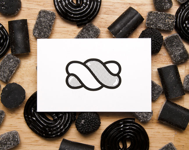
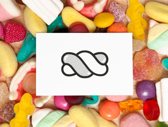
After days of sketching gummy things like chewing gum, toys and rubber objects we found the right one: a marshmallow. The candy is something that you can share, it’s sweet, colourful and timeless. Oh, and it doesn’t have a real economic value. We may offer candies to start a conversation, or just to be kind. We want to share a candy with every person in the world!
How did we design all this stuff?
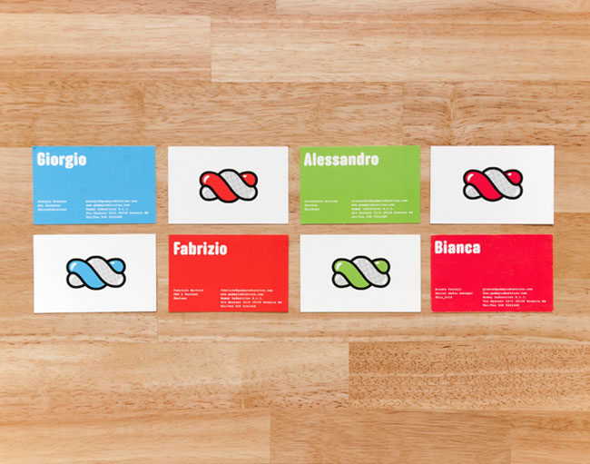
Once we found our personality, it was very simple to design the Gummy brand. Our reference for the typography was the heavy industries signs, and for the overall style we researched the mid 20th century candy world. The mix of these two antipodes resulted in a brand identity that expresses strength and fun at the same time.
Why don’t we print stationery?
As we work on web marketing and digital branding, we rarely print stuff. Corporate identity has to be fitted on all digital media these days: it doesn’t matter if you can fax your logo, as long as it looks nice on Twitter!
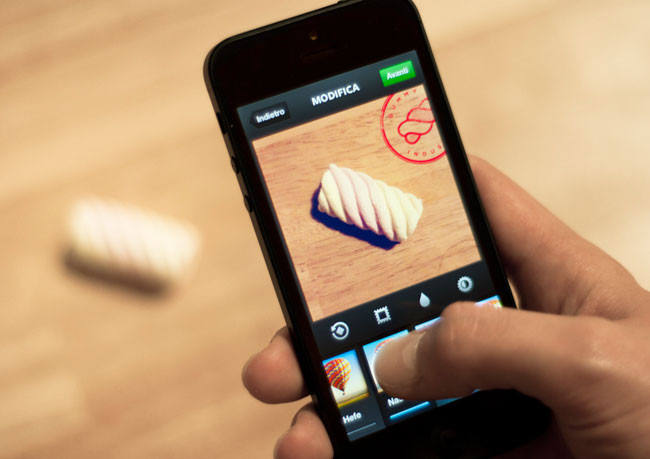
So, we customized all that we could do, online and offline:
- Our office
- Facebook headers
- Instagram pictures
- Keynote presentations
If you are around, you’re welcome to drink a cup of coffee and get some candies!
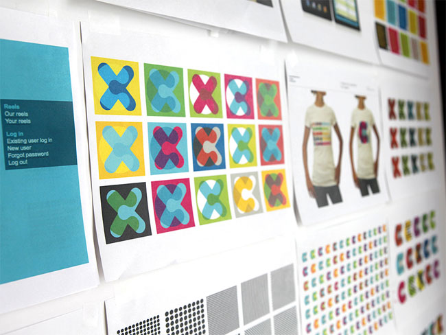
![]() Logo studies
Logo studies
![]()
![]() Icon studies
Icon studies


More from Gummy Industries.


Comments
Complimenti! Tutto veramente ben fatto ed originale!
I appreciate that they are trying something different. It’s bold to not have marketing referenced at all. My last business tuxedo in the name and everyone asked if I was a tailor. It’s a good talking point, but if you didn’t plan for it the conversation gets old fast.
Great job with the designs!
Really enjoy the playfulness Gummy is showing here. The evolution of their logo is nice as well, the addition of the texture makes me think about some of favorite gummy candy (gummy worms, the half red and half blue ones of course!).
Kudos.
Love it!
From the concept to the design, it’s brilliant.
Also laughed out loud at the “Always talk to strangers (they have the best candy)” display in their office.
Brilliant and memorable.
I like the playfulness of this one, it looks like you guys are having lots of fun while you work, colour scheme emphasises this, your office looks cool an old arcade game in the corner, help yourself to sweets I get it.
The thing that doesn’t sit right for me, and this could be something that’s lost in translation by the way, is the name ‘Gummy Industries’. I mean I get the point that Brescia is a steel working, industrial place and you want to separate yourselves from that and to stand out from the crowd. But Gummy in England, or maybe just to me, sounds like its a bit dodgy, might not work properly or even an old bloke who has lost all his teeth.
Also with the mark, maybe it would have been nice to see something a bit more lateral?
Gummy bears bouncing here and there and everywhere…
It all looks lovely and beautiful but I don’t think it communicates what you do as a business.
I was wondering…do Gummy Industries provide free dental care for their employees?! =)
This is a really strong branding system; it’s clean, memorable, good humoured and I can see it working very well across different applications.
What really interests me though is how it works with the audience – I’m pretty sure most people wouldn’t identify this as a company working in branding and media – they’d say it’s a confectionary business. But that doesn’t mean it fails – it simply means people need to get to know the company and what they do before the logo gets ‘loaded’ with the actual nature of the business. And having a strong identity is a significant part of the battle in nuturing an informed audience – you just need to interest them long enough to convince them. It poses questions about how far a business can push an identity and in actual fact, does it need to ‘speak’ of the business initially, in order to be a success. Food for thought.
It’d be really interesting to hear how this has worked for Gummy.
Love this branding, really caught my eye and very memorable. What the company does we can find out afterwards, once they’ve caught our attention. A lot of companies have names that don’t relate to their business and it shows a certain confidence in their brand. Need to go buy some sweet now…
Hello Matt Saunders!
Our neighbours actually think that we produce and sell candies. But our customers come mainly from our internet reputation and from word of mouth: potential and actual clients know us because of our work. So, the “Gummy Industries” name and image helps us being different and being remembered (that’s why an identity is useful).
After that, a name is only a name: once people know what we do, they kinda forget the meaning of our name (and they remember we’re playful).
Our identity does not _describe_ what we do, it’s more of a metaphor, and customers get it!
I hope this answers to your question!
Hello Alessandro,
Thanks very much for taking the time to reply. It’s great to hear the logo is a success beyond the great design and it’s really inspiring to have confirmed what I’d suspected, that as long as you have an arresting design, it doesn’t matter if it reflects either the business service/product or the ethos/attitude of the company – once you’ve got an audience’s attention, the name/logo becomes a symbol for all of your business.
Thanks again and great work!
Matt
Category wise Gummy has balls. The brand has wit, character and youthful energy. I would rather do business with them than some dinosaur who thinks they know everything.
I don’t agree with people who think that logos should show the nature of the business in the logo for it to succeed.
Suppose I were a martian and I never knew Apple and see it for the first time. How do you think will I associate the icon to the nature of the business? And yet we all know that the Apple logo is one hell of a success. The form of the logo maybe a clue to what kind of brand it is but you get exposed to their marketing efforts then you see what they have to offer.
A brand should represent a tone of voice. Thinking that every logo should show what the company does is madness.
Now that’s killer design. Absolutely love the look. Energetic, fun, and very versatile.
I adore this! ADORE it.
The simple yet strong shape, the colours, the amazing little Lichtenstein style dots. Wow.
Best branding I’ve seen (well, for my tastes) in a long time.
Ragazzi, tutto fantastico, complimenti!
Hey does anyone have any ideas what typeface is used in this identity? It is a beautifully designed identity and I have a keen interest in typography. I am writing an essay on typographic treatment in the world of corporate identity and would love to include this typeface as an excellently chosen typeface for the brand.
Hey Oisin Hunt just shoot me an email at:
Alessandro at gummyindustries.com
I’ll be glad to help you.