Indygen is cutting a fresh path in the telecom landscape, it goes beyond telecom — a bold brand dedicated to the young generation of digital natives.
A brand developed with and for the young and cool, a great experience for Brandient, who delivered strategy, naming, visual identity, proprietary typography, vinyl toy design, web design and more for the fresh telco brand.
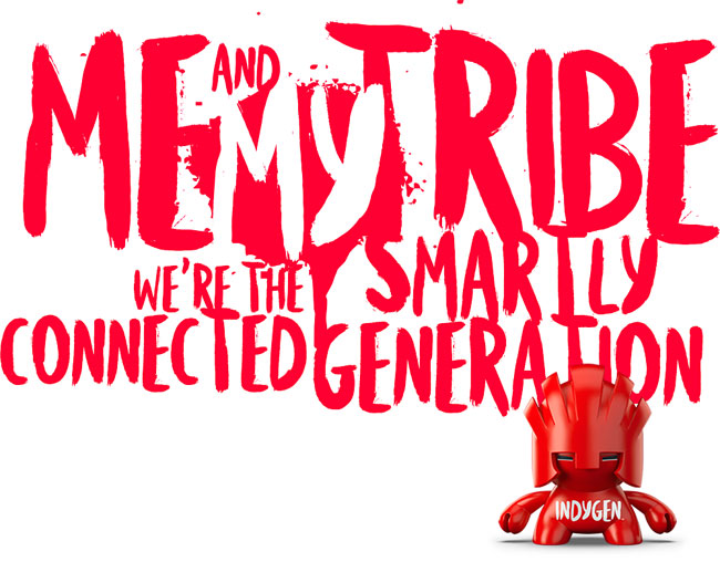
The name’s primary decoding comes from the English indigene/indigenous (Romanian “indigen”), meaning local, tribe, community, with a twist of “indie” (independent, self-determining, distinct, different, self-developing, free, unconventional, small, etc.). It is another name for “the smartly connected generation”, consequently the principal line of the brand.

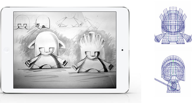
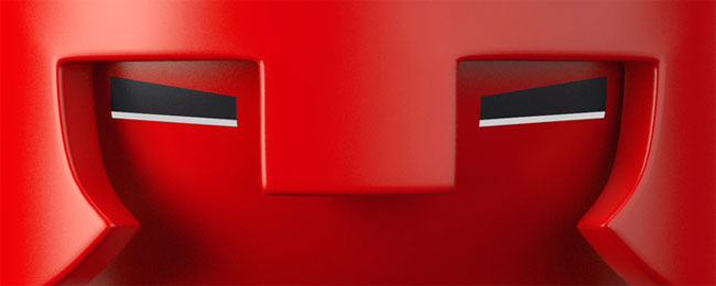
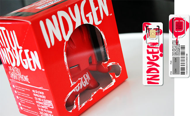
Indygen challenges common knowledge and takes nothing for granted, not even the idea that a SIM card has a certain aspect and comes packaged in a paper envelope. This is why the Indygen SIM card has an aspect different from anything else, and it comes packaged in a brand-property collectable series of urban-warrior-shaped designer toys.


The cardboard package is further playing on the collectible concept, while being also used as a promotional medium.
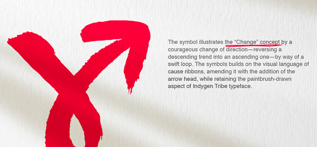
We designed a custom typeface with three fonts to sustain the “unrest” spirit of the brand, including the trademark “change” symbol as a glyph.
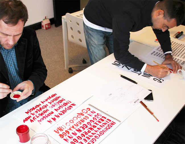
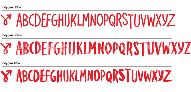
This is the Indygen typeface at work.
The visual identity has been created by Cristian Kit Paul, creative partner, who also coordinated the design team, with senior designer Ciprian Badalan leading the implementation team.
“Why use commercial typefaces when you can create your own? Why go for the bland SIM pack when you can create a collectable designer toy for it? Why have a logo when the style itself can say ‘Indygen?’ This is not the average target, and we set out to design a striking, albeit very simple brand — one able to say ‘Like me!’ to the right person.”
— Cristian Kit Paul, Brandient
A brand shaped like a youth movement needs a visual expression able to convey the rebellious energy the youngsters carry in their hearts. An integral part of the typeface-based visual platform, the logo expresses the natural spontaneity of the kids as well as their desire to change.


![]()
Brandient elsewhere on Identity Designed: Bitdefender.
More from Brandient.


Comments
The concept behind the name is genius.
The design matches the target market in a way that works.
They embrace change, so why not build a brand that does too?
I like that the brand itself is flexible and based around their custom typeface which is divided into three distinct but similar categories.
Everything from the iPad mocks to the vehicle wraps look like they belong.
The point that stuck out from the article was:
Why have a logo when the style itself can say ‘Indygen?’ – Cristian Kit Paul
Couldn’t have said it better myself.
Great post!
Minimal yet powerful. This hits all the right spots. Amazing how type can carry the load so well. Were you able to create alternate glyphs for the font to give it some variation when the same character is used repeatedly in the same text?
Thank you, Kurt. We wanted a flexible construct, almost a transparent one. Interesting things happened when we considered the implications of a brand working more like a loose framework.
Thanks Bhadri. We did consider alternate glyphs and dropped that in the 1.x versions because of the speed of the implementation and the implications from the point of view of web fonts. I hope we can come up soon with a 2.0 version with alternate glyphs.
You’re welcome :)
Flexibility is good.
There’s a fine line between consistency and expected that needs to be crossed to engage and connect with the target market.
Thanks for the reply!
The branding definitely captures the young and cool. The character is great I wouldn’t mind to have one for my desk. When I first seen the typeface It seemed a little off and as if it would not work. But as I seen other pieces it works well together.
I adore the type, hand-drawn type is where it’s at at the moment. Really switches up the game a bit, changes up the conventional.
Not super keen on the mascot/character idea, but everything else is spot on, really vibrant, punchy, exciting, youthful and full of energy. Great job, guys!