Issho translates as “together” in Japanese, so the idea of “togetherness” was a theme throughout the restaurant branding, with kintsugi being at the very core. Kintsugi is an ancient Japanese art form where repairing an item with gold joins makes the object more desirable than before. Often different pieces of pottery are used like “patches” with varying patterns, colours and textures.
![]()
To quietly echo this theme, the logo uses a “double s” glyph within a hanko seal.
The copper join is used in a singleminded way across all menus and printed items. The join is sometimes on its own in a way that disrupts the copy — like on the food menu — and at other times the join is shown with different finishes and patterns. The drinks menu, for example, has a pattern in one section, a UV varnish in another, and a colour in the third.


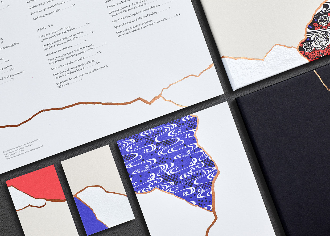

We tried many different techniques to get the kintsugi join working in a controllable way so we could combine the elements and menus together with one continuous crack. We went from drawing in different mediums to smashing porcelain.

In the end what worked best was to simply tear paper and then reattach with a gap and scan. The cracks were then isolated and retouched to get the correct feel. That process was discovered in the concept stage, and worked so well it was carried through to artwork. It was time consuming, especially making all of the printed items connect, but in the end it added an extra level of detail that was really worth it.

We created three modern patterns with the Japanese/British London-based pattern house, Eley Kishimoto.
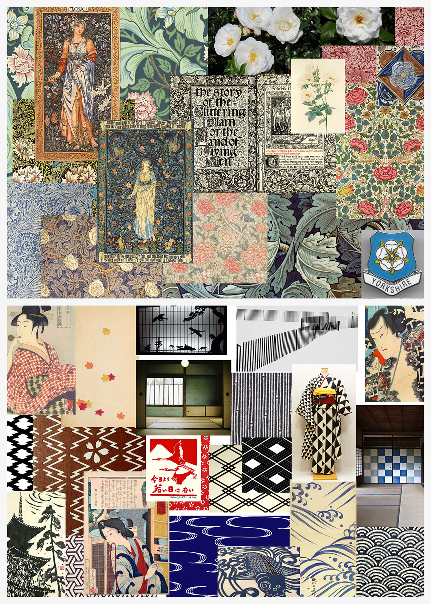
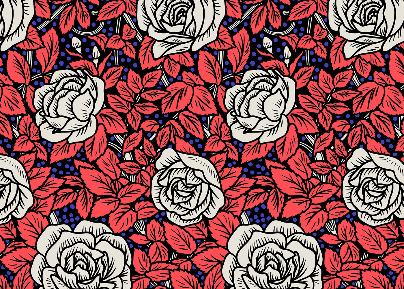

As the restaurant is based in Leeds, The British pattern features the white rose of Yorkshire, and to complement some of the water details in the interior (including fish scale screens) the Japanese pattern was created with an ichimatsu stream reference.

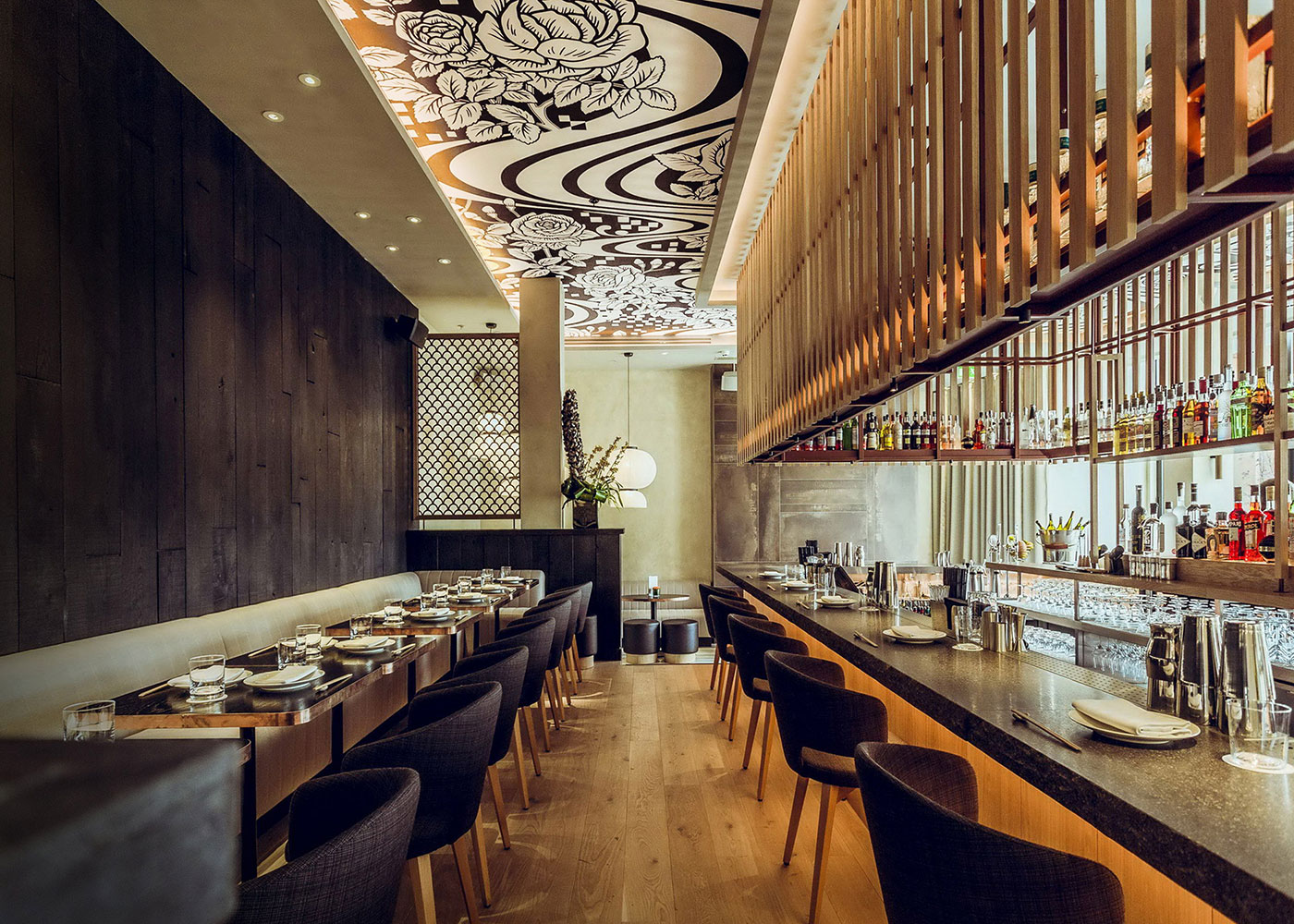
A third pattern brings both of these elements together. The black and white version of the third “together” pattern was also used in the ceiling of the interior.


Working with Eley Kishimoto was a real pleasure, particularly seeing how they create modern patterns from traditional sources. They have a very single-minded and concept-driven approach, and were able to apply contrast between the British patterns (embellished, romantic, tight, and filled) and the Japanese patterns (spaced, simple, graphic, and loose).
We created six large posters showing Japanese/British people, shot by Laura Lewis and Benjamin Bentley, and joined with copper foil. British and Asian models were sourced and shot in a simple portraiture style.

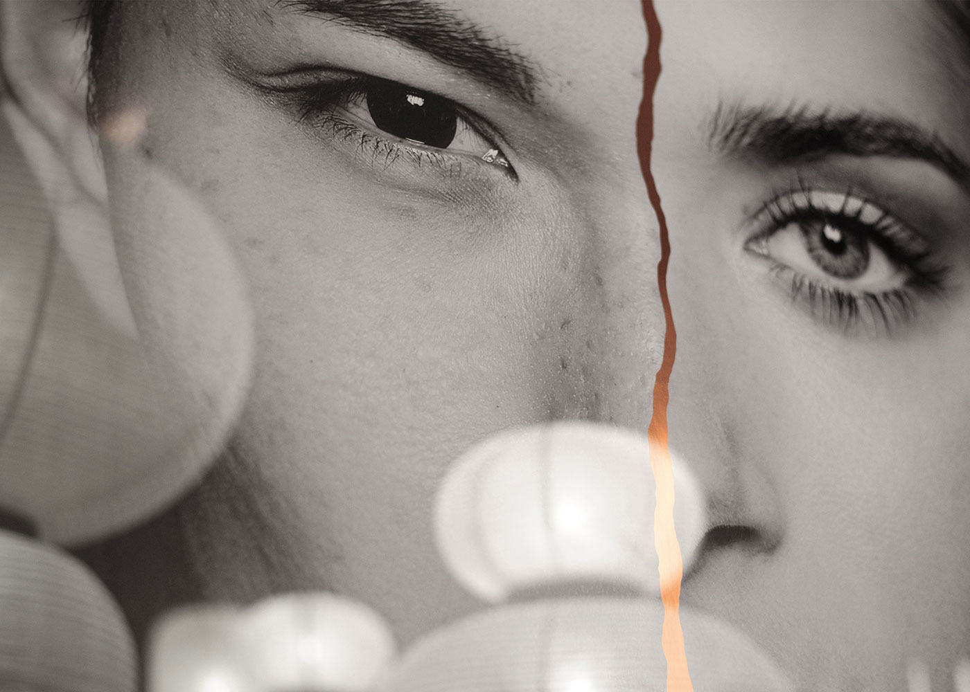

The crack was created using the same technique as with the menus, before an incredibly large rub down was made and applied (this needed very calm hands). The artwork was then framed and hung in various locations within the restaurant space.

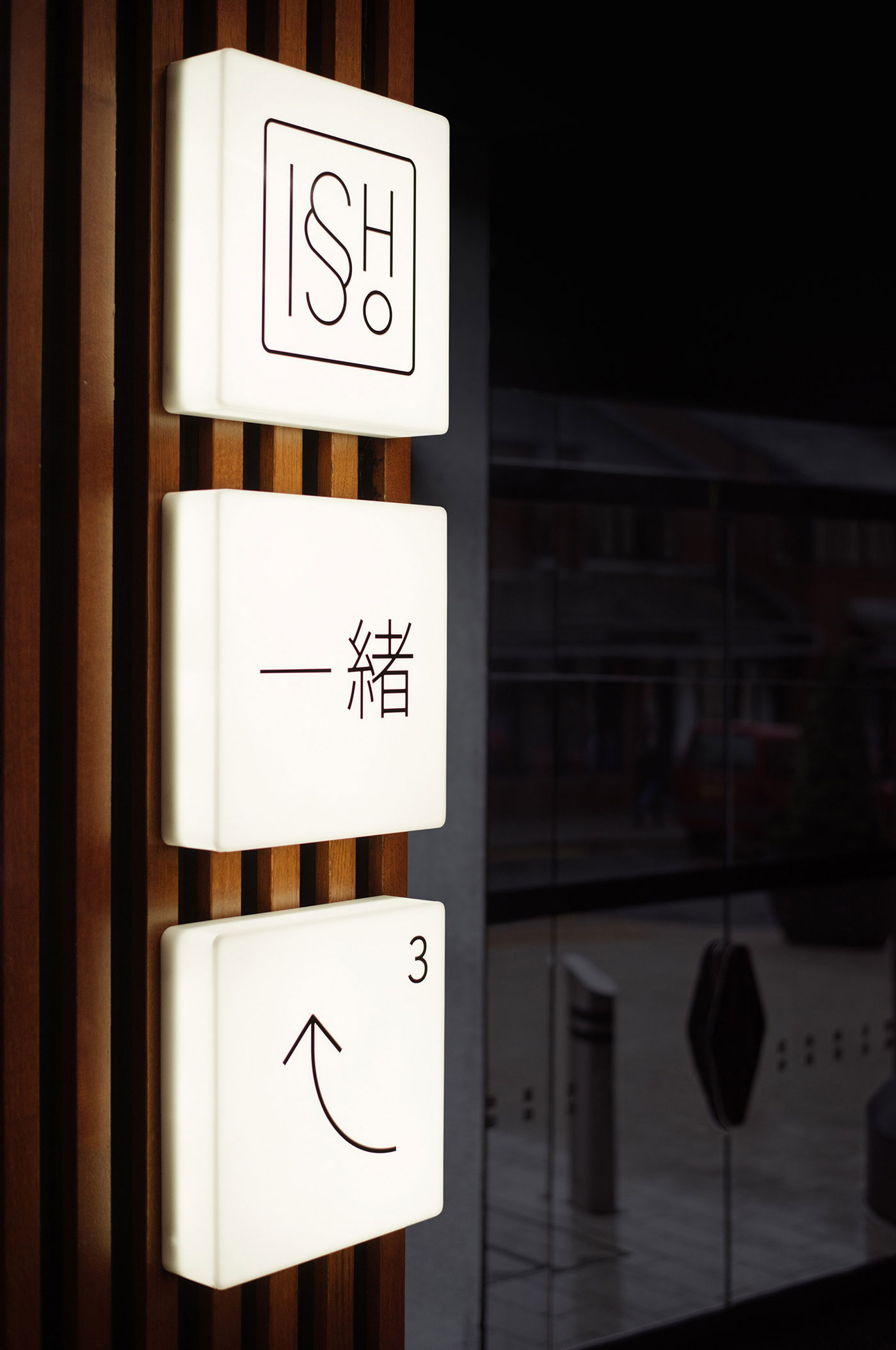
A distressed metal plate with a copper kintsugi join was used for the restaurant signage, with warm light boxes used for directional signage in reference to a traditional Japanese paper lamp-stand.


Finally, we had more than 50 small kintsugi plates made to act as the bill holders for the end of the meal.


Comments
Absolutely stunning, love the Wabi Sabi influence.
I love the amount of research and the level of detail that went into this project.
Deep approach, rooted sources, traditional and modern aspects, master craftsmanship, knowledgeable design implementation, vision from start to end process – excellent execution. Elegant and simple yet enriched visual outcome.
The level of detail is inspiring. Beautiful execution.
I think this is spot on. What a great idea!
I forgot this was an identity design, I felt I was looking at the process of artists. It’s stunning work with impeccable detail flourishes.
Original and unique. Nice!