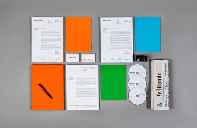
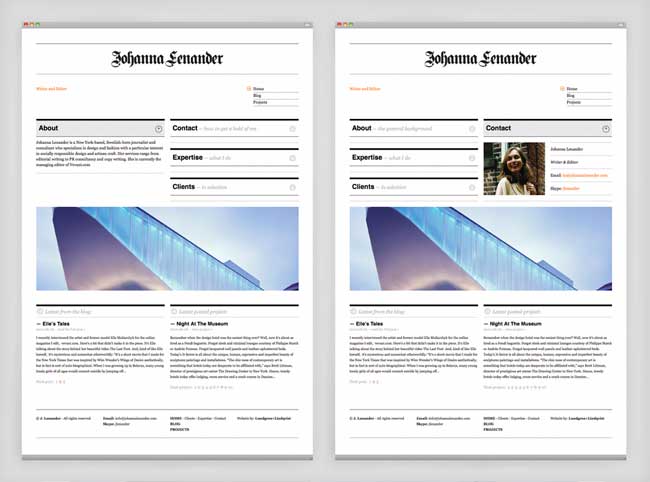
Johanna Lenander is a writer and editor, living and working in New York City. Johanna is also the author of the book Hair Wars. Working for prestigious clients, such as Style Magazine (New York Times), Elle, Gucci and Karl Lagerfeld, Johanna needed a site that not only displayed her writing skills but also reflected her sense of style. We were approached to design and build the site and to design Johanna Lenander’s identity and printed matter.


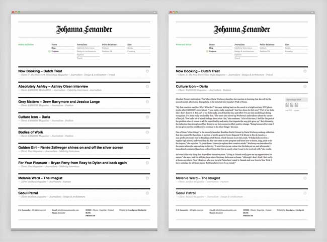
The site was built so that it would give the visitor a quick overview enabling them to assess the information of interest rapidly. The aesthetic, both of the identity and website, follows the editorial tradition of classic newspapers, but with a modern twist. We used the WordPress CMS as a platform for the site which enables Johanna to easily edit the site and upload new work.
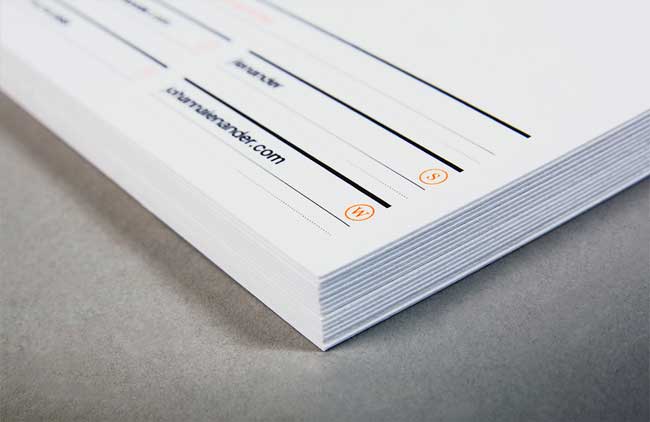
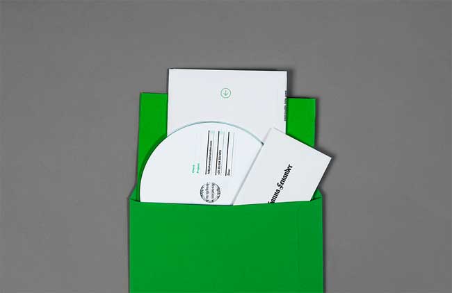
Printing techniques included relief and fluorescent inks. High quality paper stock — such as the uncoated Munken Polar 400gsm — was used for the stationery.
Visit the website: www.johannalenander.com

More from Lundgren+Lindqvist.


Comments
In general, I like the simplicity of the design. But in all honestly, I’m getting kind of tired of seeing the whole “thick and thin horizontal rules combined with Helvetica to create an 80s retro feel, with a bit Swiss grid thrown in for good measure” thing. When Koodo launched their look a few years ago is was supposed to be a joke — it even went as far as to spoof the the 20 Minute Workout. (http://koodomobile.com) But now I’ve seen it a hundred times. Let’s move on to the 21st century.
Is it really an 80’s retro style, though? For me this sort of design is timeless. Even if it’s been done before it has a clean frankness that is always refreshing. Personally I don’t agree that designers should always be on the lookout for a flashy, ‘modern’ style, specially when it comes at the cost of dismissing everything else. It’s bad that ‘new’ would be more highly valued than ‘good’.
I don’t agree with the “double face” the design has. On the website it sort of works because of the newspaper feel, but on the stationary the logo doesnt mix with the helvetica and horizontal lines. The logo also doesnt feel like a proper logo but as a header. I can’t relate at all one thing with the other! And I agree with Erich, lets move on…!
This is excellent.
I’d have to agree with both Erich & Carolina, I’m afraid. The treatment of the logo is absolutely fantastic, but with the rest of the identity, it’s extremely (to name the paper) NY times-esque.
Whoops, clicked earlier than I should’ve, so please excuse the double post.
Just because Ms Lenander has worked for the NY Times surely doesn’t mean that her identity has to be a mini-me of NY Times too? The printed matter & identity works, just not with each other if this was meant to be a unique approach.
Speaking of colours, how would it look if that orange or blue were substituted with a nice deep red? Now that would be powerful, especially when combined with that blackletter. On second thought, I think maybe somebody already used that brand style.
@Erich: Koodo is not a good example for comparison
I’ve been holding my breath on this one….but I want to get my comment in before the next item is featured. I honestly like the actual identity but I am not fond of the branding. The whole layout of everything just seems generic.
“Don’t try to be different. Just be good. To be good is different enough.”
This is very good design.
@Erich, I think the blackletter kills the “swiss” style quite effectively. I think the Helvetica could/should have been cut, and it would look better. But, overall, I get a “newspaper” vibe from the whole identity. Why is this appropriate? She’s a writer! She writes…for newspapers, among other things!
Yes, there are elements of cliché that could have been left out, but I don’t think we should judge this as a designer’s identity, but rather as a writer’s identity, for which it is more powerful and more appropriate. For a designer, it would be… stale, to say the least. For a writer, it makes more sense.
Alessio, I agree 100%.
This is entirely appropriate for the client. I don’t think it’s an excellent, great, fantastic or any of the other superlatives that have been poured out here. It’s just right. Nice job. Both client and designers should be proud.
I think we get a little too hung up on the details sometimes. The bigger picture is always more important.
I think designers sometimes forget that identities are not, and should not be, designed for other designers. If this solution helps the client and her audience connect, what else really matters? Remember, this is an identity and site for an editor; which means it’s all about content; which means the design should work to present that content in the most navigable way. I say, good job on doing just that, while injecting the whole package with just enough style to differentiate.
I love this . . . timeless classic design, not understanding the earlier references to retro 80’s, this styles always been around, more so in the 50’s and 60’s with the likes of Muller Brockmann and Massimo Vignelli, in the 80’s and 90’s it was the inspiration for April Greiman, Why Not Associates, 8VO and Cartlidge Levene.
In my view all design is about rediscovering, never inventing, being original is simply a fresh pair of eyes.
The beauty of this identity for me is the juxtaposition of that heavy gothic font against the clean simple style, and those vibrant accent colours . . . beautiful work (loving the thermography print detail too)