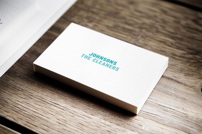
I felt that Johnsons the Cleaners’ current identity was tired, outdated and didn’t reflect their status as the UK’s largest dry cleaners. The new identity optimises white space to give a clean, fresh look, whilst linen stock is used throughout to provide a qualitative feel.
I added some fun to the branding by creating symbols that represent their services, then applying them in a creative manner. The letterhead features an iron symbol indicating the fold line.


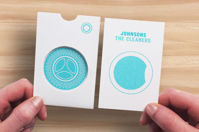
The priority club membership card comes in a sleeve that looks like a washing machine (depicting the full, then empty machine when the card is removed).

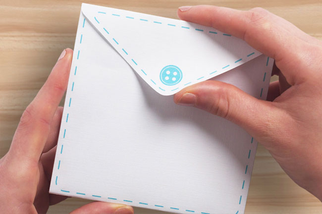
Finally, the discount voucher comes in an envelope with a button symbol on the back, and the voucher itself has a tear off strip designed like a zip.

More from Ben Vessey.


Comments
Very ‘clean’ (sorry) design and understated application of the ideas, really solid work.
Is this actually a project commissioned by Johnsons or just a design study by the designer?
I like the little clever understated flourishes like the iron indicating the fold line and the voucher zip tear off… but the typebased logo is rather dull and does look like something an inexperienced design student would have come up with based on what to be honest is an aesthetic that repetitively churned out a lot of moment by graphic design students at art schools (believe me I know, it wasn’t long I was one too – but avoided this while watching everyone else do exactly the same work over and over again). I would have actually kept the broad idea of the existing Johnsons the cleaners logo (in terms of structure and design it’s pretty decent) itself and just evolved it slightly, and using it with the really quite wonderful whimsical flourishes and colour palette. It’s a shame because the logo is a fundamental part of the identity, and it just looks rather lazy and unmemorable and an afterthought to the rest of the ideas.
Wow, Ash. I couldn’t disagree more. Their current logo is, well… even if this is a study, I can see why Ben picked Johnsons.
The wordmark is not anywhere near understated in a boring way. It plays well with the rest of the identity, which is nearly reminiscent of a clean, classy, leave-it-to-beaver-era of air-dried, crisp, white linens and quality industry… circa 1952.
I think the pocket and button might be a bit over the top for me, but that’s just personal taste. I see what he’s going for, and I believe he accomplished it well.
It’s clear this isn’t a commercial project, the design cues a fun and well drawn but ultimately flights of fancy with very little focus on communication or positioning.
I think it’s perhaps a little naughty of Ben not to be clear about the origin of the project, simply stating that it’s ‘Rebrand for the UK’s largest dry cleaners’ on his website is a little misleading.
The giveaway is in the phrase, “I felt that Johnsons the Cleaners’ current identity was tired…” Also that the diecut on the membership card has obviously been done by hand.
I like this a lot. I like the wit and whimsy. I like the colours
However, it seems to me that the applications have been chosen to fit the idea. How often do Johnson’s write letters? What about the little reminder tag for when you pick up your drycleaning. What about the hangar and the clothes wrapping? What about the website. What about the retail space.
I would prioritise the touchpoints that are fundamental to the customer journey. These are the places where the brand has to work the hardest – the places where the application of an identity or the deployment of a visual vocabulary needs to support the delivery of an experience that lives up to the brand’s promise.
That said, Johnson’s do have a priority club and I expect that receiving the one designed here might be a more delightfully tactile experience than the one that currently exists.
Personally, I don’t think there is anything wrong with showing self initiated rather than commissioned projects – but I do think you need to be explicitly clear which is which.
Finally, I’m tempted to agree a little with both Ash and Shawn. The actual logo isn’t much of a design tour de force, but then they don’t always have to be. Sometimes they just need to be the foundation stone of an identity – an element of consistency that lies at the heart of a vibrant and dynamic universe.
Well played, Shaughn. Very fair indeed. I can see these elements being used on the corporate level, but I’d be interested to see the application on more traditional, consumer-touching elements as well.
My mistake, it does however remain a little ambiguous on his website.
Don’t get me wrong I do love a lot of the ideas, the design flourishes are really lovely and do make you smile – and I can see it being more appealing and doing something for the Johnsons brand – but like I say, and would agree with Shaughn here, the applications have been chosen to fit certain ideas. I get the feeling the creative thinking process has been followed in the wrong order, possibly in reverse, and agreeing with Shaughn again, I would have prioritised the touchpoints of a customers journey. Retail is very people focused environment, and from design perspective they have to be the starting point as they are ultimately the audience. Having said this, if you even just took the ideas as they are and replaced the logo with the existing Johnson’s logo changed to match the colour palette, and expanded the applications to a more appropriate applications, you’d have a pretty strong concept to pitch.
I’m inclined to agree with Ash here that the logo isn’t what I’d like to see done with it, and that actually given that it’s such an established brand I’d rather haven seen a modern taken on their existing identity – but I do feel that the change should have been fairly radical still.
I’m not so sure it’s a good idea to change the company colours for instance. Though saying that, are the colours green and yellow or blue and yellow, they can’t seem to make up their mind! :O
However, the marketing collateral designs are excellent and one can only hope this prompts Johnsons to think seriously about a refresh of their identity :)
Good work!