For the longest time, residents of West Jakarta had to settle for coffee shop chains found only in malls bearing names that were all too familiar. Koultoura seeks to change that, bringing a fresh stand-alone coffee shop, offering a cozy place to hangout and a masterfully brewed coffee to match.
Koultoura is the pioneer of modern stand-alone coffee shops in West Jakarta, and seeks to capture the market for good coffee as well as the casual coffee drinkers, mostly residents of the nearby area. We were tasked to deliver a comprehensive branding suit that would capture a wide range of market, define its presence and personality as somewhere to go for good coffee, and a hip hangout place.
It was clear that the biggest challenge in this project was to “please everyone.” With a number of different audience types to target, a sharp branding suit would be a tough one to create. Especially with the location of the shop, where most potential customers are not yet used to the concept of a stand-alone coffee shop, we needed something to invite them into the store
We approached this challenge through a multi-layered communication, by addressing:
- The stereotype
- The personalities
- Education
All wrapped in a friendly, easy to digest package.
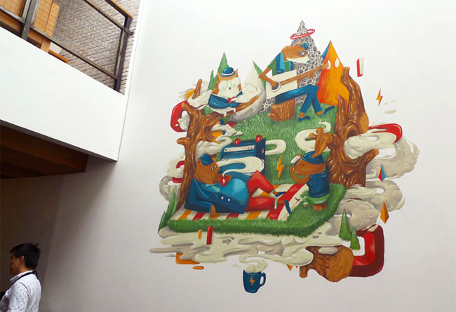
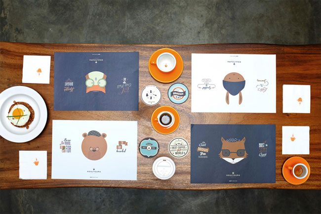
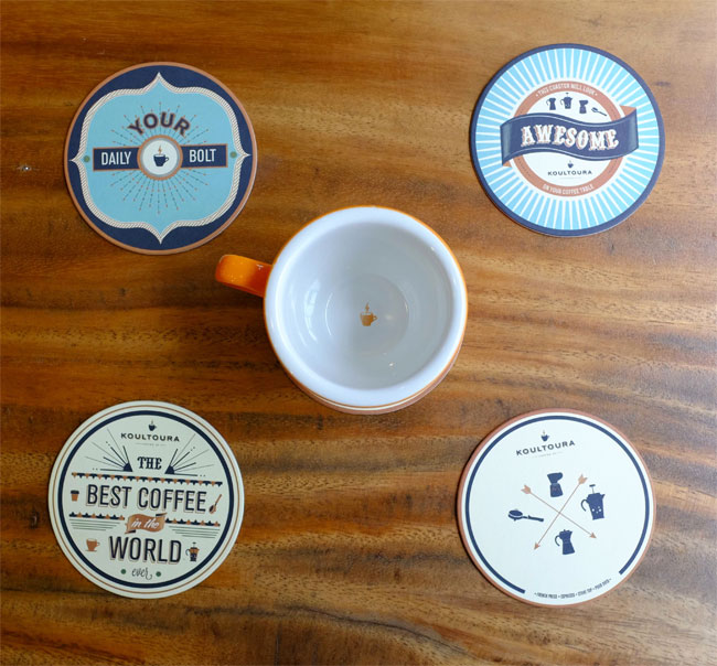
The stereotype we approached was through the logo, a cup of lightning bolt, suggesting a cup of drink to jolt you, in this instance, coffee.

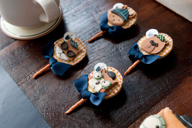
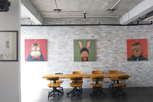
The personalities we created through mascots each had varying dispositions that most people can relate to. These characters share the same passion — a good cup of coffee.


Education is very important in terms of raising the awareness of the more general audience to understand more about coffee, brewing types, and its culture, to encourage them to be more explorative when it comes to the drink.


View more brand identity design on the FullFill website.

Comments
As much as I love this brand, and I do love it, it is missing something quite vital: the female aspect.
Let me start by singing its praises. I love brands that really bring the art part of design to the forefront. And brands with a “story” are more approachable and, I believe, attract more loyal customers. Overall I love this brand. But…
If you look really closely on one of the photos towards the end, there is what appears to be the face of a penguin with a flower or bow on its head. I guess that is the nod to those customers of the female persuasion. I am not necessarily against an all masculine motif, but it does feel exclusionary. The characters seem to embody the moody artist types who are “misunderstood” and basically view women as exotic, scary creatures. The penguin proves that theory. The bear, fox, rabbit and owl can all be found in the same parts of the world and even sharing the same forests. Not so a penguin. It seems like a missed opportunity to have not made the fox and the owl feminine. In any typical coffee shop you see the beautiful, unconsciously sexy, music dabbling coed (fox) and the people watching, agelessly serene, bookish/crafty chick (owl).
Changing those characters’ genders with minor alterations to clothing, would not have effected any of the rest of the brand. The whimsical, artsy, moody motif, color palette, marks, etc. would have remained the same. Course, when the brief talked about a variety of target audiences to please, perhaps women truly weren’t a consideration. That entire area of the world has a bad reputation when it comes to women. Too bad they couldn’t overcome that checkered past with this modern, hip, brand.
I am quite certain they (the designers) did not deliberately leave women out of the design, may be subconsciously perhaps, maybe the designers were all chaps who leaned towards foxes and bears. I cannot believe this alienates women at all, the style is light enough, whimsical enough to appeal to all sexes and quite frankly they have done a great job of branding a coffee shop without a lot of the clichés you’d expect to find in a typical coffee shop design.
I do not believe they left women out deliberately. As for whether the obviously female absent brand alienates women or not, well, that can only be answered by women. It sure wouldn’t take much to include them, and it would not change the overall brand, as I outlined in my initial response. Hopefully they see the wisdom of including females in their brand going forward.
I love your perspective and want to praise your input. You put a lot of thought into your reply and I really appreciate your point of view. I would 100% have to agree that the lack of female representation does weaken the brand as a whole even if it wasn’t deliberate. More diversity ALWAYS strengthens a brand even if it is a strong brand to start with.
When I first looked through this design scope, I didn’t love it. Not because it wasn’t beautiful, but I didn’t feel a connection to it. It felt distant. To inject a female perspective would have broadened its reach. Love your thinking Trish! (This response is years later — I’m a little late, hahah.)
The rabbit could be a woman. I have seen women in coffee shops looking like that.
Compared to your standard coffee shop I don’t think I’ve ever seen something like this. I understand what people have mentioned regarding the gender of the animals but personally I didn’t notice this until I read the comments.
The only thing I felt was does this alienate the normal client who uses a coffee shop. Looking through the brand I imagine this place to be full of hipsters with their apple products,flat caps and beards writing novels.
It maybe a location thing, but to be honest most people in Nottingham UK who need a coffee are middle age people who need a quick pick me up from work. (I apologise for the sweeping statement!)
Overall really great though and would love to visit.
This is an interesting theme for a coffee shop. It looks very Fantastic Mr.Fox-ish. Somehow with coffee shops or any “branded” space, physically experiencing the space gives a better sense of the effectiveness of the new identity. So I am unable to comment on whether or not having a female character is really affecting the message in any way.
I like the intelligent conversation happening here regarding the audience appeal. I may sound like I’m stereotyping, but this coffee shop looks to appeal to women first? I don’t see masculine men cuing over cute animals while drinking their joe. The brand manages to keep it from being cutesy, but c’mon. Ladies gotta love their furry male animals to look after them and keep good company.
I can see where you are all coming from though, and the only mistake this brand may be making is comparing visitors with the character personalities, when the mascots should only be mascots. I find that people don’t like to be figured out as a certain type or labelled and that is what I believe is causing this hot fuss.
I’d like to congratulate this great idea, I can imagine the atmosphere inside the coffee store!
I’m a barista, I’ve worked as an HR analyst in Starbucks and in Le Pain Quotidien, if you need a new joiner in your staff please let me know!
Best regards from Argentina!
Silvi