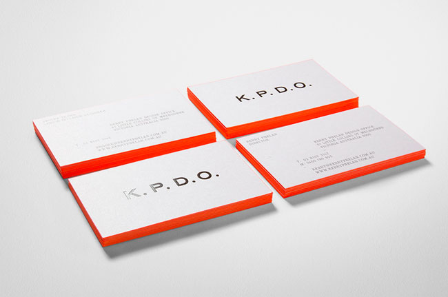
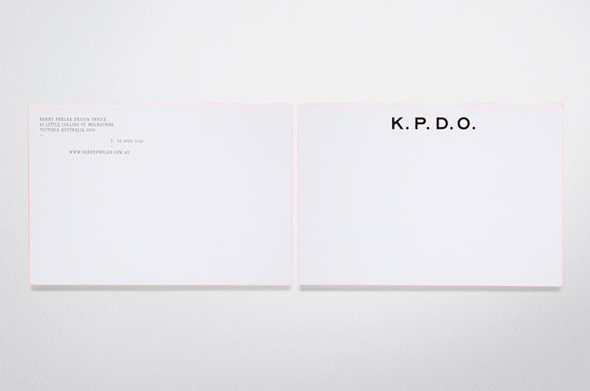
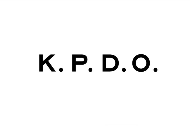
K.P.D.O. is an identity designed for Kerry Phelan Design Office, a newly-formed, interior design studio in Melbourne. Kerry Phelan is one of the most respected and awarded interior designers in Australia. She co-founded Hecker Phelan in 1999, before forming Hecker Phelan and Guthrie in 2002. Kerry left HPG in December 2009 to pursue individual creative pursuits.
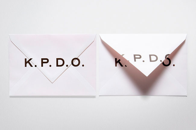
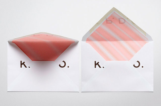
Moving from a brand to become a personable identity, we took an old-school atelier/studio approach to reflect the purist, humble and approachable qualities of the studio. The idea is based in subtleties that count, allowing the work to speak for itself and not hide behind corporate branding.
Elsewhere on Identity Designed: ACCA and Social Traders.
More from Fabio Ongarato.


Comments
This is the sort of identity that would never be featured on the likes of Brand New as the majority of commenters there simply would not get it. I can almost see the ‘that’s not a logo’, ‘my mum/gran/hamster could do that in Word’, ‘epic fail’ type of comment now…
But that’s why this blog is a whole lot better for it; it shows subtle, beautiful work like this. Work, dare I say it, that the majority of subscribers and visitors will get, understand completely and admire.
Great work.
So simple and subtle, but so beautifully executed. Lovely work. =]
I like this a lot. My favorite is the envelope! The whole interior decorations just suit the brand so well. This is some clever work!
I completely agree with Martin, it’s delicate identities like this that I really admire, it allows the product/service of the company to breathe. The letterhead and business card typography is beautiful, and the envelope tops off a well executed identity.
Unfortunately this is exactly the kind of logo that would get unknown designers in trouble with their clients. What I mean is that some clients would demand their money back.
I guess I’m too much of a chicken for trying to pull off something like this.
Reading the comments so far from a designers own marketing perspective have been really interesting (I’m reading them with my marketing hat on).
Having the confidence to execute an like this identity involves taking risks. The ability to have this kind of freedom is something you either build up over time or create from the outset with great positioning of your design business.
As with any business designers have a choice. You can appeal to the masses or decide to serve a niche. If you check out the Fabio Ongarto website you can see how they’ve positioned themselves to attract a certain kind of client. The kind of client who wants their product, service or company to “have room to breathe”.
Fantastic to see some more excellent work coming from downunder too!
With this kind of identity, the execution must be flawless. But in my opinion, if the last image is accurate, the space between the K and P is a bit to big compared to the other two. Maybe I’m overly critical here but my typographic eye can’t help but notice the imbalance.
I just noticed something, kind of funny actually, if you read the initials in Spanish it sounds like “ke pe-d-o”, which if you add a question mark at the end it (que pedo?) translates literally to “what fart?”
Just an observation…
hahahahah… K.P.D.O.
In Spanish, especially Mexico, we use that as a “What up” which literally means “What fart?” …rofl.
Besides that looks awesome though.
Sorry, I couldn’t resist.
:)
The design is simply exquisite. Elegant, refined… simply stunning. I’ve fallen completely in love with your site. I’ve added your link on my blogroll.
Keep posting, it’s great!
This the kind of work that you can submit to a client when you are at your level but that you cannot if you are a junior designer working for yourself. It is the kind of thing though, that you SHOULD present if you are doing work experience for a top agency. Dare. Abuse. Dont be afraid.
Thanks, good inspiration.
The challenge with something like this is captured in the comments above.
This is design for the designer’s sake. Frankly, the average Jane and Joe are not going to “get it”. That’s just the way it is. They’re going to see 4 letters separated by periods and say WTH is that supposed to mean?
It reminds me of musicians who take the time to achieve the perfect recording. 99% of their effort is lost on most of their fans who play the music back at lower quality through inexpensive gear and an untrained ear. At the end of the day their fans care about the lyrics, beats and rhythms, not the precision and perfection of the recording. Musicians recording for the musician’s sake.
Brands need to be designed from the target audience’s perspective not the designer’s.
it’s difficult with design like this that the mention of its subtlties and elegance. yet most designers in the profession are egotistic crude philistines. why does the industry value such qualities that they possess so little of. and can egotists really create qualities that they have none of themselves…