Krajna, a land of gentle hills, lakes, woods, and meadows extending between Greater Poland and Pomerania. People who came to first settle in the region — some 2,500 years ago — might appreciate the local flora. Perhaps they would rub the seeds, leaves, and flowers in the palm of their hands to better connect with nature. More than two millennia later, machine presses could serve to extract the plants’ rich contents. And now, KRAYNA takes advantage of today’s technology to benefit best from what invariably grows in our very surroundings.
Nature was here long before mankind. Out of deep respect and admiration for Her, KRAYNA provides vegan skincare cosmetics: sustainable, cruelty-free, 100% plant-based. Sharing this affection for the natural, we complemented the brand with considerate yet powerful design.
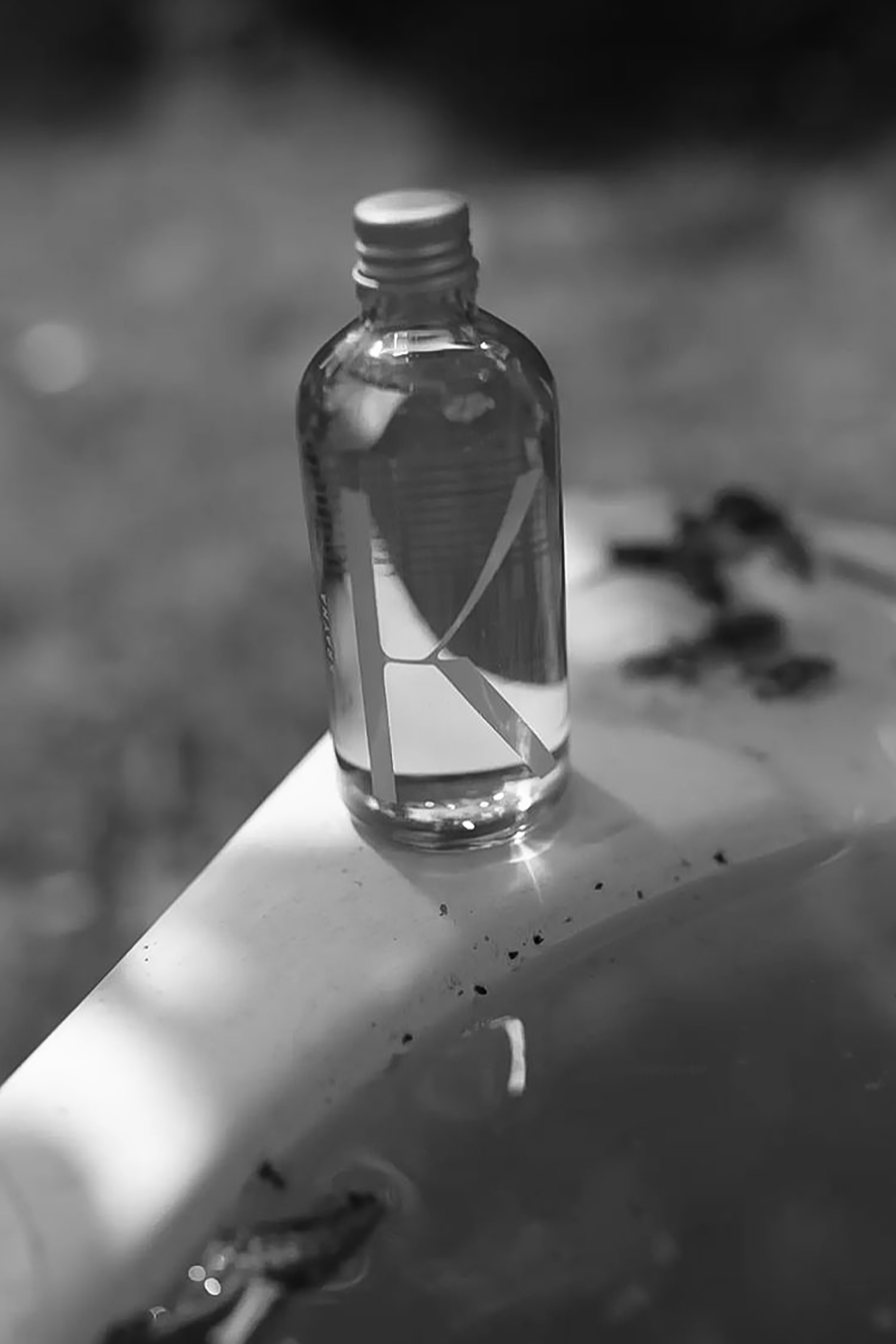
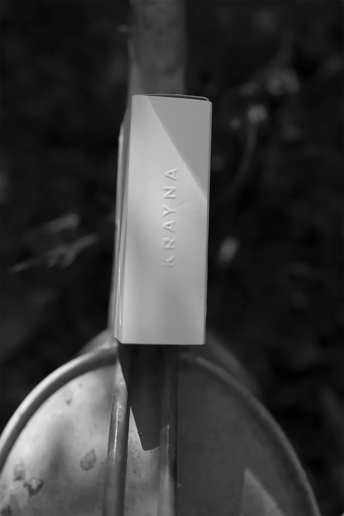
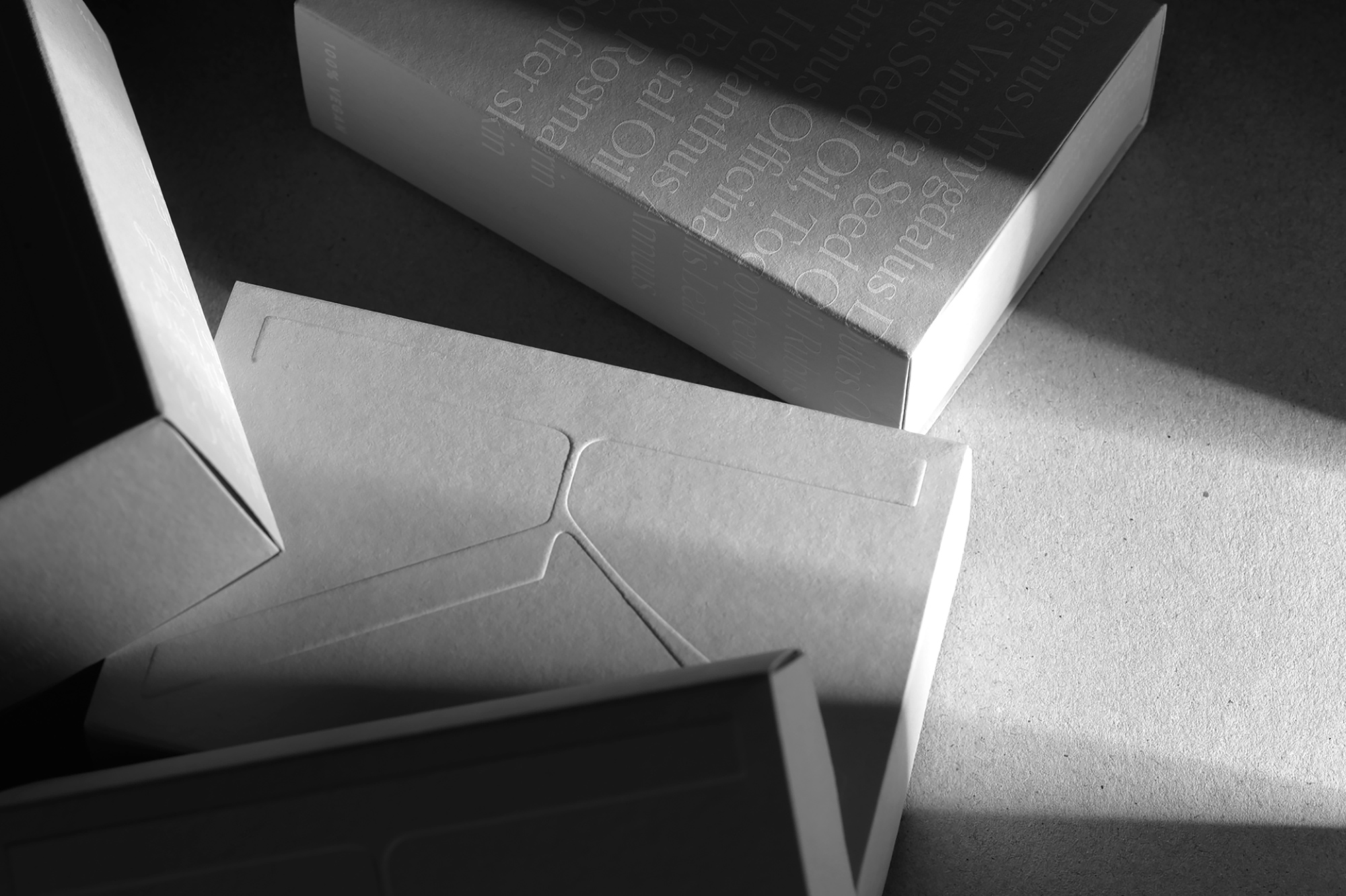
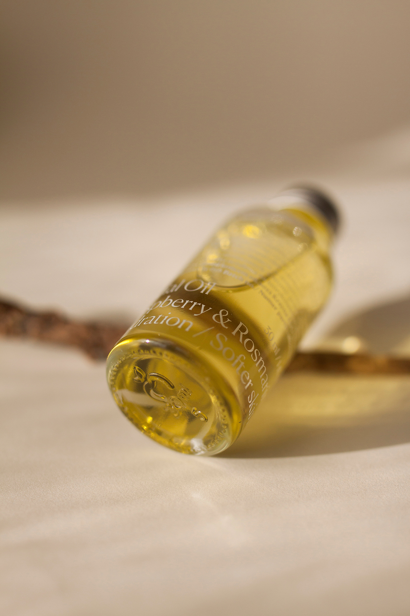
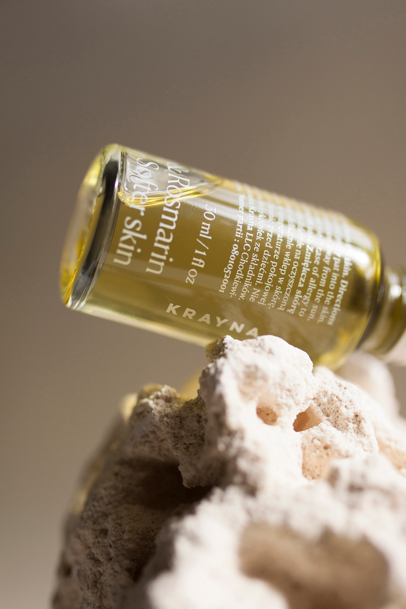
Nature speaks for Herself. That’s why we adopted a minimum-interference approach, reflected — or rather seen through — all over KRAYNA’s packaging. The containers are transparent and based on carefully selected methods: screen-printed white ink celebrates the tone of oil, allowing it to shine, and there are no plastic labels, naturally. Instead, what accompanies the ecologically friendlier glass and aluminium is only FSC©️- and PEFC©️-certified papers, conforming to strict environmental criteria. At the same time, embossing means minimised application of refined coatings, for an even more conscious and self-aware production.
Nature is wiser than our representations of it, too. Accordingly, taking the minimalist mindset a step further, we decided to leave out illustration, CGI, or photography altogether, in favour of type alone. Being a genuinely abstract invention, typography has been put to good use as it communicates the product’s core: the ingredients, set in an above-average size these obviously deserve.
The two typefaces starring in KRAYNA’s new designs were chosen to express its essence decidedly yet tenderly. Confidence is certainly one virtue of Canela (by Miguel Reyes / Commercial Type), which covers most area on the bottles and boxes as it was applied, in different magnitudes, to product designations, volumes, as well as ingredients and directions for use. The same, near-serif flaring gives the letters grace and elegance — qualities that also emanate from the brand’s humble attitude.
The distinctive K added to adorn each container hints at the lettering employed by KRAYNA in the past, and it makes a subtle statement: rendered through the Polish-made font Telecom Light (by Jan Estrada-Osmycki), the initial is breathing green with its leaf- or stem-like ascending diagonal.
Design:
Pat Hølm
, Anna Nawara
Project management:
Mat Erdmann
3d animation:
Jacek Cichy
Photography:
Patryk Chenc
, Angelika Łagowska
, Mateusz Wojnar
More from Heyholm.









Comments
Loving the colours and photography!