The chefs of La Bottega, Francesco Gasbarro and Paulo Airaudo, wanted to meet us after being attracted by our previous work. A funny aspect from the meeting was how one of the two chefs brought a logo sample where he simply replaced the name of an existing brand with his own. It wasn’t pretty. So a part of our job was to analyse what we were presented with, refute the chef’s rationale, then show how to visually communicate a brand that aspired to Michelin status. As consummate professionals, the chefs welcomed our analysis with pleasure, and we were able to work on the new logo with complete autonomy.
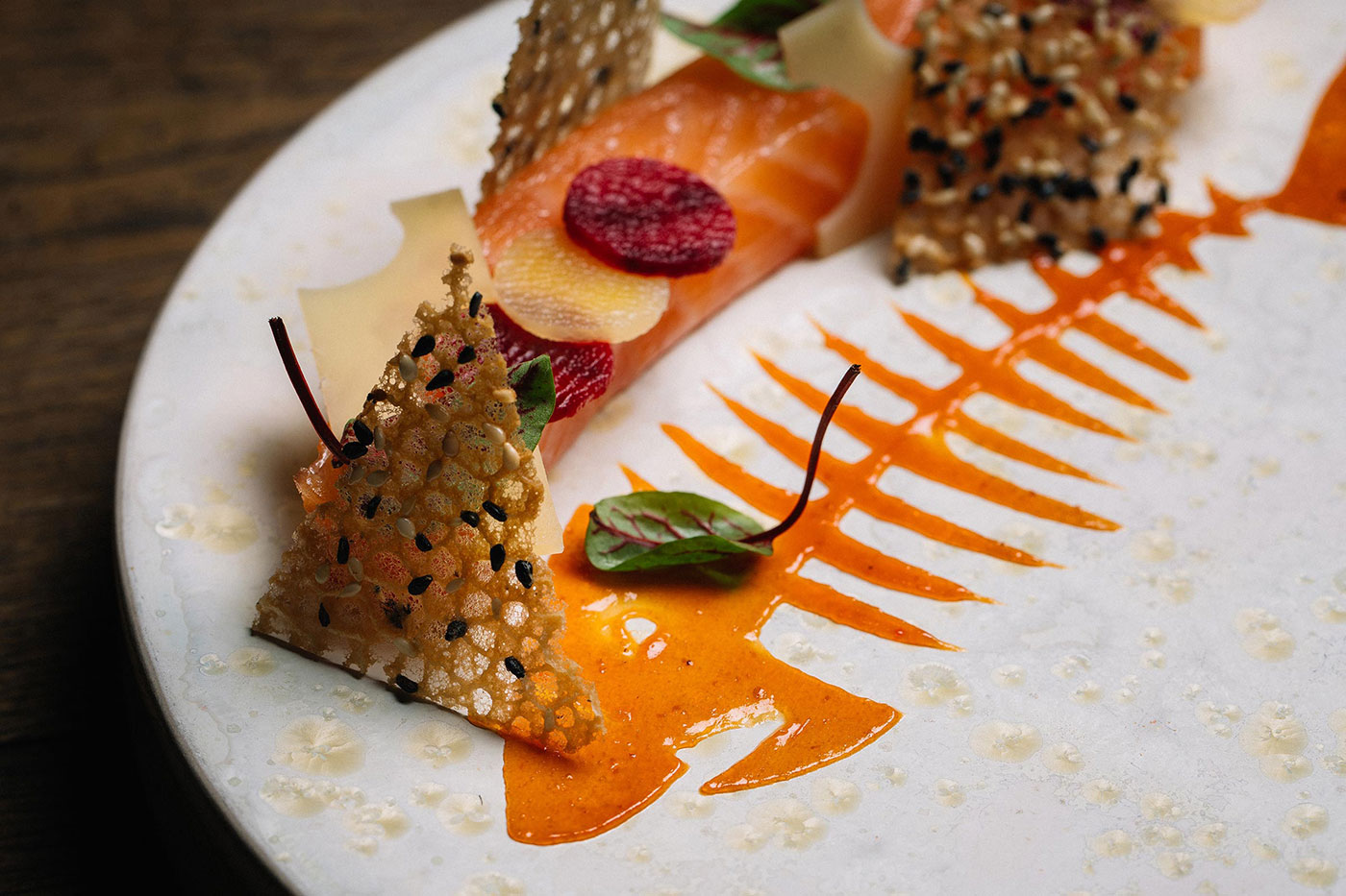
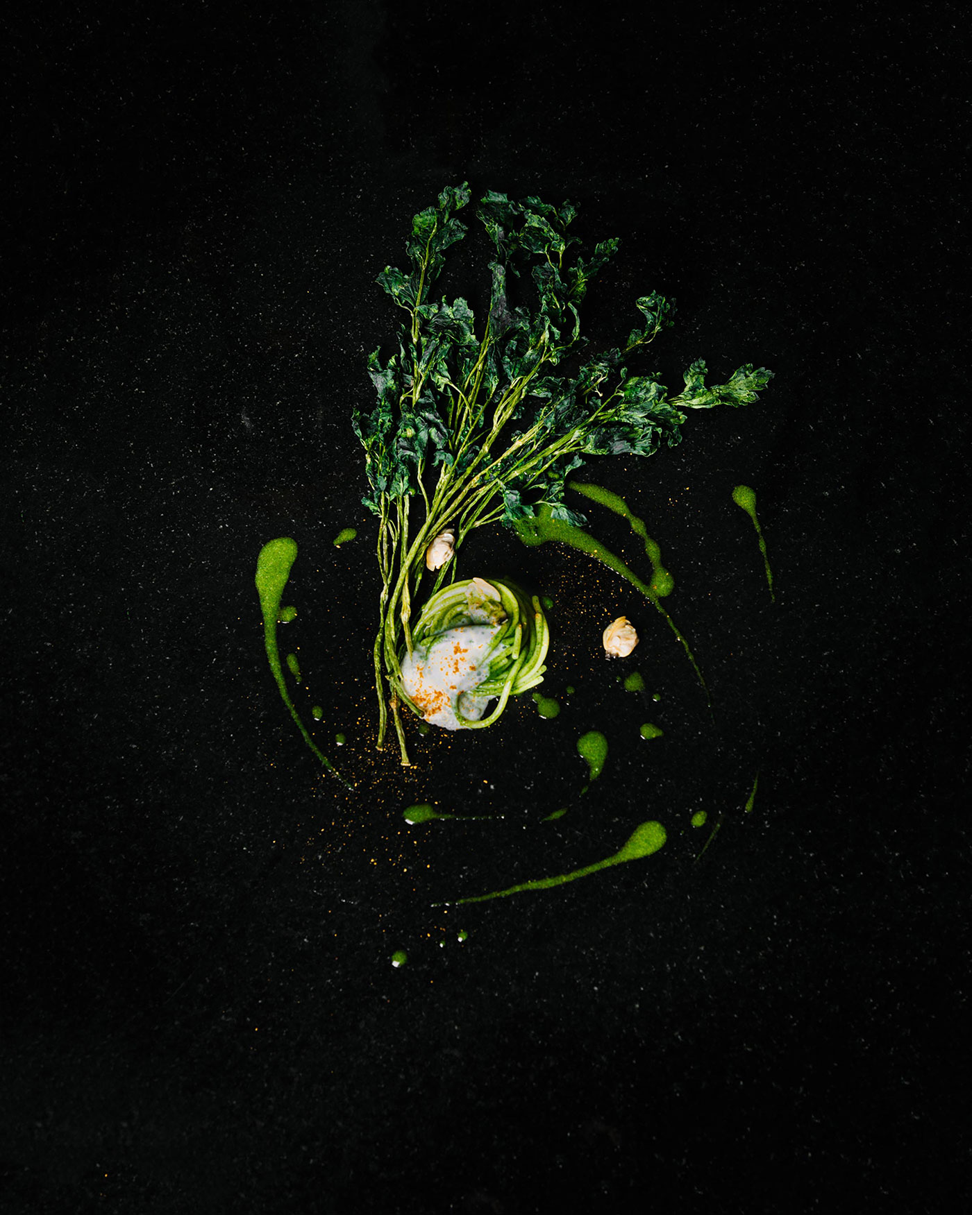
Our main objective was to transmit the identity of a true Italian restaurant in Switzerland, managed by professional chefs — not the classic tourist restaurant with food for all tastes. This was a new beginning for the duo. They had already worked together in prestigious Florentine restaurants, and they now wanted to earn a Michelin rating with something of their own.

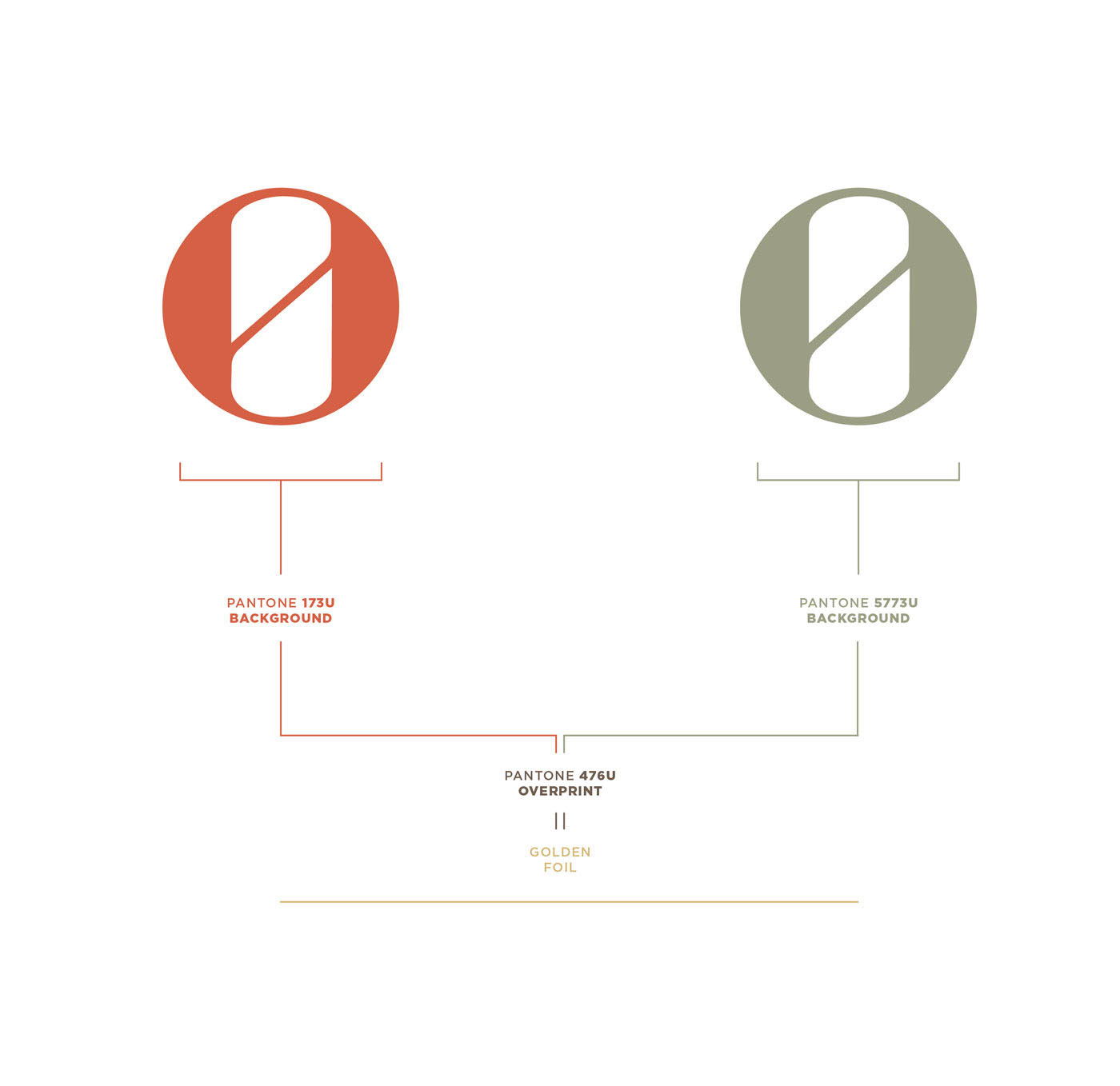
The barred O symbol has a double meaning: the number 0 for a new beginning, and the division of the character into two, representing the duality of each dish conceived by the two chefs. The symbol is an atypical monogram, because it doesn’t correspond to Bottega’s first letter. Our client greatly appreciated our vision through the initial draft and decided to continue with the design of the complete corporate identity.
For the paper stock of the printed materials, we relied on Fedrigoni, the paper mill with which we often work. It offers special, high quality products, and we chose the Materica Terrarossa 360gsm for the business cards and related material. For the staff tickets we used the Materica Gesso 360gsm, with a lighter version for menus and consumables. The detail is printed using Pantone 476U and 173U, that help to bring out the colour of Materica. The supporting fonts are Arno Pro and Gotham.
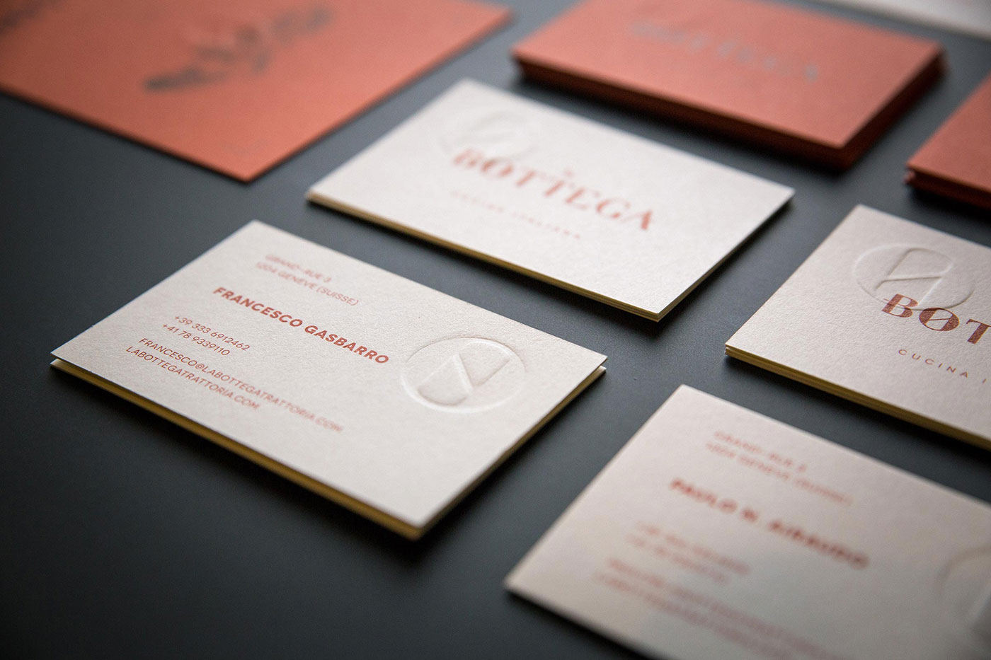

The print process was handled by our trusted print shop Arte e Stampa, a small, artisan facility that has been in business for generations. We almost always work with them because we’ve created a friendship that’s beyond the commercial dynamics, and they always fulfil our particular needs. In this case, for example, the handmade button that overlaps the Pantone print has quite a long drying time on our selected paper stock.


Six months after the launch of La Bottega, the restaurant reached the most coveted goal and was awarded the Michelin star. Some time later, the chefs decided to open another restaurant, also in Geneva, called Osteria della Bottega. It’s part of the same brand but serves simpler Italian dishes, while maintaining the high quality approach that distinguishes La Bottega.
This gave us the impetus to create a brand font that would be applied to everything under the La Bottega name. It’s clearly a Bodonian font, which we have renamed Bottegoni. We developed it in two variants, so you can use the version with the horizontal bar termination in the letters that begin and end the word.

For the Osteria restaurant we retained the Fedrigoni Materica paper stock, this time in its Acqua variant.

Bottegoni has been very useful in the development of products sold exclusively in restaurants: Francesco and Paulo have chosen and produced the highest quality delights, all from Tuscany. For some of the products, such as olive oil and beer, we were asked to design premium packaging to reflect the quality while remaining cohesive with the overall brand.

We repeated the previously used colours in two ways: Terrarossa paper for the oil packaging, and, for reasons related to food law, the beer labels were printed using Pantone 173U and 5773U on liquid-proof paper. We also added a gold foil to the lettering.
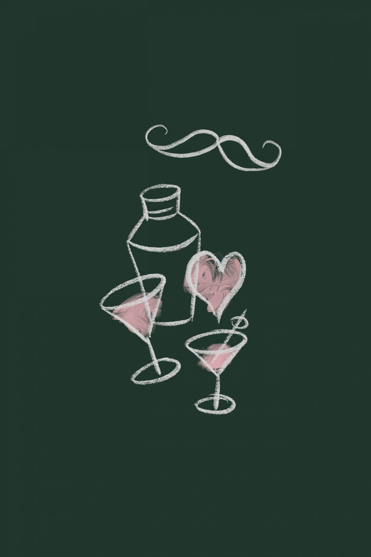
All illustrations were made solely for La Bottega by Stefania Pelliccia.


Photography by Stefano Casati and Alex Stephen Teuscher.
More from Kidstudio.

Comments
Beautiful work, good lettering, colors, and composition.
It’s a shame, despite how they mentioned Pantone colors, that the printed work was done in CMYK.
This is not completely correct. The menu (which is printed day by day on a regular laser printer) is ofc CMYK but all the corporate identity (and the labels, too — except for the Oil’s cream background) is in Pantone.
A delicious and delightful identity. The identity avoked timelessness and yet modern. Excellent work.