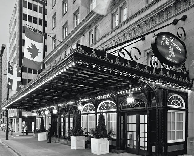
Montreal’s luxurious Ritz Carlton Hotel played host to La Vittoria 2012 where, for the fourth straight year, the branding was entrusted to lg2boutique. La Vittoria, a gastronomic event that raises funds for a different charity each year, benefited the Jewish General Hospital Foundation’s support of Alzheimer’s research, for 2012.
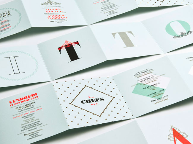
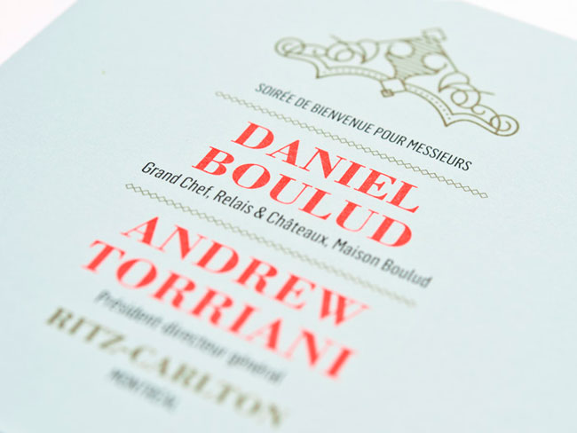
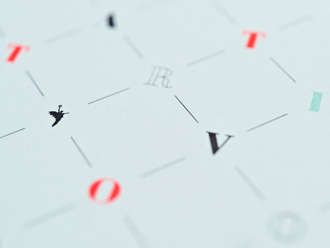
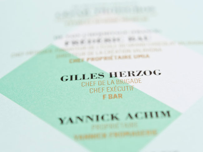
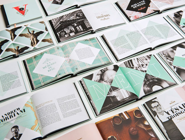
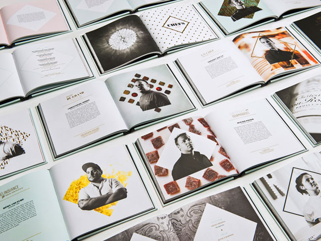
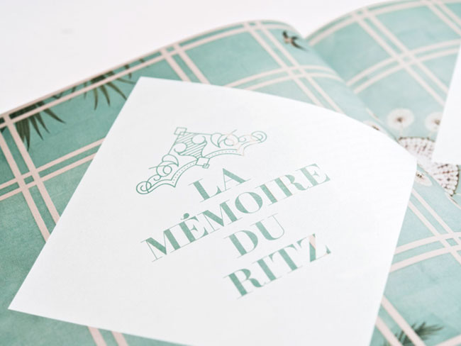
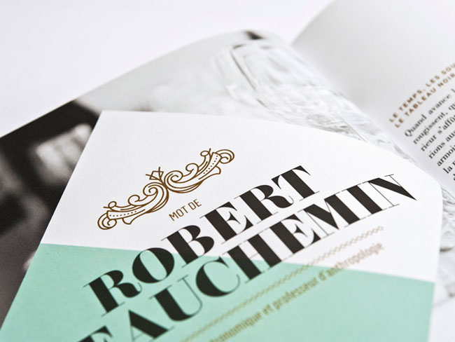
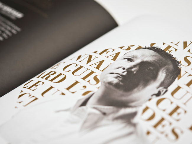
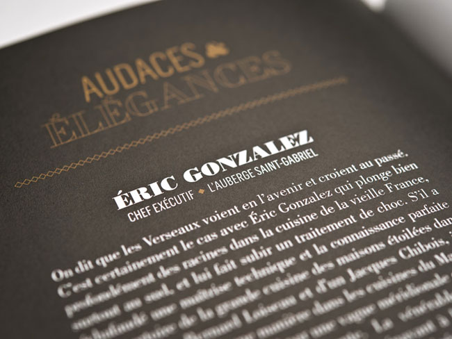
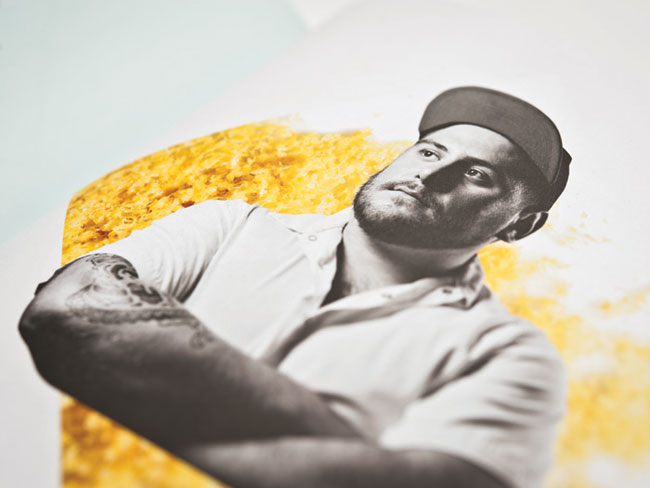
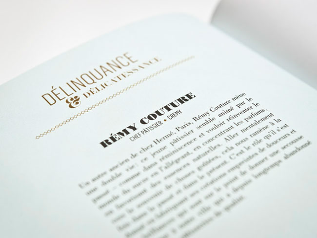
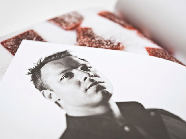
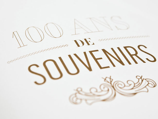
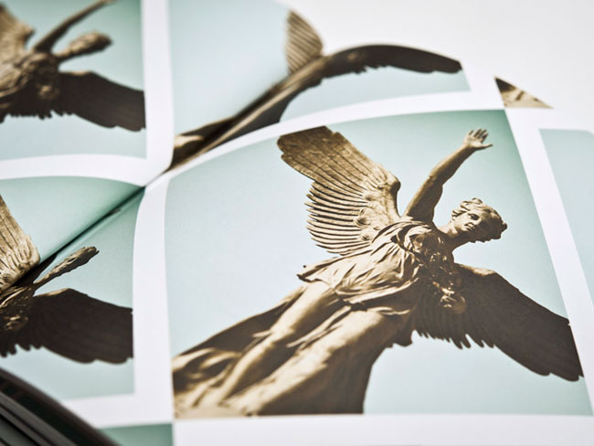
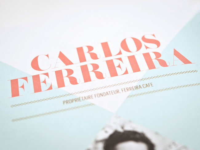
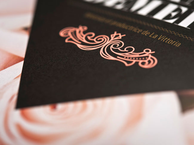
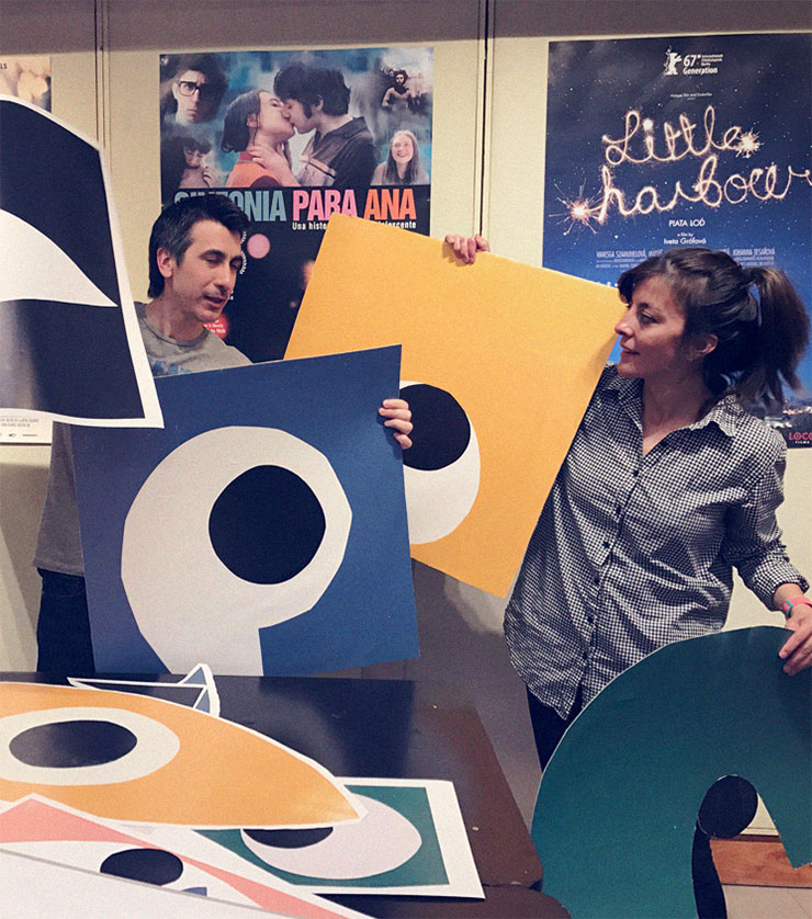
The branding was inspired by the location and the theme of remembering, a reference to the cause for which donations were solicited. All of the rooms were imbued with the duality between 2012 and the time of Louis XVI. The staging of French traditions was interpreted using spiral scrolls and minimalist geometry; gilding and fluorescent colouring. Taking architectural elements as well as photographs of the renowned chefs as references to statues from a bygone era served as highlights of the visual touches of this unique evening.
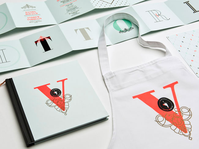
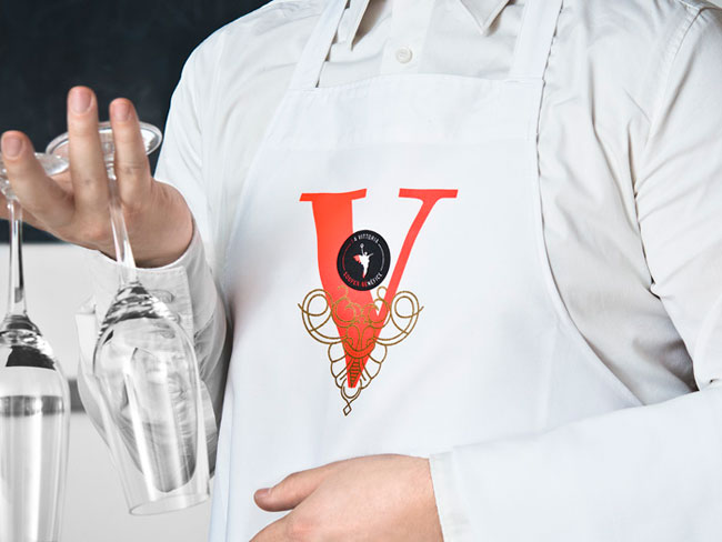
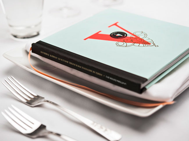
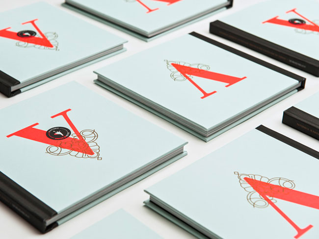
lg2boutique created the graphic platform including the invitation, the waiter’s aprons and the souvenir program to mark the prestigious dinner gala.
The creation process took around two months.
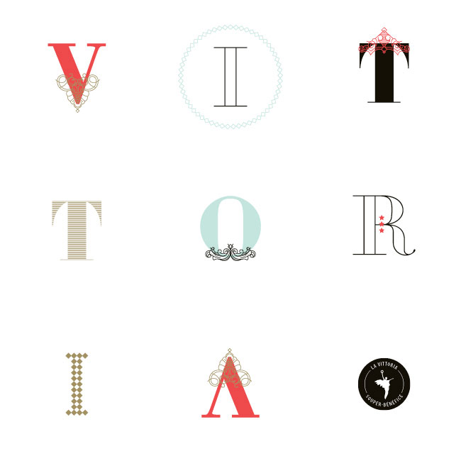
The diamond shape plays an important role in the Ritz decoration, so it was the base to start the identity of La Vittoria 2012. It was important also for the souvenir book to be square so it would fit perfectly with the diamond form.
Client: Johanne Demers, La Vittoria
Creative directors: Claude Auchu, Serge Côté
Designers: Cindy Goulet, Marie-Pier Gilbert
Copywriter: Pierre Lussier
Photographer: Luc Robitaille
Print production: lg2fabrique
lg2boutique elsewhere on Identity Designed: Horst, and F. Ménard.
View more brand identity work on the lg2boutique website.

Comments
DESIGN ENVY!
Damn that looks good. They really pulled off that diamond throughout all the different mediums and layouts. I love the letters too, make me think of Jessica Hische’s Daily Drop Caps.
Thanks for sharing this one! It’s going very high up on my inspiration folder.
In the same, top notch quality as their previous work that’ve been featured here on ID. The font and colours are beautifuly chosen and mixed and the diamond shape is excellently pulled of throughout the whole project.
The photography in the diamond shapes makes me think of… something else, can’t quite put my finger on it.
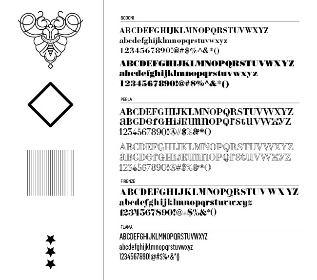
Oooooozes prestige, great typography gotta love a bit of Bodoni. Whats really doing it for me is the colour pallet though. Not too fussed on the mark but the whole brand identity is rather delicious, for some reason I fancy a nice Gelato from a little Italian ice cream parlour.
Only gripe is that the letter A is an upside down letter V, not sure why this is am I missing something here?
Wow this is stunning! Enough said
Looks stunning but it does not hightlights the cause of what the event really is about.
I agree with Larry, it looks nice, but doesn’t really say much about the event. Like the others have said, it does ooze prestige, but doesn’t really ooze a sense of charity and helping people with Alzheimer’s.
Not to be pedantic, but is it really a brand identity? Surely it’s more of an event promotion? I’m not saying that to detract from the work, but if the branding is done every year – and for a very limited period – one can afford to be a little more experimental.
I also wish we could have seen it in October last year when the event was actually taking place, but I don’t want to complain too much.
Very nicely put together and the colour palette is lovely.
Agree with Larry. Visually beautiful put together but lack substance to what it is all about.
Guys I think you’re not putting yourself in the shoes of the target market here. Picture the scene you have been invited to a prestigious charity fund raiser, black tie affair at the rather snazzy Ritz Carlton Hotel that the likes of Adam, Larry, Richard and Robert don’t get invited to (hope I don’t cause any offence here). You know what the fundraiser is all about or maybe you don’t but are just willing to write a big cheque as long as you are treated to a rather delightful evening where all of the most important people around are rubbing shoulders. The invitation, and admittedly my french isn’t parfait but surely tells one what one needs to know, and you know what, I also get to take away a beautifully crafted program to show off to all of my friends, very impressive.
Maybe I’m wrong and have just been watching too many episodes of Frasier but it’s ticking all the right boxes for me. Oh and you know what it’s so damn exclusive we create a new identity for it every year.
Adam,
The rationale behind the whole project only points out the prestigiousness of the event. Surely if you invite wealthy/affluent people (the target audience) to such event the most important fact you have to communicate is the importance of what the event is really is about – and that is to raise funds for charity! This piece of promotional/event branding does not any way communicate that across.
It’s merely a beautifully crafted piece of decoration.
Adam,
Funnily enough, I have been invited to that kind of event (not because I’m rich, but because of the work I was involved in). I can’t remember what any of the bits of paper I received were like, but I do remember eating lots of lovely truffles and quaffing expensive champagne.
My comments have nothing to do with the design per se, which I think is very nice. People involved in identity design strive to create work which communicates what a brand stands for, what it aims to achieve, and how it wishes to be seen. I don’t think this does that. As you said, it seems designed to appeal to people who just want a nice meal. That’s all well and good, but this is a brand identity showcase, and I think a lot of the readers care about more than whether or not something looks nice. My comments also reflected the timing, as this event was in October 2012. This means we can’t see how any accompanying materials may have looked (website, etc).
Of course design should appeal to the target audience, but surely that’s not all it should do? It sounds rather shallow, really.
Just having a look at this again after featuring the year after. You’re right, Larry, the post didn’t mention much about what this actually is. My fault. I added a small update: the work is for “a gastronomic event that raises funds for a different charity each year.” A group of people involved in the food business in Quebec get together for the good of their profession, and to help charities at the same time.